Interior Mood Board Ideas That Will Transform the Way You Design Every Room
There’s something quietly magical about the moment a blank wall becomes a vision — when scattered images, fabric swatches, and paint chips suddenly click into place and you think, yes, that’s exactly how I want to feel when I walk through that door. Mood boards aren’t just a designer’s tool. They’re a way of giving your imagination permission to speak before a single piece of furniture is moved or a single gallon of paint is opened. If you’ve ever stared at a room that felt “off” and couldn’t quite put your finger on why, this guide is for you.
—
Table Of Content
1. What a Mood Board Actually Is (And Why Most People Get It Wrong)
Let’s start here, because this matters more than most tutorials admit. A mood board is not a Pinterest board. It is not a collection of pretty things you’ve saved over the years with vague intentions of “someday.” A mood board is a deliberate, intentional curation — a visual language you’re building for a specific space, a specific feeling, a specific life you want to live inside that room.
The confusion starts when people treat mood boards like wishlists. They pin a Parisian bedroom, a Californian kitchen, a Japanese bathroom, and a Scandinavian living room — all of which they love individually — and then wonder why their actual space feels incoherent. A mood board should feel like one sentence, not a paragraph of unrelated ideas. Every element on it should be in conversation with every other element.
Think of it this way: if your mood board were a playlist, every song would have the same emotional throughline — even if the genres varied slightly. That’s the standard to hold yourself to.
“A mood board isn’t a collection of things you love — it’s a declaration of who you are becoming in this space.”
The best mood boards have a clear emotional identity. Before you place a single image, ask yourself: how do I want to feel in this room? Calm? Energized? Grounded? Romantic? That single answer should govern every decision that follows.
—
2. The Digital Mood Board Tools That Make the Process Effortless
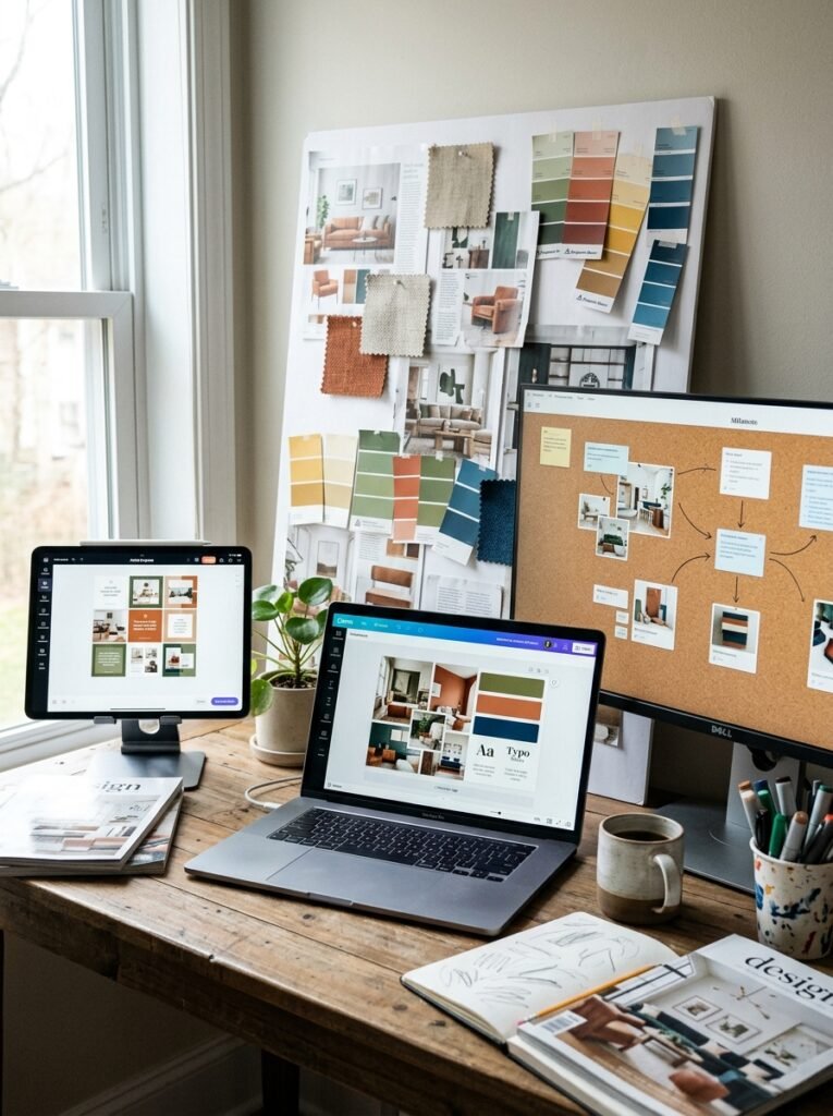
Technology has made mood boarding more accessible than ever, and if you haven’t explored the full range of tools available, you’re likely working harder than you need to. The most popular platforms for digital mood boards include Canva, Milanote, and Adobe Express — each with its own strengths depending on how visual and technical you want to get.
Canva is beloved for its drag-and-drop simplicity and its enormous library of design elements. You can upload your own inspiration images, pull colors directly from photos, and arrange everything on a clean canvas in under an hour. Milanote, on the other hand, is built specifically for creative projects. It has a more freeform, cork-board feel — ideal for people who think in webs rather than grids. You can add notes, links, and sketches alongside images, which makes it especially useful for tracking the “why” behind your choices.
Adobe Express is for those who want their mood boards to look genuinely polished — something you’d be proud to share on Pinterest or present to a contractor. The templates are sophisticated, and the color palette extraction feature is extraordinary for building cohesive design schemes.
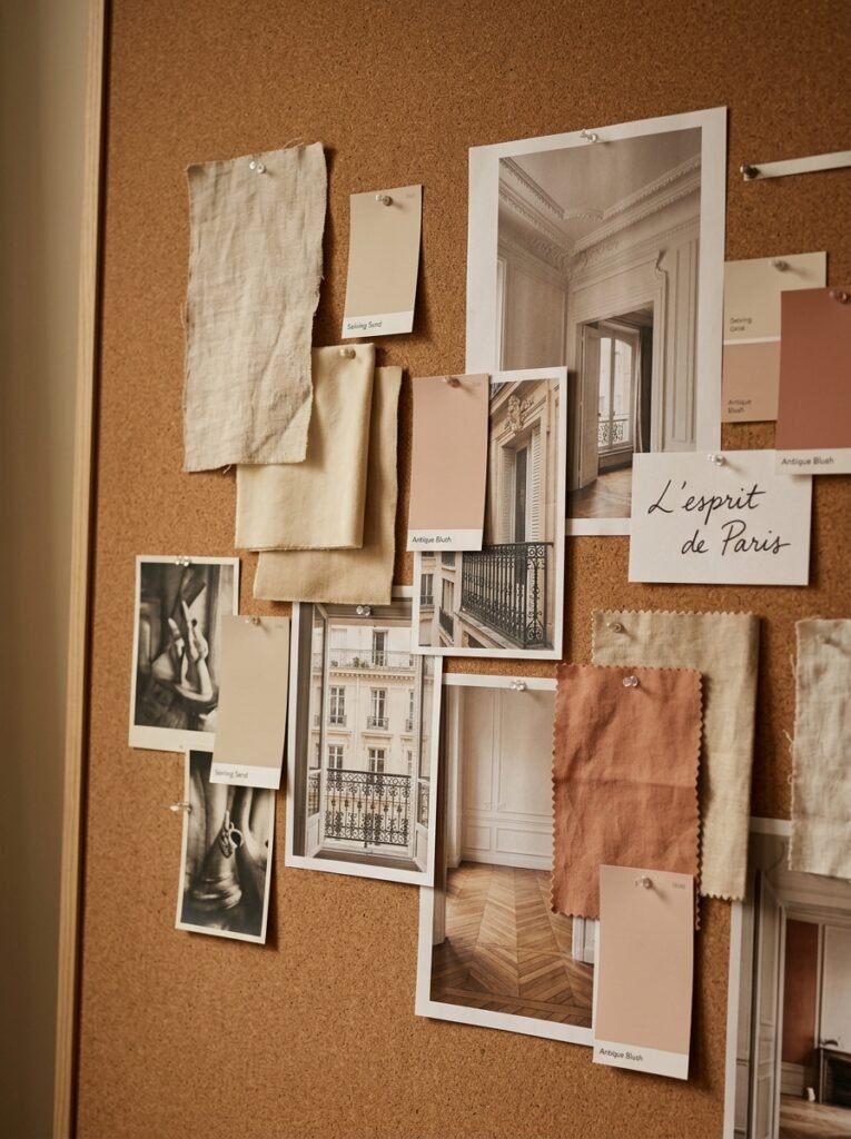
If you prefer to work offline — and there is something deeply satisfying about physical mood boarding — a large foam board, magazine clippings, paint swatches from your local hardware store, and fabric samples from an upholstery shop can create something no digital tool quite replicates. You can touch it. Carry it around the room. Hold it up against an existing wall. That tactile feedback is invaluable.
—
3. How to Choose a Visual Theme That Actually Holds Together
The most common mistake people make when building a mood board is choosing aesthetics based purely on what they see trending — without asking whether those aesthetics align with how they actually live. Cottagecore is breathtaking in photographs, but if you have three young children and two dogs, the reality of linen tablecloths and open ceramic shelving may be more aspirational than practical.
That’s not a reason to abandon beauty. It’s a reason to be honest with yourself about your lifestyle before you commit to a visual theme. The best interior design always begins with real life, not an idealized version of it.
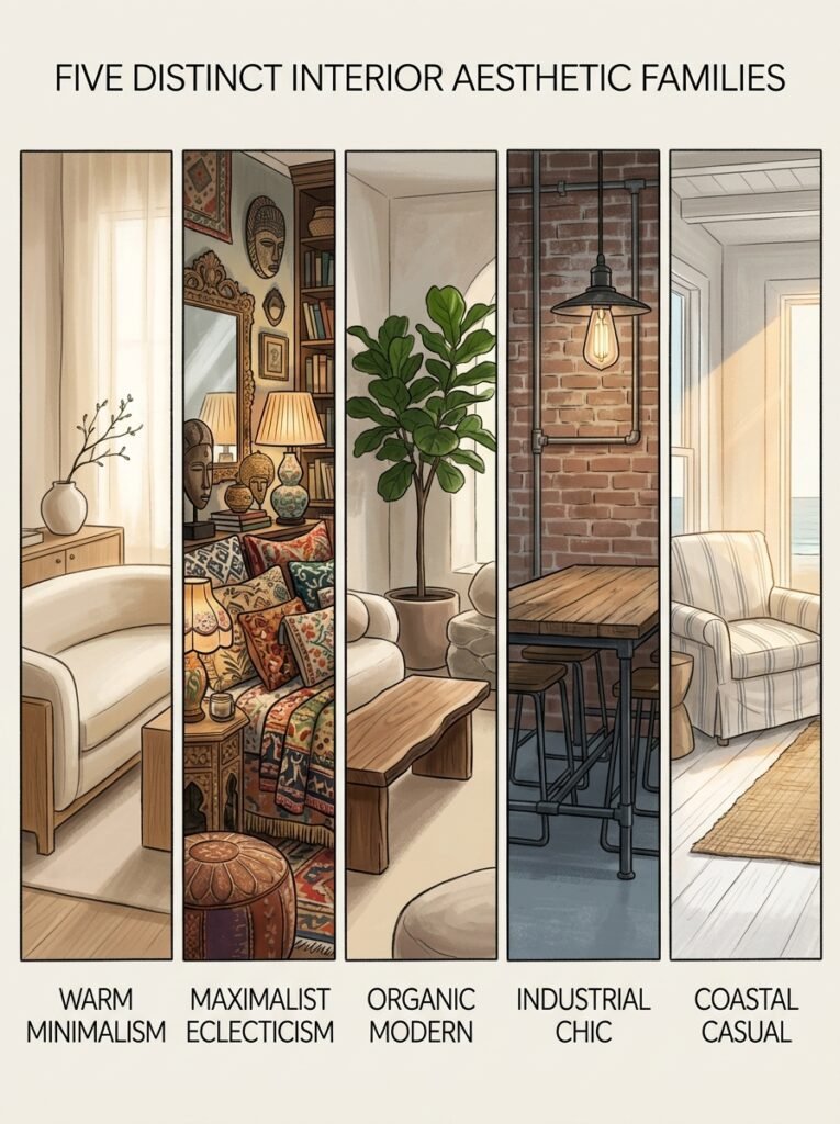
A strong visual theme usually draws from one of several broad aesthetic families — warm minimalism, maximalist eclecticism, organic modern, industrial chic, coastal casual, or classic traditional — and then personalizes within that family. You’re not copying the aesthetic; you’re translating it into your own life. That translation is where the magic happens.
Start by pulling fifteen to twenty images that genuinely move you, without overthinking. Lay them side by side. Look for the pattern — not in the objects, but in the feeling. You’ll almost always notice a throughline: certain colors appearing repeatedly, a consistent quality of light, rooms that feel either expansive or intimate. That pattern is your theme trying to introduce itself.
—
4. The Color Palette Section: Where Most Mood Boards Live or Die

Color is the single most powerful element in any mood board — and in any room. It speaks before furniture, before texture, before scale. The moment someone walks through a door, they feel the color temperature of the room before they consciously register a single object.
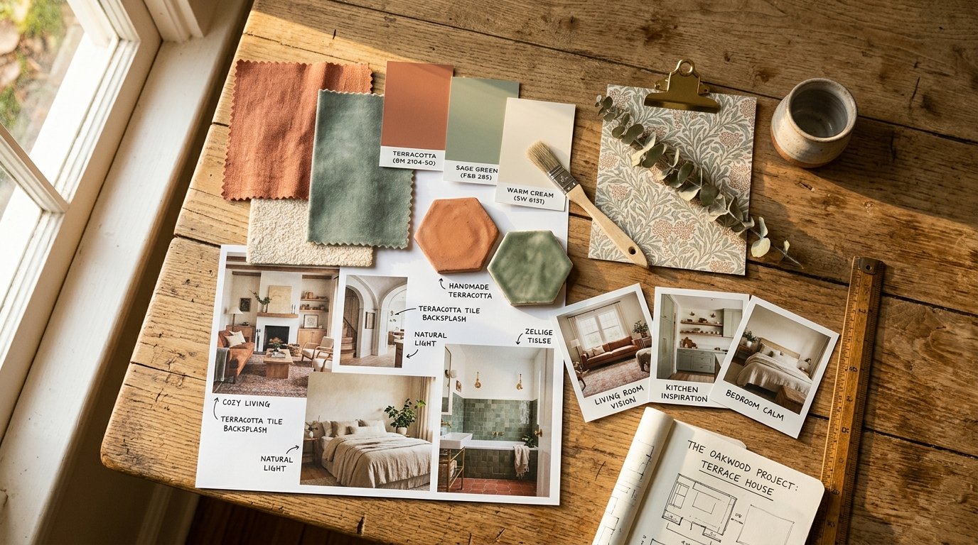
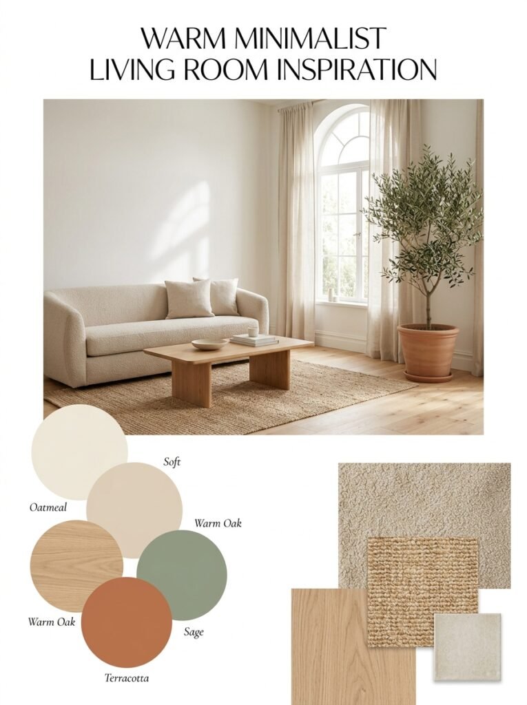
A well-constructed color palette for a mood board should have three to five colors maximum. More than that and your eye loses its anchor point. The classic formula is: one dominant neutral (the wall and large surface color), one secondary tone (upholstery, area rugs, curtains), one or two accent colors (accessories, art, hardware), and occasionally a small hit of contrast that wakes the whole scheme up.
What makes mood boards come alive is when the color palette is pulled from natural sources — the exact green of a particular moss, the warm ochre of terracotta after rain, the dusty blue of morning light through old linen. These colors have an organic credibility that trend-based palettes sometimes lack. They feel real because they come from the world.
When building your color section, don’t just place solid paint swatches. Layer them — a swatch of fabric, a photograph showing that color in natural light, a small sample of a tile or stone with those undertones. Color behaves completely differently in different materials, and a mood board that shows this nuance will save you from expensive surprises later.
—
5. Texture and Material Samples: The Layer That Makes a Room Feel Finished
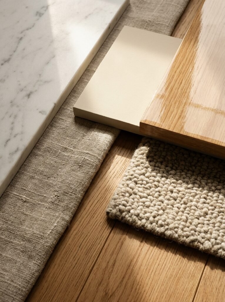
Ask any interior designer what separates a room that photographs beautifully from a room that lives beautifully, and they’ll say texture without hesitation. Texture is the element that makes a room feel inhabitable — warm, layered, human. And it’s one of the most underrepresented elements in amateur mood boards.
When you’re building your mood board, actively seek out images that emphasize material contrast. Smooth marble against rough linen. Matte walls behind a high-gloss lacquered cabinet. Warm wood floors beneath a nubby wool rug. The friction between materials is what creates visual and tactile richness.
“Texture is what transforms a room from a showroom to a sanctuary.”
For physical mood boards, try to include actual material samples wherever possible. A small cutting of the sofa fabric. A paint chip in the exact finish (matte, eggshell, or satin) you’re considering. A corner of the tile you’re evaluating. These physical samples respond to real-world light in a way that photographs cannot fully capture, and holding them against your existing walls can prevent costly mistakes.
Digitally, you can represent texture through layering images in Canva or Milanote — overlapping a fabric image with a wood grain image to show how they’ll sit together. The goal is to give your eye the experience of the room before the room exists.
—
6. How to Style Your Mood Board for Pinterest Sharing
If you’re creating mood boards with the intention of sharing them on Pinterest — and given that interior design is consistently one of the platform’s highest-performing categories, you absolutely should be — the visual composition of the board itself matters enormously.
Pinterest is a visual search engine as much as it is a social platform. Images that perform best have certain qualities in common: they’re vertically oriented (2:3 ratio is ideal), they have a clear focal point, they use high contrast to draw the eye, and they communicate their concept within the first two seconds of viewing. Your mood board needs to tell its story instantly.
For a Pinterest-ready mood board, organize your elements asymmetrically — this is more visually interesting than a symmetrical grid. Place your dominant inspiration image in the upper two-thirds of the composition. Cluster your color palette swatches in one corner. Let texture samples anchor the lower portion. And always include enough white or negative space for the eye to rest.
The title matters too. A mood board titled “Warm Minimalist Living Room — Earthy Tones and Natural Light” will dramatically outperform one titled “My Living Room Ideas.” Be specific, be descriptive, and use the language your audience is already searching for.
—
7. Room-by-Room Mood Board Inspiration to Get You Started
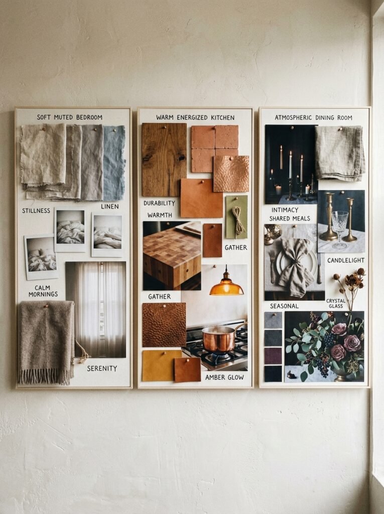
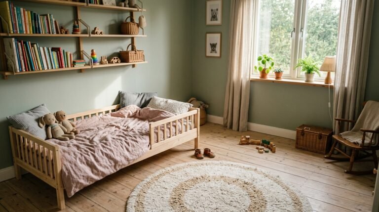
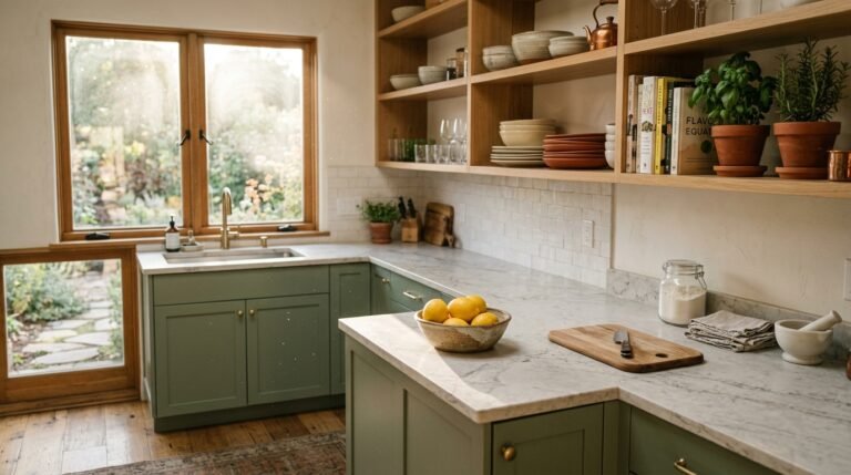
Different rooms call for dramatically different emotional registers, and your mood board should reflect that. A bedroom mood board should feel restful, soft, and private — think muted tones, layered linens, and imagery that conveys stillness. A kitchen mood board might feel more energized and functional, with an emphasis on material durability, warm lighting, and the kind of organized beauty that makes cooking feel like a pleasure rather than a chore.
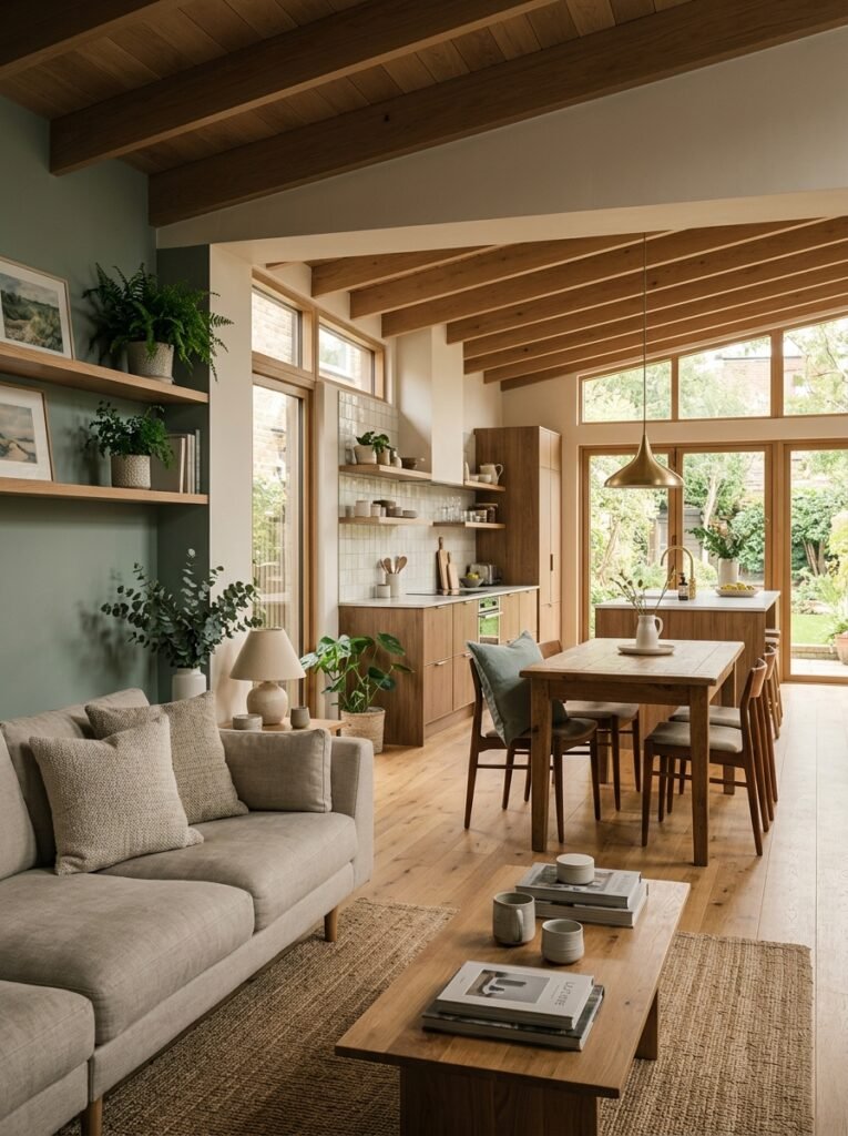
Living rooms are perhaps the most complex to mood board because they carry so many emotional responsibilities. They need to feel welcoming to guests, comfortable for everyday family life, and aesthetically coherent over time. A living room mood board that works typically balances at least three scales of furniture (large sofa, medium accent chairs, small side tables), incorporates both warm and cool light sources, and has a clear focal point — whether that’s a fireplace, a gallery wall, or a statement window.
For dining rooms, mood boards that emphasize atmosphere — candlelight, gathered linen napkins, seasonal centerpieces — tend to be the most evocative. The dining room is the room of celebration and connection, and its mood board should feel celebratory, even in its quieter moments.
—
8. The Mistake of Ignoring Natural Light in Your Board
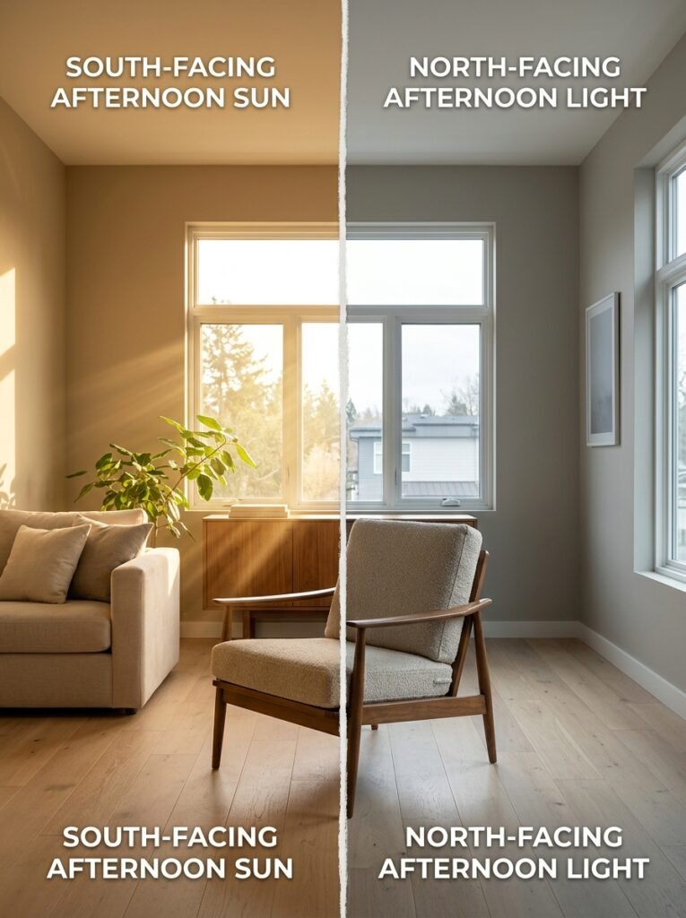
Light is the one element that no mood board can fully simulate — and yet ignoring it is one of the most common and consequential mistakes you can make. A color palette that looks warm and inviting in a south-facing room can look cold and flat in a north-facing one. Furniture that appears a rich walnut in showroom lighting can read almost black in a dim apartment.
When building your mood board, note the direction your room faces and research how that orientation affects light quality throughout the day. North-facing rooms tend to receive cool, blue-toned light and benefit from warmer color palettes to compensate. South-facing rooms are bathed in warm, consistent light and can support cooler, more neutral palettes without feeling cold.
Include imagery in your mood board that reflects your room’s actual light conditions — not just the golden-hour photography that dominates interior design media. If your room is low-light, seek out inspiration images taken in similar conditions. Your mood board should prepare you for reality, not deceive you with an idealized version of it.
—
9. How to Build a Cohesive Multi-Room Mood Board
If you’re designing multiple rooms simultaneously — or creating mood boards for an entire home renovation — the challenge shifts from creating individual cohesion to creating cohesion across spaces. Rooms that share walls or flow visually into each other should never jar. They should feel like chapters in the same book: distinct in character but consistent in voice.
“A home should feel like it was designed by the same hand, even if each room tells a different story.”
The most reliable way to achieve this is through what designers call a “through-line color” — one neutral or accent tone that appears in every room, even if it plays different roles. In one room it might be the wall color; in another, it shows up in a throw pillow; in a third, it’s the undertone in the tile grout. This repetition creates a visual rhythm that feels intentional without being monotonous.
When building multi-room mood boards, lay them side by side before committing. Squint — literally squint — and look at the overall palette impression. If one room jumps out as dramatically different in tone or weight from its neighbors, that’s your signal to adjust.
—
10. Budget-Conscious Mood Boarding: Dream Big, Shop Smart
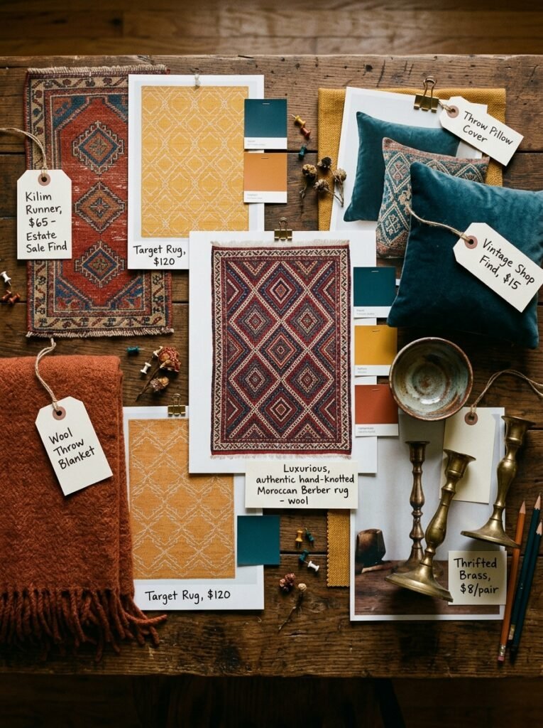
One of the most empowering things about mood boarding is that it decouples inspiration from aspiration. You can create a mood board featuring a $15,000 hand-knotted rug and use it to find a $300 rug that captures the same feeling. You’re not buying the image — you’re extracting its essence.
This is the real power of mood boarding for budget decorators. When you know exactly what feeling you’re chasing, you can find it at every price point. A mood board anchored in a warm, layered, Moroccan-inspired aesthetic will guide you toward the right objects at estate sales, vintage shops, IKEA, and high-end boutiques alike — because you know what emotional note each piece needs to strike.
The discipline that mood boarding builds — identifying the feeling beneath the object — is genuinely transformative for anyone decorating on a budget. You stop impulse buying things that feel vaguely appealing and start purchasing purposefully, guided by a clear vision that belongs entirely to you.
—
11. Seasonal Mood Boards: Refreshing Your Space Without Renovating
Not every mood board needs to be a major design undertaking. Seasonal mood boards — small, intentional updates to the feeling of a room as the year turns — are one of the most satisfying and accessible ways to keep your home feeling alive and evolving.
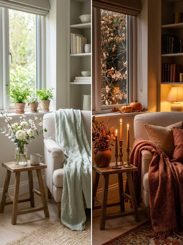
A spring mood board for a living room might introduce soft greens, white florals, and lighter textiles to replace the heavier throws of winter. An autumn mood board might bring in deep terracotta, aged brass, and the warm glow of more ambient lighting. These aren’t renovations — they’re a rotation of feeling, achieved through small object changes and strategic additions.
Pinterest is particularly well-suited to seasonal mood boarding because the platform itself operates seasonally. Content about autumn interiors starts performing well in August; spring home refresh content peaks in February. If you’re creating mood boards for Pinterest specifically, aligning your content calendar with these seasonal rhythms will dramatically improve your reach and saves.
—
12. How to Know When Your Mood Board Is Actually Done
There’s a moment — quieter than you’d expect — when a mood board is complete. Not perfect, but done. Every element is earning its place. Nothing feels like a placeholder. The overall impression communicates clearly and immediately.
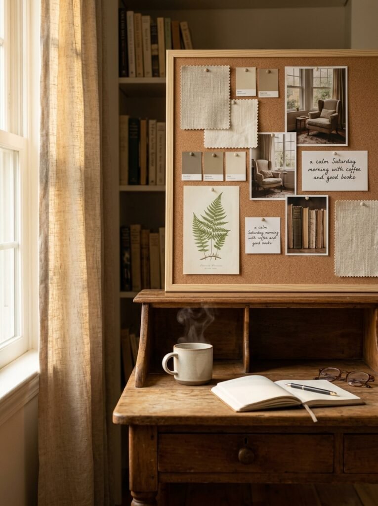
You’ll know it’s done when you can look at it and describe the room it represents in a single, specific sentence. Not “modern with warm tones” — but something like, “a calm, sun-warmed study that feels like a Saturday morning with coffee and good books.” That sentence-level clarity is the signal that your vision has crystallized.
If you’re not there yet, the answer is usually subtraction, not addition. Most mood boards suffer from too much, not too little. Remove any element you added because it was pretty rather than because it was right. What remains will be stronger for the editing.
—
🌿 How to Take Care of Your Design Vision Long-Term
A mood board is not a final answer — it’s a living document that should grow with your taste and your life. Revisit it every few months and ask honestly whether it still represents how you want to feel in your space. Tastes evolve, lives change, and the best interior design is responsive to both.
Keep a dedicated folder — digital or physical — for images that move you, organized by room or feeling. This becomes the raw material you’ll draw from when it’s time to build or refresh a mood board. Think of it as a visual journal of your evolving aesthetic.
Share your mood boards with someone you trust before making major purchases. Fresh eyes catch things you’ve become too close to see — a color that doesn’t quite work, a style direction that doesn’t align with your lifestyle, a gap in the vision that needs filling.
Finally, remember that the goal of any mood board is ultimately to make a room feel more yours — not more like a magazine, not more like a trend, but more like the truest version of how you want to live. That is always the right standard.
—
❓ FAQ
Q: How many images should a good mood board have? A: Most designers recommend between eight and fifteen images for a single-room mood board. Fewer than eight can feel underdeveloped; more than fifteen tends to create visual noise. The goal is enough variety to communicate the full aesthetic without overwhelming the eye.
Q: Can I use a mood board for a rental apartment where I can’t change much? A: Absolutely — mood boards are especially valuable in rentals because they help you be intentional with the elements you can control: furniture, textiles, lighting, and accessories. A clear mood board prevents impulse purchases that don’t serve the space and helps you create a cohesive look within constraints.
Q: How specific should my mood board be before I start shopping? A: Specific enough that you could describe it to a stranger and they’d know exactly what feeling you’re going for. You don’t need to have every product identified before shopping, but you should know your color palette, your dominant material story, and your emotional register — otherwise every shiny thing in a store will seem relevant, and nothing will truly be.
—
💭 Final Thought
A mood board is, at its heart, an act of self-knowledge — a quiet, honest conversation between who you are and how you want to live. The rooms we create around ourselves are never just rooms. They’re the backdrop of our most ordinary and most extraordinary moments, the first thing we see in the morning and the last thing we see at night. They deserve the kind of intention that a mood board, done well, can bring.
What feeling have you been wanting your home to give you — and have you ever stopped long enough to build a vision worthy of that feeling?