The Dark Blue Interior That Finally Made My Home Feel Like Mine
There’s a moment — you know the one — when you walk into a room and something shifts inside you. The light feels different. The air feels quieter. You exhale without realizing you were holding your breath. That’s what a dark blue interior does, done right. It doesn’t just decorate a room. It transforms how that room feels to live in.
—
1. Why Dark Blue Feels Like Coming Home

There’s a reason sailors have always looked at the horizon with longing rather than fear. Deep, oceanic blue carries something ancient in it — a sense of depth, of mystery, of belonging to something larger than yourself. When you bring that color inside your home, you’re not just making a design choice. You’re creating an emotional atmosphere.
Dark blue is one of the most psychologically powerful colors you can introduce into an interior. Studies in color psychology consistently find that deep blue tones lower heart rate, reduce cortisol levels, and promote a feeling of calm focus. Unlike pale blue, which can feel airy and detached, dark blue wraps around you. It cocoons. It grounds.
“Dark blue doesn’t just decorate a room — it gives the room a soul.”
Think about navy, midnight blue, indigo, or prussian blue. Each one carries a slightly different emotional signature — navy speaks of trust and tradition, midnight blue whispers of quiet luxury, indigo leans toward the artistic and the introspective, prussian blue holds something almost architectural in its depth. Choosing between them is the first — and honestly the most delightful — decision you’ll make.
—
2. The Shades That Are Changing Everything Right Now
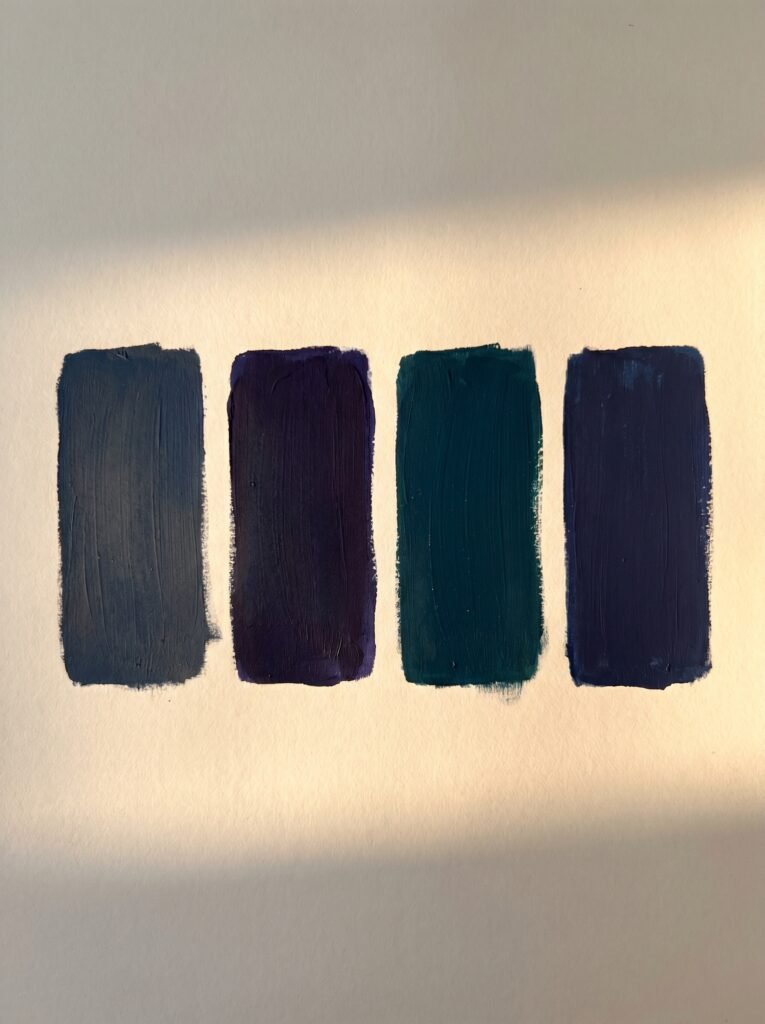
Not all dark blues are created equal, and the difference between a blue that sings and one that simply sits on the wall has everything to do with undertone. This is where most people stumble, and where getting it right makes all the difference.
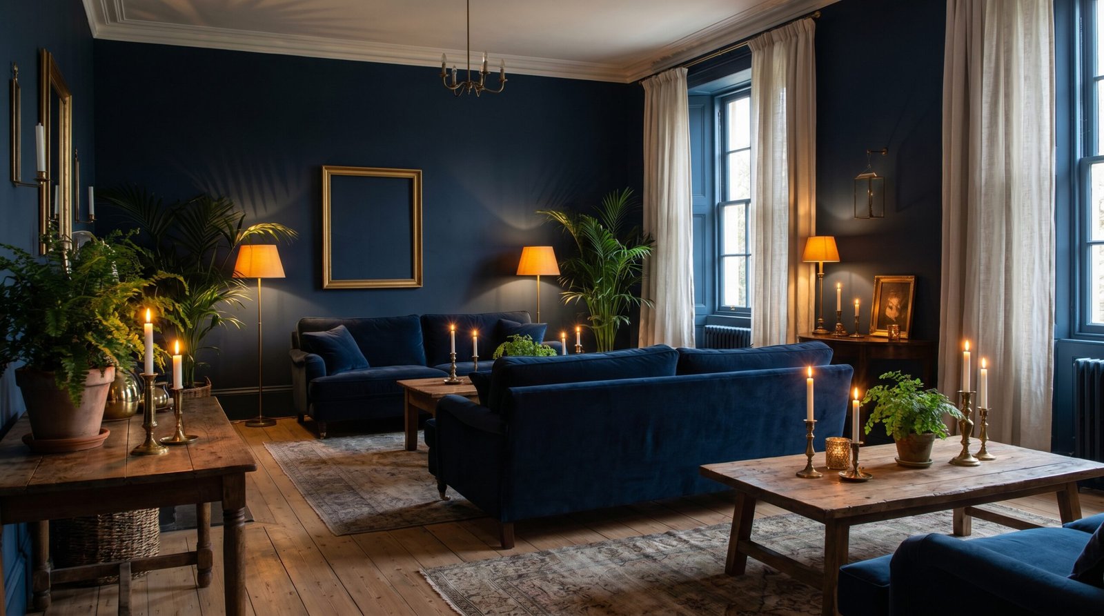
Navy blue with gray undertones — think of Benjamin Moore’s “Hale Navy” or Farrow & Ball’s “Stiffkey Blue” — reads as deeply sophisticated and works beautifully in rooms that receive warm afternoon light. It doesn’t fight the light; it dances with it.
Midnight blue with purple undertones, like “Abyss” by Behr or “Drawing Room Blue” by Farrow & Ball, is for rooms where you want genuine drama. Paired with warm brass fixtures and off-white trim, this shade creates the kind of moody elegance you typically only see in high-end boutique hotels.
Prussian blue, with its green-tinged depth, connects interior spaces to the natural world — forests, deep ocean water, stormy skies. It’s the shade most likely to make a room feel timeless rather than trendy, which is perhaps why interior designers keep returning to it season after season.
—
3. The Room That Benefits Most (It’s Not the One You Think)
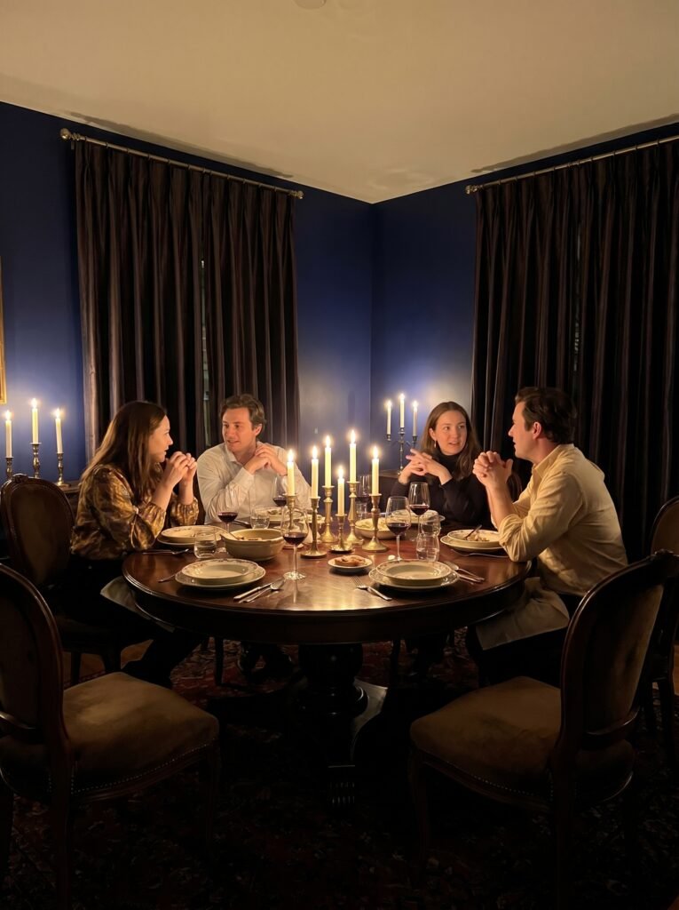
Everyone talks about navy bedrooms — and yes, a dark blue bedroom is transcendent — but the room that most dramatically transforms under a deep blue palette is actually the dining room.
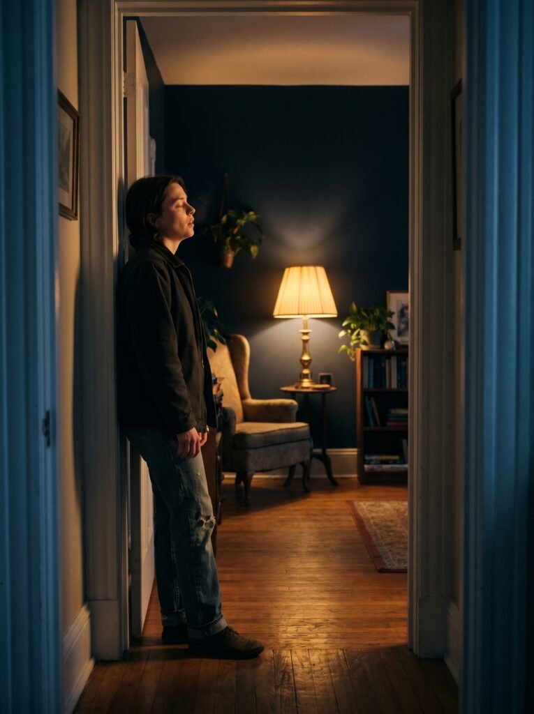
Imagine sitting down to a slow Sunday dinner with people you love. Candles lit. Food on the table. And surrounding you, a deep, enveloping blue that makes the flickering warm light glow like something out of a Vermeer painting. Dark blue dining rooms create a sense of intimacy that lighter colors simply cannot replicate. The walls press gently inward, making the table feel like a destination rather than just a piece of furniture.
The psychology here is straightforward: enclosed, slightly darker spaces encourage lingering. People stay longer. Conversations go deeper. You stop watching the clock. If you’ve ever wondered why your favorite restaurant feels so warm and welcoming despite not being particularly large, there’s a very good chance their walls are doing exactly this kind of emotional work.
—
4. Dark Blue + Natural Wood: The Combination That Never Ages
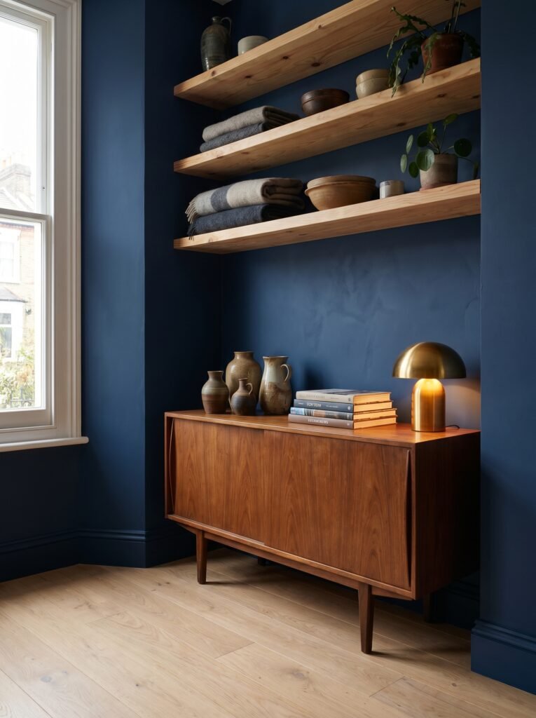
If there’s one pairing that interior designers return to consistently — across decades, across styles, across continents — it’s dark blue with natural wood. The contrast is almost primordially satisfying: cool and deep against warm and organic, smooth against textured, still against living.
Light oak floors beneath navy walls create a layered richness that feels both modern and rooted. Walnut furniture against midnight blue reads as deeply luxurious without feeling precious or untouchable. Even something as simple as raw pine shelving against indigo-painted walls carries an effortless warmth.
The key is to let the wood breathe. Don’t cover it. Don’t try to match it too carefully to the blue. Simply let the two materials coexist — because they were always meant to.
—
5. How Light (Natural and Artificial) Completely Changes Dark Blue
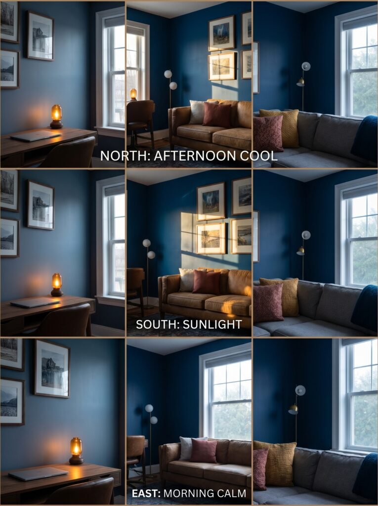
This is the conversation most design articles skip, and it’s the one that matters most if you’re genuinely considering committing to a dark blue interior. Dark colors behave differently depending on the light source, the time of day, and the orientation of your room — and understanding this will save you from disappointment.
North-facing rooms receive cool, indirect light throughout the day. In these rooms, dark blue can veer toward cold and flat unless you counterbalance it with warm artificial lighting — think amber-toned bulbs, warm-spectrum LED strips beneath shelving, and the strategic placement of table lamps at low heights to create pockets of warmth.
South-facing rooms are dark blue’s best friend. The warm, direct light that floods south-facing spaces through the afternoon transforms deep blue walls into something genuinely spectacular — rich, vibrant, almost jewel-like.
“The right light doesn’t reveal a dark blue room. It unlocks it.”
East-facing rooms get their best light in the morning, which tends to be softer and cooler. This works beautifully in bedrooms where a dark blue wall lit by morning light creates that rare combination of calm and gentle energy — perfect for easing into the day without jarring your senses.
—
6. The Art of Layering Textures in a Dark Blue Room
When you commit to a dark interior palette, texture becomes your most powerful tool. Because deep blue absorbs light rather than reflecting it, a single-textured room risks feeling flat or even oppressive. The solution is to stack textures intentionally — and generously.
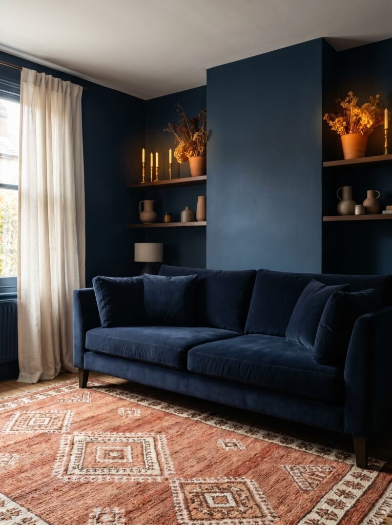
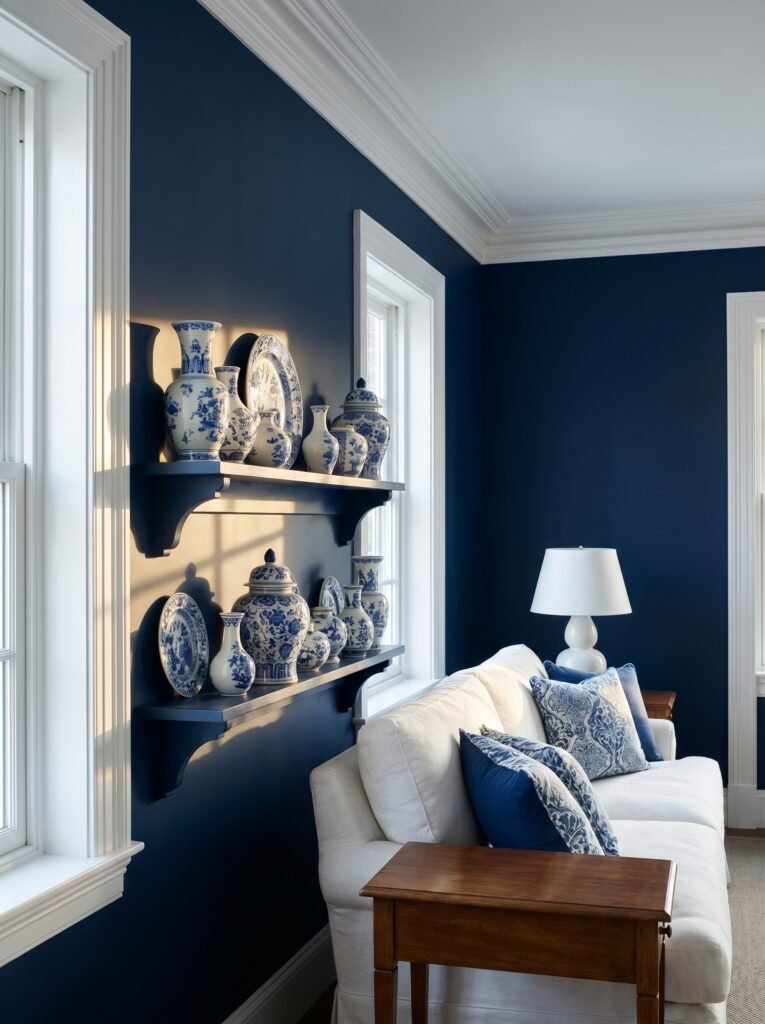
Velvet sofas in navy or teal alongside dark blue walls create tonal depth through contrast of finish. Linen curtains in off-white or warm cream soften the heaviness of the room while creating visual relief. A hand-knotted wool rug in geometric pattern brings in warmth and absorbs sound, making the room feel cozy rather than cavernous.
On shelves and surfaces, bring in objects that catch and hold light: brass candlesticks, ceramic vessels with matte glazes, stacked books with light-colored spines, dried botanicals in terracotta pots. Each one becomes a small point of warmth against the deep blue backdrop — like stars against a night sky.
—
7. Dark Blue Kitchens: Bold, Beautiful, and More Practical Than You’d Expect
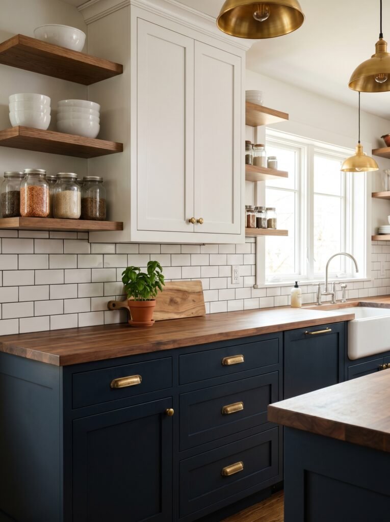
The dark blue kitchen has moved firmly from trend to classic — and for good reason. Navy or midnight blue cabinetry, particularly on lower cabinets paired with lighter upper units, creates a grounded, sophisticated visual that photographs beautifully and wears even better in real life.
The practical case for dark kitchen cabinets is underappreciated: fingerprints, smudges, and everyday cooking wear are far less visible on dark surfaces than on white or cream cabinetry. For families with young children or anyone who genuinely cooks in their kitchen — rather than merely posing in it — this is a significant advantage.
Pair dark blue lower cabinets with white subway tile, unlacquered brass hardware, and butcher block or light marble countertops, and you have a kitchen that feels simultaneously timeless and magazine-worthy. Add open shelving on one wall to prevent the cabinetry from feeling heavy, and display a thoughtful mix of functional and beautiful objects: stacked white bowls, glass jars filled with grains and spices, a potted herb or two.
—
8. The Small Space Question: Does Dark Blue Shrink a Room?
Almost everyone asks this, and almost everyone is working from the same myth: that dark colors make small rooms feel smaller. The truth is considerably more interesting than that.
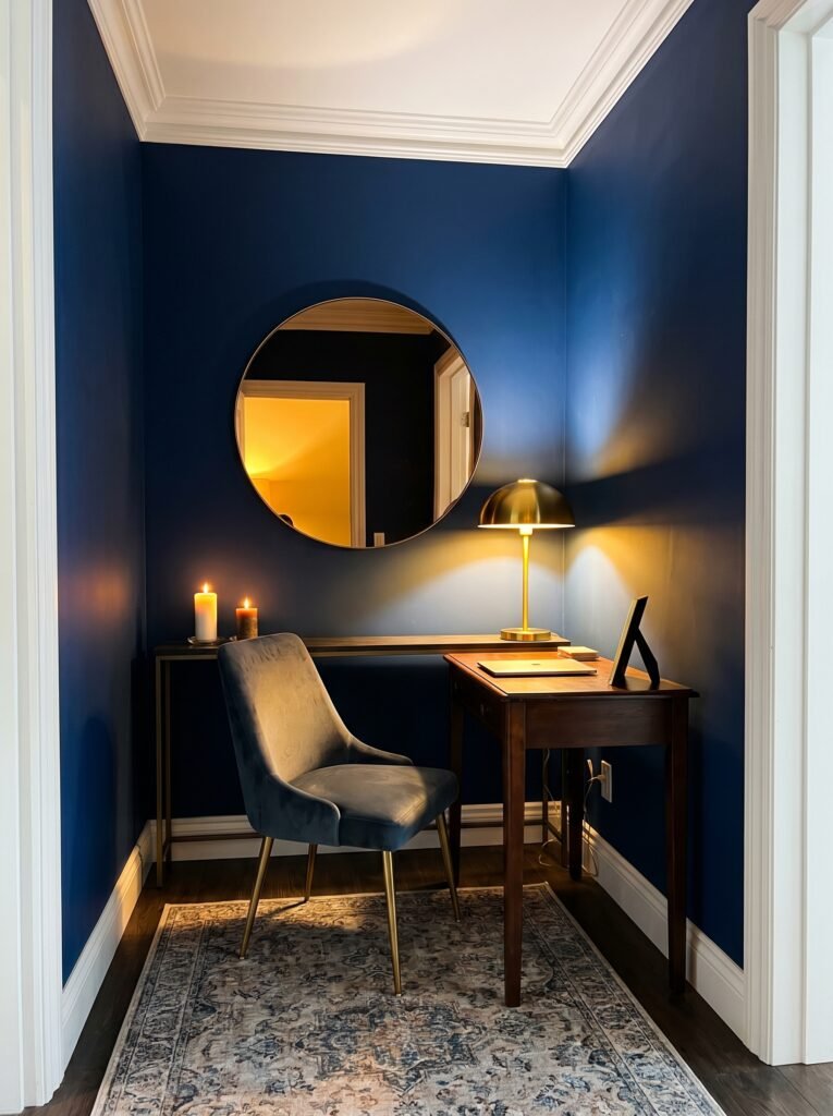
Dark colors do make the boundaries of a room — the walls, the ceiling, the floor — recede visually. This creates an effect of depth and dimension that can actually make a small room feel more intentional, more considered, and more atmospheric than the same space painted white. What dark blue removes is harsh angularity. The sharp edges of a small room soften into something more enveloping.
The key to using dark blue successfully in a small space is light and contrast. Keep trim bright white or warm cream. Introduce mirrors strategically — not to “make the room bigger” in the tired real estate sense, but to multiply the candlelight and lamp glow that the dark walls will otherwise absorb. Choose furniture with visible legs rather than chunky floor-hugging pieces, to maintain a sense of visual space at floor level.
A small dark blue room, done thoughtfully, doesn’t feel small. It feels like a sanctuary.
—
9. Metals That Love Dark Blue (and One That Doesn’t)
The metal finishes you pair with dark blue walls will determine whether your room reads as warm and inviting or cold and clinical. Getting this right takes about thirty seconds once you know the rule.
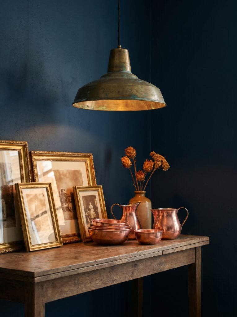
Brass and gold — warm metals — are the natural partners of dark blue. Unlacquered brass, in particular, develops a beautiful patina over time that only improves against a deep blue backdrop. Antique gold picture frames, brass pendant lights, gold cabinet hardware: all of these draw warmth out of the blue and give the room a curated, lived-in quality.
Copper is perhaps the most spectacular pairing of all — the warm, rosy depth of copper against prussian or midnight blue creates something almost alchemical in its richness.
Matte black works too, though it takes the room in a sharper, more graphic direction — beautiful for a modern or industrial aesthetic, but less cozy than warm metals.
“Brass and dark blue together are proof that contrast creates beauty.”
Chrome and brushed nickel — the cool metals — are the ones to approach with care. Against dark blue, they can tip a room from moody and rich into cold and corporate. Use them sparingly, and only if you’re committed to a very contemporary, minimal direction.
—
10. Dark Blue and White: The Timeless Tension That Always Works
There is something about dark blue and white together that feels almost elemental — like ocean meeting foam, or night sky meeting moonlight. It’s a combination that appears across cultures and centuries: Dutch Delftware pottery, Greek island architecture, classic American coastal homes.
In an interior, the key is proportion. Too much white against dark blue and the room loses its moodiness — the color becomes an accent rather than an atmosphere. Too little white and the room can feel airless and heavy. The sweet spot is roughly 70% dark blue to 30% white and light tones — enough contrast to make the white surfaces sing, but enough blue to preserve the depth and drama.
This is why so many designers recommend painting walls and ceiling in dark blue but keeping trim, architraves, and window frames in bright white. The white lines create definition and articulation without undermining the enveloping quality of the blue.
—
11. Adding Botanical Elements: Why Plants Look Extraordinary Against Dark Blue
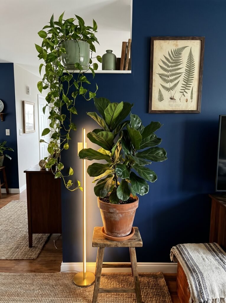
If you’ve never seen a lush, trailing pothos or a dramatic fiddle-leaf fig against a navy wall, you’re missing one of interior design’s quietest pleasures. Green plants pop against dark blue in a way that simply doesn’t happen against white or gray walls — the contrast is vivid and alive, like something you’d find in a rainforest at the edge of the ocean.
Dark blue walls also make ceramic plant pots — particularly terracotta, sage green, or warm cream — look carefully curated even when you’ve simply placed them on a shelf. The darkness of the background does the visual work of making everything in front of it look more intentional, more considered, more beautiful.
Don’t stop at live plants, either. Botanical prints in simple frames, dried eucalyptus in dark glass vases, pressed flower arrangements — all of these bring an organic warmth to a dark blue room that prevents it from ever tipping into coldness.
—
12. Making It Your Own: The Personal Touches That Elevate a Dark Blue Interior
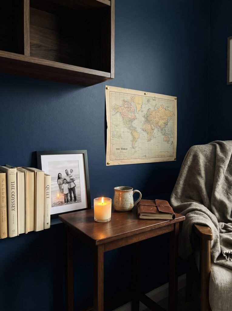
Here is the thing about dark blue interiors that no one tells you until you live in one: they make your personal objects look extraordinary. Books look more curated. Art looks more considered. Even a simple candle on a side table becomes a moment of warmth and intention against a deep blue backdrop.
This is why the final, most important step in creating a dark blue interior is to resist the temptation to over-style it. Collect slowly. Add objects that carry meaning for you — the pottery mug from the market in Portugal, the vintage map you found in a secondhand shop, the photograph taken on a morning that changed you. Against dark blue, these things don’t just sit in a room. They tell a story.
The rooms that people save on Pinterest, that they screenshot at 11pm and share with their partners, aren’t the most expensive rooms or the most perfectly curated ones. They’re the rooms that feel lived in and loved — rooms where the design serves the life rather than the other way around.
—
🌿 How to Take Care of a Dark Blue Interior
Living with dark blue walls is genuinely easy — but a few practical habits will keep your space looking its best for years.
Touch up paint promptly when scuffs appear, because dark colors show abrasion more visibly than light ones. Keep a small pot of the original paint labeled and stored, and touch-ups become a five-minute task rather than a project. For dark blue cabinetry, use a soft microfiber cloth rather than rough sponges, which can dull the finish over time. In dark blue rooms, dust and lint on dark upholstery or floors is more visible — a quick pass with a lint roller on velvet upholstery every week keeps the room looking intentional. Protect dark blue walls from direct, prolonged sunlight where possible, as UV exposure can cause fading over years. Finally, keep the room alive — refresh plants, rotate objects on shelves, change throw pillow covers seasonally. A dark blue room rewards attention and evolves beautifully over time.
—
❓ FAQ
Q: Will dark blue walls make my room feel depressing? A: Only if the room lacks warmth in other elements. Pair dark blue walls with warm lighting, natural textures, and a mix of warm metals like brass, and the result is deeply cozy and atmospheric — the opposite of depressing. The key is balance: blue provides the depth; other elements provide the warmth.
Q: What colors go best with dark blue in interior design? A: Warm whites and creams create classic contrast. Warm wood tones add organic richness. Brass and gold metals bring warmth and luxury. Soft terracotta or burnt orange accents create a surprising but beautiful complementary pairing. Sage green ties the room to nature and softens the intensity of deep blue.
Q: Is dark blue a good color choice for a bedroom? A: It’s one of the best. Research consistently shows that deep blue promotes relaxation and improves sleep quality. A dark blue bedroom, properly lit with warm ambient lighting, creates a sense of sanctuary that lighter colors struggle to match. Start with an accent wall if you’re unsure, and see how you respond to living with it.
—
💭 Final Thought
Dark blue is not a color for people who are afraid of their homes. It asks something of you — a willingness to commit, to go deeper, to trust that beauty sometimes lives in shadow rather than light. But the rooms that take that leap are the ones that people remember long after they’ve left. The ones that make you exhale when you walk through the door.
So here’s the question worth sitting with: what would it mean for your home to finally feel like a place that holds you — not just houses you?