Why Gray Keeps Winning in Small Apartments — And How to Make It Feel Like Home
You moved in, painted the walls a perfectly safe greige, and then stood there wondering why it felt like a waiting room. Gray is supposed to be sophisticated. Warm. Timeless. But it keeps going cold on you, and you can’t figure out why. Here’s what’s actually going wrong — and how to fix every last inch of it.
—
1. The Gray That’s Quietly Killing Your Living Room Vibe
Not all grays are created equal. This is the thing nobody tells you when you’re standing in front of forty paint chips at the hardware store, squinting under fluorescent lighting that lies to you about everything.
Gray has undertones — cool blue-purples, warm beige-greens, rosy mauves — and whichever one lives inside your wall color is going to fight with everything you put next to it. A cool blue-gray wall turns a cream sofa slightly yellow. A purple-undertoned gray makes natural wood look dirty. A greige that reads warm in the store can go clinical and flat the moment the afternoon light disappears.
Before you buy a single throw pillow or a new rug, figure out what your gray is actually doing. Hold a piece of pure white paper against the wall. Then hold a warm white, a cream, a tan. Whichever one makes the wall look most neutral tells you the undertone. Once you know that, you can stop fighting your own room.
The warm-toned grays — think greige, clay-gray, linen-gray — are working with you on this. They want wood tones, organic textures, terracotta. The cool grays want contrast: navy, crisp white, dramatic charcoal. Choose a side and commit. Rooms that try to be both end up feeling like neither.
“The problem is never gray itself. The problem is not knowing which gray you actually have.”
—
2. The Layering Trick That Makes Gray Rooms Feel Impossibly Cozy
There’s a reason some gray living rooms feel like a spa and others feel like a dentist’s office. The difference is almost never the furniture. It’s layers.
Think of your room in three planes: what’s on the floor, what’s at eye level, and what’s above you. An apartment that only has “stuff” at eye level — a sofa, a TV unit, a coffee table — will always feel thin and a little sad, no matter how beautiful each individual piece is. The eye has nowhere to travel. There’s no sense of depth.
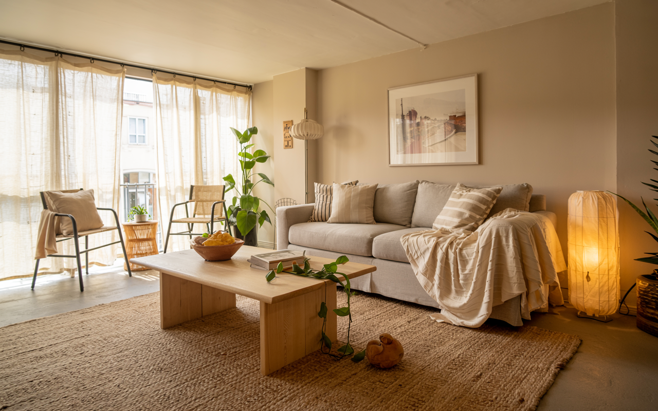
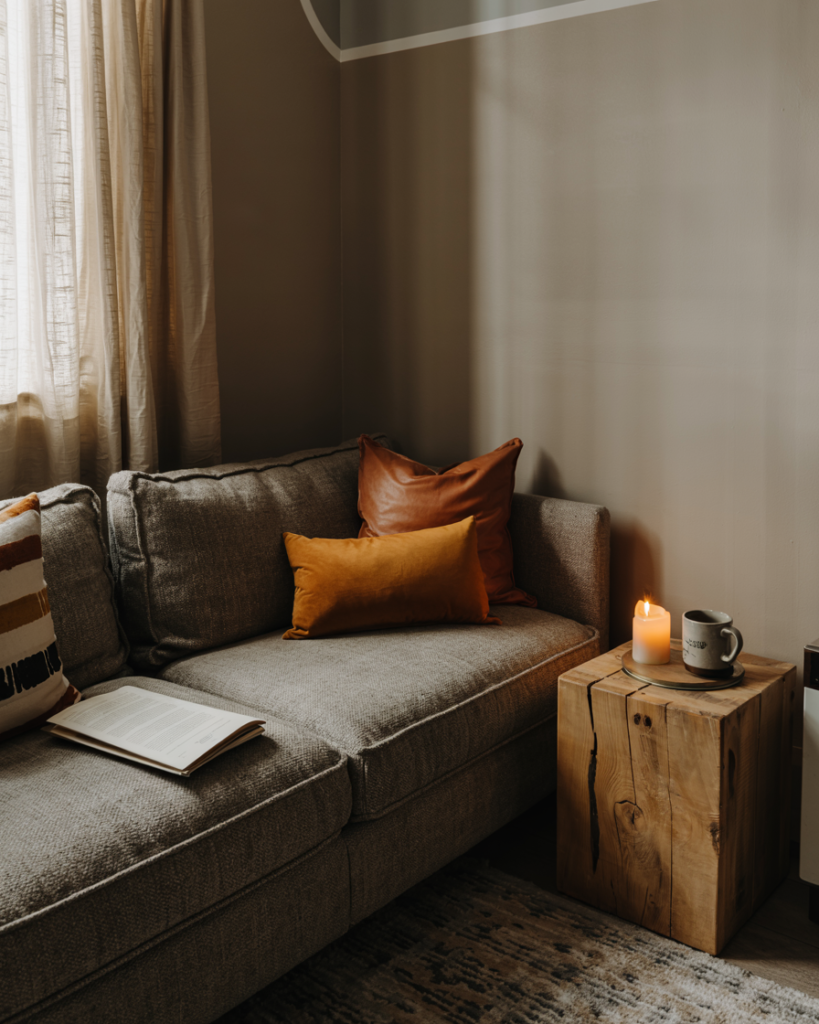
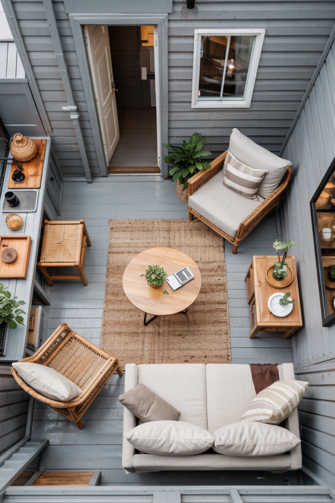
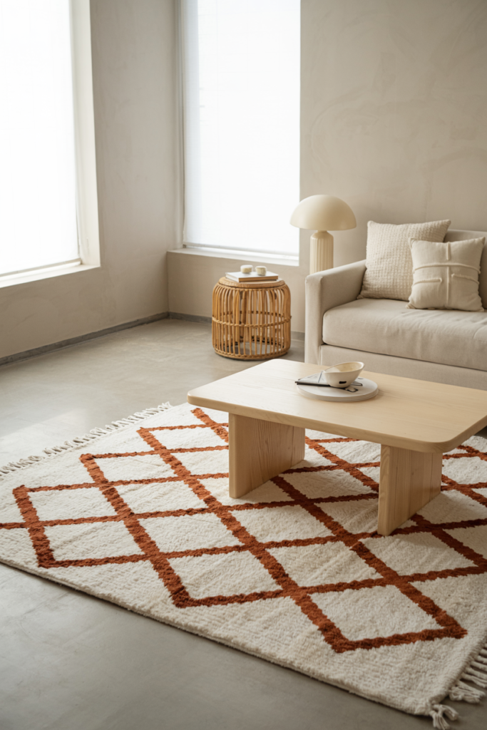
Start on the floor. A large area rug in a warm tone is probably the single most impactful thing you can add to a gray room. Not a small rug that floats sadly under the coffee table — a proper rug that the front legs of every sofa and chair can rest on. In warm ivory, caramel, oatmeal, or a soft rust. It grounds the gray instead of competing with it.
Then move up. Layer throws over the sofa arms — a chunky knit, a linen weave, something with texture rather than just color. Stack cushions in odd numbers with varying sizes. A 22-inch cushion behind a 16-inch cushion behind a lumbar roll. That layering creates the feeling of abundance, which is what “cozy” actually means.
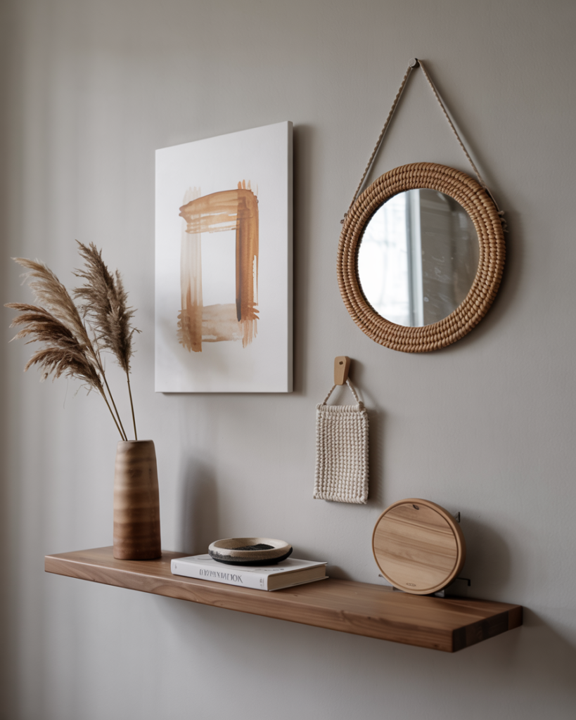
Finally, look up. Empty walls kill rooms. Art, a gallery wall, a large statement mirror, a woven hanging — something that draws the eye upward and makes the ceiling feel higher. In an apartment, this is non-negotiable.
—
3. What to Put on a Gray Wall Without Making It Look Like a Showroom
Gray walls and white frames. We’ve all done it. And we’ve all ended up with a room that looks like it belongs in a property listing rather than someone’s actual life.
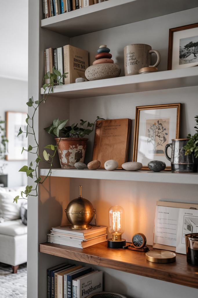
The key is warmth and imperfection. Swap some of those white frames for natural wood — honey oak, walnut, dark ash. Mix the sizes so nothing is too matchy. Add something that isn’t framed art at all: a wall-hung basket, a ceramic sconce, a small shelf with a plant trailing over the edge. The goal is a wall that looks like it was built slowly over years, not curated in an afternoon.
For the art itself, lean into earthy tones. Terracotta abstracts, botanical prints, warm sepia photography — anything that pulls a little warmth toward the wall rather than bouncing cold light back into the room. Avoid blue-toned or very cool artwork unless you’re specifically going for a moody, intentional palette. On a gray wall, cool art just reads as more gray.
One rule that works every single time: anchor a gallery wall with one piece that’s larger than everything else, and let the rest orbit around it. The scale difference creates visual interest and stops everything from looking like it was measured with a ruler.
—
4. The Sofa Color That Looks Best Against Gray (It’s Not What Influencers Tell You)

Everyone will tell you to get a cream sofa. And yes, cream against gray looks clean and calm and very, very Pinterest-ready. But here’s what they don’t show you after three months: the cushion marks, the pet hair, the coffee stain you’ll spend every Sunday fighting.
For a real apartment — one where people actually sit and live and occasionally eat cereal on the sofa — consider warm camel, cognac leather, or a deep teal instead.
Camel velvet against a mid-gray wall is one of those combinations that makes people stop walking through your flat and say oh. The warmth of the camel pulls out the beige undertones in the gray and the whole room suddenly feels intentional and expensive. It photographs beautifully, it hides wear gracefully, and it doesn’t require you to live like a museum curator.
Cognac leather does something different — it leans into the contrast, makes the room feel a little more editorial, a little more lived-in in the best way. Aged leather gets better with time, and that patina against a cool gray wall creates exactly the kind of layered, collected feel that looks like it took decades rather than a weekend.
Deep teal, dark navy, forest green — these are the bold choices, and if your gray is on the cooler side, they can look extraordinary. The contrast is clean and dramatic. Go for a matte or velvet finish rather than a shiny fabric and it will feel luxurious rather than loud.
“The cream sofa looks perfect in the photo. The camel sofa looks perfect in real life. Choose accordingly.”
—
5. How Lighting Alone Can Take a Gray Apartment from Sad to Stunning
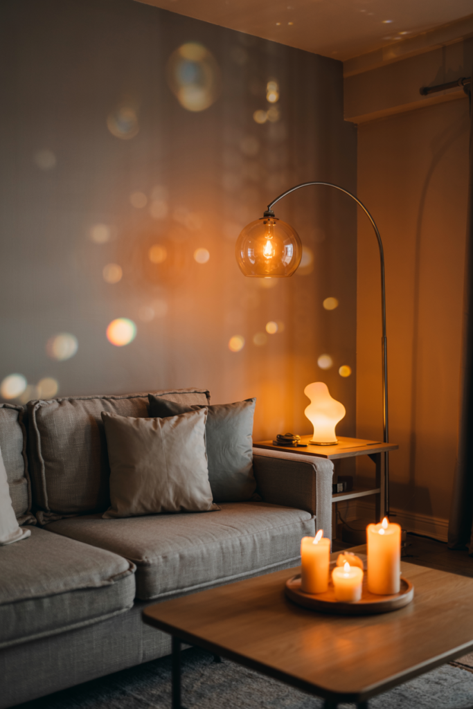
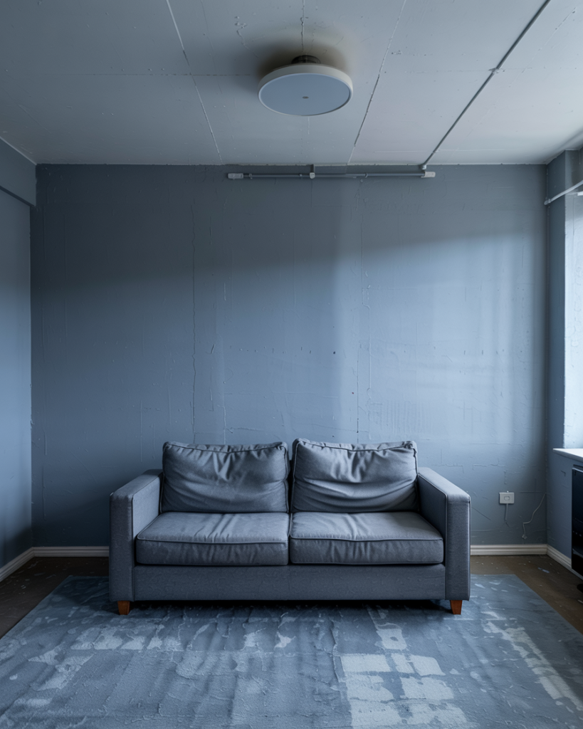
This is not about buying more lamps. Well, it is about that, but it’s also about understanding something more fundamental: cool overhead lighting is the enemy of coziness in a gray room, full stop.
Most apartments come with a ceiling light or a recessed fixture that blasts cool white light downward and makes gray walls look almost blue. You walk in after work and it feels like a car park. The fix is layering your light sources, not just your textiles.
You want light coming from three heights: floor level (a tall arc lamp or uplighter), table height (a lamp on a side table or console), and the warm glow of candles or a diffuser at coffee table level. When all three are on at once and the overhead is off — or dimmed to almost nothing — the room transforms.
The color temperature of your bulbs matters enormously. Go for 2700K or below. That’s the amber glow of an Edison bulb at 7pm, the color of light that makes everything, including gray walls, look warm and alive. Anything above 3000K starts edging toward the blue-white spectrum that makes cozy interiors impossible.
In apartments with no dimmer switches, plug-in dimmers cost almost nothing and change everything. It takes ten minutes and a five-dollar part and your evenings will look completely different.
—
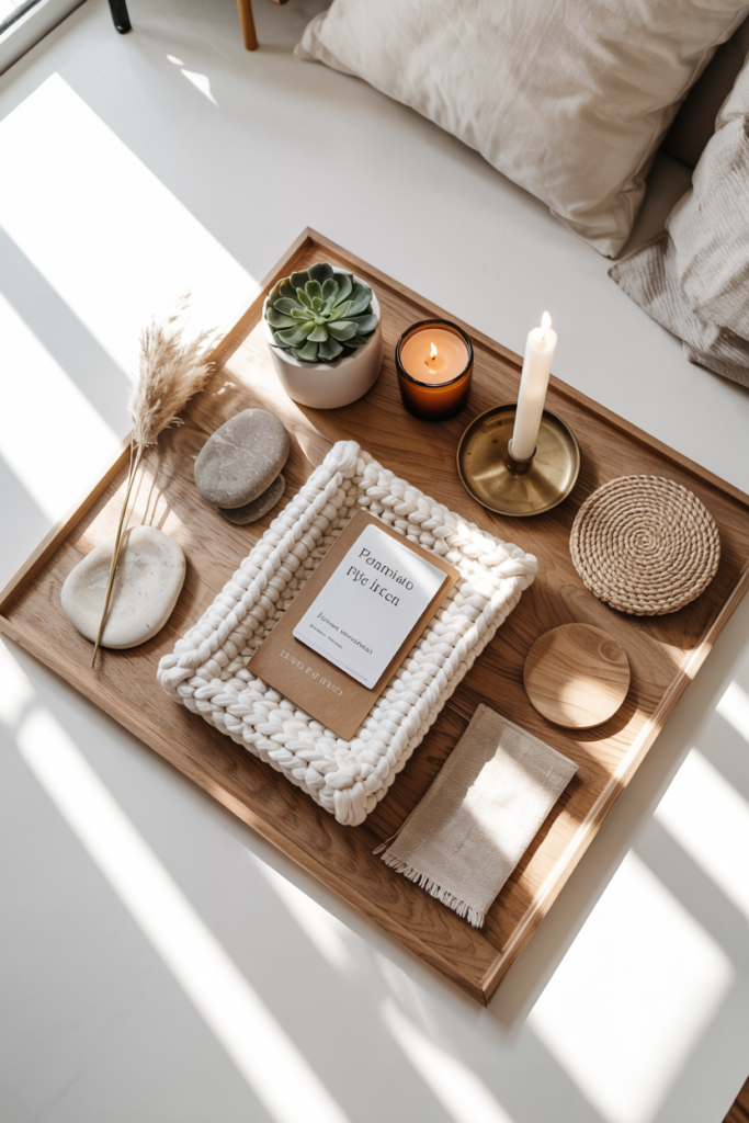
6. The Texture Combinations That Make Gray Feel Rich Instead of Flat
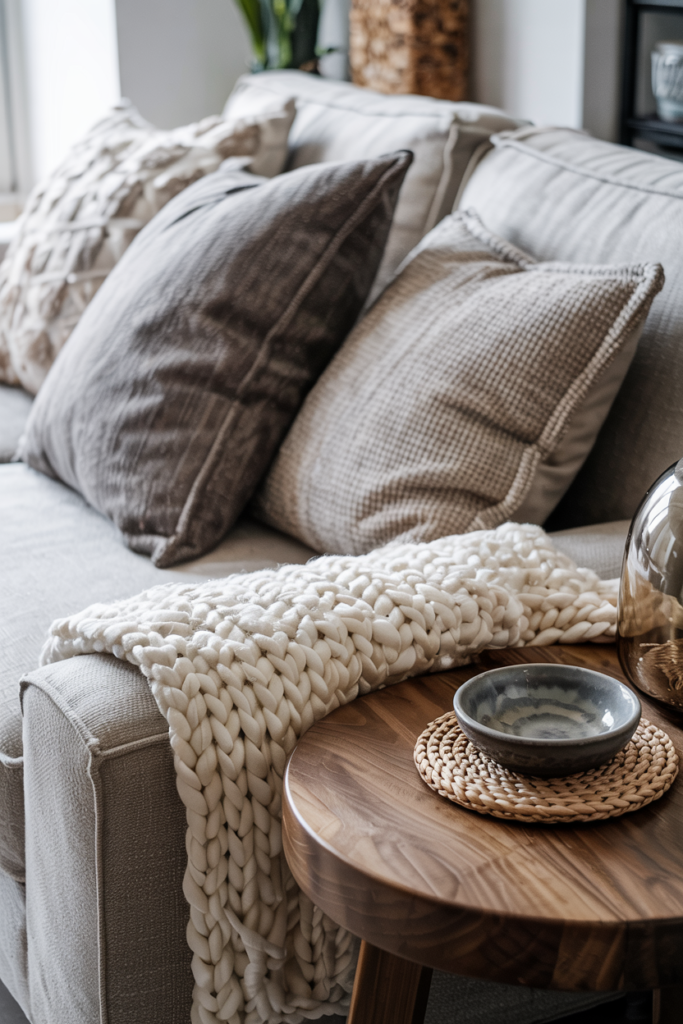
Here is the brutal truth about gray: it has almost no visual warmth on its own. None. It’s a neutral, which means it’s borrowing all its personality from everything around it. That makes texture the most important tool you have.
Rough linen against smooth gray. Chunky knit against painted plaster. Raw terracotta against matte gray. Woven rattan against brushed concrete. Velvet against brick. Every time you put two textures next to each other that are genuinely different — not just slightly different shades of the same thing — you create depth. And depth is what makes a room feel expensive.
In a small apartment, this is the cheat code. You don’t need more space. You need more contrast between surfaces. A concrete side table with a wool rug. A smooth marble tray next to a rough dried botanicals arrangement. A glass vase next to a ceramic one with an uneven glaze.
The most common mistake people make is buying everything from the same place in the same aesthetic family, so everything is slightly different but fundamentally the same material weight. A room full of IKEA and a room full of Pottery Barn will both feel flat if all the textures match each other. Shop around. Layer up. Let things be visually interestingly different from each other.
—
7. The Plant Situations That Actually Work in Smaller Gray Rooms
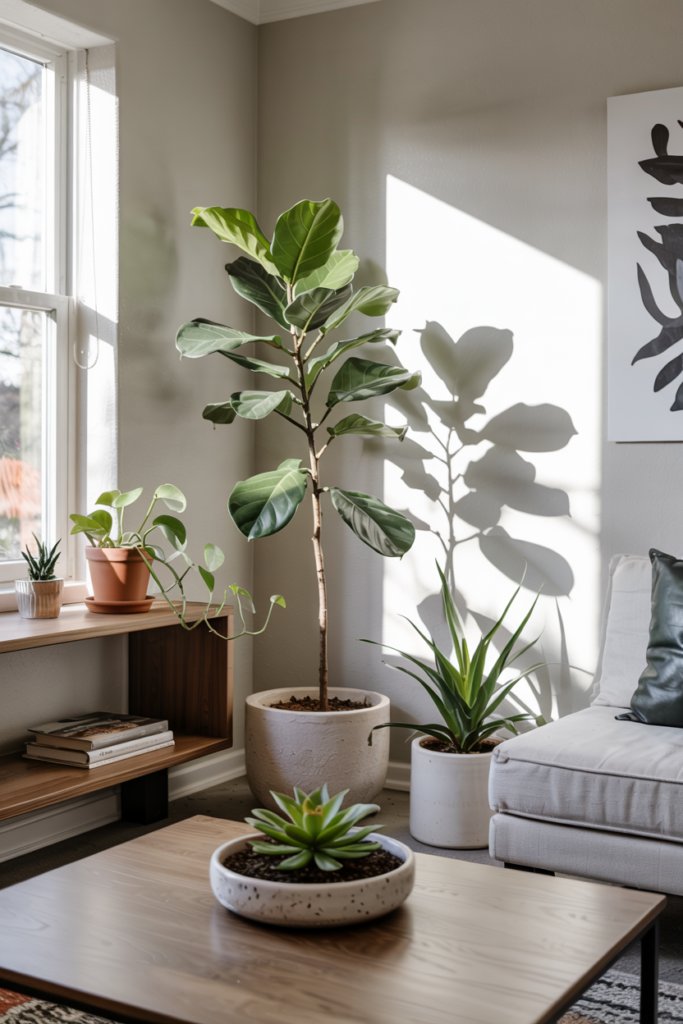
Some plants make a gray room feel alive and lush and beautifully imperfect. Other plants just sit there, slightly sad, in a pot that’s too small, and make the room feel like someone tried and gave up.
The plants that punch above their weight in gray apartments: trailing pothos (put it high and let it fall), a fiddle leaf fig or olive tree if you have the light for it, a trailing string of pearls, snake plants in sculptural pots, and dried pampas grass in a tall ceramic vase for those of us who consistently murder the real thing.
The pot matters as much as the plant. Earth tones always. Terracotta, taupe, matte white, dark olive green, unglazed stoneware. Avoid anything glossy or bright-colored in a gray room — it fights rather than adds.
One large plant beats three small plants in terms of visual impact. If you’re choosing between a cluster of little succulents and one tall monstera, go tall every time. In an apartment living room, a plant at floor level that reaches waist height completely changes the energy of the space. It adds scale, softness, and something alive that no throw pillow can replicate.
“One large, slightly imperfect plant in the right corner will do more for your living room than every small accessory you own combined.”
—
8. The Color That Pairs With Gray Better Than Any Other (And It Isn’t White)
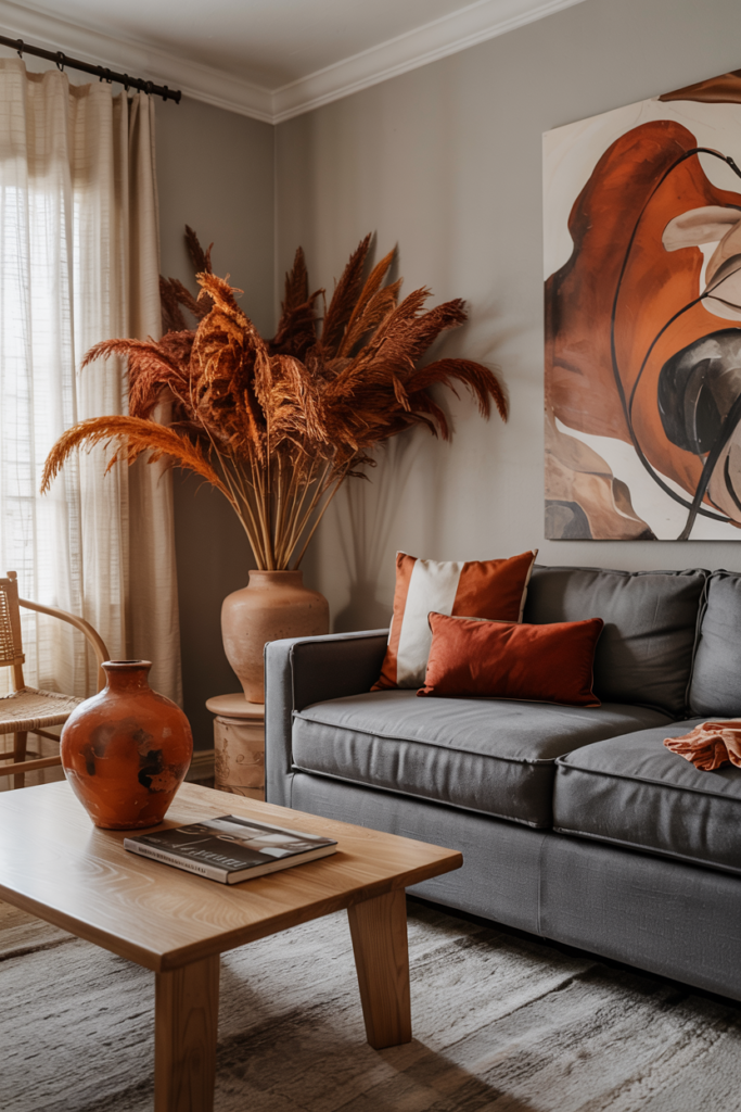
Terracotta. It’s not even close.
Terracotta and gray have been showing up together constantly — on Pinterest, in editorial shoots, in the apartments of people whose homes always look inexplicably good. And it makes complete sense once you understand what’s happening: terracotta is essentially warm earth tone, made of clay and heat and sun. Gray is cool and mineral. They’re opposites, and they do exactly what opposite tones do — they make each other pop.
You don’t need to go full terracotta. A pair of terracotta cushions on a gray sofa. A rust-toned rug. A cluster of terracotta pots by the window. A single warm orange throw draped over an armchair. Just enough warmth to counterbalance the cool.
If terracotta feels too bold for you, the next best choice is a dusty, muted sage green — not the bright mint that was everywhere in 2015, but a grey-green, almost army-toned sage that reads as a deep neutral. It works beautifully with both warm and cool grays and adds that sense of organic, botanical life to a room without screaming at you.
Both of these colors photograph beautifully, which matters when you’re inevitably going to want to share your finished room somewhere.
—
9. Furniture Arrangement in Small Gray Apartments That Actually Creates Flow
Most people arrange their furniture against the walls because it feels like it makes the room bigger. It almost never does. What it actually does is create a ring of furniture around an empty space in the middle, which makes the room feel hollow and oddly formal.
Pull things forward. Float the sofa a foot or two away from the wall. Put the coffee table close enough to reach from the sofa without leaning uncomfortably far. Group the seating together so conversation feels possible, not like you’re shouting across a gap.
In a small room, this takes courage. It feels like you’re taking up more space. But what you’re actually doing is creating a zone — a defined, intentional area that reads as a room within a room. The space behind the sofa becomes a visual break, a place for a console table or a tall plant, and suddenly the apartment has more than one plane to look at.
The rule that helps most: measure the diagonal of your room from corner to corner, then use that number to help you choose your rug size. A rug that’s too small is worse than no rug at all. It needs to anchor the furniture group, not just peek out from under the coffee table like it’s embarrassed to be there.
—
10. The Small Details That Make the Biggest Difference in Gray Rooms
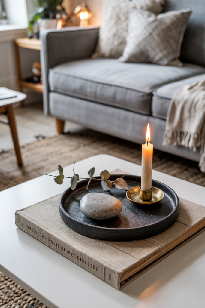
Books. Stacked horizontally on a coffee table. Arranged by color on shelves. Propped up on a console with an object in front of them. Books are warm, personal, and endlessly textural — and in a gray room, they pull in every tone you could possibly want.
Candles in amber or woody scents, never sharp or citrus. The visual warmth of a lit candle matters even before you consider the smell. A cluster of three candles in varying heights on a tray becomes an object in itself.
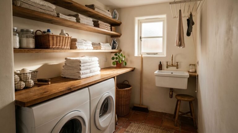
A woven or rattan element somewhere. A basket for throws, a side table, a set of trays on the coffee table. Natural materials do for gray rooms what a squeeze of lemon does for a sauce — they sharpen and lift everything around them.
And one mirror, always. Not a tiny one. A large, ideally arched or interesting-framed mirror that doubles the light in the room and creates the illusion of more space without you having to knock any walls down.
—
11. What to Do With Gray Floors When Everything Feels Too Matchy
Light gray walls plus gray flooring — whether that’s pale wood, concrete, or grey-toned tile — can tip quickly into monochrome overwhelm. It all blurs together and reads as one big flat surface instead of a room.
The answer is contrast, but not conflict. If your floors are cool gray, your rug should introduce warmth: jute, wool in cream or camel, a vintage-style Persian in dusty rose and gold. The floor and the rug should be clearly different so the eye separates them.
If your floors are a warm-toned grey or grey-brown, you have more flexibility — you can go either warm or cool with the rug and it will work as long as there’s enough value contrast. Dark rug on light floor. Light rug on dark floor. The rule is simple and it works every time.
For the furniture, the same principle applies. Light gray floors need furniture with some weight and depth — darker wood tones, deep-colored upholstery. Everything being the same mid-tone gray makes a room look like a concept, not a home.
—
12. The Final Layer: How to Make a Gray Apartment Feel Undeniably Personal
Here’s the truth about Pinterest-perfect gray apartments: they can look beautiful and feel completely anonymous at the same time. The difference between a room that looks like a hotel and a room that feels like yours is almost always the same thing: personal objects.
Not generic decor. Not stock-photo bowl of lemons. But the pottery mug you bought at a craft fair that has a small chip you never fixed. The stack of postcards you’ve been collecting for years. The framed print that’s slightly crooked and you never straightened it because it looks better that way. A blanket that’s been washed so many times it’s softer than anything you’d find in a shop.
Gray is the perfect backdrop for all of this, which is actually why it became so popular in the first place. It doesn’t compete. It holds. It makes the things you actually care about look considered and intentional rather than cluttered.
So stop waiting for the room to be “finished” before you add the personal things. The personal things are the finish. They’re what make someone walk into your apartment and feel like they understand something about you that you didn’t have to say out loud.
That’s what cozy actually means.
—
🌿 Quick Tips
Start with your gray’s undertone before buying anything else — hold a warm white and a cool white against the wall and see which one the wall fights with. That tells you everything.
Layer your light sources before you layer your textiles. No amount of cushions will save a room lit by one cold overhead bulb.
One large plant beats three small ones every single time. Go tall, go sculptural, use a pot in terracotta or matte earth tones.
In a small apartment, float your furniture away from the walls rather than pushing everything back against them. It makes the space feel bigger, not smaller.
Introduce terracotta somewhere — even one cushion or one pot — and watch the whole room warm up immediately.
—
❓ FAQ
Q: What color accessories go best with a gray living room? A: Terracotta, warm camel, dusty sage green, and deep teal all work beautifully with gray, depending on whether your gray leans warm or cool. Start with one warm accent color and build from there rather than trying to incorporate several at once.
Q: How do I make a gray apartment living room feel less cold and clinical? A: The biggest culprits are cool-toned lighting and a lack of texture. Switch your bulbs to 2700K or lower, layer multiple light sources (floor lamp, table lamp, candles), and add organic textures — chunky knit, linen, jute, rattan — throughout the room. The gray won’t feel cold once the light is right.
Q: What size rug should I use in a small apartment living room? A: Always bigger than you think. In a small room, the front legs of all your main seating should rest on the rug. A rug that sits only under the coffee table makes the space feel disjointed. If the room is very tight, go for a runner or a round rug rather than a tiny rectangular one.
—
💭 Final Thought
Gray is not a lazy choice and it’s not a boring one. It’s a question — and your whole room is the answer. Every texture, every warm light source, every personal, imperfect object you add is how you answer it. The apartments that feel cozy and beautiful and undeniably real are never the ones where everything matched perfectly. They’re the ones where someone made a series of small, thoughtful, personal decisions and then stopped worrying about finishing. What one thing in your living room is still waiting for that kind of attention?