
The Blue Couch That Changed My Entire Living Room (And the 12 Ways to Style It Right)
You walked past it in the furniture store. Maybe twice. Then you went home, thought about it for three days, and now it’s sitting in your living room and you’re staring at it wondering what on earth comes next.
A blue couch is a commitment. A beautiful, bold, completely worth-it commitment — and styling it well is easier than you think.
—
1. Why Blue Is the Neutral You Never Knew You Needed
Here’s the thing nobody tells you at the furniture store: blue behaves like a neutral when you let it.
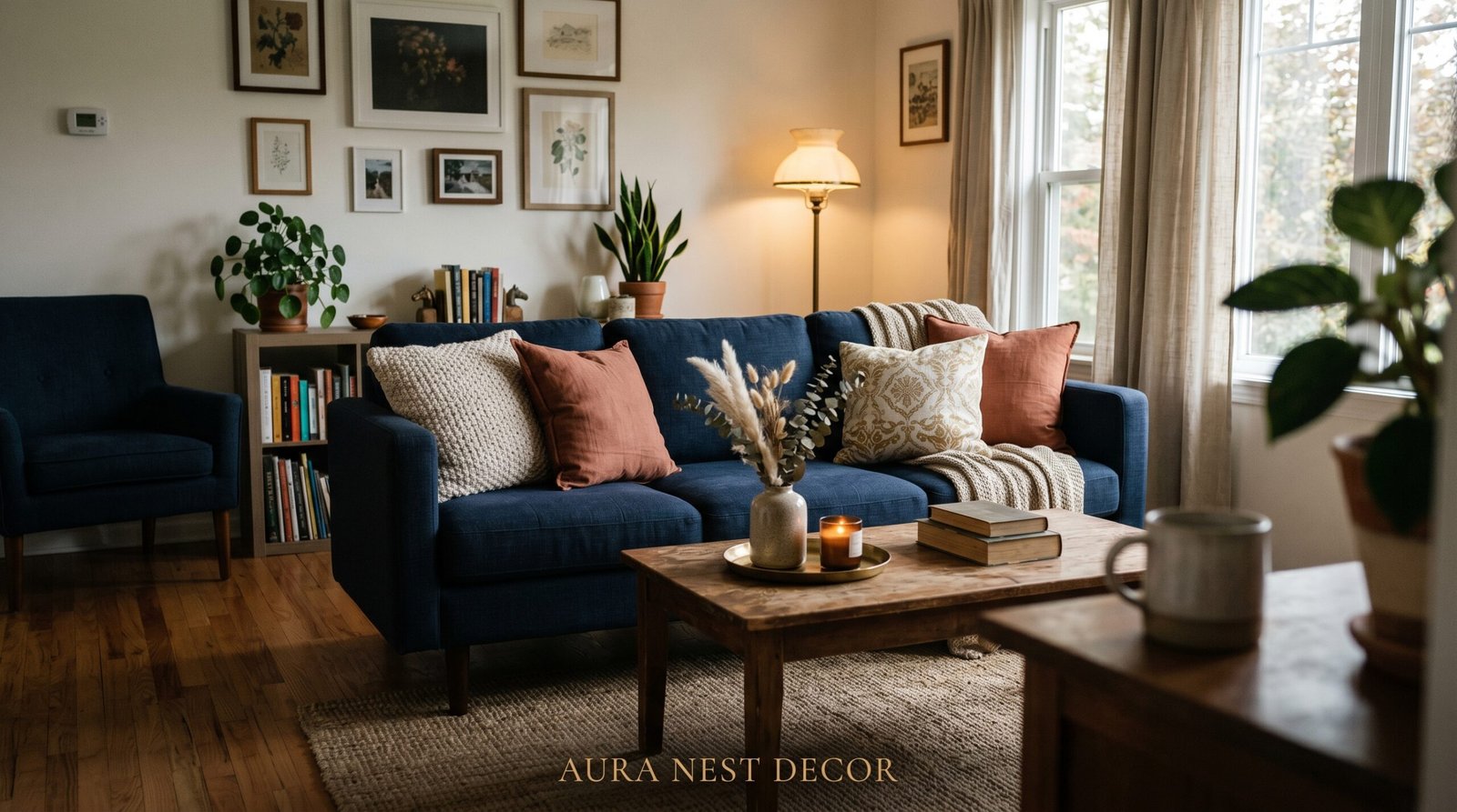
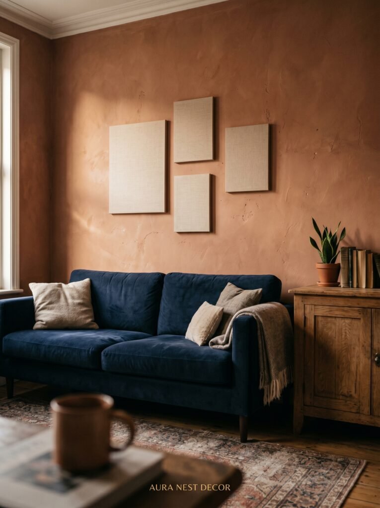
Think about it. Navy sits just as quietly as charcoal. Dusty slate plays the same grounding role as greige. Even a bolder cobalt couch has this quality where it doesn’t compete with everything else in the room — it anchors it. The reason so many people struggle after bringing home a blue couch is that they treat it like an accent piece when it’s actually meant to be the foundation.
The shift in mindset matters enormously. Once you stop asking “what do I put around my blue couch?” and start asking “what does my blue couch want the room to feel like?” — everything becomes clearer.
Deep blues like navy and indigo want warmth around them. Brass hardware, cognac leather, warm wood tones, amber candlelight. Mid-range blues — teal, slate, dusty blue — are incredibly flexible and will lean coastal or cottage or modern depending entirely on what surrounds them. Bright blues want to be the statement, so the rest of the room should whisper while the couch speaks.
Your couch isn’t the problem. It’s the key. You just need to figure out which door it opens.
“Stop treating your blue couch like an accent piece. It’s the anchor — and everything else gets built around it.”
—
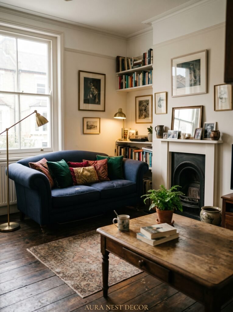
2. The Rug Formula That Makes Every Blue Couch Look Intentional
If there’s one thing that can make or break a blue couch living room, it’s the rug. Get this wrong and the whole room looks like a waiting room at a budget hotel. Get it right and people will stop mid-conversation to comment on how beautiful it all feels.
The good news: the formula is simple. Go warm or go natural.
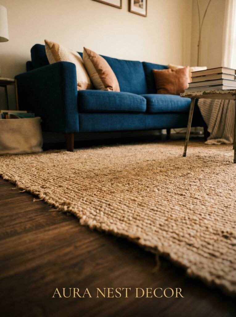
A cream, ivory, or oatmeal jute rug under a blue couch does something almost magical. It pulls all that cool, composed blue down to earth. The contrast is subtle but you feel it immediately when you walk into the room — the whole space softens without losing its edge. This works for nearly every shade of blue, from a pale powder blue sofa to the darkest midnight velvet.
If you want more pattern, go with something that has warm ochre, terracotta, or rust tones woven through. A Moroccan-style rug or a faded vintage Persian with dusty reds and gold? Genuinely stunning under a navy couch. The warmth in the rug balances the cool in the couch and suddenly the room feels curated, not accidental.
What to avoid: matching blue rugs. Blue on blue, unless executed by someone with real professional confidence, tends to look like you got a set deal and couldn’t say no. Your rug should answer the couch, not echo it.
Size matters too. Go bigger than you think. The rug should sit under the front two legs of the couch at minimum — ideally under all the furniture in the seating area. A too-small rug is one of the most common living room mistakes, and it makes even a beautiful space look unsettled.
—
3. The Wall Color That Actually Works (Stop Defaulting to White)
White walls with a blue couch. Safe. Fine. A little expected.
Don’t get me wrong — crisp white absolutely works, particularly if you’re going for a coastal or Scandi vibe. But there are so many other options that work better and most people never even consider them.
Warm white with a hint of cream or yellow undertone, for starters, will do more work than stark white ever could. It makes the blue in the couch look richer. It stops the room from feeling clinical.
A deep terracotta or warm rust wall? Transformative. Sorry — outstanding. With a navy or deep teal couch, a terracotta feature wall creates this moody, enveloping feeling that’s the visual equivalent of a Sunday afternoon with no obligations. It’s become incredibly popular in both American and British homes over the last few years and for good reason — the contrast between cool blue and warm orange-red sits directly opposite on the colour wheel, meaning they were always meant to work together.
Sage green is another unexpected winner. Soft sage with a dusty blue or slate couch feels like the inside of a very beautiful greenhouse. Add natural linen, exposed wood, and a few trailing plants and you’ve got something that feels genuinely alive.
Dark walls, even in small rooms, can work beautifully with a lighter blue couch. Deep charcoal, forest green, even dark navy against a mid-blue sofa — it sounds like a risk and it pays off spectacularly.
—
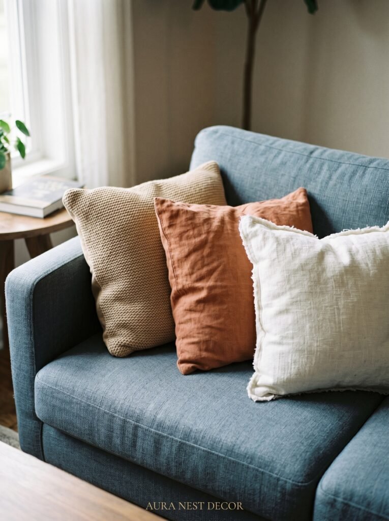
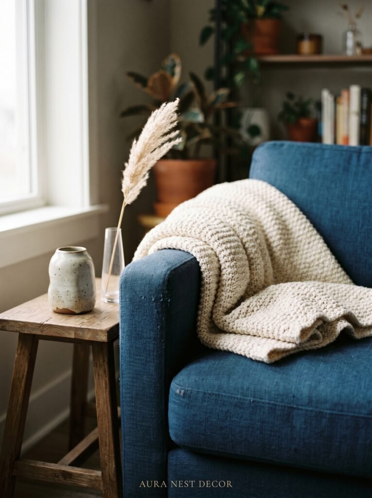
4. Throw Pillow Combinations That Don’t Look Like You Tried Too Hard
Throw pillows are where most people either overthink everything into a mess or underthink it into boredom. There’s a middle path and it’s wonderful.
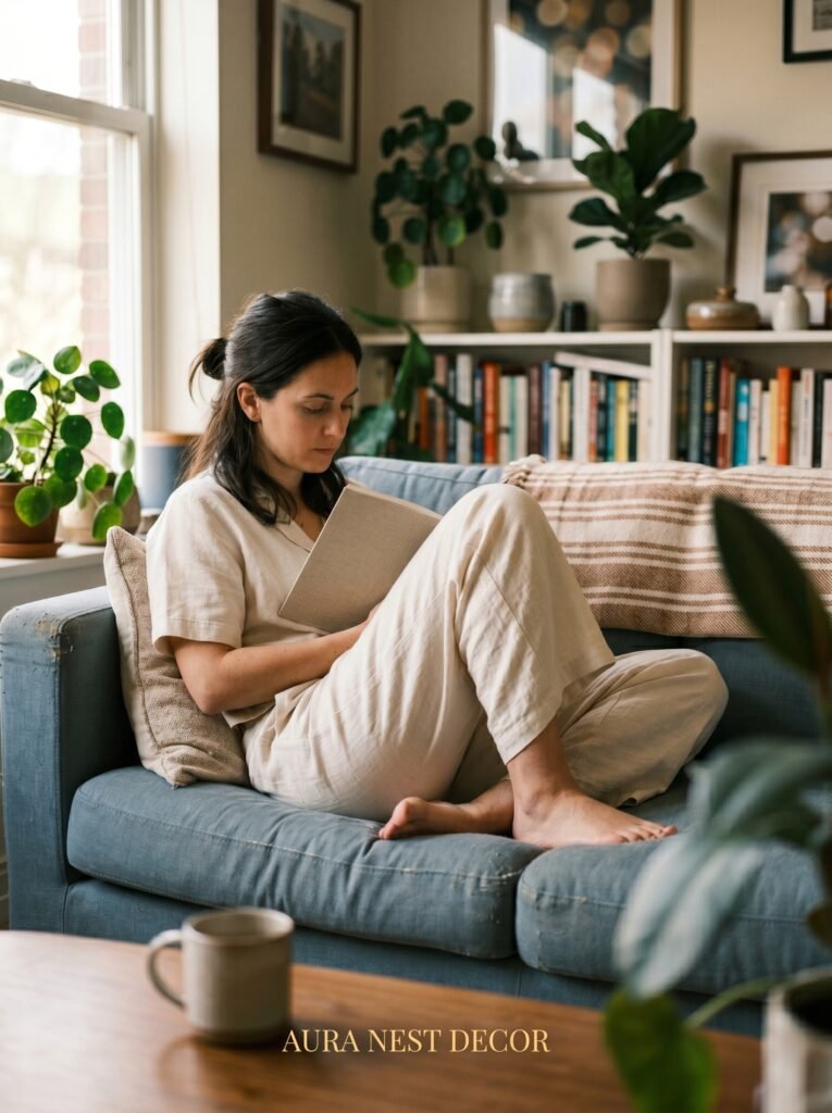
Start with texture, not colour. Chunky knit, linen, velvet, embroidered cotton — mix the textures first and the colour story will come together naturally. A velvet navy couch loves the soft roughness of a linen pillow. A cotton teal sofa loves the slight sheen of a woven pattern.
For colour: you have three directions you can go.
First option — warm contrast. Mustard yellow, burnt orange, rust, terracotta. These are the warmest friends a blue couch has ever had. Two mustard linen cushions, one with an embroidered detail, alongside a cream chunky knit? Settled, confident, beautiful.
Second option — soft neutrals. Cream, warm white, beige, camel. This is the quiet approach. The whole look becomes calm and airy. It works brilliantly for powder blue or French blue couches that have a softer, more romantic quality to them.
Third option — pattern mixing. Take the braver route: one bold geometric, one botanical print, one plain. Keep them connected by one or two shared colours and you’ve got something that looks genuinely curated rather than bought as a set from a single catalogue page.
And please — three to five pillows. Not nine. Not two. That sweet spot gives you layering without the couch looking like it’s being swallowed whole.
“The throw pillow formula isn’t about colour first. Start with texture, and the rest will follow.”
—
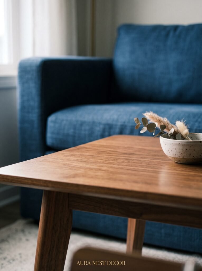
5. The Wood Tone That Pairs Better With Blue Than You’d Expect
Most people instinctively reach for dark wood when they have a blue couch. Espresso coffee table, dark walnut side tables. It’s not wrong. But it’s not the most interesting choice either.
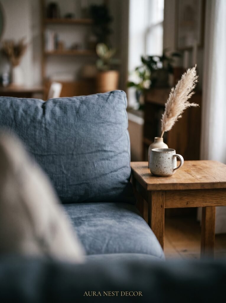
Light and medium wood tones — oak, ash, light walnut, pine — do something remarkable against blue. They bring warmth without heaviness. A live-edge light oak coffee table in front of a navy velvet couch looks like it belongs in a very carefully styled boutique hotel, the good kind, the one where you photograph the room immediately upon arrival.
Rattan and bamboo work beautifully too. A rattan side table next to a blue sofa has this effortless, slightly laid-back quality that keeps the room from feeling too formal or composed.
The key principle: blue couches already have visual weight. Your wood furniture doesn’t need to add more. Let it breathe. Let the lighter, warmer tones do the work of balancing the room rather than competing for dominance.
—
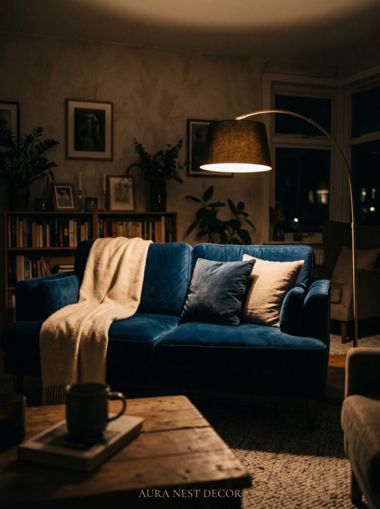
6. Lighting That Makes a Blue Couch Look Like It Cost Twice as Much
Lighting changes everything and most people know this intellectually but still hang one overhead light and wonder why the room doesn’t feel right.
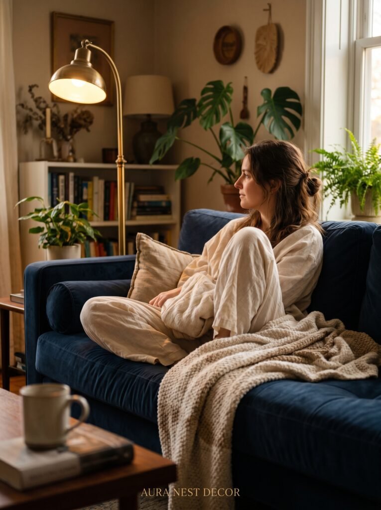
The amber glow of an Edison bulb at 7pm in a room with a navy couch is one of the coziest things I’ve ever witnessed. That specific warmth, that golden quality, draws all the richness out of deep blue tones. The couch goes from furniture to feature.
For a blue couch living room specifically: warm bulb tones are non-negotiable. Cool white or daylight bulbs will make your blue couch look stark and unwelcoming. Stick to bulbs in the 2700K–3000K range. Warm. Golden. Lived-in.
Layer your light sources. A floor lamp in the corner, a table lamp on a side table, maybe a pair of wall sconces if you’re going the extra mile. Multiple light sources at different heights creates depth and dimension that no single overhead fitting can replicate.
A table lamp with a linen shade, casting that warm diffused glow onto the cushions of a dusty blue sofa in the early evening? That’s a Pinterest photo waiting to happen. That’s also just a Tuesday night at home, which is the real goal.
—
7. Plants That Don’t Feel Like an Afterthought
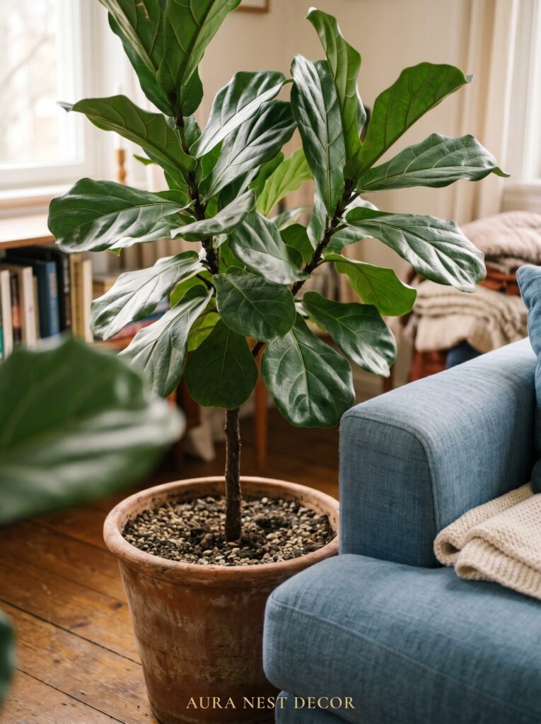
Plants in a blue couch living room aren’t decorative accessories. They’re structural.
The deep greens of big tropical leaves — monstera, fiddle leaf fig, bird of paradise — pick up the yellow-green undertones that sit adjacent to blue on the colour wheel and create a visual harmony that feels completely natural. Because it is. Blue and green exist together in nature constantly. We’re just recreating that indoors.
A large statement plant in a terracotta or cream ceramic pot positioned to one side of the couch anchors that corner of the room. It adds height, life, and a quality of warmth that no piece of furniture can quite match.
Trailing plants on shelves or hanging above a blue couch soften the whole composition. That spill of green against blue is gentle and effortless in the best way.
If you’re plant-sceptical or genuinely struggle to keep things alive: a single well-chosen dried grass arrangement in a tall clay vase does similar visual work. No watering required. Still beautiful. Still intentional.
“A big plant in a terracotta pot next to a blue couch isn’t a finishing touch. It’s part of the architecture of the room.”
—
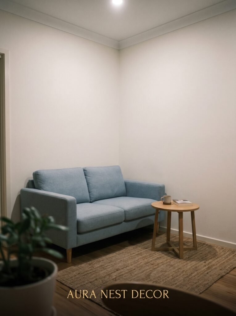
8. Small Blue Couches in Small Rooms: The One Rule That Changes Everything
Small room, blue couch. Lots of people panic here. They start second-guessing the whole purchase.
Here’s the rule: visual weight, not actual size, is what makes a small room feel cramped.
A smaller, low-profile blue couch in a compact space doesn’t shrink the room if you keep the surrounding furniture light and raised. Hairpin legs on your coffee table. Open shelving instead of a closed media unit. A mirror to bounce the light. These choices make the room breathe even with a bold-coloured sofa as the centrepiece.
Where people go wrong in small blue couch rooms is overcrowding. One statement couch needs space around it. A small couch surrounded by heavy furniture, a large rug in a dark colour, and window treatments that block the natural light will always feel boxed-in.
Let the couch be the thing. Clear the space around it. Let it exist in some breathing room and the blue becomes less dominant, more of a considered design choice.
A compact linen armchair in cream or oatmeal rather than a second large sofa keeps the seating balanced without the room going heavy on one side.
—
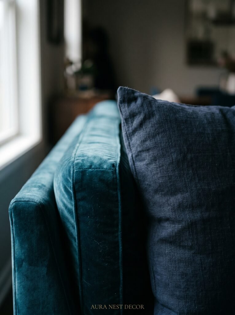
9. The Velvet vs. Fabric Question Nobody Talks About Honestly
Not all blue couches are created equal and the material changes everything about how you style the room.
Velvet blue couches are moody, opulent, dramatic. They catch light differently at different times of day — lighter in the morning, almost jewel-like by lamplight in the evening. A velvet navy couch wants a room that leans into that richness. Brass, dark wood, deep terracotta, heavy linen drapes. The full picture.
Linen or cotton blue couches are more relaxed, more casual, more forgiving in the overall scheme. A faded denim-style blue linen sofa wants bleached wood floors, simple cotton throws, a jute rug, natural pottery. The coastal cottage look comes naturally here.
Performance fabric and microfibre blue couches — the practical, family-home choices — have a cleaner, more matte appearance. They tend to read as more contemporary and they work beautifully with a modern or Scandinavian aesthetic. Clean lines, geometric cushions, light wood furniture.
Knowing which camp your couch falls into is the first styling decision. Everything else follows from the material.
—
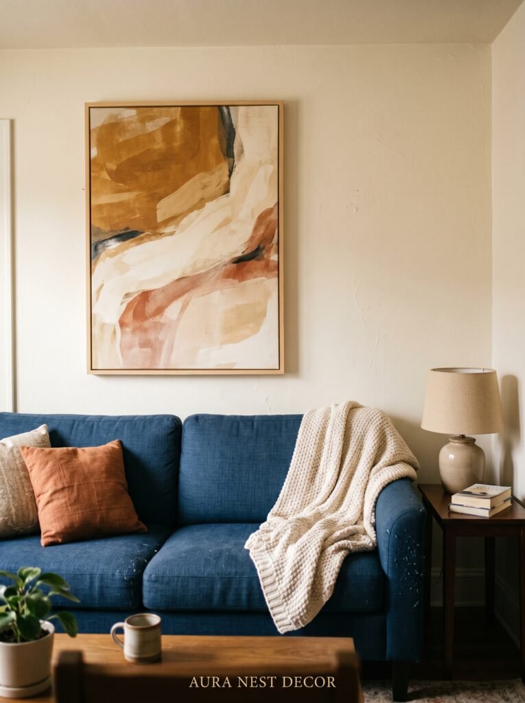
10. Artwork That Feels Matched on Purpose, Not Matched by Accident
Hanging the wrong art above a blue couch is painfully common. And the most common mistake isn’t hanging something that clashes — it’s hanging something that matches too literally.
A painting with a lot of blue in it, hung directly above a blue couch, announces its own planning. You can see the thought that went into it and that’s the problem. The best-styled rooms look uncontrived.
Go for art that picks up one of your accent colours instead. A large abstract with ochre, terracotta, and cream above a navy couch. A botanical print with deep greens and warm dusty tones above a teal sofa. A black and white photograph that lets the couch be the only colour in the whole upper half of the room — that one is quietly brilliant.
Scale matters enormously. A small piece of art above a full-size couch looks adrift. You want the art to span roughly two-thirds of the sofa width at minimum. One large piece or a confident gallery wall with a mix of sizes — both work. A single medium-sized frame centred above a three-seat sofa never quite does.
—
11. The British Living Room Version vs. The American Living Room Version
Blue couches live differently on each side of the Atlantic and both approaches are worth understanding.
In British homes, a blue couch often sits in a room with more pattern mixing, more heritage elements — panelled walls, period fireplaces, layered rugs, an inherited armchair that doesn’t quite match but somehow works. The British approach is less afraid of depth and darkness. A deep inky blue sofa in a Victorian terraced house with forest green walls, original sash windows, and a William Morris-print cushion? That’s a specific kind of perfection.
In American homes, blue couches tend to appear in brighter, more open-plan spaces. The coastal farmhouse look — shiplap, whitewashed wood, linen, natural fibre rugs — is a particularly beloved combination. Light pours in differently in a wide American living room than it does through the narrow sash windows of a British semi-detached and the styling naturally adapts.
Neither approach is better. They’re just calibrated to different bones. Look at your actual room — the ceilings, the windows, the floor, the light — and let that tell you which direction your blue couch wants to lean.
—
12. The Small Details That Make People Say “How Did You Do That?”
It’s never the big things that make a room look truly finished. It’s always the small ones.
A folded throw in a warm contrasting colour draped over one arm of the couch. Not tucked, not spread out — folded and draped, like someone just set it down. That specific casualness takes practice to achieve but when it lands, the couch immediately looks more inviting.
A stack of two or three books on the coffee table, not a tower, not a single book, a stack. With something small on top — a piece of driftwood, a smooth stone, a small candle. The layering grounds the table and connects it to the couch without trying.
Candles, always. Even unlit, a few candles in the room at evening add something. Lit, with a blue couch catching the flicker? The whole room becomes a different place.
And finally: don’t style it to death. Leave a little imperfection. A slightly asymmetric cushion arrangement, a book face-down on the side table, a plant that’s slightly bigger than the space strictly calls for. Real homes look lived-in, not staged, and that quality — that sense of actual human life happening inside a beautiful space — is the thing nobody can buy from a catalogue.
—
❓ FAQ
Q: What color walls go best with a blue couch? A: Warm whites, terracotta, sage green, and even deep charcoal all work beautifully with blue couches depending on the shade and your preferred aesthetic. The biggest thing to avoid is cool-toned greys or stark brilliant white, which can make a blue couch feel cold and unwelcoming rather than bold and intentional.
Q: Can I have a blue couch in a small living room? A: Absolutely — the key is keeping the surrounding furniture light, low-profile, and spaced well so the room breathes. Avoid overcrowding with heavy pieces, choose an open-leg coffee table, and make sure your lighting is warm. The couch’s colour isn’t what shrinks a room; visual clutter is.
Q: What throw pillows go with a blue sofa? A: Warm-toned pillows in mustard, rust, terracotta, and burnt orange are classic pairings that feel intentional and balanced. Soft neutrals like cream and linen work for a quieter look. Mix textures first — velvet with linen, knit with woven — and aim for three to five pillows rather than filling every inch.
—
💭 Final Thoughts
A blue couch is one of those purchases that asks something of you. It asks you to commit, to build around it, to trust that bold can also be warm. And when you get it right — when the rug is warm, the light is golden, and the room feels like it was always supposed to look this way — there is genuinely nothing more satisfying.
You didn’t make a mistake buying that couch. You just gave yourself a project worth doing.
So — what shade of blue are you working with, and which of these directions feels most like your room?


