The Ceiling in Your Living Room Is the Most Wasted Design Opportunity in Your Home
You’ve repainted the walls. You’ve agonized over sofas. You’ve swapped out every lamp twice. And the whole time, the ceiling — that giant blank plane directly above everything you love — has just been sitting there, white, ignored, quietly doing nothing.
It doesn’t have to be that way.
—
1. Why Everyone’s Finally Looking Up (And What Changed)

There’s a shift happening in how people think about living rooms, and it’s not coming from some big design trend report. It’s coming from people who got bored. Lockdowns did something funny to interior design — people stared at their homes for so long that they started noticing things they’d always skipped over. The ceiling was one of them.
And once you see it, you can’t unsee it.
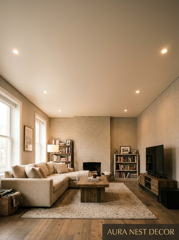
Right now, the most shared living rooms on Pinterest — the ones that stop the scroll — almost all have something going on above eye level. A painted ceiling in a deep, moody color. Exposed beams. A coffered grid that looks like it belongs in a countryside manor. Or just a really excellent light fixture that turns the ceiling into something worth looking at.
It’s not that ceilings are a new idea, obviously. Grand old houses in the UK have had ornate plasterwork for centuries. Classic American craftsman bungalows had their wood-paneled ceilings decades before anyone called it a trend. But the modern version of this is different — it’s more intentional, more edited, less fussy. People aren’t going full Victorian anymore. They want something that feels current and considered, not like a set piece.
So what does that actually look like? That’s what we’re getting into.
—
2. The Color That Keeps Showing Up in Every Beautiful Living Room Right Now

Deep green. Not sage, not mint — I mean a real, serious, almost-black green. And it’s not just on walls anymore.
Painting the ceiling a dark, saturated color might sound terrifying, but the rooms it works in are genuinely stunning. The key is that it makes the ceiling feel like it recedes — it disappears into itself, and suddenly the room feels both more dramatic and more cozy at the same time. Which shouldn’t be possible, but here we are.
The specific shades that keep appearing: Farrow & Ball’s Studio Green, or their Railings (which reads more charcoal with a green undertone), or anything in that family of deeply pigmented forest tones. For US readers, Sherwin-Williams’ Rookwood Deep Red, Pewter Green, or even their newer deep slate options hit a similar note.
But it’s not just green. Navy is having an absolute MOMENT on ceilings. Charcoal is still working. And there’s a particular dusty terracotta situation showing up in warmer-toned living rooms that honestly looks incredible in evening light — I wasn’t sure about it until I saw it and then I couldn’t stop saving it.
The rule everyone gives you is that you should match the ceiling color to your trim or your darkest accent. I’d say it’s more like — start there, and then trust your gut about whether it’s too much. Sometimes “too much” is exactly right.
—
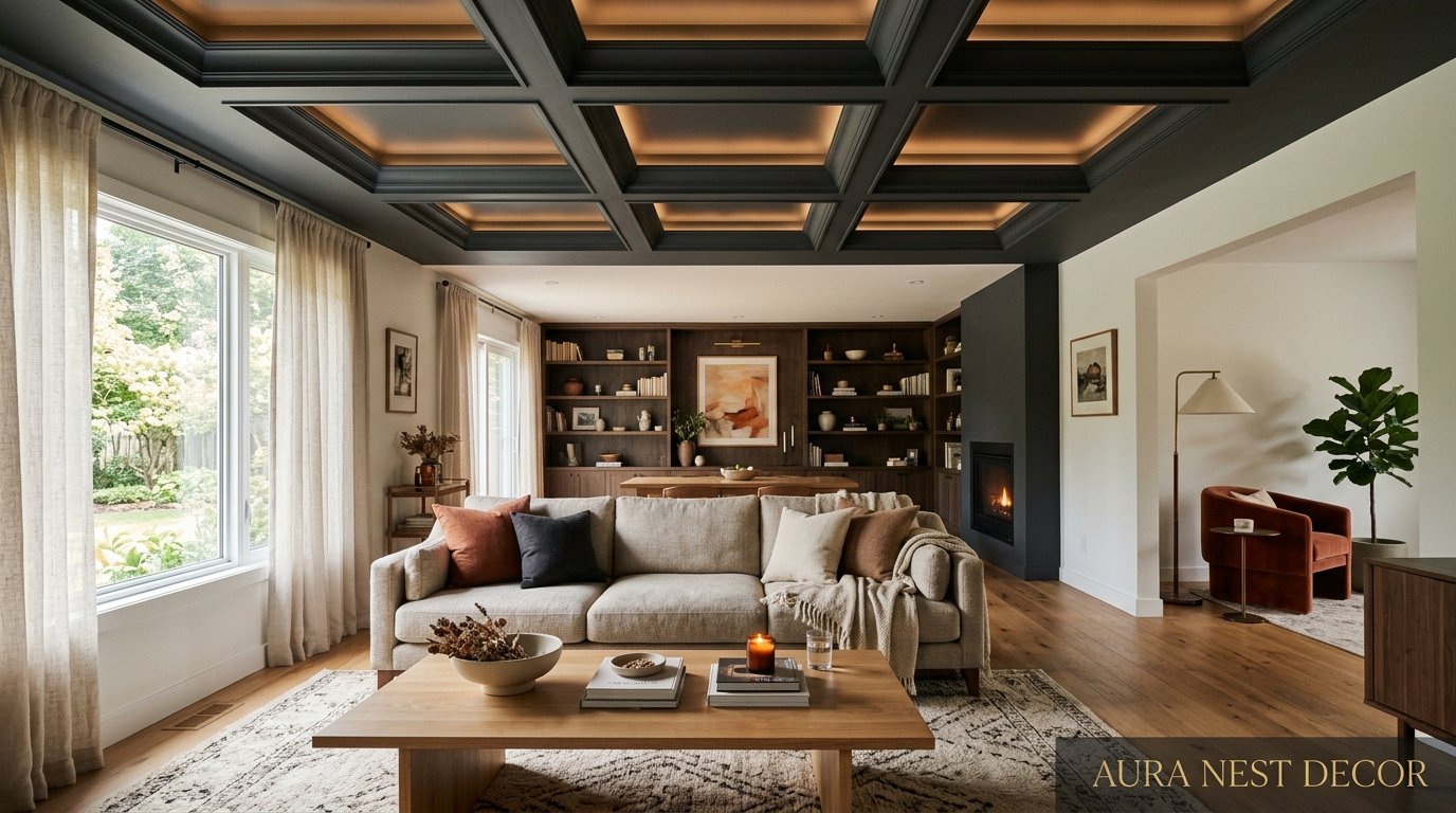
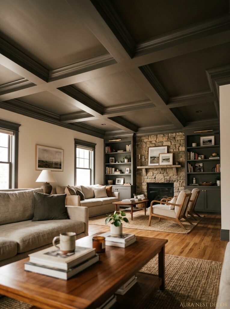
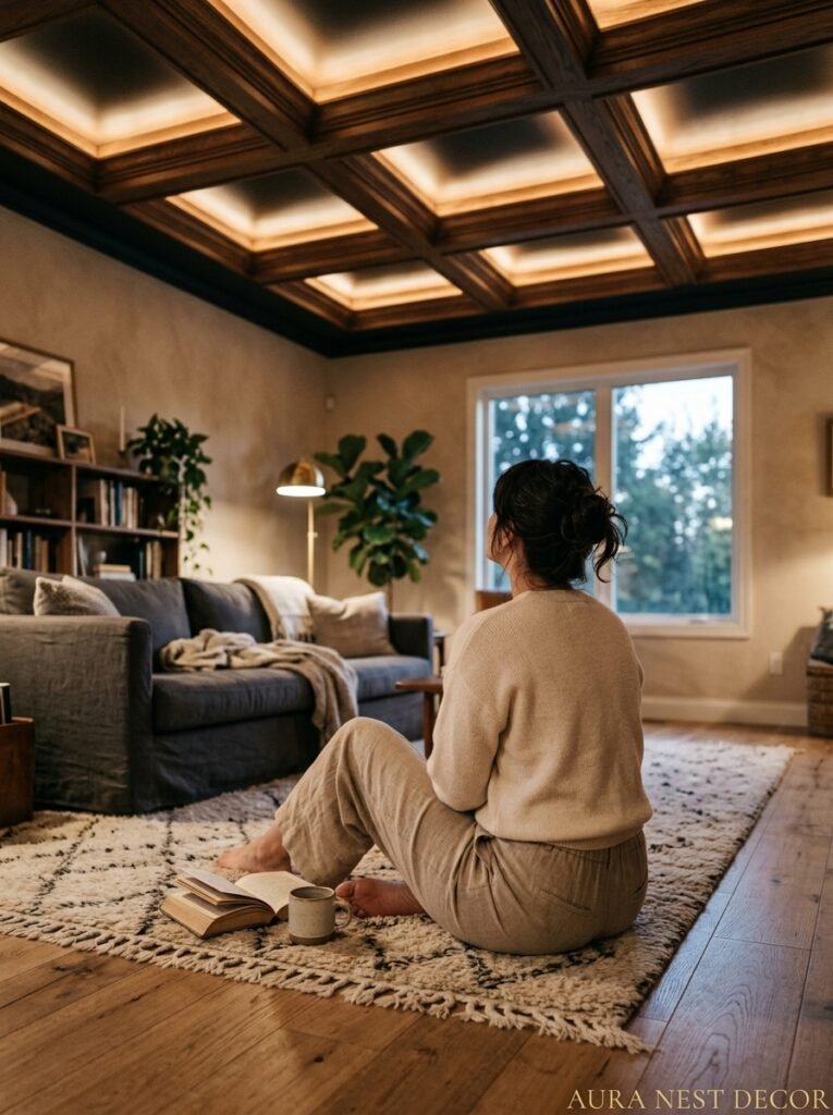
3. Coffered Ceilings Without the Victorian Overdose
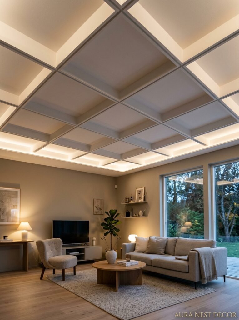
Coffered ceilings have a reputation. Stuffy library. Old men’s club. Grand estate in a PBS drama. But done right — with the proportions pulled back and the materials kept simple — they’re one of the most satisfying things you can add to a living room ceiling.
The modern version doesn’t use thick, chunky molding. It uses clean, flat panels with shallow depth — maybe 2 to 3 inches of relief, not 8. The grid creates structure and visual interest without feeling heavy. Paint it the same color as the ceiling (or one shade darker) and it reads as subtle and architectural rather than ornate.
What it does to a room is genuinely hard to explain until you see it in person. The ceiling suddenly has weight and intention. The room feels designed rather than decorated. And there’s something about a coffered ceiling that makes furniture arrangement feel easier — like the room has already told you how it wants to be organized.
In UK homes with lower ceilings, this is still very doable — you just go even flatter with the molding, and you keep the color consistent so the shadow lines do the work instead of the depth. In American homes with standard 8-foot ceilings, shallow coffers work beautifully if the squares are kept larger. Don’t try to squeeze in a tiny grid. Bigger squares, less molding, cleaner result.
—
4. The Beam Question (And Honestly, It Depends on Your House)

Exposed beams get a lot of love online. And some of that love is deserved! Real structural timber beams in an older home — original, imperfect, a little irregular — are genuinely beautiful. They tell the story of the house.
“A ceiling that tells the story of the house it’s in will always be more interesting than one that was installed to look impressive.”
Fake beams are a different conversation. And I’m not here to tell you they’re wrong — a well-installed faux beam using lightweight polyurethane can look really convincing, and they’ve gotten dramatically better in the last few years. But they work best in homes that have a reason for beams. A new-build with contemporary everything and then suddenly rustic barn beams across the ceiling? That’s a tension that’s hard to resolve.
Where beams work in modern living rooms: rooms with any kind of organic, natural, or earthy design direction. Homes with stone, brick, or wood already present. Spaces going for that Nordic farmhouse or modern rustic look that’s been everywhere for a few years now. If your living room already has linen and terracotta and a jute rug, beams are going to feel completely right.
Where to be cautious: very sleek, minimal interiors. Very small rooms where the beams will read as obstacles rather than features. And anything super low — if you’ve got 7.5 foot ceilings, beams might make people feel like they have to duck, which is not the vibe.
—
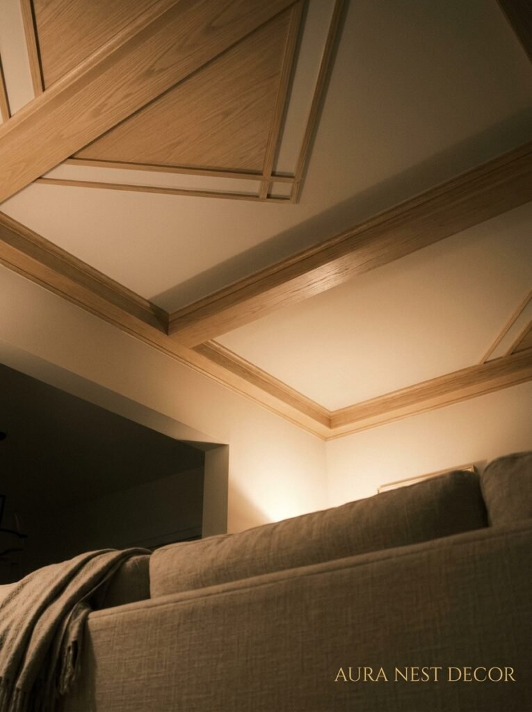
5. Tongue-and-Groove Paneling: The Underrated One
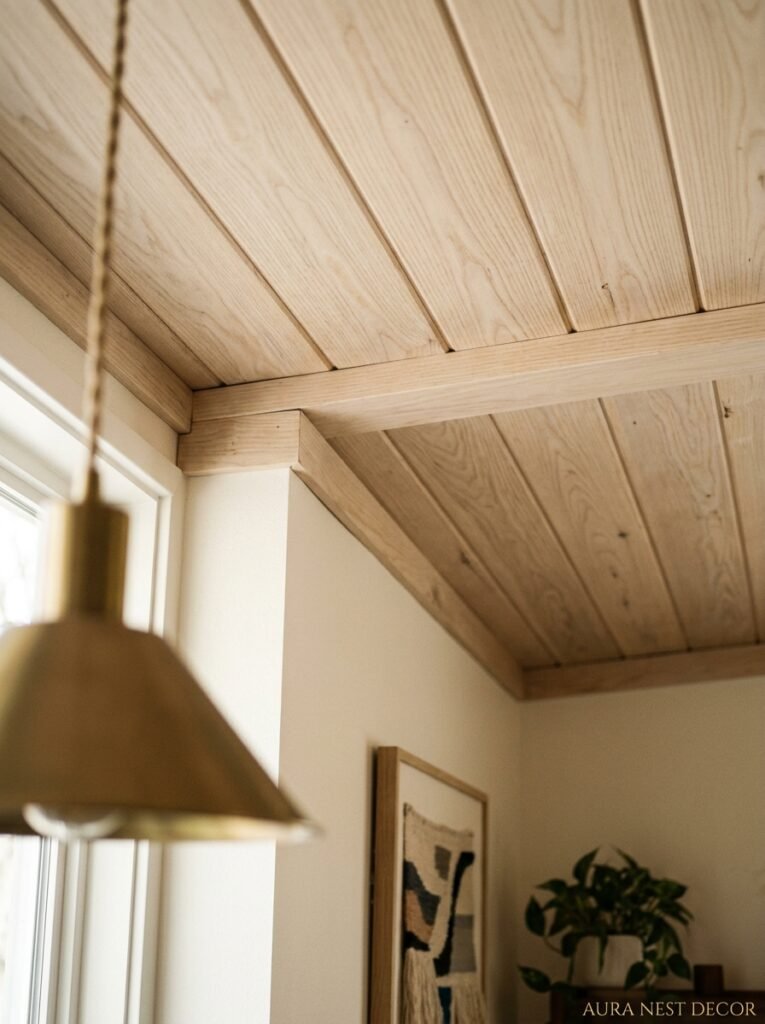
Not enough people are talking about tongue-and-groove on ceilings. It gets a bit overshadowed by the beam obsession, but honestly? A beautifully done tongue-and-groove ceiling is one of those things you walk into a room and feel before you consciously see it.
The texture adds warmth in a way that paint just can’t. It’s subtle. The parallel lines draw your eye across the ceiling rather than straight up, which actually makes rooms feel wider. And it’s surprisingly DIY-able — more so than coffers or plasterwork, anyway.
You’ve got options with finish. Raw wood with a matte sealer goes beautifully in natural, organic interiors. Painted white (or off-white — not pure brilliant white, please) reads as coastal or classic. Painted in a deep color it becomes more dramatic, more Nordic. Stained dark it tips into traditional but in a good way, a warm-library-in-the-evening way.
A specific thing I love: tongue-and-groove on a sloped ceiling above an open-plan living room. The slope means the texture catches light differently at different points, and the whole thing just feels like a considered architectural detail rather than a decorating add-on.
—
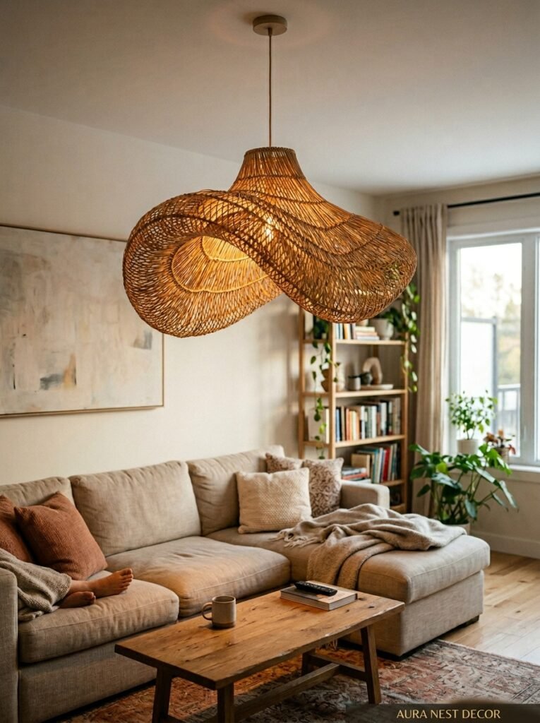
6. That One Statement Fixture That Does Everything
Let’s be honest: sometimes the ceiling treatment isn’t about material or texture at all. Sometimes it’s entirely about the light.
A genuinely spectacular ceiling fixture — and I mean something that makes you look up and say “oh” — can do more for a living room than almost any other single change. Not a chandelier that’s too small and floats awkwardly in the middle of nowhere. Not a flush mount that looks like it came with the apartment. Something that was chosen for this room, in this scale, with this intention.
Right now the interesting lights are doing several things at once. There are sculptural rattan and wicker pendants that cast incredible patterned shadows. There are plaster-effect pendants in organic shapes that feel almost like ceiling sculpture. There are oversized, dramatic smoked glass globes that look incredible lit or unlit. And for the people who want to go really architectural: recessed lighting designed not as a grid of can lights but as a deliberate pattern — rings, lines, asymmetric clusters — can actually function as ceiling design in itself.
Scale matters more than almost anything else here. Most people go too small. For a living room, most designers will tell you to size up from whatever you think looks right, and they’re correct. A fixture that commands the ceiling anchors the room. A fixture that apologizes for itself just makes the ceiling look emptier.
“Most people go too small. The light that feels almost-too-big in the store is usually exactly right once it’s in your room.”
—
7. Plasterwork and Ceiling Medallions: The Case for Going Traditional
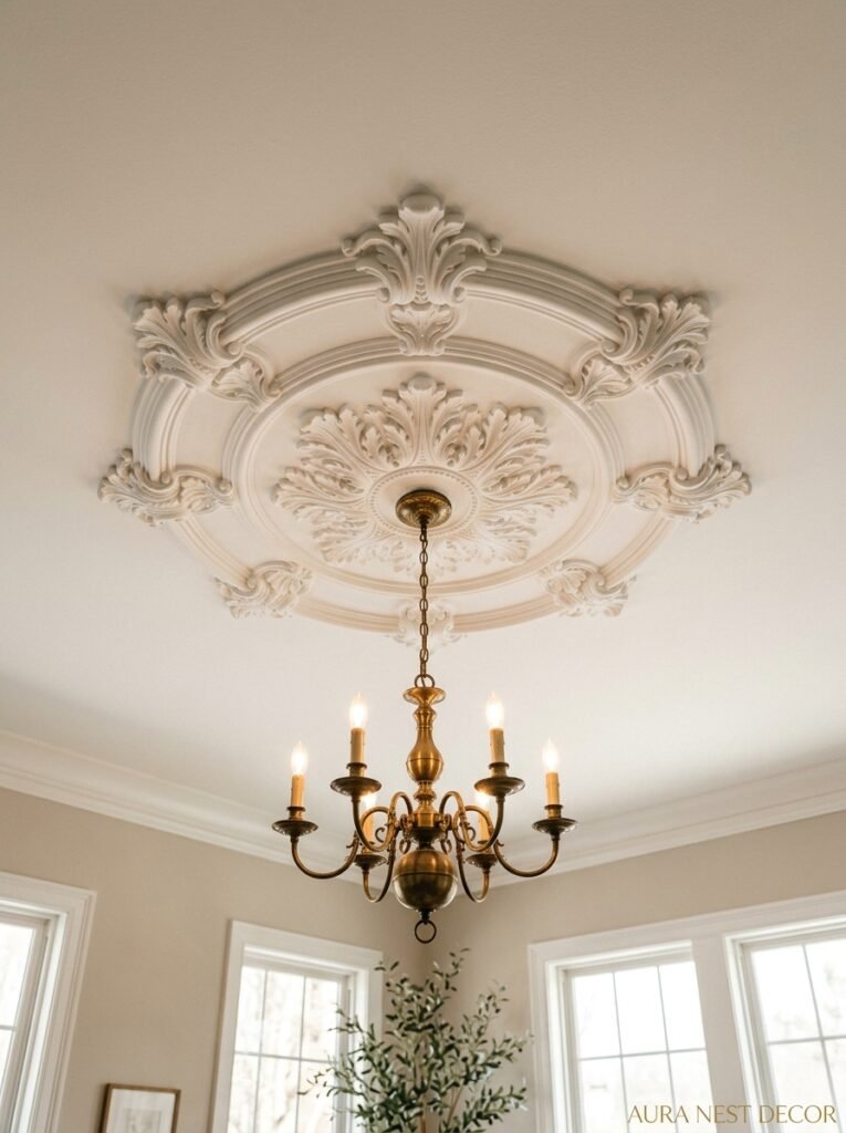
Here’s an opinion: plasterwork gets dismissed as fussy and old-fashioned by people who’ve only seen it done badly.
Done well — and by “done well” I mean thoughtfully placed, properly scaled, and painted in a way that either highlights or deliberately hides the detail — ceiling plasterwork is one of the most genuinely characterful things you can add to a living room. It has TEXTURE in a way that nothing else does. You can feel it with your eyes.
In older UK homes, original plasterwork is a gift that some people have literally painted over twelve times in magnolia. Please, stop doing that. Strip it back. Highlight the details with a contrasting tint. Let the house breathe.
For American homes without existing plasterwork, there’s a very good modern equivalent — lightweight polyurethane medallions and molding strips that install with construction adhesive and paint up beautifully. The key is keeping the scale proportional to the ceiling height and room size. And you don’t have to cover the whole ceiling. A center medallion anchored around a fixture, with a simple border of molding running around the perimeter, is restrained and elegant and does exactly enough.
—
8. The Wallpapered Ceiling That Sounds Insane Until You See It
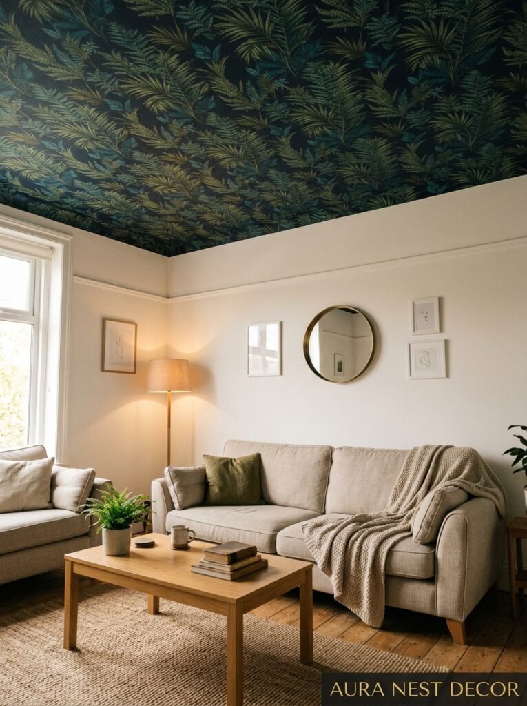
I’m going to say it: wallpaper on the ceiling is one of the best living room decisions you can make, and most people won’t try it because it sounds too bold.
It’s not that bold in practice. Most patterned ceiling wallpapers are subtle — a tonal texture, a very quiet botanical, a fine geometric in a shade close to the wall color. They add depth without screaming. And the effect in person is like the room has been completed somehow, like you’ve found the last piece.
The bolder version — a dark, dramatic, maximalist pattern overhead — is absolutely a thing, and it works in rooms that commit to a strong aesthetic rather than hedging. Deep indigo ceiling wallpaper with a small repeat above pale walls? Absolutely stunning, I don’t care what anyone says.
Practical note for anyone considering this: the ceiling needs to be smooth, the paper needs to be specifically suitable for ceilings (heavier papers are harder to work with overhead — use something lighter or vinyl-coated), and if you’re not a confident DIYer, this is worth hiring out. Misaligned pattern on a ceiling is very visible.
—
9. Low Ceilings Don’t Mean No Options — They Mean Different Ones
Right. So you’ve got an 8-foot ceiling — or god forbid, 7.5 — and you’re sitting there reading about coffered ceilings and thinking “not for me.” And look, some things genuinely won’t work. But there’s more headroom than you’d think (sorry).
The first thing to do with a low ceiling is paint it lighter than the walls, not white-white but a very light, barely-there version of whatever your wall color is. That creates a natural, airy gradient that lifts the eye.
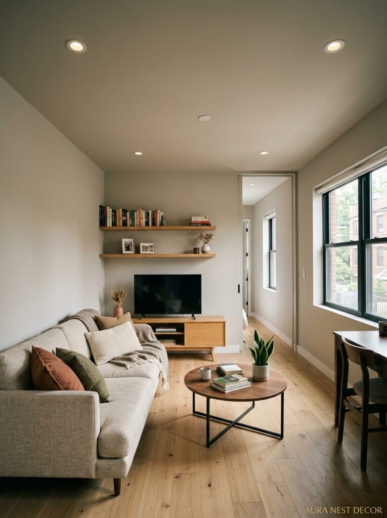
Second: keep the light source in the ceiling minimal and high. Flush mounts with serious design intention — not the builder-grade pancake lights — can be genuinely beautiful and don’t eat into your headroom. Low-hanging fixtures in a low-ceilinged room are a mistake I see constantly.
Third: vertical elements in the room (tall shelving, floor-to-ceiling curtains hung right at the ceiling line, tall plants) redirect attention so the ceiling doesn’t feel oppressive. It’s a kind of visual redirection.
And a subtle painted or wallpapered ceiling can absolutely still work — something tonal and light that adds texture without adding visual weight.
—
10. The Stretch Ceiling That Sounds Industrial But Isn’t
Stretch ceilings have a weird reputation. They get associated with commercial spaces, nightclubs, sort of-dodgy renovation shortcuts. But the contemporary residential version is a completely different product.
High-quality stretch ceiling systems — the kind being used in higher-end UK and US new builds — offer things a standard plastered ceiling genuinely can’t. Perfectly seamless finish, no cracking, integrated recessed lighting in any configuration, acoustic properties that genuinely reduce echo in open-plan living rooms. And they come in matte, satin, and even fabric-effect finishes that look genuinely beautiful.
The cost is higher than standard finishing, and it does require professional installation. But for open-plan living areas where lighting design matters and acoustics are a real issue — big rooms with hard floors and high ceilings — it’s worth knowing about.
—
11. How Ceiling Design Connects Everything Else in the Room
This is the thing that doesn’t get said enough: the ceiling doesn’t just exist above your room. It interacts with everything in it.
A dark ceiling makes warm-toned furniture glow. A textured wooden ceiling makes natural materials feel intentional rather than random. A dramatically lit ceiling makes art and objects on the walls look more considered. The ceiling, when it’s doing something, acts as a frame — it tells you how to read everything else.
Which also means the ceiling you choose has to make sense with what’s already in the room, or with the direction you’re headed. A coffered ceiling in a very minimal, pared-back Scandinavian-inspired living room is going to feel incongruous. A stark, unfinished exposed concrete ceiling above a cozy, layered, maximalist room is going to feel cold in all the wrong ways. The ceiling should feel like it grew from the room, not landed on it.
“The ceiling should feel like it grew from the room — not like it landed on it from a different design entirely.”
—
12. Where to Start When You Have No Idea Where to Start
Okay. You’re convinced something needs to happen. But you’re standing in your living room staring at a flat, white void and you genuinely don’t know where to begin.
Start with the light. Before you commit to any structural or decorative change, spend a week noticing how light moves through your living room. Morning light, afternoon, evening. North-facing or south-facing. Where the shadows fall, where the warmth pools. Because every ceiling decision — color, texture, fixture — is going to interact with that light, and understanding it first means you make smarter choices.
Then do one thing. Not five things. One. Paint the ceiling. Or add the pendant. Or put up the tongue-and-groove on just one section if it’s an L-shaped room. See how it feels before you commit to more. The rooms that look overdone almost always got there because someone tried to do everything at once, couldn’t stop, and never stepped back.
The best living room ceilings don’t look like someone was trying to make a statement. They look like someone knew exactly what they wanted. There’s a difference.
—
❓ FAQ
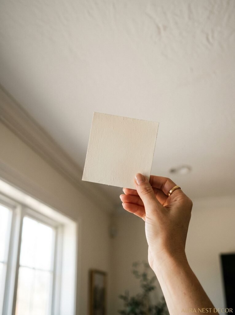
Q: What’s the easiest modern ceiling update that doesn’t cost a fortune? A: Honestly? Paint. Painting your ceiling a deep or interesting color is one of the highest-impact, lowest-cost changes you can make to a living room. A good quality ceiling paint, proper prep, and a weekend is all you need. Start there before committing to anything structural.
Q: Do dark ceiling colors make a room feel smaller? A: Not necessarily — it depends on the room. In a high-ceilinged room, a dark ceiling actually brings it down to a more intimate scale, which can feel more comfortable. In a low-ceilinged room, it can feel oppressive, which is why lighter or tonal colors work better there. The finish matters too — a matte dark ceiling recedes more than a satin one.
Q: Can I add beams to a modern, contemporary living room or do they only work in traditional spaces? A: You can, but you need to commit to the contrast. A very contemporary room with one organic, warm-toned beam feature can work beautifully — it’s the same logic as mixing an antique piece into a modern space. What doesn’t work is a lukewarm attempt: a few beams that feel like they weren’t sure if they should be there. Go all in or leave it alone.
—
💭 Final Thoughts
The ceiling’s been the forgotten room in the room for too long, and I think part of that is just habit — we decorate what we see at eye level and we forget to look up. But some of the most genuinely beautiful living rooms I’ve ever saved, or walked into, or lingered in without being able to explain why, had something happening overhead.
You don’t have to do something dramatic. Sometimes the right move is just to stop ignoring it.
What’s the one thing about your ceiling that’s been quietly bothering you every time you sit down in your living room?