
The Neutral Boho Living Room That Feels Like a Deep Exhale
You walk in, drop your bag, and something just… loosens. The room doesn’t shout at you. It breathes. That’s the quiet magic of modern boho done right in neutrals — and once you understand what actually makes it work, you’ll never look at a beige wall the same way again.
—
1. Why Modern Boho Neutrals Hit Different From Every Other Neutral Trend
There’s neutral, and then there’s this. The difference matters enormously.
Neutral in a minimalist room feels controlled — deliberate blank space, clean lines, nothing out of place. Neutral in a traditional room feels safe, maybe a little forgettable. But neutral in a modern boho room? It’s the opposite of empty. It’s full without being loud. Warm without screaming it. Layered in a way that looks effortless but absolutely isn’t.
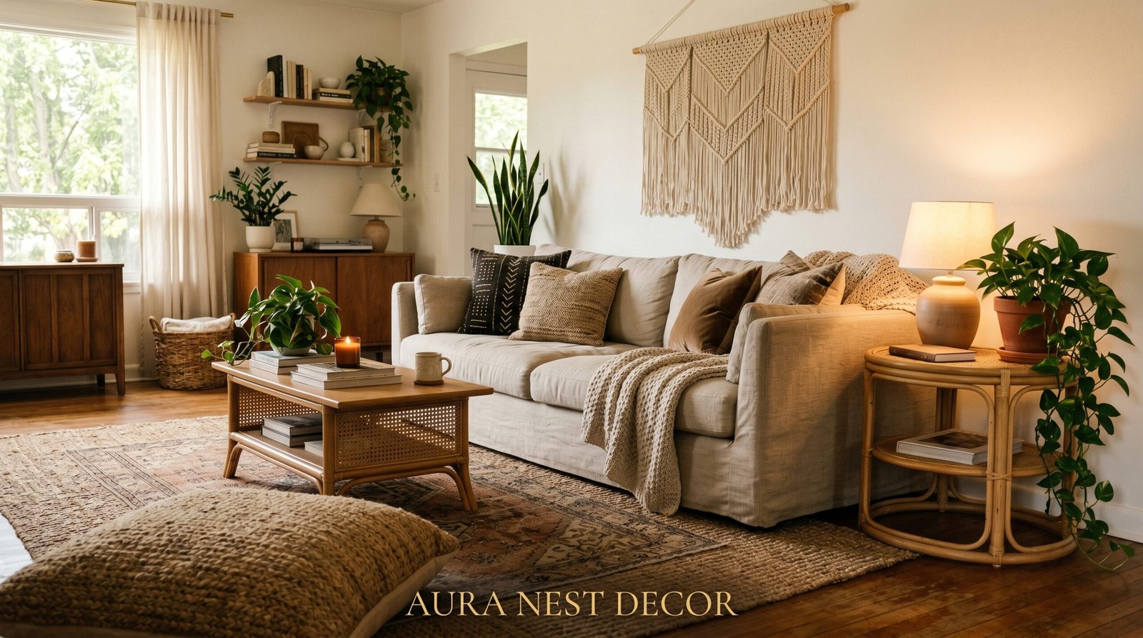
Modern boho neutrals live in a very specific palette. We’re talking warm sand, raw linen, undyed wool, weathered driftwood, soft terracotta that’s been washed back until it almost whispers. These aren’t the cold greys that dominated interiors for a decade. These are colours that feel like they came from somewhere — a beach in Devon, a market in Santa Fe, a farmhouse kitchen in the Cotswolds.
The “modern” part is what keeps it from tipping into maximalist chaos. There’s still an underlying structure. Clean furniture shapes. Intentional space. The boho layers live on top of that structure, not instead of it. That tension — order and wandering spirit existing in the same room — is exactly what makes it so endlessly satisfying to look at.
“Neutral doesn’t mean plain. It means the quiet confidence to let texture do all the talking.”
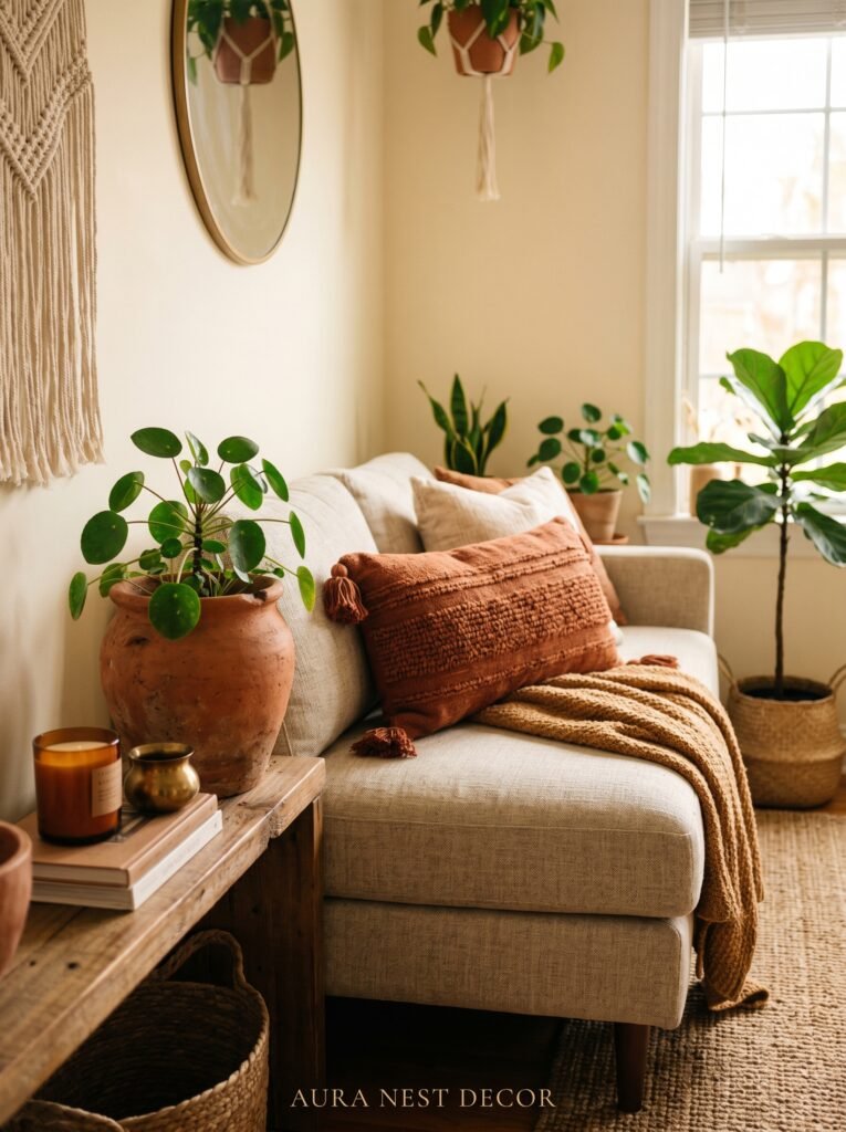
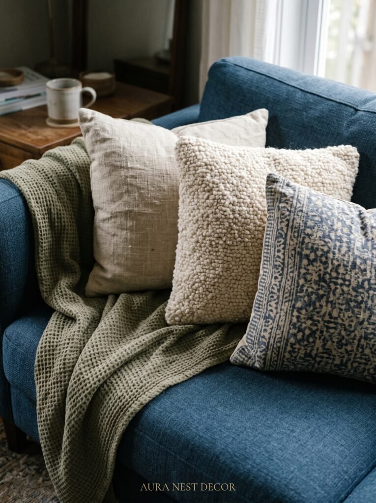
2. The Linen Sofa Debate — And Why the Answer Is Probably Yes
Everyone asks about linen sofas. They want one desperately, they’re terrified of them practically, and the answer is almost always: just get it.
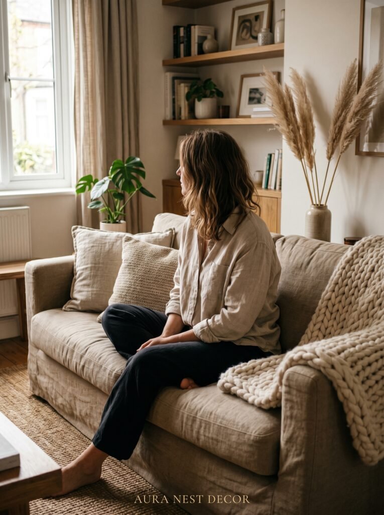
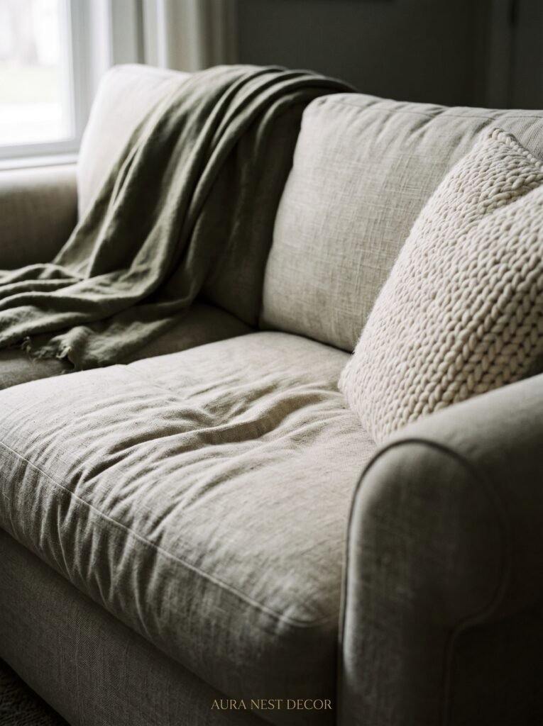
A linen sofa in warm oat or natural undyed fabric is the single piece that will anchor your modern boho room more than anything else. It’s not just a colour choice — it’s a texture choice, a feeling choice. Linen has this particular quality in afternoon light where it almost seems to glow from within. Not dramatically. Subtly. The way good things tend to be.
For practical concerns: yes, linen can wrinkle. Lean into it. The slight rumple is part of the aesthetic — it signals that this room is lived in, loved, used by actual humans and not staged for a catalogue shoot. A few things genuinely help: a tightly woven linen blend (mixed with a small percentage of polyester holds up far better than pure linen), removable washable covers if you have children or pets, and a slipcover style that allows the fabric to move naturally without fighting it.
American readers often worry about pet hair on light sofas. British readers tend to worry about the damp — linen in a poorly insulated Victorian terrace can hold moisture. Both concerns are real. The fix is the same: a good linen blend, not pure linen, keeps the look while dramatically improving performance. Pair it with a chunky throw in natural ivory wool draped over one arm. Not folded neatly. Just resting there, like someone just got up.
3. The Color That Keeps Showing Up in Every Beautiful Boho Room Right Now
Warm terracotta is having its moment, but the version showing up in the best rooms isn’t the bold, saturated clay-pot orange you might be imagining. It’s the washed-back version. The one that looks like it spent three summers in the sun.
Think of it as blush’s earthier, more interesting sibling. Where blush leans pink and soft, this particular terracotta leans warm and ancient — the colour of old roof tiles in Tuscany or a well-worn unglazed pot on a windowsill. As an accent in a neutral boho room, it does something remarkable: it grounds the space in warmth without adding visual noise.
Where does it show up? Everywhere and nowhere at once, which is the trick. A single terracotta ceramic vase on a low coffee table. A terracotta-toned cushion among five neutral ones. A woven basket in this colorway sitting by the fireplace. The point is saturation control — you’re not painting a wall in it (though a deep terracotta accent wall absolutely can work if you commit). You’re letting it appear in small, deliberate doses like a chord resolving in a piece of music.
Pair it with warm white walls, the oat linen sofa, raw wood, and aged brass. You’ll wonder how you ever decorated without it.
4. Rattan Doesn’t Have to Look Like a Holiday Let — Here’s the Distinction
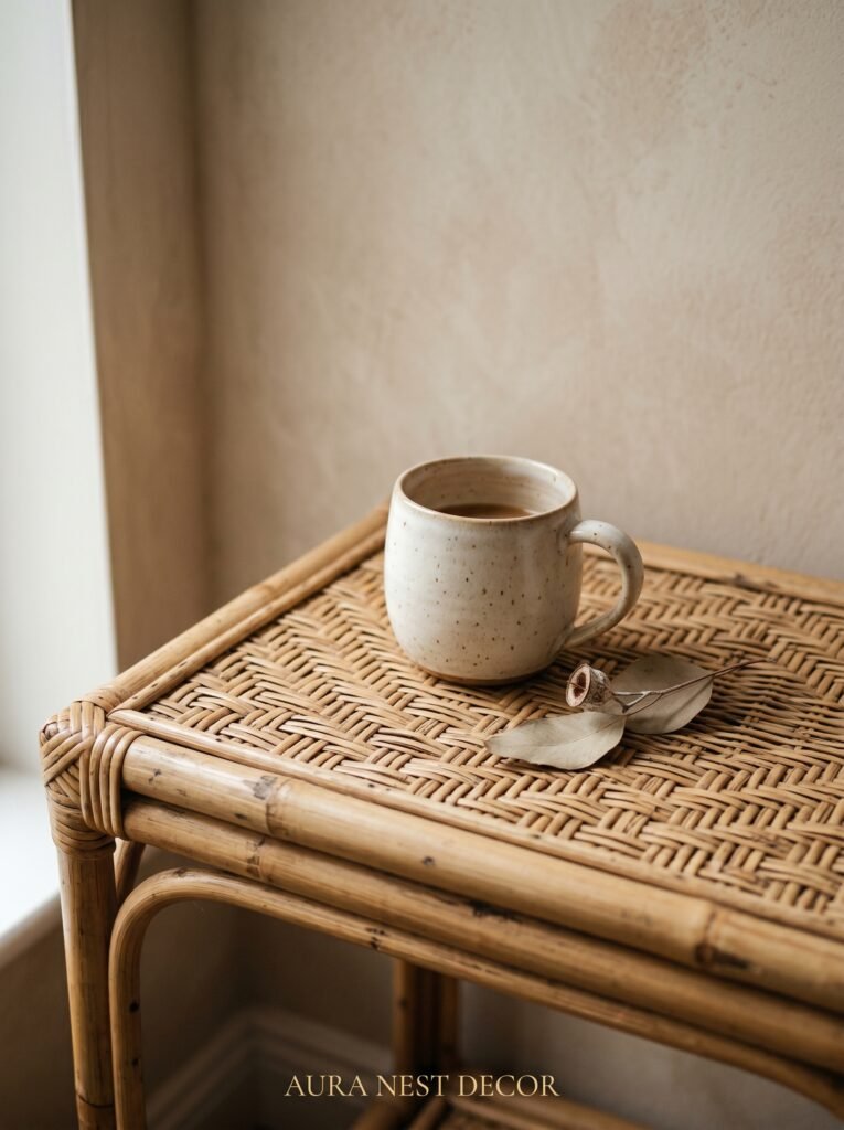
There is a version of rattan furniture that immediately conjures a budget Airbnb in Cornwall or a patio café that’s seen better days. And then there is rattan done with intention, and the distance between those two things is enormous.
The key to modern boho rattan is placement and proportion. One rattan piece — an armchair, a side table, a pendant light — reads as intentional. Three rattan pieces reads as a theme. Five rattan pieces reads as a decision you might regret. The single rattan accent armchair in a curved, organic shape is the current sweet spot. Not the enormous throne-style peacock chairs that dominated a few years ago. Something lower, softer, with a cushion in a warm neutral fabric that suggests the chair was chosen for comfort as much as for looks.
Rattan pendant lights are still brilliant, but the shape matters now more than ever. The open-weave globe style in a medium size, hung low over a coffee table or in a reading corner, creates that amber pooling effect in the evening that no other light fitting quite replicates. It’s the 7pm light that makes you want to pour a glass of wine and not move for three hours.
In the UK especially, pairing rattan with heavier textiles — a wool throw, a deeply textured rug — stops it from feeling summery or temporary. It grounds it. The juxtaposition of the lightweight woven furniture and the heavy, warm textiles is genuinely beautiful.
“One rattan piece is a choice. Five is a theme. Know the difference.”
5. The Rug Formula That Makes Any Neutral Room Feel Complete
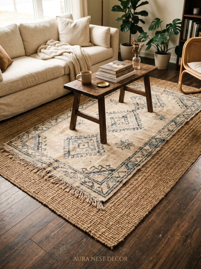
A rug can make or break a neutral boho room, and the mistakes people make are remarkably consistent. Too small. Too patterned. Too contrasted against the rest of the room.
The rule for size is non-negotiable: in a living room, all four legs of the sofa should sit on the rug, or at minimum, the front two legs. A rug that floats in the middle of a seating arrangement with no furniture touching it looks like it arrived in the wrong room. Size up. Almost always, size up.
For texture and pattern in a neutral boho room, natural fiber rugs are a revelation — jute, sisal, seagrass, and flat-weave wool all work beautifully. A jute rug has a particular quality of warmth underfoot and a slight roughness that reads as organic and grounding. The pattern doesn’t need to be complex. A simple geometric weave in warm cream and natural brings just enough visual interest without competing with the rest of the room.
The UK has a brilliant tradition of antique-style rugs in faded, muted tones — what designers call “worn” Persian or Moroccan styles — and these are magnificent in a modern boho neutral room. If you can find one at a car boot sale or in a charity shop in good condition, you’ve struck gold. The irregular pattern, the slightly uneven pile, the sense that the rug has a story — that is exactly the energy a boho room needs.
Layer them if you’re feeling adventurous. A smaller cowhide or a flat-weave cotton runner over a jute rug adds dimension and keeps that casual, collected-over-time feeling intact.
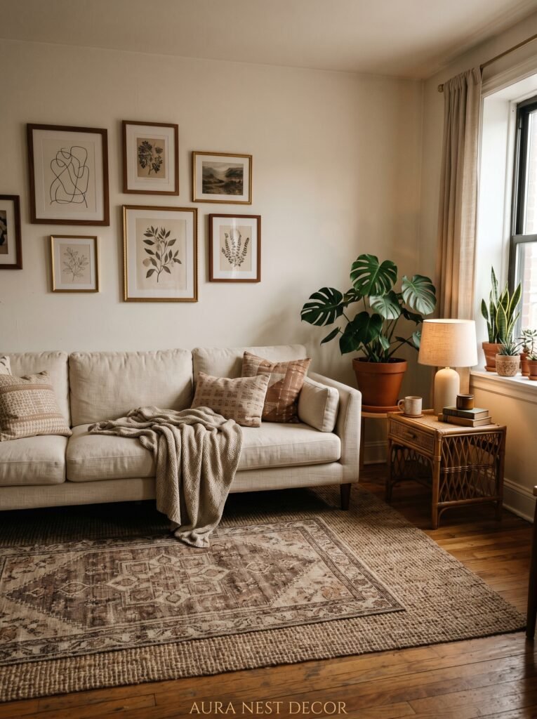
6. What to Do With White Walls When You Don’t Want White Walls
A lot of people start their boho neutral room with brilliant white walls because they’re renting, they’re nervous, or they genuinely thought it was a neutral. Then they wonder why the room feels cold and unfinished no matter how many throws they add.
White walls are not neutral walls. They are cold walls. And in a modern boho room, coldness is the enemy.
The solution is a warm white, a greige, or a soft sand tone — and in the UK especially, this shift makes an astonishing difference because British light is notoriously grey and flat for much of the year. Dulux’s “Natural Hessian” or Farrow & Ball’s “Elephant’s Breath” work beautifully as a warm backdrop. For American readers, Benjamin Moore’s “White Dove” or Sherwin-Williams “Accessible Beige” accomplish something similar — they read as neutral but carry warmth.
If you can paint, even just one wall in a deeper tone — a warm greige, a soft clay, a muted sage in that washed-out, low-saturation range — it will define the room and give your layered boho elements something to lean against. Textured paint finishes are having a genuine renaissance right now. Limewash paint in a warm putty tone applied with a wide brush for irregular coverage? It’s almost aggressively beautiful in a modern boho room. The uneven surface catches light differently throughout the day, and the texture adds exactly the kind of organic imperfection that makes a space feel alive.
7. The Art of the Boho Gallery Wall Without the Chaos
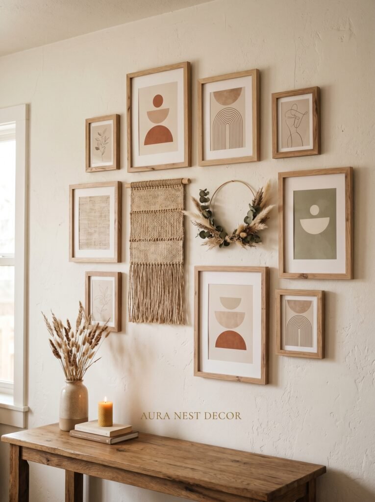
Gallery walls either look like they were curated by someone with a very clear vision or assembled in a feverish weekend with whatever was available. The difference is almost always editing.
In a modern boho neutral room, a gallery wall should feel collected, not cluttered. Botanical prints in simple wooden frames. A single piece of abstract art in earth tones. A small woven wall hanging — not the enormous macramé installations of five years ago, but something smaller and more refined. Black and white photography mixed with a watercolour. The key is consistent framing (wood tones and simple profiles, not a mix of ornate gold and cheap black plastic) and a coherent palette in the artwork itself.
Warm creams, warm whites, terracotta, sage, and charcoal — if every piece of art on your gallery wall lives within that range, the whole thing reads as intentional even if the styles vary wildly.
Spacing matters as much as the pieces themselves. Too tightly packed and it reads as frantic. Too spread apart and it loses cohesion. A rough guide: two to three inches between frames, and anchor the whole arrangement with your largest piece slightly left of centre to create visual interest.
“The gallery wall is where your room tells its story. Edit ruthlessly, then hang.”
8. Plants — But Specifically, the Ones That Actually Look Right
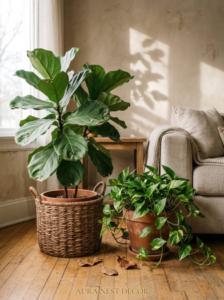
Not all plants suit a modern boho neutral room, and this is worth saying plainly. A succulent collection on a bathroom windowsill is lovely. A row of identical terracotta pots in uniform sizes feels more like a display than a living room. The difference, again, is variety and intention.
The plants that genuinely elevate a modern boho neutral space tend to be the ones with strong, organic shapes. A tall fiddle leaf fig or a bird of paradise in one corner provides vertical drama without any fussiness. A trailing pothos or devil’s ivy spilling from a high shelf adds that downward movement that makes rooms feel generous and full. A monstera — still — because it simply works. The sculptural quality of those split leaves against a warm white wall has not dimmed.
Pots matter as much as plants. In a neutral room, ceramic pots in warm white, sand, terracotta, and raw speckled stoneware are exactly right. Avoid anything too shiny or too industrial. The pot should look like it could have been found in a market, not ordered from a tech company.
Dried and preserved botanicals are also genuinely useful in a boho neutral room. Dried pampas grass is everywhere, yes, but for good reason — the soft, feathery heads in cream and blush catch light beautifully. Dried eucalyptus, dried cotton stems, even a simple bundle of dried wheat in a tall ceramic vase — these bring the warmth and organic form of plants without the maintenance.
9. The Coffee Table as the Room’s Most Important Story
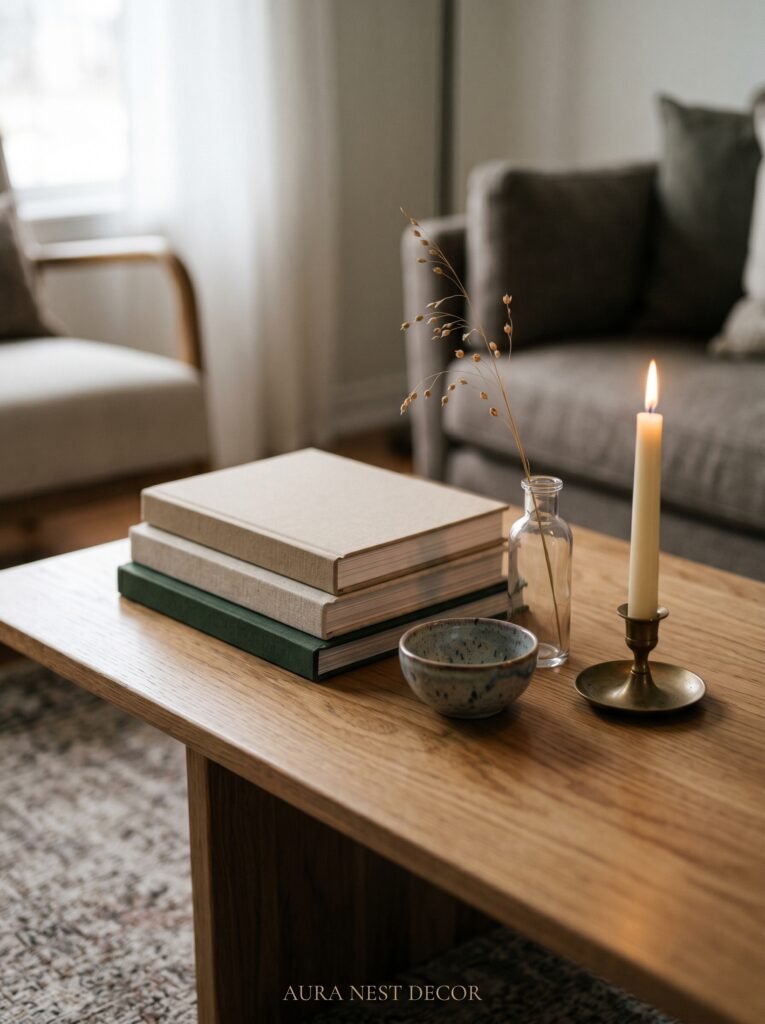
Your coffee table isn’t just a surface. In a modern boho room, it’s the edit. It’s where you show what the room is about.
Stack two or three large format books in neutral-toned spines — design books, travel photography, anything beautiful and matte-finished. Rest a single ceramic object on top: a handthrown bowl, a rough-edged tray, a sculptural vase. Add one living element — a small plant, a single dried stem. Leave space. The space is doing as much work as the objects.
In the UK, there’s a long tradition of cluttering every available surface, and the boho aesthetic can slide easily into hoarding territory if you’re not careful. Restraint in the boho context doesn’t mean minimalism — it means curation. Every object on that coffee table should be there because it’s beautiful or meaningful. Nothing should be there because it landed there.
The coffee table itself: a reclaimed wood top with simple legs in a natural or matte black finish is timeless. Rattan or wicker as a tray on top of a more substantial table works well. A low-profile concrete or stone coffee table grounds the room beautifully with organic texture while maintaining clean lines.
10. Lighting — The Part of the Room That Everyone Gets Wrong
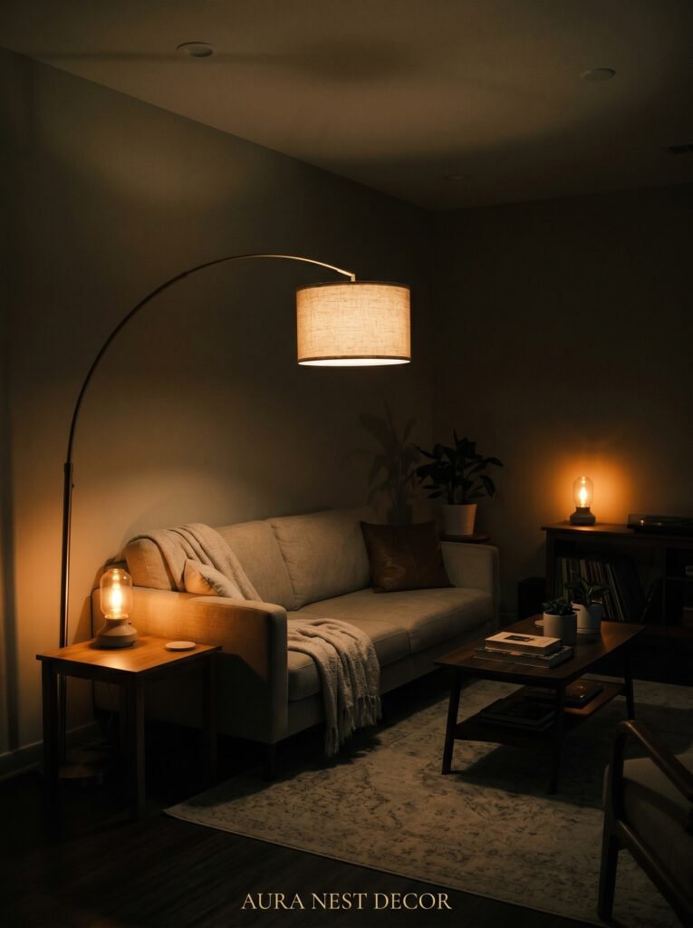
The overhead light is almost certainly ruining your room. This is a difficult truth but an important one.
Overhead lighting in a living room, especially harsh LED downlighters or a single central pendant on full brightness, flattens everything. It removes shadow, which removes dimension, which makes all those beautiful textures you’ve carefully layered look like a flat, overexposed photograph.
The fix is layers of lower light sources. A floor lamp in a warm-toned shade beside the sofa. The rattan pendant mentioned earlier, but on a dimmer, hung low. Table lamps on side tables and shelving units, all in warm-white bulbs (2700K or lower — this matters, write it down). Candles, always candles, in simple ceramic or glass holders scattered at different heights across the room.
In the UK, given the prevalence of grey skies and dark evenings for half the year, this lighting approach isn’t just aesthetic — it’s psychological. A living room lit with multiple warm sources at different heights in the evening creates a cocoon that genuinely affects your mood and your sense of comfort in the space.
In the US, where air conditioning often means rooms are sealed and artificial light does more heavy lifting, the same principle applies. You want the room to feel like it’s lit from within, not from above.
11. Textiles — The Difference Between Collected and Contrived
The layered textiles in a great modern boho room look like they were gathered slowly, from different places, over different seasons. The truth is they usually were. And when they’re not — when someone orders ten matching cushions from a single online retailer in one afternoon — the room always reveals it.
This is the texture principle: vary the material, not just the colour. Linen cushions alongside chunky wool throws alongside a velvet cushion in deep terracotta alongside a woven cotton bolster. Same neutral palette. Completely different hands. The variety of tactile experience when you sit in the room — reaching out and touching the sofa, pulling the throw over your legs, leaning back against the cushions — that variety is the boho warmth that makes people want to stay.
Cushion arrangements: an odd number almost always looks more natural than an even number. Five on a three-seater sofa. Three on an armchair. Let some lean and tilt slightly. You’re not styling a shop window. You’re creating a room where someone actually lives.
The throw: leave it imperfect. Drape it over one arm of the sofa or fold it loosely in a large woven basket on the floor beside the coffee table. A chunky knit throw in natural ivory or warm oatmeal does something no other single textile quite does — it immediately makes the whole room feel like it’s been loved.
12. The One Rule That Makes a Neutral Boho Room Feel Intentional Instead of Accidental
Here it is. The thing that separates a room that looks beautiful from a room that just looks beige with stuff in it.
Every single element needs to be warm-toned. Not some of them. All of them.
Metal accents: aged brass, brushed gold, or matte black — never chrome or silver or nickel. Wood: warm oak, walnut, light pine with a honey stain — never grey-washed or whitewashed. Ceramics and pottery: creamy white, terracotta, matte sand — never stark white or cool grey. Plants: green-toned and lush — not the kind of succulents that lean blue or purple. Art: warm palette throughout.
The reason this rule is so important is that neutral rooms live or die by their undertone. A warm neutral room in amber, honey, and sand creates a completely different atmosphere from a cool neutral room in grey, slate, and steel. They’re both technically “neutral,” but one feels like a cashmere jumper and one feels like a waiting room.
You’re going for cashmere. You’re going for the room that makes people walk in and immediately say I want to sit down and never leave. The way to get there is rigorous, almost obsessive warmth in every single element you bring into the space.
Don’t skip this step. It’s the whole thing.
—
❓ FAQ
Q: How do I make a neutral boho room work in a small living room? A: The principles are identical, but scale down the number of layers rather than the quality of them. One large rug, one statement plant, fewer cushions, and lighting at multiple heights will achieve the same warmth in a smaller space without making it feel overcrowded. The biggest mistake in small spaces is going too small with everything — a medium rug that doesn’t anchor the furniture will make the room feel smaller, not larger.
Q: Can I do modern boho on a budget in the UK or US? A: Absolutely — and in many ways, the aesthetic suits a budget better than most. Charity shops and thrift stores in both countries are full of the exact ceramic pieces, woven baskets, wooden trays, and textured throws that make this look work. The linen sofa is the one area where spending more genuinely pays off in durability and appearance. Everything else can be found, sourced, or made inexpensively over time.
Q: What’s the difference between modern boho and traditional bohemian decor? A: Traditional bohemian decor tends to embrace saturated colour, bold pattern, heavy layering, and an anything-goes eclecticism. Modern boho takes the same love of texture, natural materials, and collected-over-time feeling but filters it through a more restrained, neutral palette and cleaner furniture forms. The result feels calmer and more contemporary while keeping all the warmth and personality of its roots.
—
💭 Final Thoughts
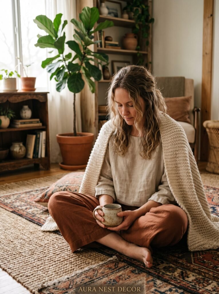
The best modern boho neutral rooms I’ve ever seen all share one quality: they look like someone lives there completely and happily. Not like a page from a magazine. Not like a showroom. Like a real life, warmly and intentionally lived.
That’s actually the goal. Not perfection — presence. Not a styled snapshot, but a space that gives something back to you every time you walk into it.
So, what’s the one thing in your living room right now that isn’t warm-toned — and what would you replace it with?


