
The Sitting Room Glow-Up Nobody Talks About: 12 Modern Luxury Ideas That Actually Feel Lived In
You walk into a room and something just settles in your chest. You can’t name it immediately. But you know you want to stay. That’s the difference between a sitting room that looks expensive and one that feels it — and the gap between those two things is exactly what we’re exploring today.

—
1. The Sofa Choice That Changes Everything Else in the Room
Start here. Not with paint. Not with cushions. The sofa.
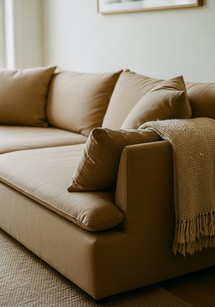
Most people get this wrong because they pick the sofa they think they should want — the cloud-grey modular, the safe beige corner unit — and then spend years wondering why the room never quite clicks. A modern luxury sitting room doesn’t play it safe with its anchor piece. It commits.
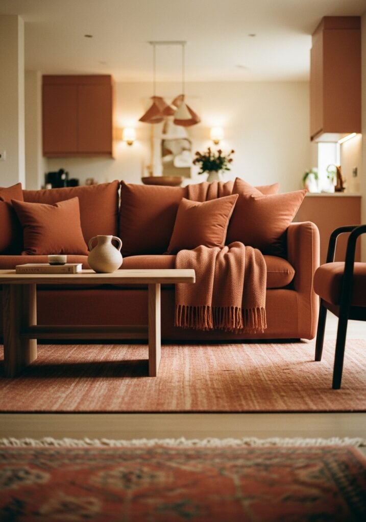
Right now, the sofas doing the most interesting work in beautifully designed rooms are low-slung, with clean geometric lines and fabric that has some substance to it — a deep boucle, a heavyweight linen, a velvet that doesn’t apologize for itself. Rust, warm camel, forest green, even a confident navy. These colours hold a room in a way that greige simply doesn’t.
The key is proportion. A sofa that sits too high makes a room feel like a waiting area. Drop the seat height down — somewhere around 17 to 18 inches from floor to cushion — and suddenly everything looks more intentional, more European, more designed. Pair it with a low coffee table and you’ve done more work than any gallery wall could ever do.
One more thing: stop trying to match the sofa to your walls. The most interesting rooms let the sofa be its own statement and build everything else in conversation with it, not in agreement.
“The sofa isn’t the backdrop — it’s the opening line of the whole story.”
—
2. Why Warm Lighting Is the Cheapest Luxury You’re Not Using
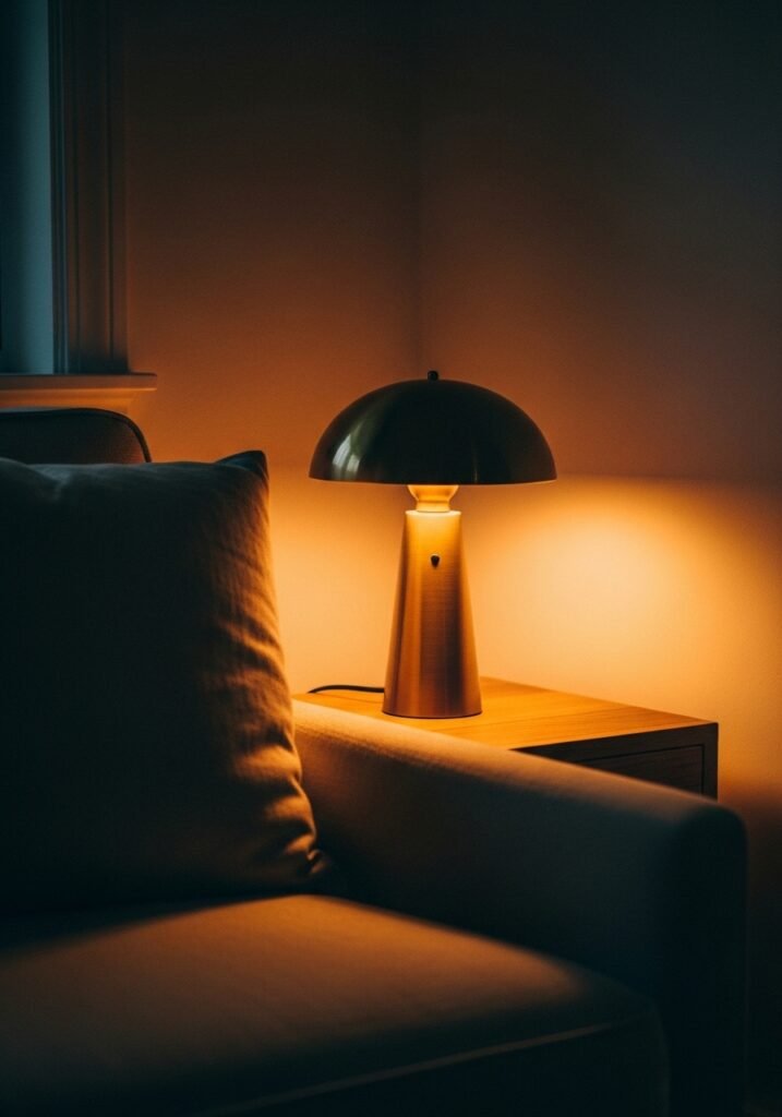
Overhead lighting is the enemy of atmosphere. There. Said it.
Nothing kills the feeling of a considered, beautiful sitting room faster than a single ceiling light doing all the heavy lifting at 6pm on a Tuesday in November. And yet, this is still the default in most homes — American and British alike — and it’s such a fixable problem.
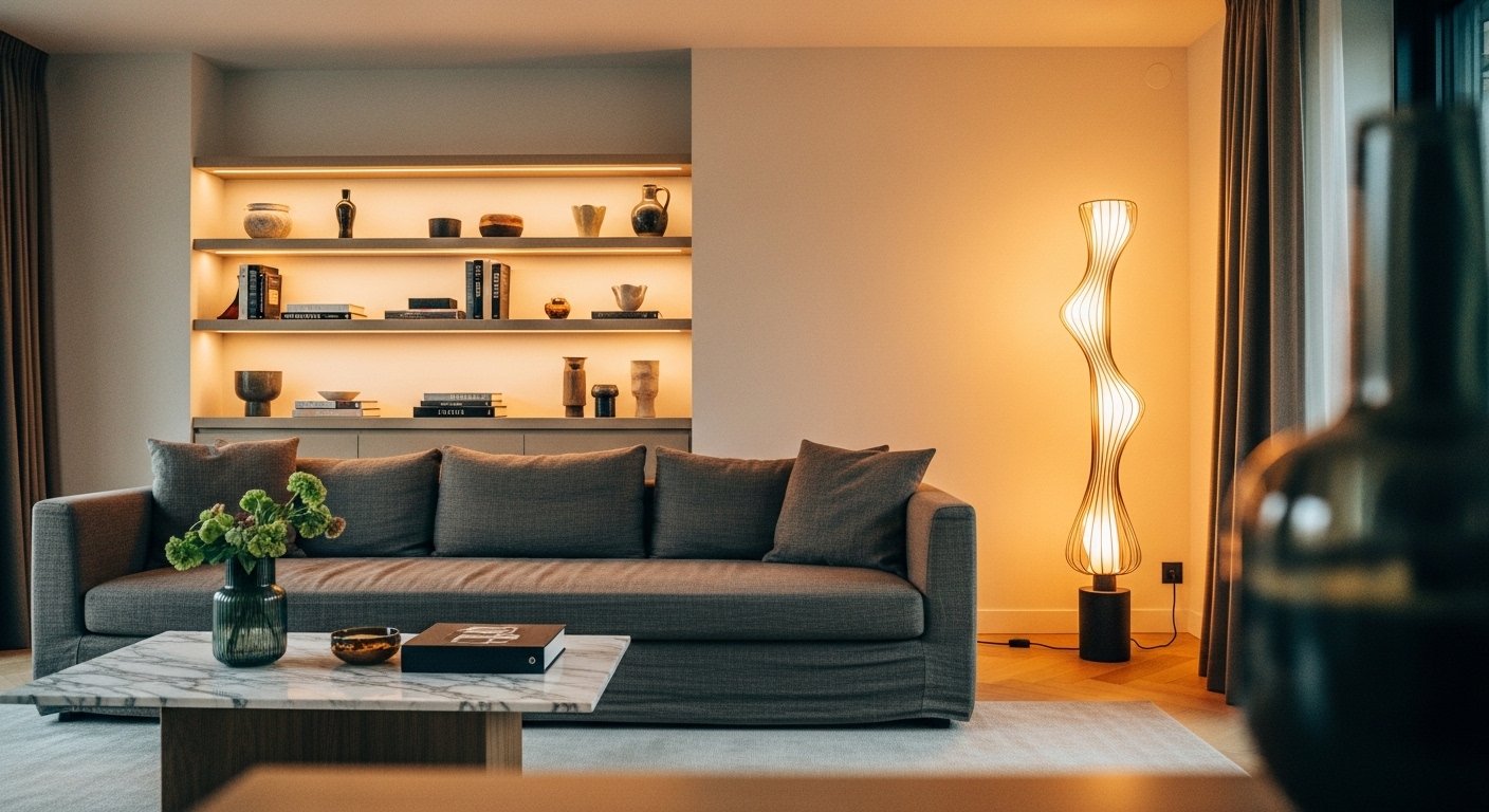
Modern luxury lighting is about layering. A floor lamp in the corner that throws amber light upward. A table lamp on a side table beside the sofa that creates a warm pool of glow at sitting height. Candles — real ones, on a tray on the coffee table, not tucked away for “special occasions.” The combination of three or four light sources at different heights creates depth. It makes a room feel like it has been thought about.
For bulb temperature: 2700K is your friend. It’s the warm end of the scale, the glow that makes skin look good and rooms look cosy without tipping into orange. Edison-style filament bulbs work beautifully in exposed fittings. A dimmer switch on whatever overhead light you do have is non-negotiable — it might be the single best home improvement you make this year for under £30 or $40.
The shift when you get lighting right is not subtle. It’s the difference between a room you pass through and a room you actually sit down in.
—
3. The Color That Keeps Showing Up in Every Beautiful Sitting Room Right Now
It’s not white. It’s not grey. It’s not even the much-discussed “greige.”
The colour appearing in the most stunning sitting rooms across Pinterest boards, interior design magazines, and newly renovated townhouses from London to Chicago right now is a warm, dirty off-white with a dusty green undertone. Think aged linen. Think the colour of old French walls. Think Farrow & Ball’s Mole’s Breath or Elephant’s Breath, or Benjamin Moore’s Pale Oak heading in a softer, more complex direction.
What makes this family of colours so compelling for modern interiors is the way it holds light. In the morning, these walls look almost white. By evening, under warm lamplight, they shift into something richer, more amber. The room changes throughout the day without you touching a thing.
This is the opposite of a flat neutral. It has character built in.
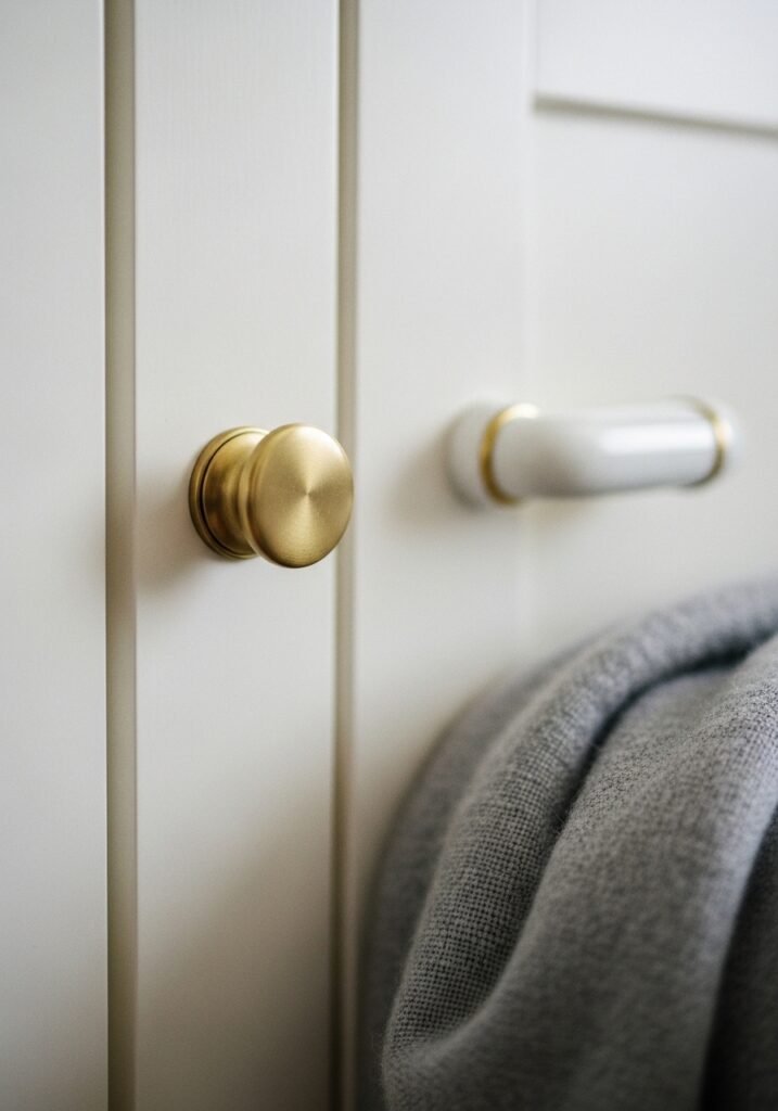
If you’re painting a sitting room in a UK terrace or a US craftsman bungalow, this direction gives you the clean lines of modern design without the coldness that pure whites can sometimes bring — especially in rooms with north-facing light. And it plays beautifully with natural wood, brass hardware, cream textiles, and that deep sofa colour we talked about earlier.
—
4. What Europeans Do With Sitting Room Shelving That Americans Rarely Try
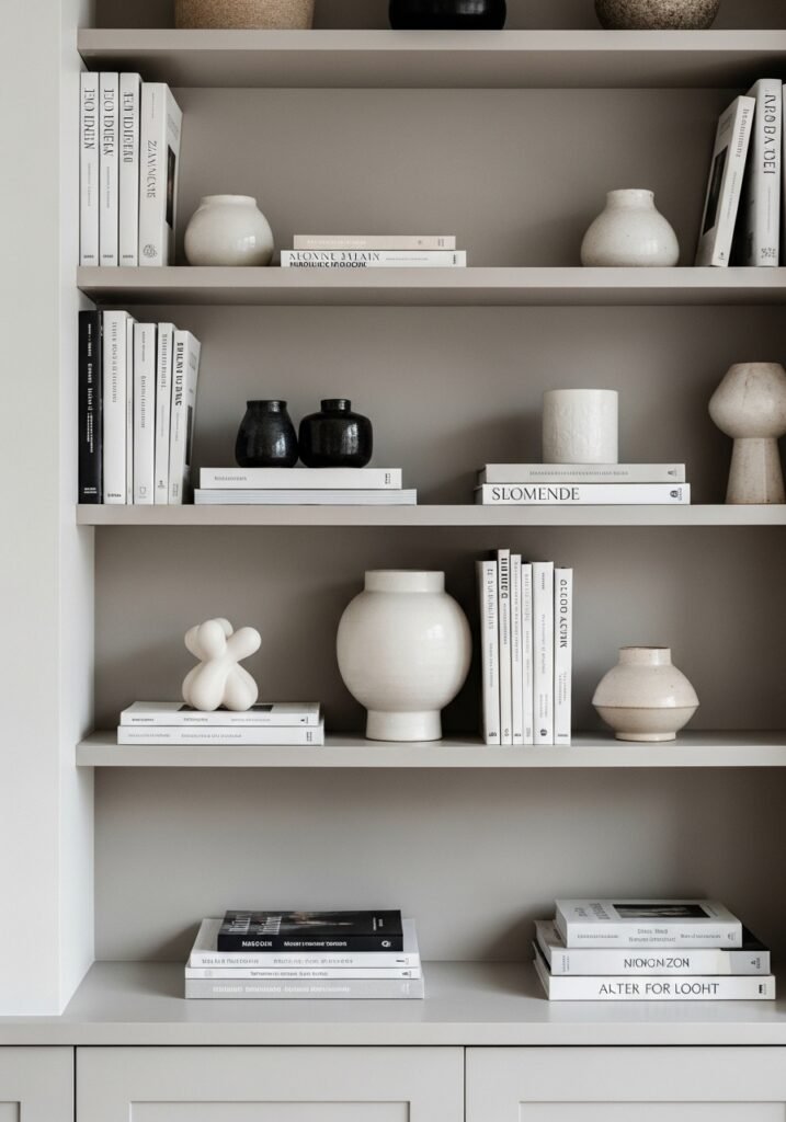
There’s a fundamental philosophical difference in how Europeans and Americans tend to approach bookshelves and built-in shelving — and it’s worth crossing that divide.
American shelving tends toward symmetry. Pairs of objects, centered arrangements, everything balanced. It’s tidy and it’s pleasant, but it rarely has the kind of magnetic, slightly chaotic energy that makes you lean in and look.
European-style shelving — particularly the approach you see in Parisian apartments, Danish homes, and certain parts of London — mixes books spine-out with books stacked flat as risers for objects. Ceramics with real presence. A single framed print leaning against the back of the shelf. A vase that’s slightly too tall and has to angle slightly. Nothing matches, but everything speaks the same language.
The luxury version of this in a modern sitting room means choosing objects that have genuine weight and personality — a rough-glazed ceramic bowl, a brass candlestick that’s actually been used, a plant that’s allowed to grow in interesting directions rather than being constantly pruned into submission. Let some shelves be nearly empty. Let some feel full. Resist the urge to fill every inch with something decorative, because the negative space is doing work too.
The shelving in a beautifully designed room tells you something about the person who lives there. Aim for that.
“A shelf that tells a story is worth more than a shelf that photographs perfectly.”
—
5. The Rug Size Mistake That’s Making Your Room Look Half-Finished
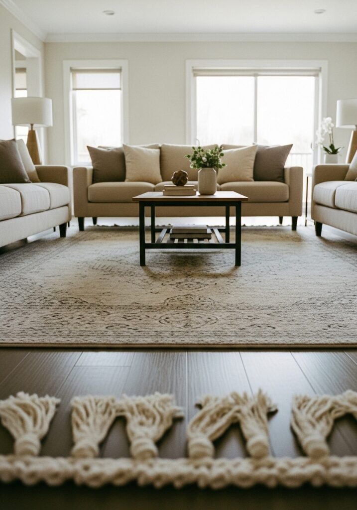
Almost every sitting room I’ve ever photographed or admired with a problem I couldn’t immediately name had the same invisible issue once I looked properly.
The rug was too small.
A rug that floats in the middle of a room with all the furniture legs hovering off its edges creates visual chaos. The eye doesn’t know where the space begins and ends. The whole room feels unanchored, like it’s in the middle of being arranged rather than finished.
The standard advice — and it’s correct — is that all main seating furniture legs should sit on the rug, or at minimum the front two legs of each piece. For a typical sitting room in a British semi-detached or an American open-plan living area, this usually means going larger than feels comfortable when you’re standing in a shop. A 9×12 foot rug is rarely “too big.” An 8×10 is often on the edge. A 5×8 is almost always fighting for its life.
For modern luxury, the rug material matters as much as the size. A flatweave jute gives wonderful texture but limited softness. A low-pile wool in a warm tone — champagne, ivory, warm terracotta — creates that underfoot luxury that makes a room feel properly finished. Persian-inspired patterns are having a significant moment in contemporary interiors right now, particularly in rooms with otherwise modern, clean-lined furniture. The contrast reads as sophisticated rather than mismatched.
—
6. One Plant That Does More Design Work Than an Entire Vase Collection
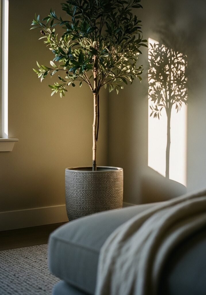
This is a somewhat controversial opinion and I’m standing by it.
A single, large, genuinely well-cared-for plant in a sitting room does more for the feeling of the space than a whole curated collection of small decorative objects on a surface. The scale creates presence. The living, slightly imperfect quality of it introduces something no purchased item can: organic, real beauty.
For a modern sitting room, the plants doing the most interesting design work right now are the ones with architectural form. A large fiddle-leaf fig in a terracotta pot near a window. A monstera that’s been allowed to properly mature and develop its splits. An olive tree in a matte black planter. These aren’t trendy in the way that comes and goes — they’re genuinely beautiful, and they reference the natural world in a way that makes interiors feel warm and alive rather than like a showroom.
The pot matters enormously. A beautiful plant in a cheap plastic pot is a design opportunity wasted. Invest in the vessel. Handmade ceramic, aged terracotta, textured concrete — these hold their own visually and add to the room even in the winter months when a plant might not be at its lushest.
If you keep one thing from this section, let it be this: go bigger than feels reasonable. The plant that makes a room is never the small one on the windowsill. It’s the one that takes up real space and demands to be looked at.
—
7. The Coffee Table Combination That Beats Any Single Perfect Find
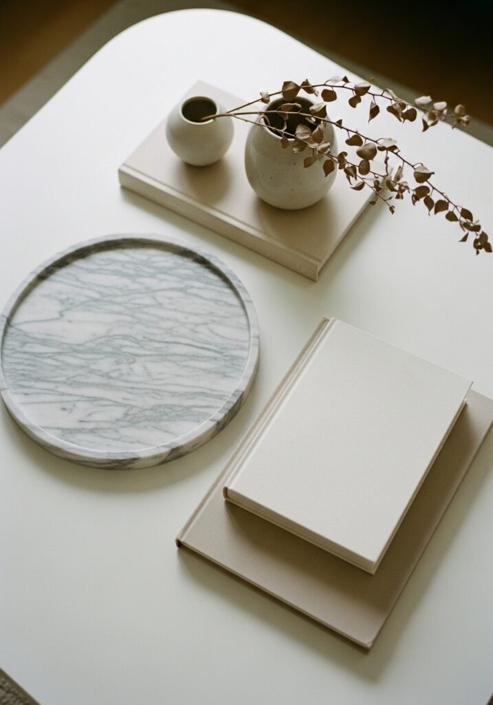
There’s a particular kind of sitting room styling that looks interesting in a way that’s hard to copy directly but easy to understand once you see the principle behind it: two coffee tables instead of one.
Not a matching set. Two genuinely different pieces that happen to work together. A low rectangular table in light wood or marble, paired with a smaller round table slightly overlapping or adjacent. A large Ottoman tray table beside a small stone cube. The combination creates a visual dynamic that a single table — no matter how beautiful — can’t replicate.
It also solves the practical problem that one table never quite does everything you need. You need surface space for a drink, a candle, the remote, a book, and some kind of decorative moment all at once. Two tables give you permission to have all of those things without the surface feeling overwhelmed.
For styling the surfaces: the rule of varying heights applies here too. A tall candle, a low bowl, a stack of books with something on top. The eye moves between the levels and the whole arrangement reads as intentional and considered rather than cluttered.
“Two imperfect tables styled with intention will always beat one ‘perfect’ table styled without it.”
—
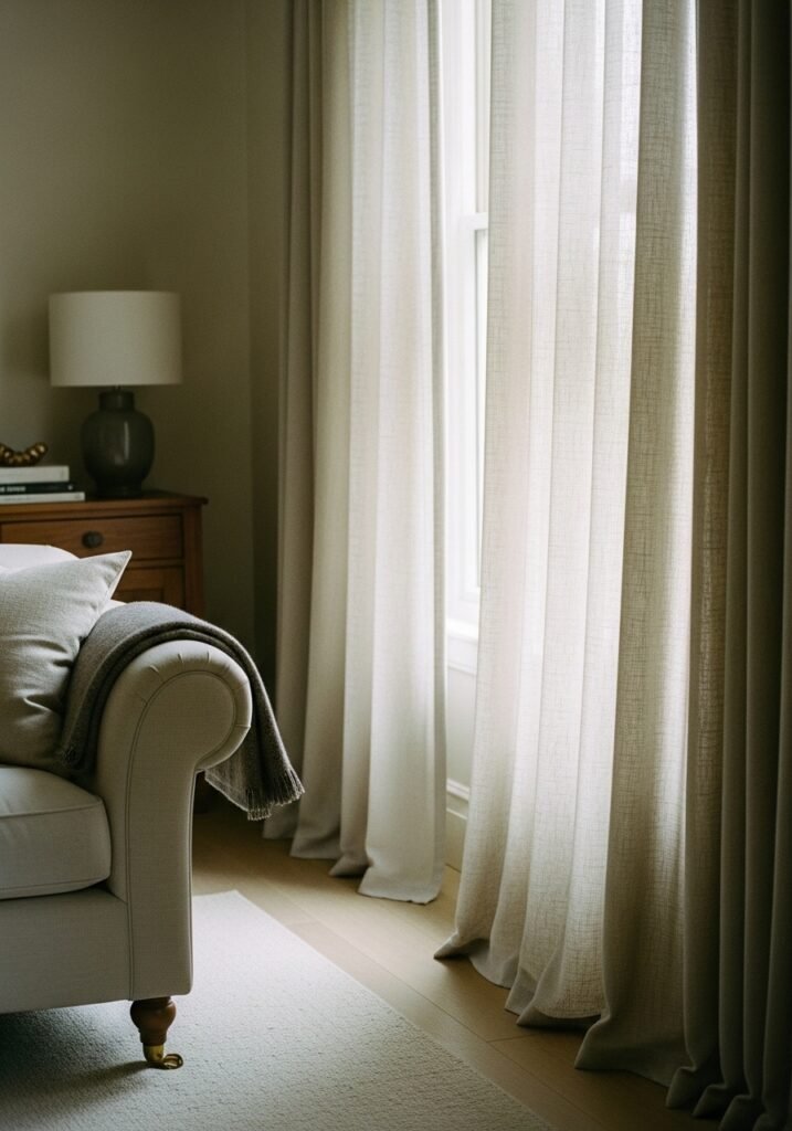
8. How British Sitting Rooms Handle Curtains Differently — And Why It Works
This is one of the clearest areas where British interior design leads and American homes could genuinely learn something: the relationship between curtains and windows.
In the US, curtains are often hung at window width — starting just at the edge of the frame and falling just to the sill or slightly below. It’s functional. It’s fine. But it makes the window, and therefore the room, feel smaller and lower than it actually is.
British decorators — particularly in the more formal sitting rooms of Georgian terraces and Victorian semis — hang curtains wide and tall. Wide means the curtains start 6 to 8 inches outside the window frame on each side, so that when they’re open, they stack against the wall rather than blocking light. Tall means the curtain rod is hung high — sometimes 4 to 6 inches from the ceiling — and the curtains fall in a gentle puddle on the floor.
The effect is dramatic without being theatrical. The window looks larger. The ceiling feels higher. The room immediately reads as more luxurious.
For modern interiors, linen curtains in a warm natural tone do this beautifully. They move in the air when windows are open, they hold the light in a lovely way, and they drape with that slightly imperfect, effortless quality that makes a room feel like it evolved rather than being set-dressed.
—
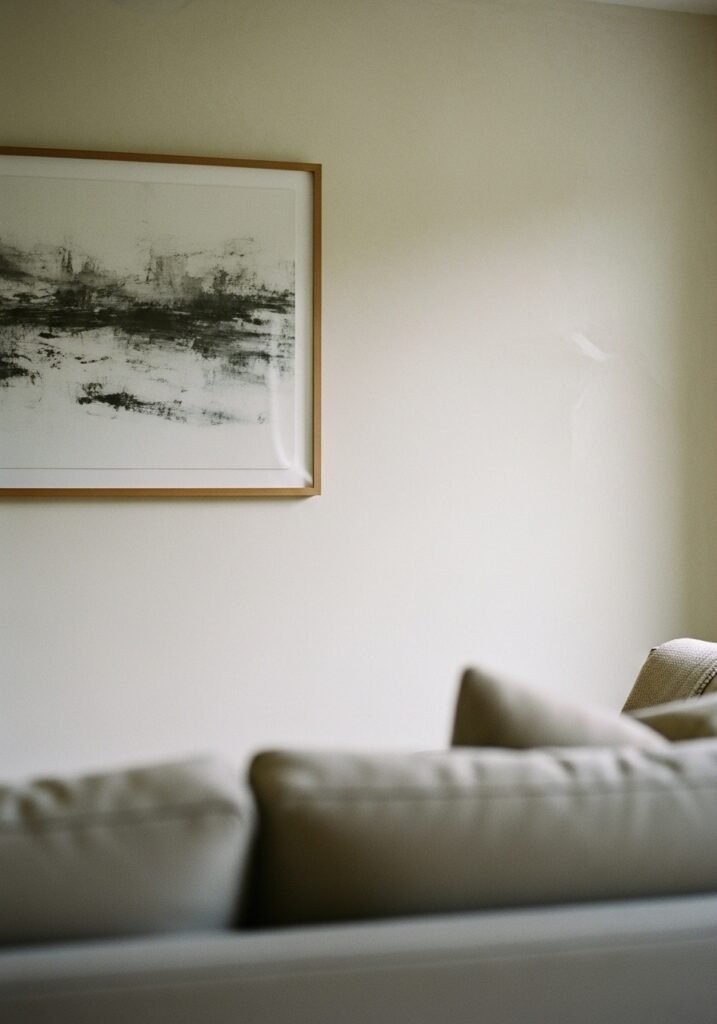
9. The Wall Treatment That’s Replacing Gallery Walls in Modern Luxury Interiors
Gallery walls had their moment. A long, well-lived moment. But the sitting rooms that feel most current and most quietly luxurious have moved toward something else.
One large piece. Or an intentional pairing of two pieces that aren’t matching but are clearly in conversation with each other.
The thinking here is about confidence. A gallery wall, at its best, tells a personal story. But at its most common, it’s a way of filling space without fully committing to a statement. One significant piece of art — or one very large framed print — requires commitment. It says: this is what I chose. This is what I see every time I sit down.
For size, the piece should feel almost uncomfortably large in the shop or on the website. Art that looks “right” in proportion when you first hang it usually disappears once the furniture is in place. Go bigger. For modern luxury, abstract works in earthy tones, large-format photography in black and white, or oversized botanical prints all read beautifully against those warm off-white walls we talked about earlier.
And hang it lower than you think. Eye level when sitting, not eye level when standing. You live in this room seated, so that’s where the art should land.
—
10. What Happens When You Bring Texture Instead of Pattern
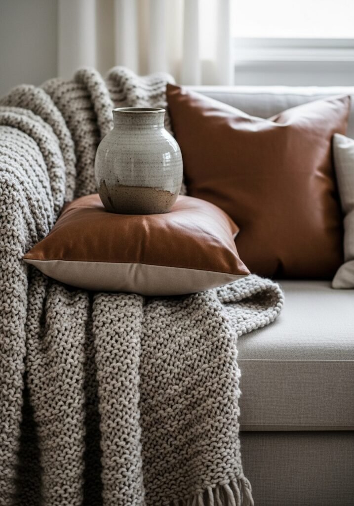
There’s a version of sitting room design that relies heavily on pattern — bold cushions, printed rugs, patterned wallpaper — and it can be spectacular when done with real intent. But for a modern luxury interior, the subtler and more sophisticated approach is to build the room in texture rather than print.
Texture means the nubbled surface of a boucle cushion next to the smoothness of a linen throw. A rough-glazed vase beside a polished marble coaster. A jute rug under a velvet sofa. A knitted blanket folded over an armrest. None of these patterns clash because there are no patterns to clash — but the room has enormous visual interest because every surface is doing something tactile.
This is the approach you’ll see in the most refined modern interiors, where nothing shouts but everything rewards close attention. The room looks calm. Then you sit in it and your hand keeps reaching out to touch things. That’s the signature of great material layering.
Keep your palette narrow — three or four tones that all belong to the same warm family — and vary the textures within it. The result is a room that feels considered, quiet, and genuinely expensive without a single piece of furniture needing to be.
—
11. The One Rule That Makes Any Sitting Room Feel Intentional, Not Just Decorated
Everything in the room should be doing at least two things.
This sounds like a design school exercise but it’s actually just practical wisdom that the best decorated rooms follow instinctively. A lamp that provides light and makes a sculptural statement. A throw that adds warmth and colour. A coffee table book that adds height to a surface arrangement and is actually read. A side table that holds a lamp and creates a nook feeling beside the sofa.
When every piece is doing double duty — functional and beautiful, grounding and interesting — the room never feels over-decorated or staged. There’s a logic to it that visitors sense without being able to name.
This rule also helps with editing, which is the skill that separates good interiors from great ones. If something in the room is only decorative and doesn’t contribute texture, atmosphere, comfort, or genuine visual interest, it’s probably not earning its place. Take it out. Live with the gap. You’ll usually find the room breathes better without it.
The sitting rooms that stop people mid-scroll on Pinterest aren’t the fullest ones. They’re the most edited ones.
—
12. The Detail That Signals Quiet Luxury Without Spending Luxury Money
Trays.
I know it sounds small. But hear me out.
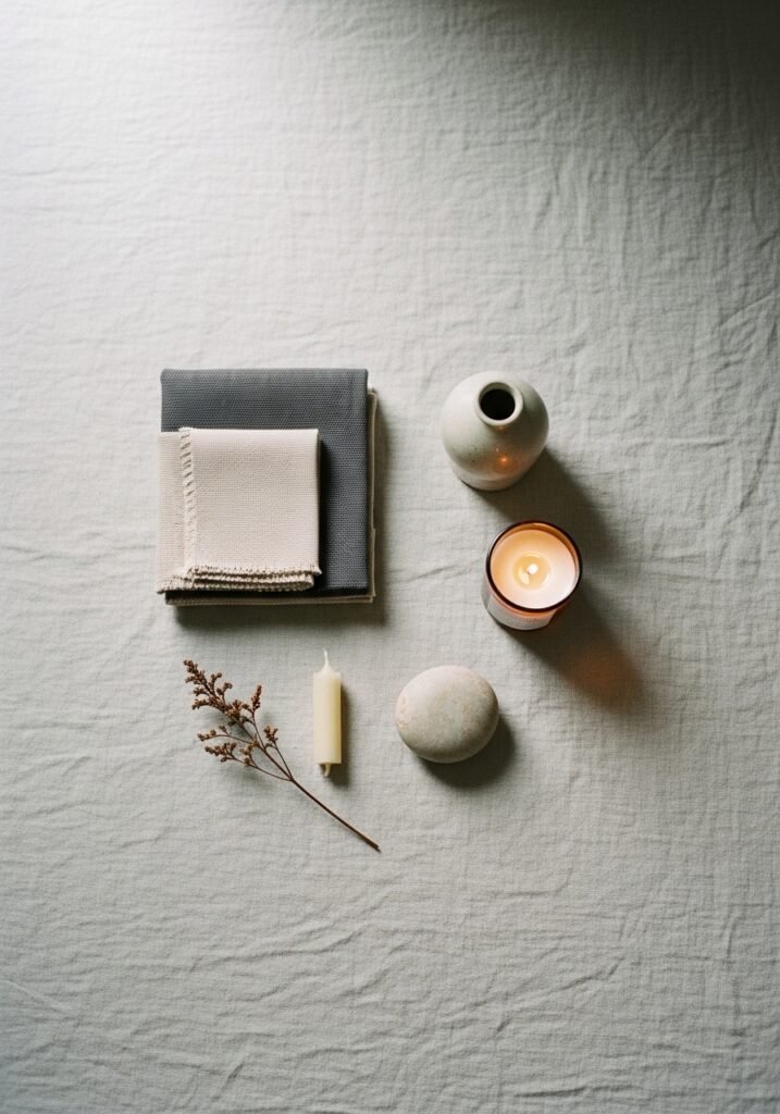
A tray on a coffee table transforms a collection of objects into a vignette. The same candle, the same small plant, the same decorative stone that looked haphazard when scattered across a surface becomes a composed, intentional moment when placed on a tray with enough negative space around each piece. It’s the same objects. It’s the same surface. The tray is doing organizational and aesthetic work simultaneously.
The best trays for modern luxury sitting rooms are made from natural materials — aged rattan, hammered brass, raw wood with visible grain, matte black lacquer. They should be large enough to hold three to five objects with breathing room rather than crammed full. And they should be the kind of thing that stays out all the time, not something you tuck away when company comes.
Same principle applies to a tray on a console table near the entry to your sitting room, or on a window ledge that gets afternoon light. A tray says: someone thought about this. Someone made a choice. That signal — quiet, low-cost, endlessly effective — is what the whole pursuit of a beautiful home is really about.
—
🌿 Quick Tips
Here are five things you can do this weekend without spending much at all. They’ll change how your sitting room feels immediately.
Swap out your lightbulbs for 2700K warm white — the shift in atmosphere happens the same evening, and it costs less than a coffee.
Fold one throw in a long rectangle and drape it over the back of your sofa rather than balled up on a cushion. It adds instant softness and looks properly styled.
Move your largest plant from where it “fits” to where it’s most visible — usually a corner that gets pulled into the room’s sight line rather than pushed against a wall.
Pull your sofa 6 to 12 inches away from the wall. Floating furniture always makes a room look more intentional and larger.
Clear one surface entirely — just try it — and only put back what earns its way back on.
—
❓ FAQ
Q: How do I make my sitting room look luxurious without a big budget? A: Start with lighting, always. Swap overhead-only lighting for layered lamp light, change your bulbs to 2700K, and add a candle or two. Then edit ruthlessly — a room with fewer, better-placed things almost always looks more considered than a fuller room. These two moves cost very little and the result is immediate.
Q: What’s the difference between a sitting room and a living room in British vs American homes? A: In British homes, a “sitting room” often refers to the more formal front reception room, while a “living room” might be the everyday family space — though the distinction has blurred considerably in modern open-plan homes. For the purposes of interior design, they’re treated identically: the goal is the same warm, inviting, beautiful space.
Q: How do I choose between a light and a dark sofa for a modern luxury look? A: It depends almost entirely on your light levels. North-facing rooms in the UK or shaded American rooms genuinely struggle with dark furniture — it can feel heavy and airless. In well-lit rooms, a deep sofa in forest green, navy, or rust creates drama and richness. When in doubt, go for a mid-tone — camel, warm tan, terracotta — which works beautifully in almost any light and feels current without being trend-dependent.
—
💭 Final Thought
The most beautiful sitting rooms I’ve ever seen weren’t the most expensive ones. They were the most decided ones — rooms where someone made choices and committed to them, where every piece felt like it belonged and nothing was apologizing for being there. You don’t need a renovation or a stylist or a bigger budget. You need a clear eye, a willingness to edit, and the courage to stop decorating before the room feels finished. Because the rooms that breathe the best always look like there’s still a little space left for living.
What’s the one thing in your sitting room right now that you’ve always meant to change?


