
Why Light Blue Interiors Feel Like a Deep Breath — And How to Make One Your Own
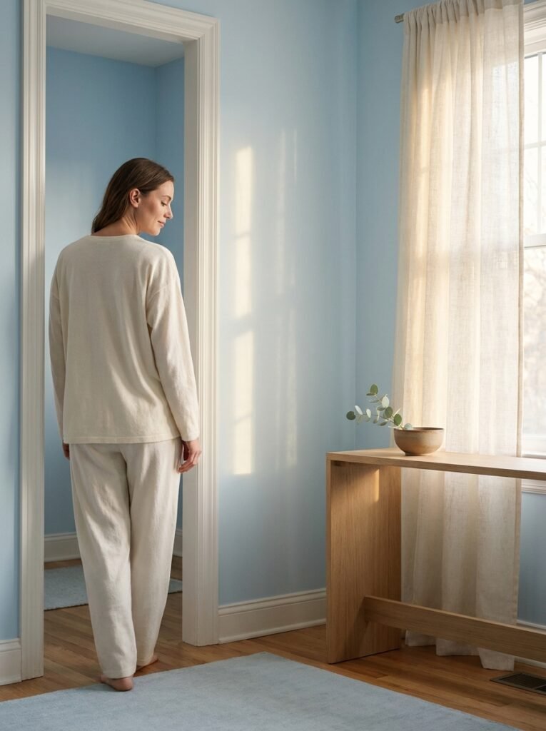
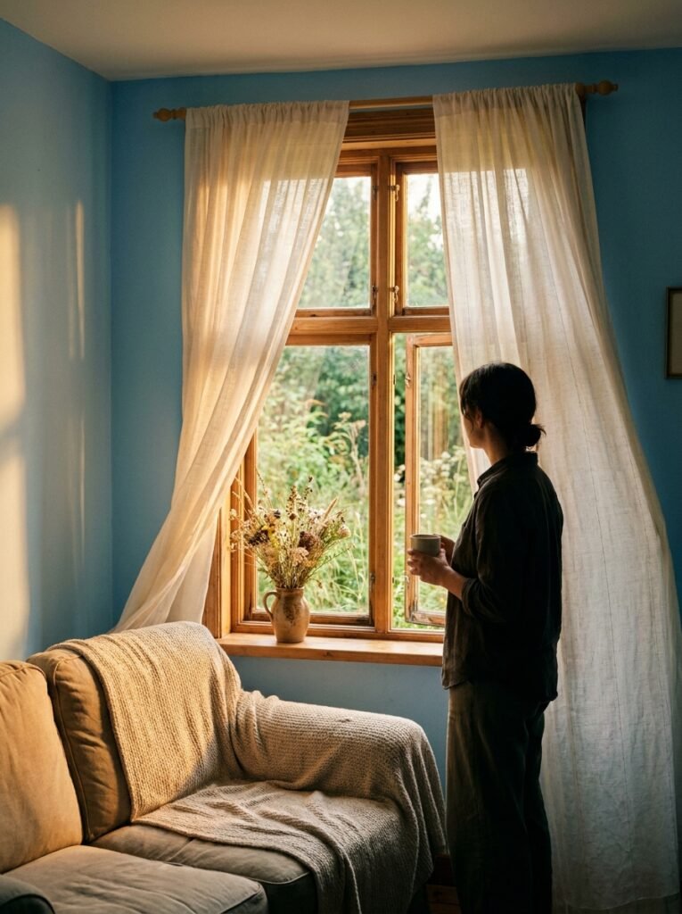
There’s a moment — maybe you’ve felt it — when you walk into a room and your shoulders drop, your jaw unclenches, and something in your chest simply relaxes. That feeling isn’t an accident. More often than not, there’s a whisper of light blue somewhere in that space, doing quiet, powerful work on your nervous system before you even notice it.
—
1. The Science Behind Why Light Blue Makes a Room Feel Different
Color isn’t just decoration — it’s communication. And light blue speaks directly to something ancient in us: open sky, still water, early morning air before the world gets loud. Chromotherapy researchers and interior psychologists have studied this for decades, and the results are consistent — cool, soft blues genuinely lower perceived heart rate, reduce stress hormones, and signal to the brain that it’s safe to rest.
But here’s what’s even more fascinating: light blue doesn’t just calm — it also clarifies. Rooms painted in soft powder blue or barely-there sky tones tend to feel more organized than they actually are. The eye reads the space as airy and intentional, even if your throw pillows are slightly crooked and there’s a stack of books on the floor. That’s the magic of a color that leans into light rather than competing with it.
So when you’re designing a room and you want it to feel like an exhale — not a statement, not a performance, just a quiet, beautiful exhale — light blue is almost always the right answer.
“Light blue doesn’t decorate a room. It transforms the feeling of being in one.”
—
2. The Shade Matters More Than You Think — A Guide to Choosing the Right Light Blue
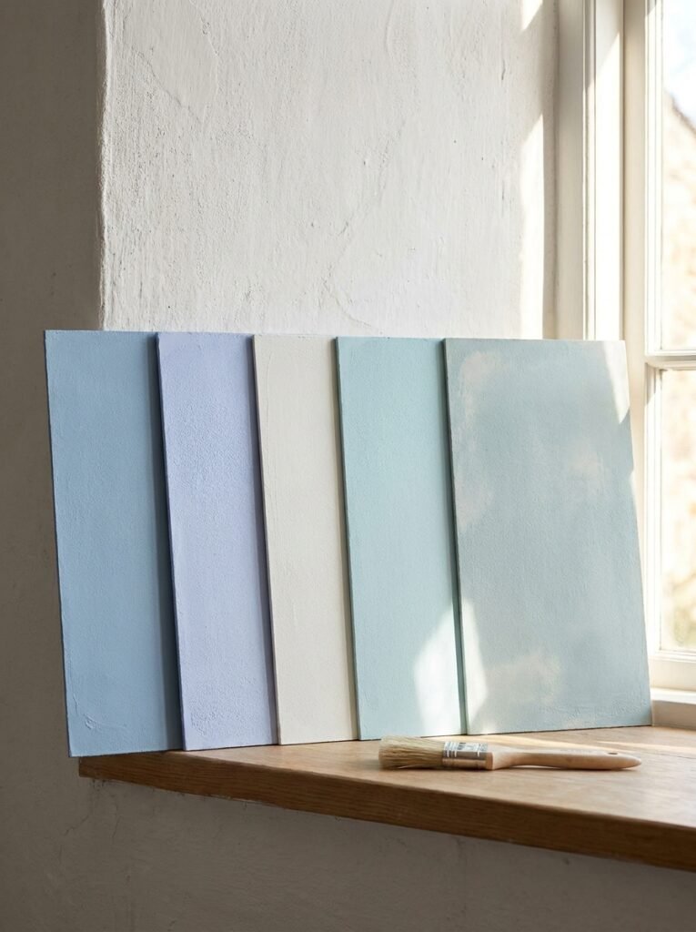
Not all light blues are created equal, and this is where so many decorating decisions go slightly sideways. There’s a world of difference between a powder blue with warm gray undertones, a icy periwinkle that pulls toward lavender, a barely-blue white that only reveals itself in direct sunlight, and a robin’s egg with a bold, confident presence.
Warm light blues — those with a hint of gray, beige, or even the faintest whisper of green — tend to feel grounding and sophisticated. Think of colors like dusty sky, colonial blue, or sea salt. They work beautifully in living rooms and bedrooms where you want calm without coldness.
Cool light blues — those that tilt toward silver or pure white — feel crisp, clean, and almost Scandinavian in their restraint. These work wonderfully in bathrooms, kitchens, and reading nooks where you want clarity and freshness.
Before committing to a paint color, always test it in your actual room at different times of day. A shade that looks ethereal at noon can feel unexpectedly gray by 4 PM when the light shifts. Paint three sample swatches of at least 12 inches each, let them dry fully, and live with them for two or three days before deciding.
—
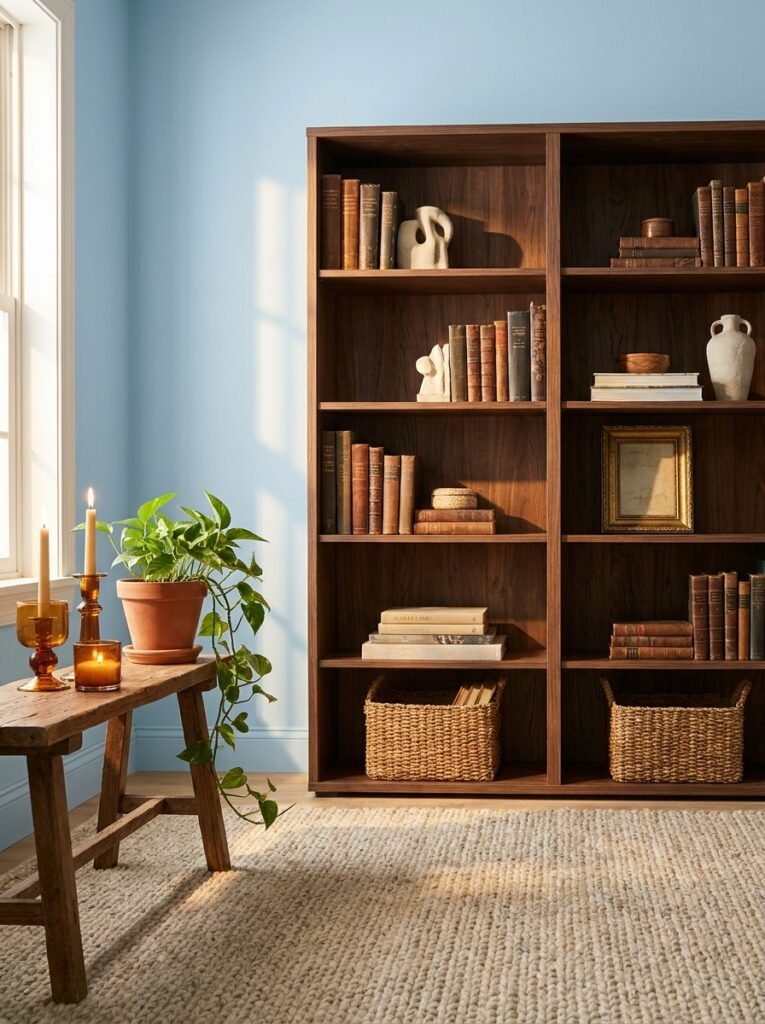
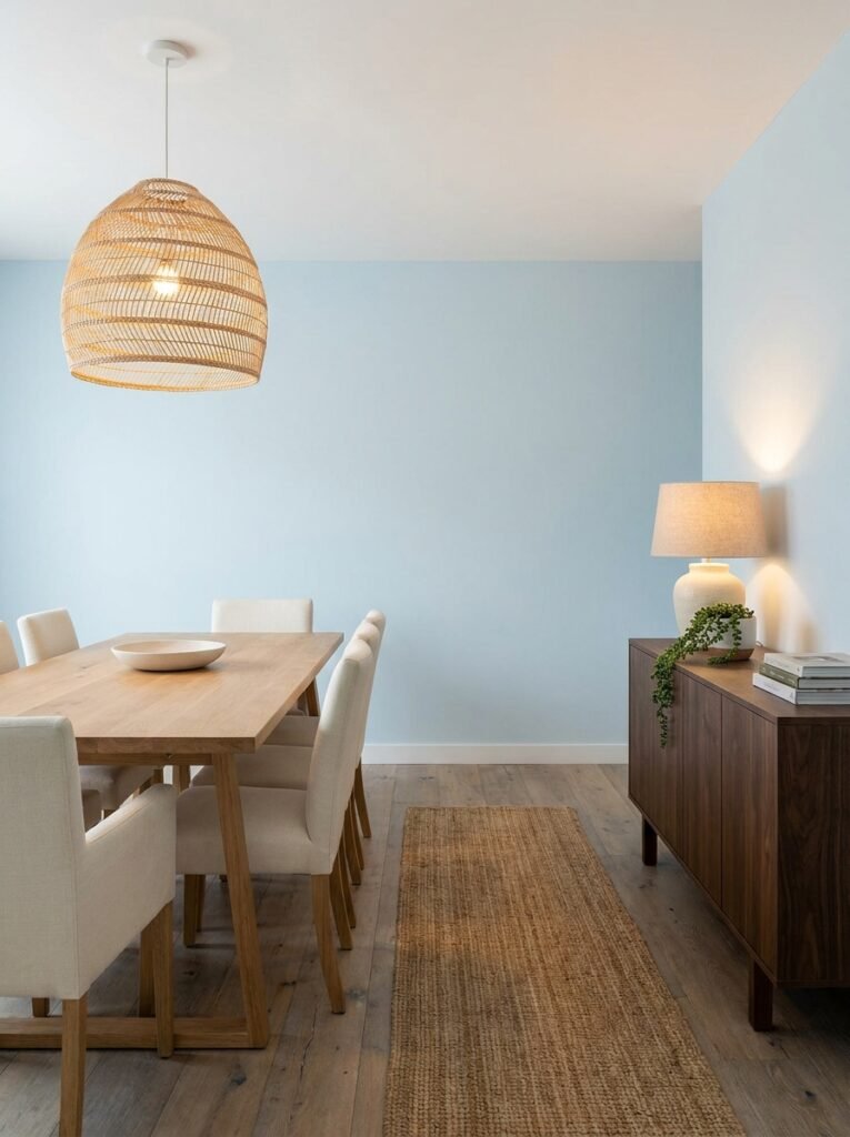
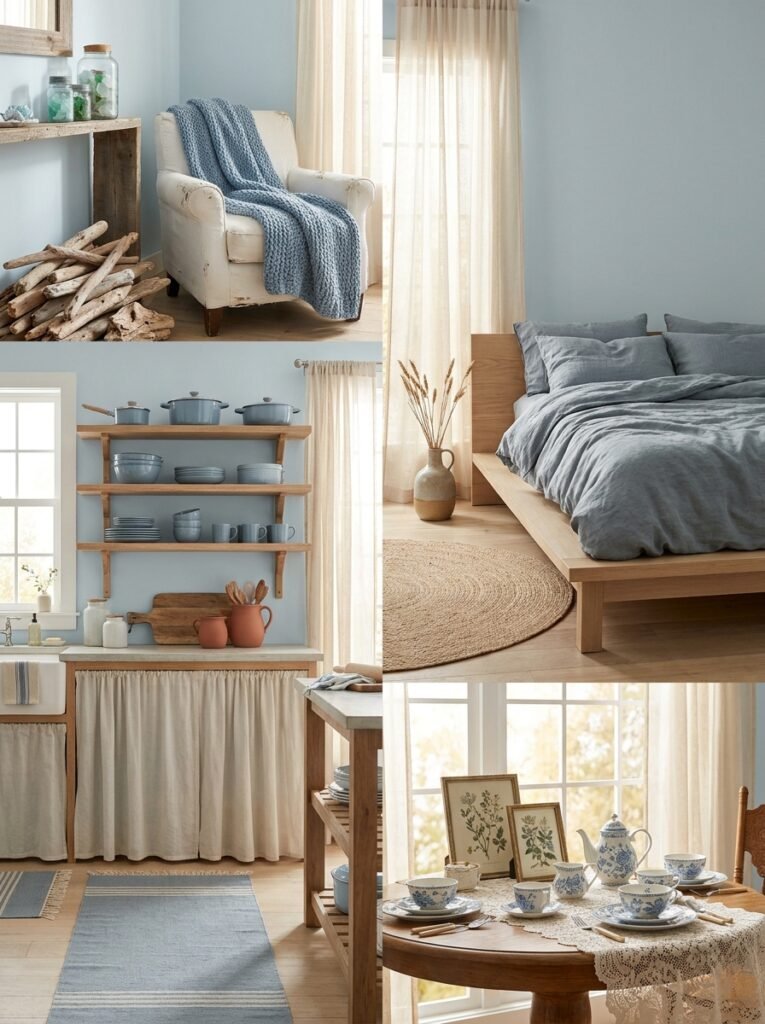
3. Light Blue in the Living Room — Creating a Space That Actually Feels Lived In
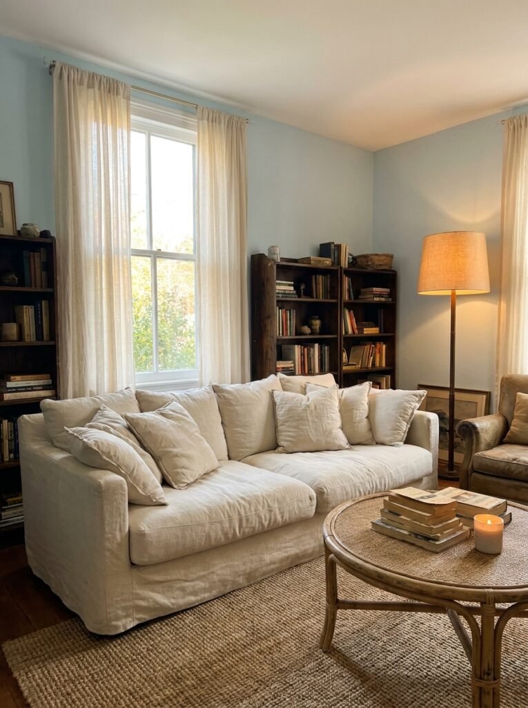
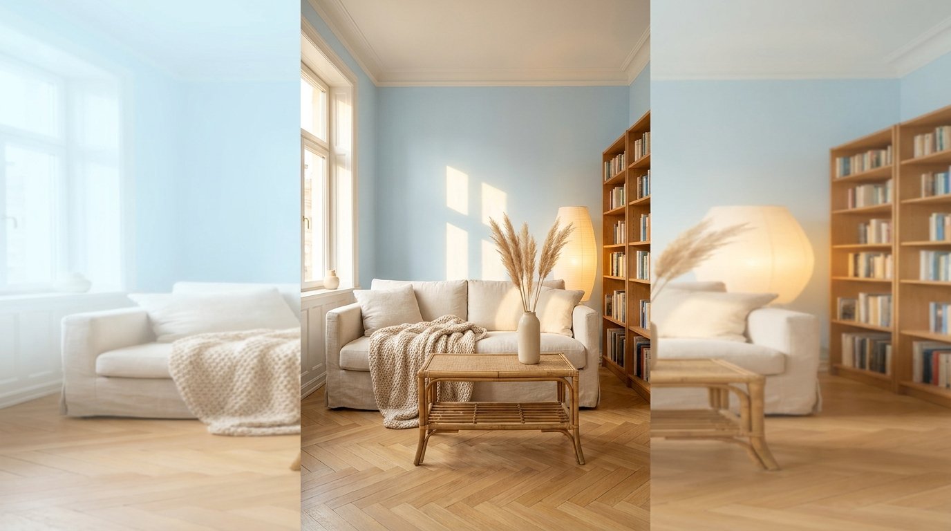
Imagine walking into a living room where the walls are the color of a clear February sky just after sunrise — soft, luminous, impossibly still. The sofa is a deep cream linen. There’s a rattan coffee table, a worn leather book spine peeking out from a shelf, and a single oversized lamp casting warm gold light into the corner. You don’t need to do anything in that room. You just want to be in it.
That is the promise of light blue in a living room, and it’s entirely achievable without a designer budget or a Pinterest-perfect lifestyle. The key is pairing the blue with textures that add warmth: woven baskets, aged wood, plush rugs, bookshelves with real, imperfect lives on them.
Light blue walls with white trim feel classic — almost cottage-like — without being fussy. Light blue as an accent wall behind a gallery arrangement feels modern and grounded at the same time. And a light blue sofa or armchair in an otherwise neutral room becomes an effortless focal point that doesn’t try too hard.
—
4. The Bedroom Transformation Nobody Talks About
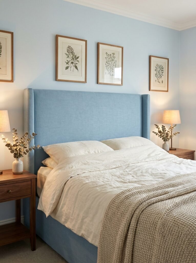
Sleep researchers will tell you that cool colors can genuinely improve sleep quality. The bedroom is where light blue earns its highest marks. A room wrapped in soft blue — whether through wall paint, upholstered headboards, bedding, or drapery — creates a sensory cue for the brain: this is a place for rest.
What makes a light blue bedroom feel luxurious rather than cold is layering. Start with a light blue foundation — walls or a statement headboard — and then build warmth around it. Ivory linen sheets. A chunky knit throw in oatmeal. Wooden nightstands with imperfect grain. Bedside lamps with warm-toned bulbs (always choose bulbs in the 2700K range for bedrooms — the warm glow softens everything).
Add in a few botanical prints in simple wood frames, a small ceramic vase with dried eucalyptus, and suddenly that light blue bedroom becomes the kind of space you photograph on a lazy Sunday morning just because it’s too beautiful not to capture.
—
5. Light Blue in the Kitchen — The Unexpected Color Choice That Works Every Time
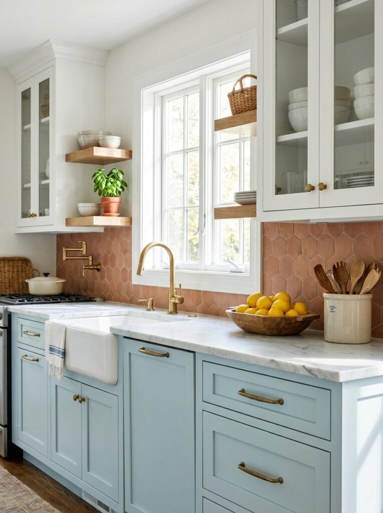
Here’s a truth that surprises a lot of people: light blue kitchens are among the most beloved, most pinned, most admired kitchen aesthetics on the internet — and yet so many people hesitate to try it in their own homes. Maybe it feels too risky. Maybe it feels like it won’t “go” with everything else.
But think about farmhouse kitchens in the French countryside. Think about coastal New England homes with their pale blue shaker cabinets and brass hardware. Think about the feeling of standing in a bright kitchen where the cabinets are the color of a robin’s egg, the countertops are a cool white marble, and the morning light is pouring through the window over the sink.
“The kitchen is the heart of the home — and light blue gives it the calmest, warmest heartbeat.”
Light blue kitchen cabinets — especially lowers paired with white uppers — create visual balance and enormous depth without overwhelming a space. Pair them with warm brass or matte gold hardware for a result that feels elevated without being cold. Add a terracotta tile backsplash or warm wooden floating shelves to bring in contrast and a sense of handmade, human warmth.
—
6. Bathroom Bliss — Why Light Blue Belongs Near Water
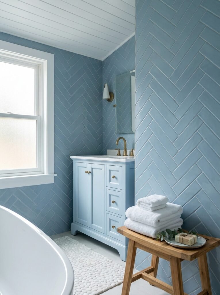
There’s something undeniably logical about placing a water-adjacent color in a water-adjacent room. Light blue bathrooms feel clean, spa-like, and deeply intentional — even in small spaces. In fact, light blue is one of the few colors that actually makes small bathrooms feel larger rather than smaller, because it reflects light and creates a sense of visual openness.
Try light blue subway tiles in a herringbone pattern, or paint the vanity a dusty sky blue while keeping walls crisp white. A powder room in deep periwinkle with aged brass fixtures is one of the most universally admired design moves in modern interior decorating. And a full light blue bathroom — tiles, walls, and all — with white accents and natural wood accessories feels like a boutique hotel you never want to leave.
Don’t overlook the power of light blue towels, bath mats, and accessories in an otherwise neutral bathroom. Even small touches of this color shift the entire emotional register of the space.
—
7. How to Layer Light Blue Without Making a Room Feel Cold or Flat
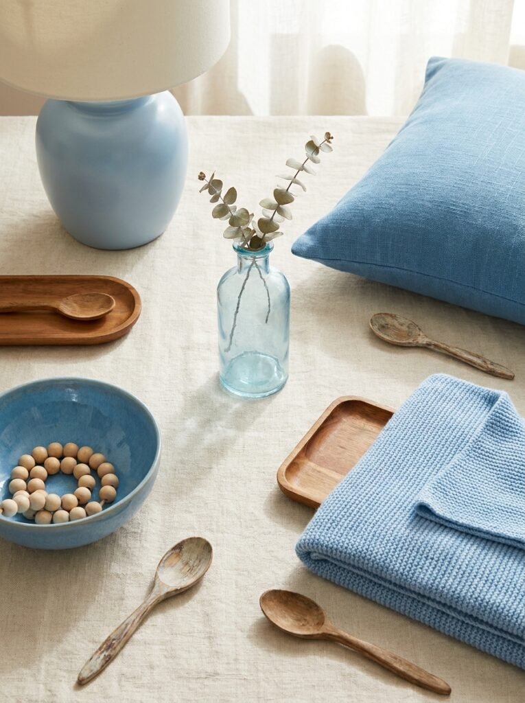
The single most common mistake people make with light blue interiors is forgetting to warm them up. A room that’s entirely blue — walls, sofa, rugs, curtains — will feel chilly and one-dimensional, no matter how beautiful the individual pieces are.
The solution is intentional contrast and layering. Light blue sings most beautifully when it’s paired with: warm whites (not stark cool whites), natural wood in any tone from blonde to walnut, terracotta and rust accents, aged brass and copper metals, cream and oatmeal textiles, and indoor plants in earthy ceramic pots.
Think of light blue as the main melody in a song — it needs the other instruments to make it complete. A light blue wall behind a walnut bookshelf, warm wool rug, and a few amber glass candleholders is not cold. It’s the visual equivalent of a cozy afternoon.
—
8. Light Blue and Natural Light — The Relationship That Changes Everything
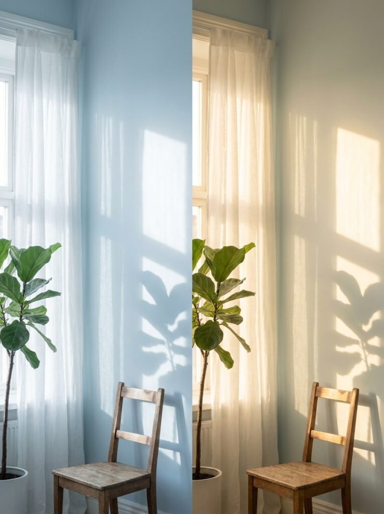
The relationship between light blue and natural light is one of the most dynamic, nuanced aspects of working with this color. North-facing rooms, which receive indirect, cooler light throughout the day, will read light blue shades as noticeably cooler and more gray-toned. In these spaces, opt for light blues with warm undertones — those that lean toward gray-green or gray-beige — to counteract the coolness.
South and west-facing rooms, which receive warm, golden light for much of the day, can handle cooler, purer light blues without feeling sterile. In fact, these rooms are where the most luminous, ethereal light blue effects happen — the walls seem to glow from within during late afternoon.
East-facing rooms receive beautiful morning light but can feel dim by afternoon. Here, light blue works beautifully as a morning room color — think breakfast nooks, home offices, and reading corners where you’re most active in the first half of the day.
“Natural light doesn’t just illuminate a light blue room — it transforms it, hour by hour, into something new.”
—
9. Furniture Pairings That Make Light Blue Walls Shine
The furniture you choose against light blue walls either elevates the entire room or quietly undermines it. Fortunately, light blue is one of the most versatile backdrop colors in interior design — it plays well with almost everything, as long as you’re thoughtful about balance.
Deep navy or midnight blue furniture creates a sophisticated, tonal palette that feels deliberate and refined. Off-white and cream upholstery creates brightness and breathability. Natural oak and birch furniture feel Scandinavian and fresh. Dark walnut furniture creates rich contrast that stops the room from feeling washed out. And rattan or wicker pieces — whether a coffee table, a chair, or a light fixture — add texture and warmth that light blue spaces deeply benefit from.
Avoid pairing light blue walls with very cool gray furniture or overly stark white furniture — the result tends to feel clinical rather than calm.
—
10. Light Blue as an Accent — When You’re Not Ready for a Full Commitment
Not everyone is ready to paint a whole room light blue, and that’s completely valid. The beauty of light blue is that even small, strategic doses of it can completely shift the energy of a space.
A single light blue throw pillow on a cream sofa. A powder blue ceramic lamp on a wooden side table. A vintage light blue vase on a kitchen shelf. A cerulean blue linen curtain panel framing a window. These accents don’t whisper — they sing, clearly and confidently, without overwhelming the room.
If you want to go slightly bolder without full commitment, consider an accent wall, a painted piece of furniture like a bookshelf or dresser, or a large-scale piece of blue-toned art. Each of these creates the emotional effect of a light blue room without requiring you to paint every wall.
—
11. Trending Light Blue Interior Styles to Inspire Your Next Makeover
Light blue has had remarkable staying power precisely because it adapts. It’s not a trend — it’s a palette that reinvents itself within each new aesthetic movement.
In coastal grandmother style, light blue appears in weathered wood furniture, linen drapery, and sea glass accessories. In modern farmhouse design, it shows up as dusty blue cabinet paint, vintage blue enamelware, and soft blue plaid textiles. In Japandi interiors, light blue takes on a more restrained, meditative quality — a barely-blue wall, a blue-gray linen cushion, clean lines and generous negative space. In cottagecore, it’s found in floral blue chinaware, painted furniture, and botanical blue prints layered over white walls.
No matter which design aesthetic speaks to your heart, light blue has a role to play in it — and it will make that role its own.
—
12. Making Light Blue Feel Personal, Not Pinterest-Perfect
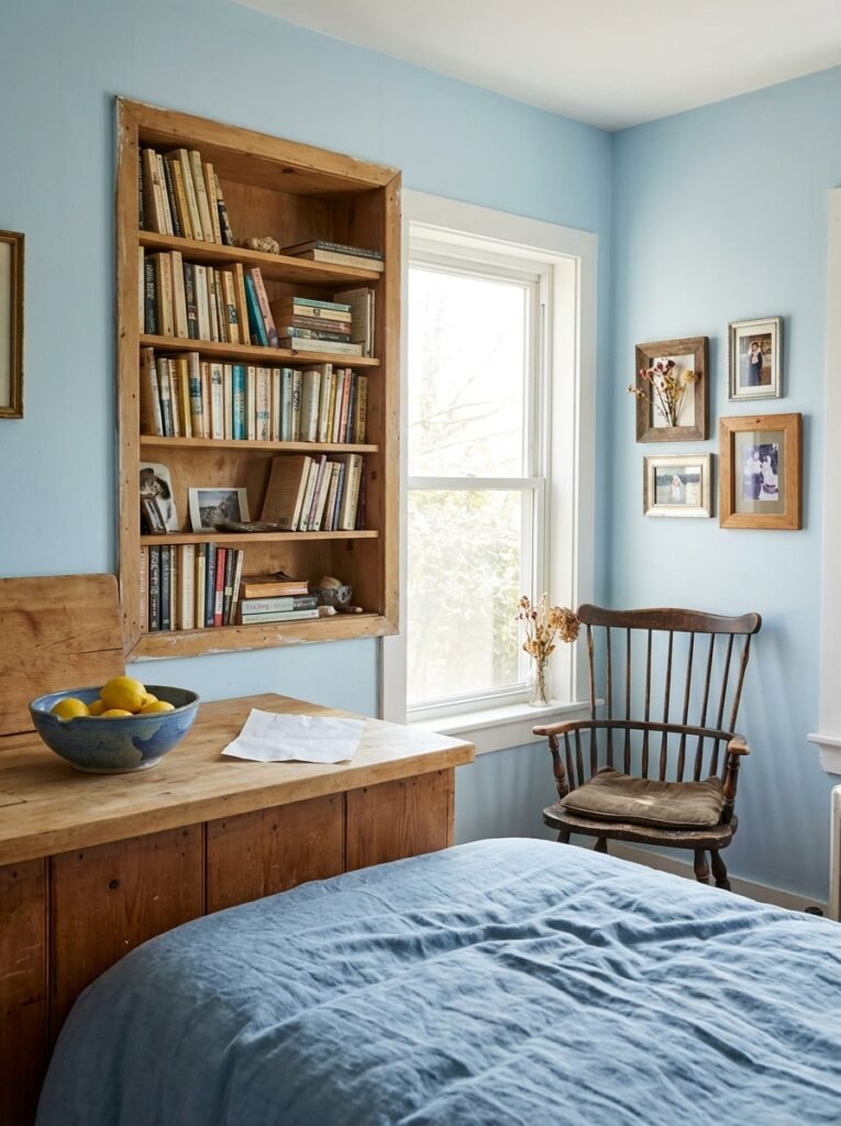
Here’s the thing nobody tells you about decorating with light blue: the most beautiful light blue rooms aren’t the ones from magazine shoots. They’re the ones that look like real people live in them — where the light blue walls frame a bookshelf of dog-eared paperbacks, where the blue ceramic bowl on the kitchen counter holds actual lemons and a crumpled grocery receipt, where the blue linen duvet is rumpled because someone slept in it last night.
Light blue becomes yours when you stop trying to make it look like a photo and start letting it be the backdrop for your actual life. Your plants that aren’t perfectly symmetrical. Your collection of mismatched frames. Your grandmother’s old wooden chair that doesn’t match anything but somehow belongs in the room.
That is the real power of light blue. It makes whatever is in the room — even the imperfect, lived-in, human things — look like it belongs there.
—
🌿 How to Take Care of Your Light Blue Interior
Light blue walls and furnishings are relatively easy to maintain, but a little intentional care keeps them looking their best for years.
Touch up paint as soon as you notice scuffs — light blue shows marks more visibly than mid-tones, but a small container of your original paint color makes touch-ups seamless and invisible. Clean light blue upholstery and textiles regularly with gentle, color-safe cleaners, and keep them out of direct intense sunlight, which can cause pale blues to fade or shift to an unwanted gray-green over time. When refreshing the room seasonally, swap out accessories rather than repainting — change out warm-toned autumn pillows for crisp spring whites, and your light blue space will feel new without any real effort. Choose quality paint with a low-VOC formula and a satin or eggshell finish — these finishes are easiest to clean and most flattering on light blue walls. And finally, trust your instincts: if a shade of light blue makes you feel good when you walk into the room, that is the right choice, regardless of what any design rule says.
—
❓ FAQ
Q: Does light blue work in a room with very little natural light? A: Yes, but it requires careful shade selection. In low-light rooms, choose light blues with warm gray or beige undertones rather than cool, pure blues. Layering in warm artificial lighting — especially lamps with 2700K bulbs — will prevent the space from feeling too cool or dim.
Q: What colors go best with light blue in an interior? A: Light blue pairs beautifully with warm whites, natural wood tones, cream, oatmeal, terracotta, soft sage green, and aged brass or copper metals. These combinations create warmth and depth that keep light blue from feeling flat or cold.
Q: Is light blue a good color for small rooms? A: Light blue is actually one of the best colors for small rooms because it reflects light and creates an impression of openness and airiness. It visually expands the space without making the room feel stark or clinical, especially when paired with warm textures and natural materials.
—
💭 Final Thought
Light blue is not just a color choice — it’s a feeling you’re choosing to come home to every single day. It’s the gentle reminder, waiting on every wall and cushion and carefully chosen ceramic, that your home is supposed to be a place of ease. And in a world that rarely stops moving, that matters more than any trend ever could.
So the question worth sitting with is this: what does your home feel like when you walk through the door — and what do you want it to feel like instead?