
Why Navy Blue Is the Secret the Best Modern Farmhouse Living Rooms Have Been Keeping
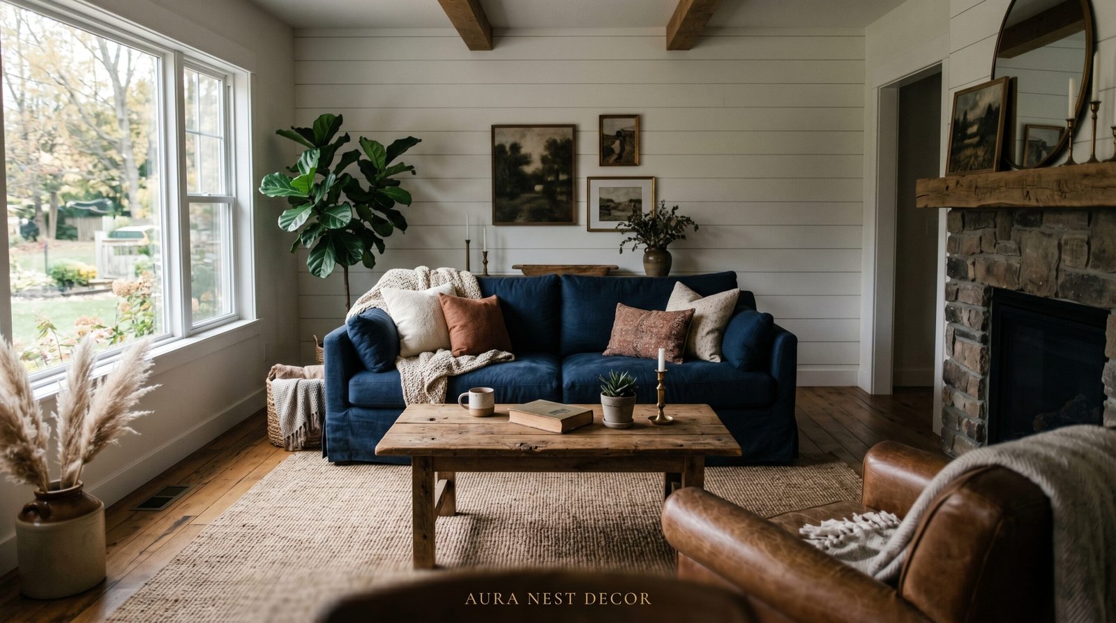
You walk into someone’s house and the living room just stops you. Not because it’s loud or over-decorated — but because it feels grounded. Layered. Like it grew there naturally. Chances are, somewhere in that room, there’s navy blue doing the quiet work.
Modern farmhouse style has a reputation for being all shiplap and neutral linen, and honestly, that version has run its course. The rooms that are turning heads right now are the ones where someone was brave enough to bring in something deep and rich — and navy blue is exactly that.
—
1. The Reason Navy Blue and Farmhouse Wood Were Always Meant to Find Each Other
Think about it for a second. Raw oak. Reclaimed pine. The warm, slightly imperfect grain of a wooden beam that’s been somewhere before it ended up in your living room.
Now think about navy blue beside it.
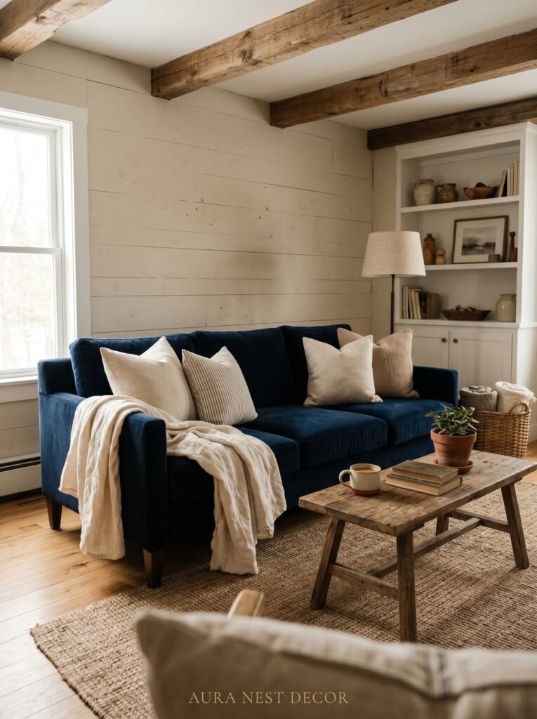
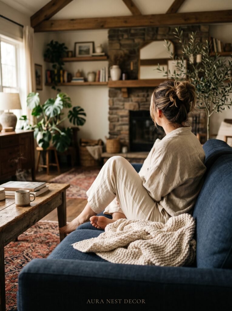
There’s a reason that combination feels so satisfying — it’s the same reason we love the ocean meeting a dock, or indigo denim against pale wood floors. The depth of navy pulls the warmth out of natural wood rather than competing with it. It creates contrast without conflict. The wood gets to be warmer, and the navy gets to look richer, and the whole thing comes together like they’d been planning it all along.
If your living room has any amount of exposed wood — beams, flooring, a mantel, a console table — navy is not just an option. It’s the answer you’ve been searching for. Pair it with lighter woods, like white oak or pine, for the highest contrast and the crispest modern farmhouse feel. Go with walnut or darker stained pieces if you want something moodier and more layered, almost like a British country house that got a very good renovation.
The key is letting the wood breathe. Don’t cover every surface. Let the navy anchor the room — a sofa, an accent wall, a set of curtains — and let the wood exist alongside it with space around it.
“Navy doesn’t compete with wood grain — it makes it the star.”
—
2. The Specific Shade of Navy That Actually Works (And the Ones That Will Make You Repaint)
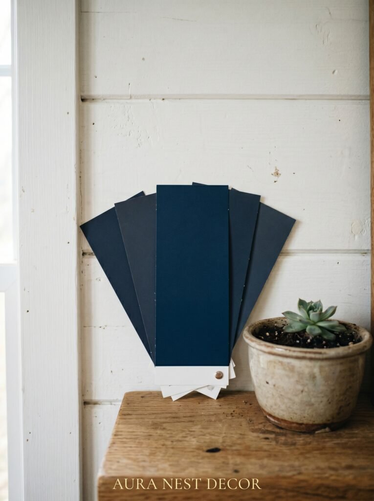
Not all navy is created equal, and this is the part that trips people up.
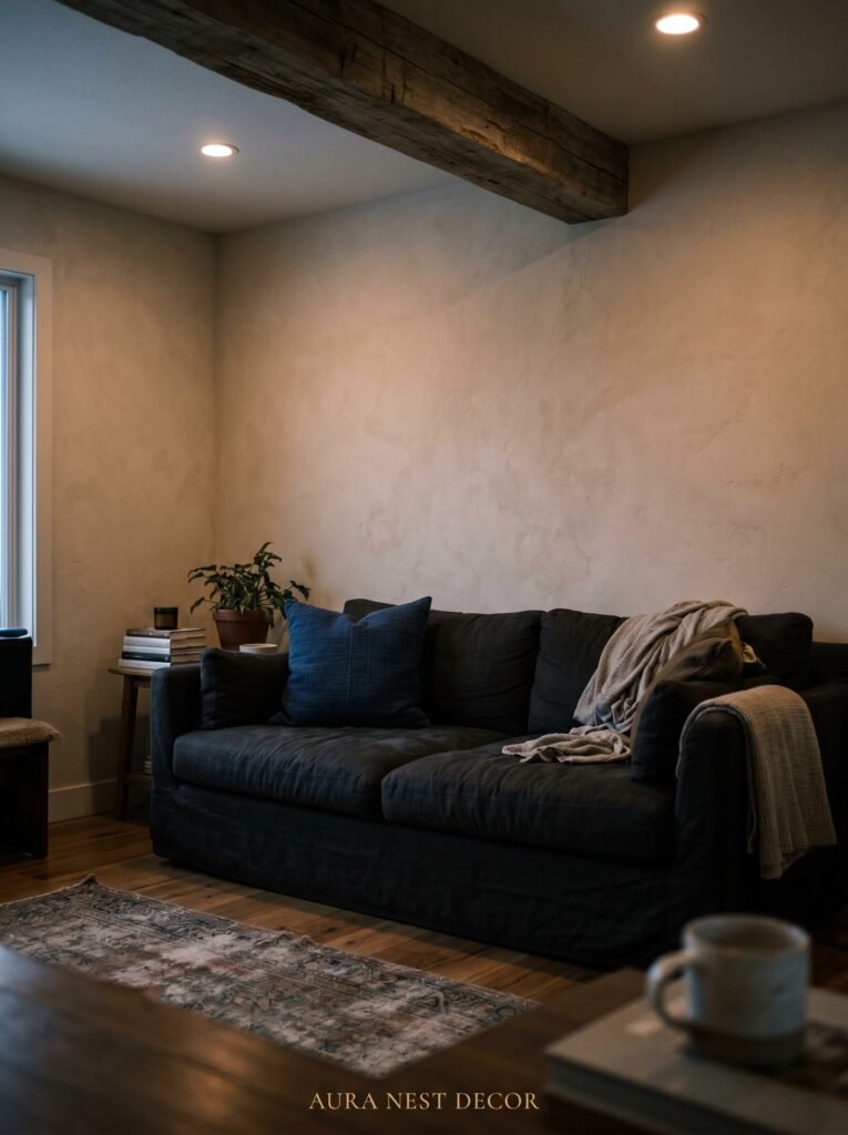
There’s a navy that pulls purple in artificial light. It looks gorgeous on a paint chip and absolutely strange in your living room at 6pm on a Tuesday. There’s a navy that reads almost black in low light — which isn’t necessarily bad, but it’s a very different vibe than what you might be going for. And then there’s the navy that stays true: deeply blue, slightly sophisticated, with just enough of a cool undertone to feel crisp without being cold.
For modern farmhouse specifically, you want navy with a very slight warm undertone or a genuinely neutral one. In the US, Sherwin-Williams Anchors Aweigh and Benjamin Moore Hale Navy are longtime favorites for exactly this reason. In the UK, Farrow & Ball Hague Blue is deeper and more dramatic — it leans almost teal in some lights and absolutely stunning in others. Little Greene’s Juniper Ash sits right in that perfect midpoint.
Test your swatch in your actual room. At three times of day: morning, afternoon, and after dark with your lights on. Natural light will reveal the cool undertones. Lamplight will bring forward the warmth. What it looks like at 8pm on a Saturday night is probably the most important test of all, because that’s when you’ll actually be sitting in it.
Buy the sample pot. Live with it for four days. I promise this advice is the only thing standing between you and a repaint.
—
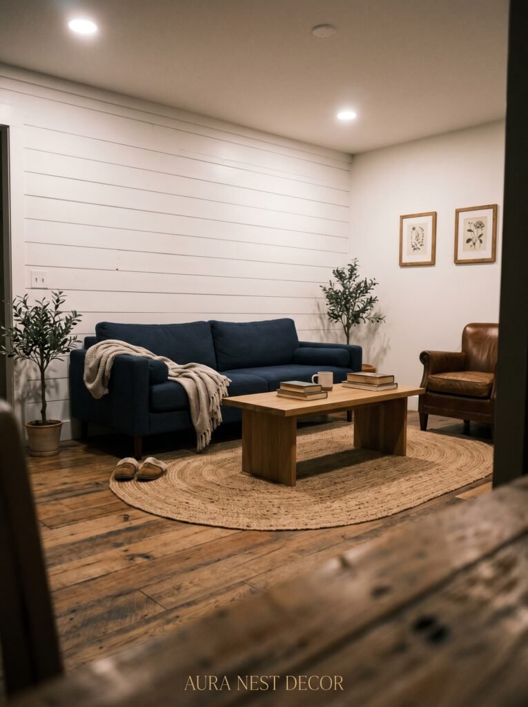
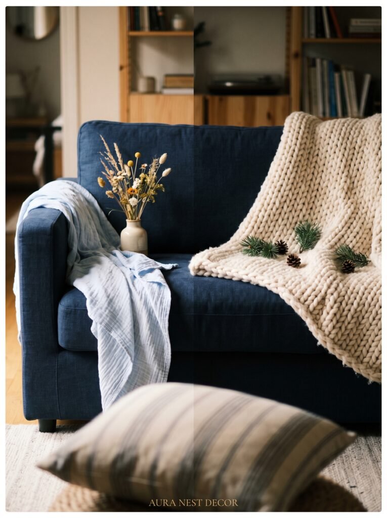
3. Why the Navy Sofa Is Less Scary Than You Think It Is
The sofa is the piece that makes people hesitate. It’s big, it’s expensive, and it feels permanent in a way that a throw pillow doesn’t.
But here’s what nobody tells you: a navy sofa is one of the most forgiving pieces of furniture you can own. It doesn’t show pet hair the way a pale linen one does. It doesn’t ghost every crumb. It photographs beautifully. And it works with almost every other color in the modern farmhouse palette — cream, rust, sage, terracotta, warm white, warm gray, and every shade of natural fiber you can layer on top of it.
The silhouette matters as much as the color. For modern farmhouse, you want something with clean lines but not harsh ones. Think track arms rather than rolled. Think low profiles rather than bulky cushions. A lawson sofa in a matte navy velvet reads very differently from a chesterfield in the same color — the first feels American farmhouse with a modern edge; the second feels more British country house, which is equally beautiful but a different story.
Linen and cotton blend sofas in navy are breathable and casual — perfect for a US home with kids, or a British living room that gets genuine use. Velvet navy will always look more intentional, more dressed up, more like a choice that somebody thought about.
Both work. Pick the life you’re actually living.
—
4. The Wall Color Combinations That Are Running the Internet Right Now
The most-saved farmhouse living rooms on Pinterest right now share one quiet trait: the walls aren’t trying to do everything.
Navy works on the walls — absolutely. An accent wall behind a fireplace in Hague Blue with white trim and natural wood accessories is one of those combinations that photographs so well people will ask you to prove it’s a real room. But navy walls in a smaller US living room or a compact British terraced house can easily tip from “moody and beautiful” to “why is it 3am in here.”
If your room doesn’t have a lot of natural light, consider going lighter on the walls and bringing navy in through everything else. A warm white wall — something with just a touch of yellow, like Farrow & Ball Strong White or Sherwin-Williams Alabaster — becomes the perfect backdrop for a navy sofa, navy curtains, navy throw pillows piled generously at either end.
If your room does get good light — south-facing windows, a sliding door, a skylight — then commit fully. Navy board and batten from floor to mid-wall with a soft white above the rail is a look that belongs in a magazine and is genuinely achievable in a weekend.
The pairing that keeps appearing and keeps winning: navy plus warm terracotta, connected by cream and natural wood. It’s earthy without being dated, warm without being overwrought.
“The rooms that stop your scroll always have at least two competing depths of color — and navy is almost always one of them.”
—
5. Textiles Are Where a Modern Farmhouse Living Room Gets Its Soul
A room can have every element right — good bones, good furniture, good color — and still feel like a showroom rather than a home. Textiles are what close that gap.
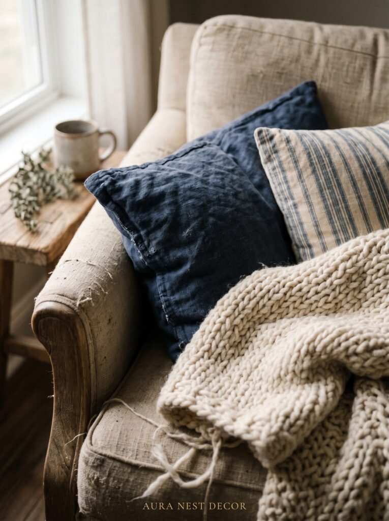
For a navy farmhouse living room, you’re layering several textures. A chunky knit throw in cream or oatmeal draped over the arm of a navy sofa. A woven jute rug that grounds the space and keeps it from feeling too formal. Linen curtains in warm white that soften the edges. Cotton velvet cushions in rust and terracotta that pick up the warm tones in the wood.
The trick is mixing the weights and weaves deliberately. Don’t put all the soft things together and all the structured things together. Weave them through the space. A woven basket next to a velvet cushion. A raw linen curtain next to a polished ceramic lamp base. These small moments of contrast are what give a room its visual rhythm — the thing that makes your eye move around the room and always find something interesting.
In the UK specifically, tartan or plaid in navy and cream (or navy and rust) has an incredible farmhouse credibility that feels local and genuine rather than imported from a Pinterest board. A single plaid throw on a navy sofa is the kind of move that looks effortless because someone understood the heritage of it.
—
6. The Lighting Choice That Makes Navy Look Its Best at Every Hour
Here’s a truth that interior designers don’t say enough: a room that looks wrong is often a lighting problem, not a color problem.
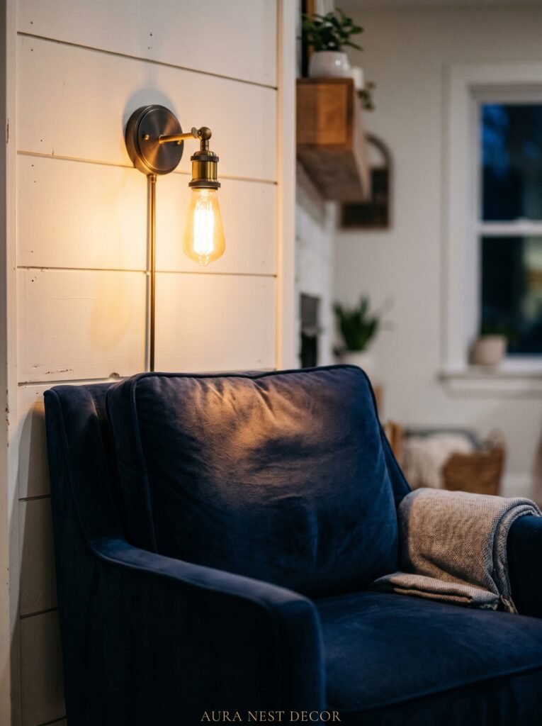
Navy absorbs light. That’s part of what makes it beautiful — that depth, that richness. But if your lighting is wrong, it will absorb so much light that the room tips into gloomy territory. The fix isn’t removing the navy. The fix is layering your light sources the right way.
You need at least three levels of light in a living room with navy as a dominant color. Overhead ambient light is your foundation, but it should not be your only source, and it should never be a harsh, flat, white ceiling light unless you want your beautiful navy sofa to look like a bruise. Warm bulbs — around 2700K — are non-negotiable.
Table lamps placed at seating height change everything. The amber glow of a decent table lamp at 7pm, casting light upward and sideways rather than straight down, is the single most effective thing you can do for a moody, warm farmhouse living room. In the US, brass and black iron lamp bases work beautifully with navy. In the UK, a ceramic lamp base in cream or stone with a wide linen shade is a classic for a reason.
Add a floor lamp in a corner. Add candles if you’re willing. Let the room have its shadows.
—
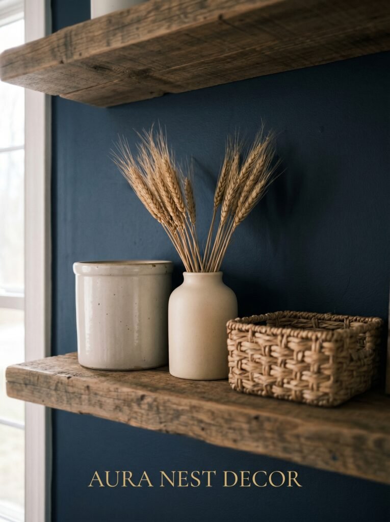
7. Farmhouse Accents That Don’t Make It Look Like a Theme Park
Modern farmhouse can go wrong in one very specific direction: when every single accessory is a rustic sign, a galvanized bucket, or something that says HOME in distressed serif font.
That version of farmhouse is finished. Nobody is pinning it anymore.
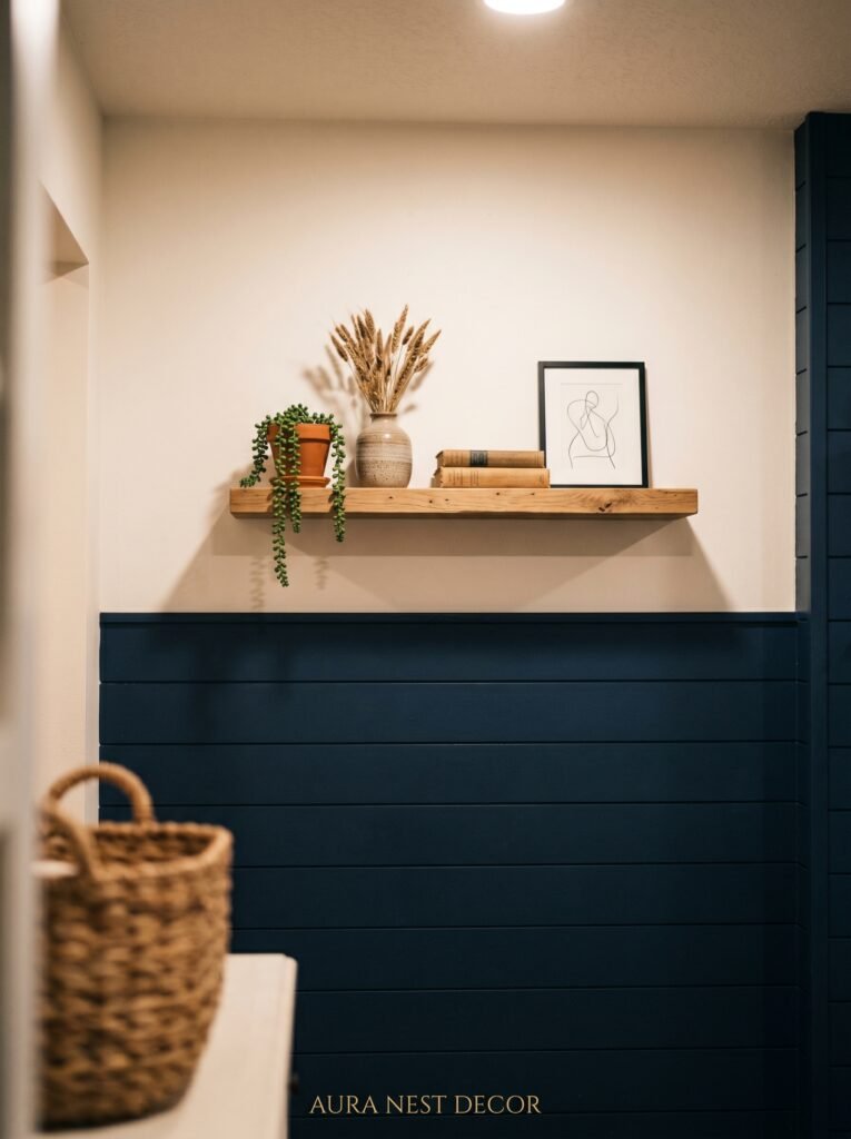
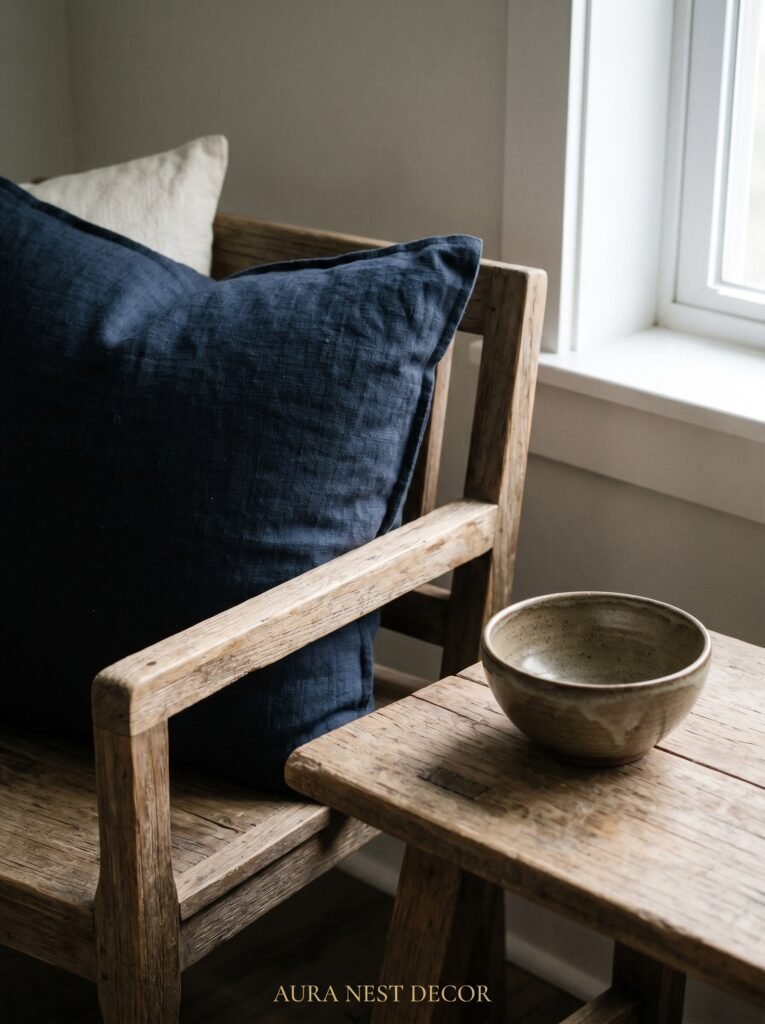
What people are pinning is the restrained version — where the farmhouse influence shows up in texture and material rather than literal signage. A ceramic vase with a matte, rough finish. A wooden tray on the coffee table. A woven basket doing actual storage work. A framed botanical print. A worn leather journal on the side table.
With navy as your base, you can lean into accents that feel genuinely collected rather than themed. Black iron is perfect — curtain rods, light fixtures, picture frames, door hardware. Aged brass works beautifully with navy too, and feels slightly softer, slightly more English-country than industrial. Choose one metal for the room and let it repeat.
Ceramics in white, cream, and terracotta scattered across the mantel and shelves will always look right against navy. Plants with broad green leaves add life without disrupting the palette. A single oversized piece of art in warm tones above a navy sofa or a navy-painted fireplace surround brings the whole thing into focus.
“One metal tone, three textures, two warm accents. That’s a farmhouse living room that looks designed rather than decorated.”
—
8. The Fireplace Moment: How Navy Turns a Mantel into the Room’s Best Feature
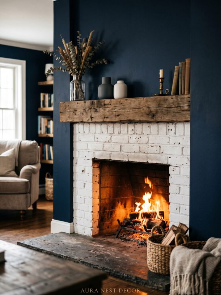
If you have a fireplace — and if you’re in the UK, there’s a decent chance you have at least the alcoves for one — navy is the element that makes your fireplace the undisputed focal point it deserves to be.
Paint the chimney breast in a deep navy. Keep the mantel itself in white or a very light cream. Stack it simply: a long horizontal mirror, a few varying-height objects, one piece of greenery. The contrast between the dark painted wall and the white trim work is so sharp and clean and beautiful that nothing else needs to compete.
In American homes without a traditional chimney breast, a navy accent wall centered behind the TV console serves the same purpose. Frame it out with board and batten if you want to earn that farmhouse credibility — the horizontal and vertical lines give a painted wall texture and depth that flat paint alone can’t achieve.
Either way, you’re creating the room’s anchor. Everything else in the room orbits it.
—
9. The Small Farmhouse Living Room Rule That Changes Everything
Small rooms make people nervous. The instinct is always to go light — light walls, light furniture, nothing too heavy — to make the space feel bigger. That instinct is half right.
Light walls? Yes, often helpful. Light everything else? Absolutely not.
A small living room with all-light everything looks sparse and a little sad. It has no weight, no presence. One piece of navy — a sofa, a single armchair, a painted built-in — gives a small room its anchor. Something heavy and intentional to organize the space around. The eye needs that.
The farmhouse approach to small spaces specifically is about layering vertically as much as horizontally. Tall curtains hung close to the ceiling and extending beyond the window frame (a trick that works identically in a British Victorian terrace and an American craftsman bungalow) make windows look larger and ceilings look higher. A tall lamp in the corner. Shelves that go up rather than spread out.
Navy in a small room, used with confidence rather than caution, makes the room look like a decision was made. And rooms where decisions were made always feel better than rooms where someone was just hoping for the best.
—
10. What to Put on the Floors When the Walls Are Doing Heavy Work
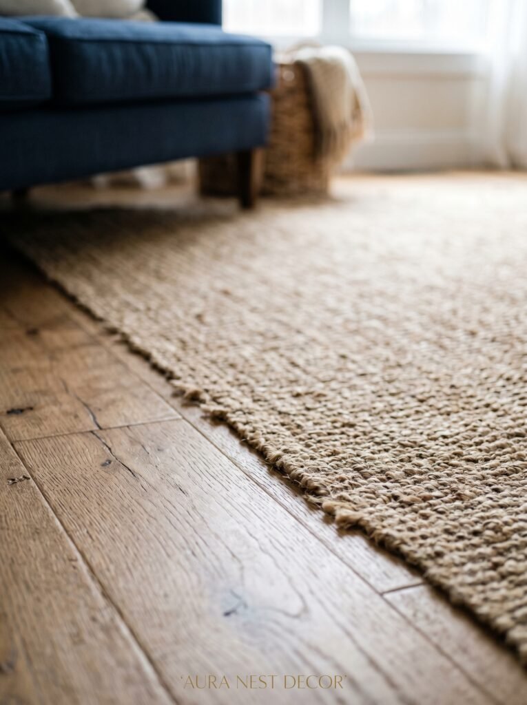
The rug is the third wall. People forget this.
In a navy farmhouse living room, your floor covering needs to balance the weight of the color above it without either disappearing or fighting for attention. The rugs that work best here are ones with natural warmth and texture — jute, sisal, wool, or a cotton flatweave — in tones ranging from cream and oatmeal to warm tan and soft gray.
A patterned rug can absolutely work — a subtle diamond weave, a worn-looking medallion, a thin stripe in cream and navy or cream and terracotta — but it needs to feel quiet. The room already has a strong color story. The rug is the floor, not the wall, and it should behave accordingly.
Size is more important than almost anything else. A rug that’s too small is the thing that makes a beautifully designed living room look like it was finished on a tight budget even when it wasn’t. In the US, a 9×12 is the starting point for most living rooms. In the UK, an equivalent or a large oblong that fits under at least the front legs of all seating is the minimum. When in doubt, go bigger.
—
11. The Seasonal Pivot: How the Same Navy Room Shifts From Summer to Winter
One of the quiet advantages of a navy-based living room is how easily it pivots with the seasons without any major changes.
In spring and summer, pull back the heavy layers. A lighter cotton throw replaces the chunky knit. Fresh greenery and white ceramics replace the candles and the warmer accents. Open the windows and let the natural light work against the navy — in full summer sun, navy comes alive in a way that’s closer to cobalt, and the room feels electric rather than moody.
In autumn and winter, add back the weight. A sheepskin on the armchair. More candles, grouped in odd numbers on the mantel. A thicker rug layered over the jute if you have one. Deep terracotta and rust cushions swapped in for the lighter ones. The room doesn’t change — it just breathes differently, the way a good coat worn in different weather is still the same coat.
This is actually one of navy’s greatest strengths as a foundational color: it’s seasonally flexible in a way that, say, sage green or warm terracotta alone are not.
—
12. The One Mistake That Makes Navy Farmhouse Look Dated Instead of Timeless
All of the above advice can be undone by one thing.
Too much contrast. Specifically: navy and stark, cold white used without any warm tones between them.
Cold white trim, cold white walls, cold white accessories against navy creates a palette that looks like a corporate logo. It’s technically correct and completely devoid of life. The modern farmhouse rooms that feel timeless and personal have always used warm whites — cream, natural linen, aged ivory — rather than bright white as their light anchor.
Warm white is what turns a color palette into an atmosphere.
Add one warm wood tone. Add one warm metal. Choose curtains and cushion covers that have been washed once and softened slightly. Let things be slightly imperfect — a mismatched arrangement on the mantel, a throw that isn’t neatly folded, a ceramic that’s slightly uneven.
That imperfection, that warmth, is exactly what makes a room feel like a home rather than a render.
—
❓ FAQ
Q: Can I use navy blue in a living room that doesn’t get much natural light? A: Yes, but be strategic about it. Keep walls light and bring navy in through furniture and textiles rather than paint. Warm-toned lighting — lamps with 2700K bulbs rather than overhead white light — is essential. A navy sofa in a naturally dark room with the right lighting actually reads as rich and intentional rather than gloomy.
Q: What colors go well with navy blue in a modern farmhouse living room? A: Your best companions are cream, warm white, terracotta, rust, warm sage, aged brass, and natural wood tones. Avoid bright or cool white, which strips out the warmth. Soft blush can work in smaller doses. Black iron as an accent metal ties everything together and keeps it sharp.
Q: Is navy blue a safe choice if I’m planning to sell my home? A: More than people expect, yes. A well-executed navy living room with warm accents reads as deliberately designed rather than risky, and buyers respond positively to spaces that feel considered. The key is keeping it balanced — one strong navy statement, warm surroundings, and nothing too dark or heavy. Avoid all-navy walls in small rooms if resale is a genuine concern.
—
💭 Final Thoughts
Navy blue doesn’t ask permission. It comes into a room and it anchors everything around it — the wood, the textures, the light — and it does it quietly, without making a fuss. That’s exactly the energy a modern farmhouse living room needs.
The rooms that last, the ones you still love two years after you decorated them, are always the ones where someone made a real decision rather than playing it safe.
So: what’s the one piece in your living room that could become the navy moment that changes everything?


