The Art of One Color: Why Monochromatic Interiors Make You Feel More at Home Than You’d Expect
There’s a moment when you walk into a beautifully designed room and something in your chest just… settles. You don’t always know why. But sometimes, it’s because the room is speaking one quiet, confident language — and your nervous system finally gets to rest.
—
Table Of Content
1. What a Monochromatic Interior Really Means (It’s Not What Most People Think)

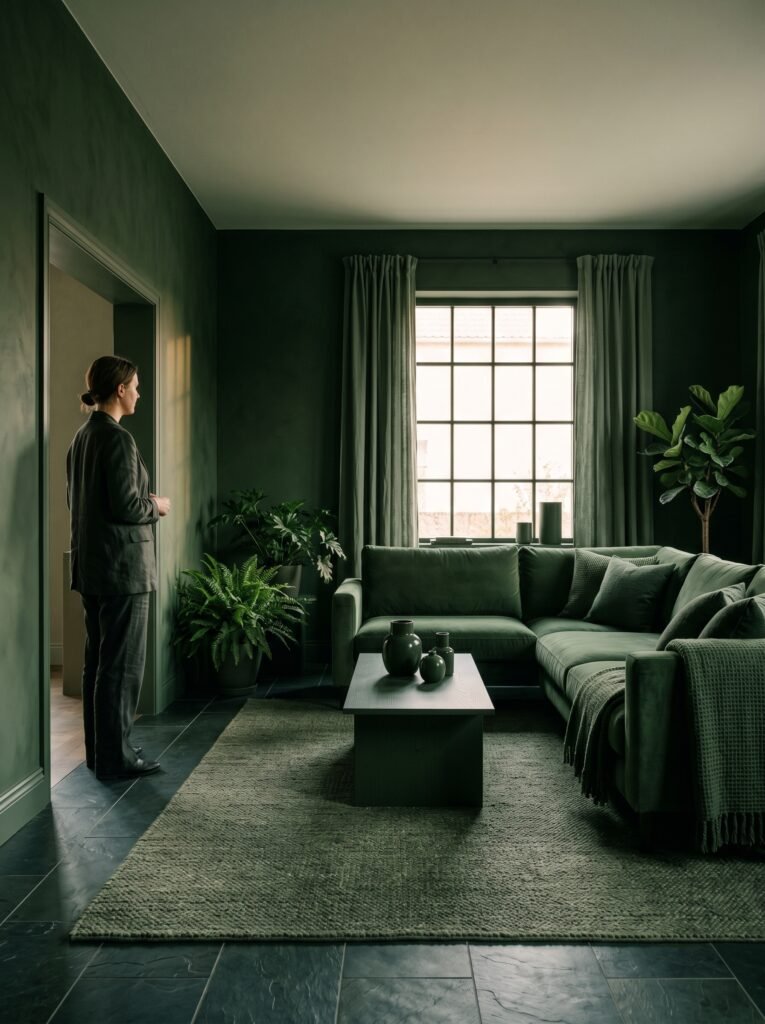
Many people hear “monochromatic interior” and picture a cold, sterile white room that looks more like a dentist’s office than a home. But that couldn’t be further from the truth. A monochromatic interior is simply a space built around a single color family — using its full range of tints, tones, and shades to create depth, warmth, and visual harmony.
Think of it this way: imagine a forest seen through morning mist. Every shade is green — from the deep, almost-black pine needles to the pale, silvery sage on the underside of a leaf. Nobody looks at a forest and says it’s boring. A well-executed monochromatic room works exactly the same way.
“Monochromatic design isn’t about using less — it’s about seeing how much one color can truly do.”
The word itself comes from the Greek mono (one) and chroma (color). Interior designers have long used this approach not as a limitation, but as a form of artistic discipline — a way of creating spaces that feel intentional and emotionally coherent from the moment you step inside.
—
2. The Psychology Behind Why These Rooms Feel So Calming

There’s actual science behind why monochromatic spaces tend to feel so restful. When your eyes move around a room filled with competing colors, your brain is constantly processing contrast, making micro-adjustments, and working to categorize what it sees. It’s subtle, but it’s real — and it adds up.
A room built in one color family reduces that visual noise dramatically. Your brain doesn’t have to negotiate between clashing hues. It settles into a single emotional register, and that register — whatever color you’ve chosen — gets to do its work fully and completely.
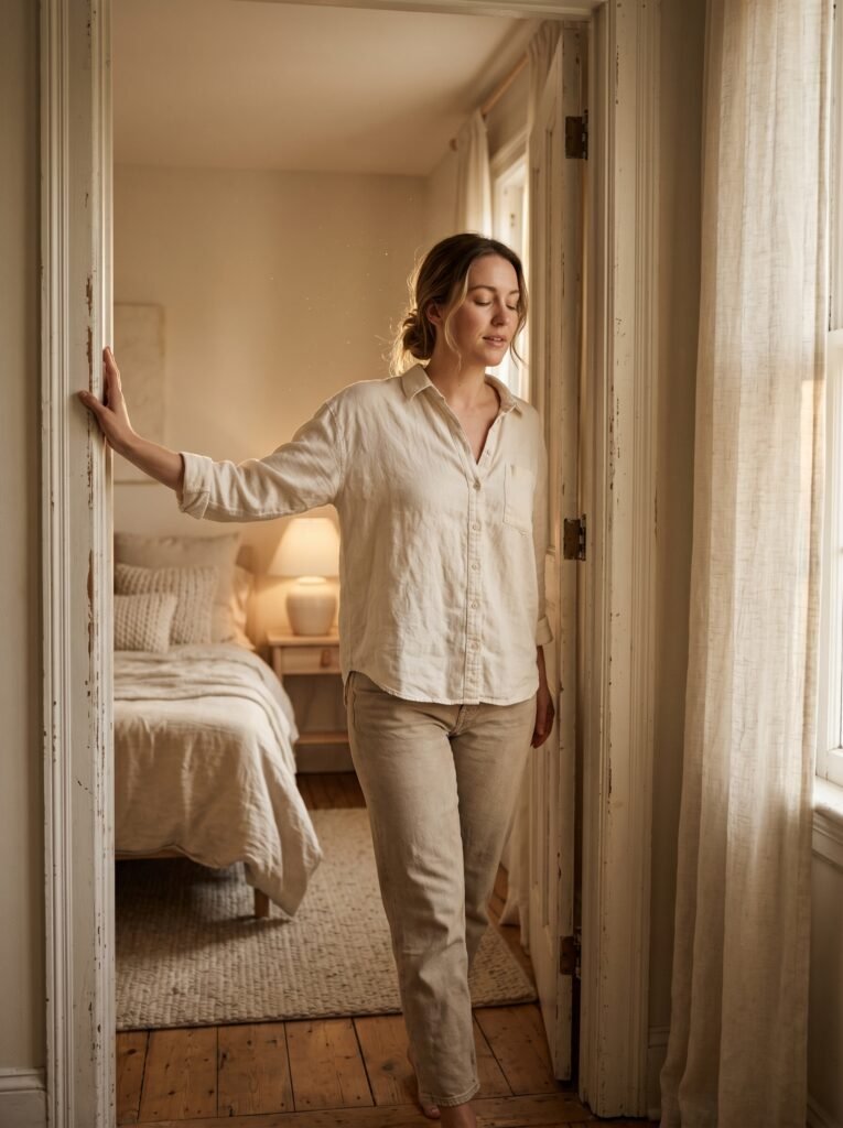
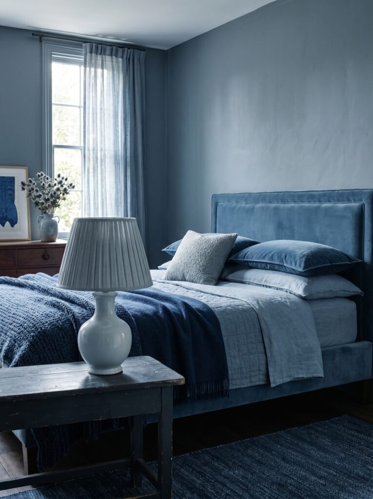
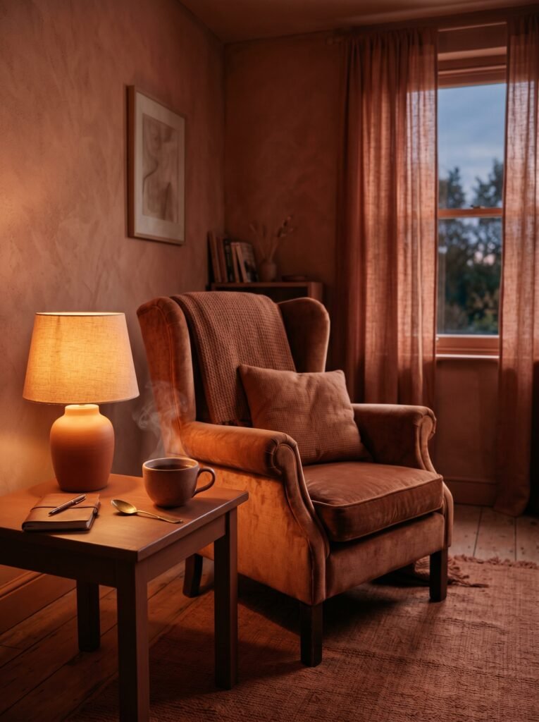
Warm beiges and creamy off-whites generate a sense of safety and softness. Deep navy or forest green rooms feel anchored, like you’re held by the walls themselves. Dusty rose or terracotta spaces carry a quiet intimacy that makes conversation feel more personal.
—
3. A Brief History: From Ancient Palaces to Modern Living Rooms

Monochromatic design is far from a modern trend. Ancient Egyptians decorated entire tomb chambers using variations of a single ochre or turquoise palette. Chinese imperial designers layered reds and crimsons throughout ceremonial halls to convey power and prosperity. Swedish Gustavian interiors of the 18th century favored a cool, muted grey-blue palette that still looks remarkably fresh today.
The approach moved through the Art Deco period, where rooms were sometimes dressed head-to-toe in champagne and gold. It influenced the minimalist wave of the 1990s and the much softer, warmer “quiet luxury” aesthetic that has dominated interior design conversations in the early 2020s. The thread running through all of it is the same: when everything belongs to the same color family, the space gains a rare sense of purpose.
—
4. The Difference Between Monochromatic and Monotonous
Here’s where a lot of people go wrong when they try this at home. They pick a color — say, grey — paint every wall, then buy a grey sofa, grey curtains, and a grey rug. The result feels flat. It feels like a mistake. And they conclude that monochromatic design just isn’t for them.
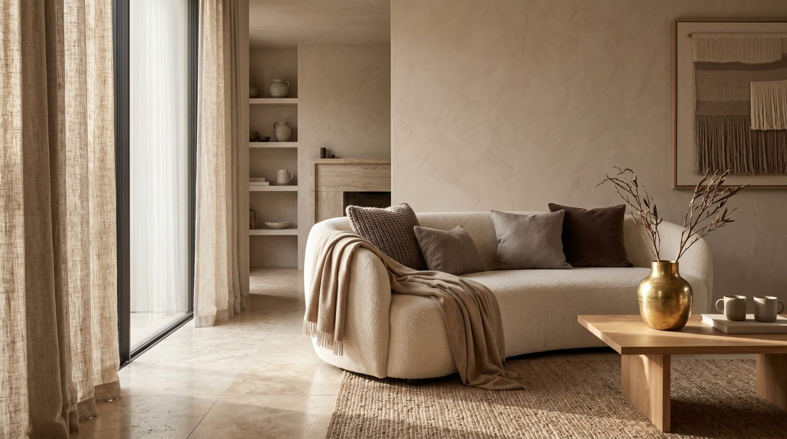
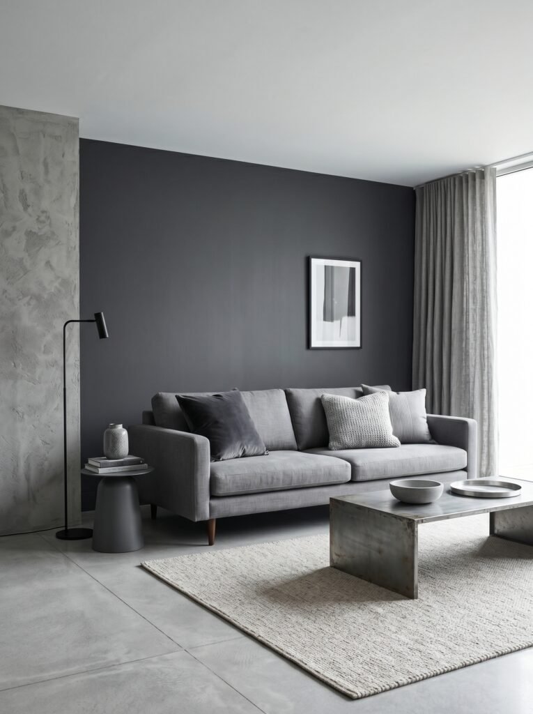
But what they’ve actually created is monotony, not harmony. The secret lies in variation — in playing with the full spectrum of a single hue. That means pairing a deep charcoal wall with a mid-tone dove grey sofa, then layering in a warm stone-colored rug, a silver throw, and a barely-there pale grey ceiling. Every element is grey, but no two surfaces are the same grey.
Texture becomes everything in a monochromatic room. A velvet cushion, a linen curtain, a rough plaster wall, and a polished wooden floor can all exist within the same color story while giving your eye something genuinely interesting to travel across.
—
5. Choosing Your Color: The Decision That Changes Everything
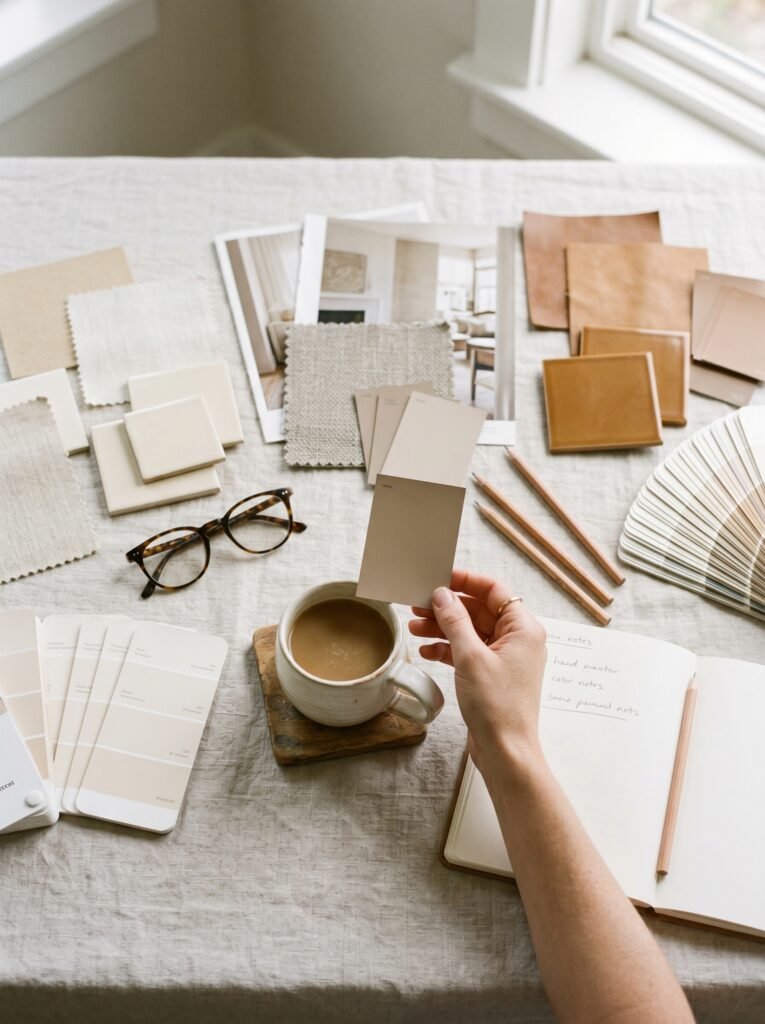
The color you anchor your monochromatic interior around isn’t just an aesthetic choice — it’s an emotional one. Before you even open a paint swatch book, it’s worth asking yourself how you want to feel in this room. Not how you want it to look in photographs, but how you want to feel on a grey Tuesday morning when you’re drinking your first coffee.
Warm neutrals — think sand, ivory, warm taupe — are forgiving, timeless, and flattering in virtually any light. They’re the safest starting point for anyone new to this approach. Blues and greens in their softer shades carry a biophilic quality, a subtle reminder of water and nature that most people find instinctively soothing. Bolder choices — terracotta, sage, deep plum — demand more commitment but reward that commitment with spaces that feel truly distinctive and alive.
“The right color doesn’t just fill a room — it completes a feeling you didn’t know you were searching for.”
—
6. The Role of Natural Light in a Monochromatic Space
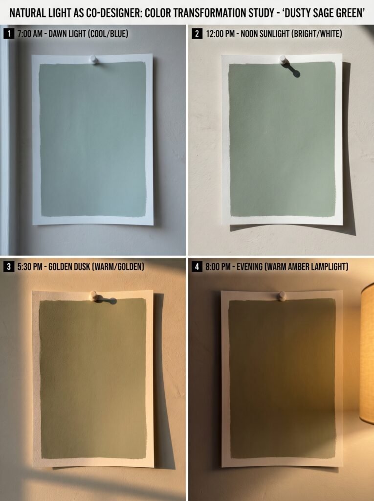
Light is the invisible co-designer of every monochromatic interior, and it deserves serious consideration before you commit to any palette. A color that feels sophisticated and moody in a showroom can look dingy and flat in a north-facing bedroom with limited natural light. Conversely, a shade that seems almost too pale in the paint store can glow with remarkable warmth in a sun-drenched living room.
Interior designers generally recommend getting large paint samples — at least A4 size — and living with them on your walls for several days before deciding. Watch what happens to that color at 7 in the morning, at noon, at dusk, and under your artificial evening lighting. You’re not choosing a color; you’re choosing a color in the context of light, and those are genuinely different things.
—
7. Furniture, Fabrics, and the Art of Layering Tones
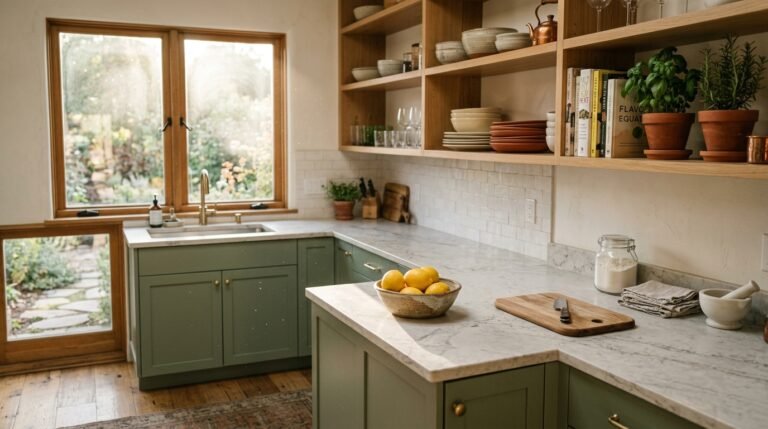
Once your walls are settled, the layering begins — and this is where monochromatic design becomes genuinely exciting. Think of your room as a composition with a foreground, a middle ground, and a background. Your walls and large furniture pieces establish the base. Rugs, curtains, and upholstery build the middle layer. Cushions, throws, books, ceramics, and plants bring it all to life in the foreground.
Each layer should sit within your chosen color family but contribute something slightly different — in tone, in texture, or in finish. A matte wall paired with a glossy ceramic lamp base within the same hue range creates a quiet conversation that’s endlessly more interesting than pure uniformity. This interplay is what separates a thoughtfully designed monochromatic room from a painted box.
—
8. When Neutrals Aren’t Neutral: The Warm-Cool Divide
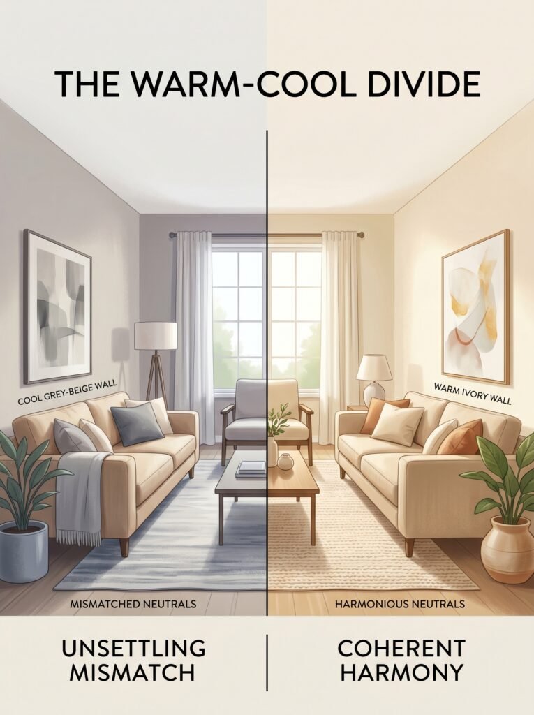
One of the most common mistakes in monochromatic decorating — even among experienced decorators — is mixing warm and cool versions of the same color without realizing it. Every color has an underlying temperature. Some whites lean yellow or pink (warm). Others lean blue or grey (cool). Some greys have a green undertone; others pull purple.
When you mix a warm beige sofa with a cool grey-beige wall, something subtle but unmistakable feels off. The room doesn’t cohere. People often blame the furniture or the paint choice, when what they’re actually experiencing is a temperature mismatch. Before purchasing anything significant, hold it against your wall in natural light, and check that both elements pull in the same direction — either both warm or both cool.
—
9. Accent Colors: To Add or Not to Add?

A truly monochromatic interior uses only one color family. But in practice, most people introduce one very quiet accent — often a natural element like wood, brass, or greenery — that technically steps outside the palette but anchors the room in the real world. This is not a design failure; it’s a human one, and it tends to make spaces feel lived-in rather than staged.
“A single stem of eucalyptus in a monochromatic room isn’t breaking the rules — it’s reminding you the world outside still exists.”
The key is restraint. One natural wood coffee table in an otherwise blue room doesn’t disrupt the palette; it grounds it. A collection of brass picture frames doesn’t shatter a beige scheme; it gives the eye a finishing note to land on. What you want to avoid is multiple competing accents that start to tell their own story — at that point, you’ve moved away from monochromatic design entirely.
—
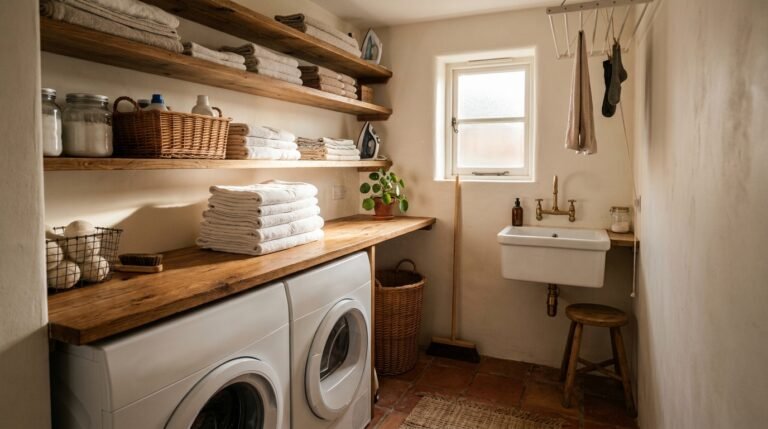
10. Small Spaces Love a Monochromatic Palette
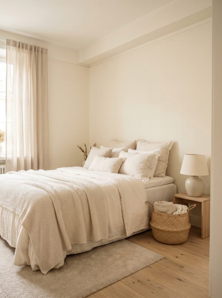
If you’ve ever lived in a small apartment and spent too much time trying to make a cramped room feel bigger, here is perhaps the most practical gift monochromatic design offers: visual continuity. When walls, floors, and furniture share the same color family, the eye cannot easily detect where one surface ends and another begins. The room appears to expand.
This is why many professional designers working with compact urban apartments reach for monochromatic palettes almost instinctively. A small bedroom dressed in layered creams and warm linens reads as serene and spacious. The same room with contrasting furniture, a feature wall, and bright accessories reads as cluttered, regardless of the actual square footage.
—
11. The Rooms That Suit This Approach Best
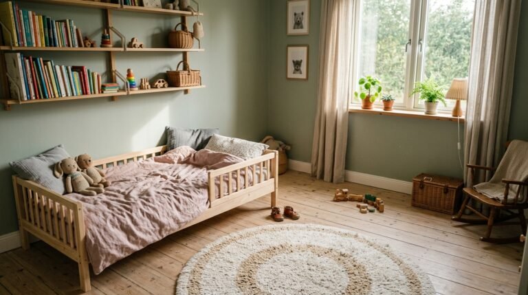
While monochromatic design can work in any room, certain spaces respond to it with particular enthusiasm. Bedrooms benefit enormously from the visual calm it creates — the lack of contrast reduces stimulation and genuinely supports better sleep. Home offices designed in a single muted palette help maintain focus throughout the working day, removing the subtle visual distractions that busier rooms create.
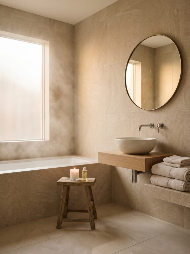
Bathrooms are perhaps the most effortless application of all. A bathroom tiled, painted, and accessorized in variations of the same grey, white, or stone palette feels spa-like without any excessive investment. Living rooms require more confidence and more layering, but when they work, they become the rooms that guests remember and inevitably ask about.
—
12. The Quiet Confidence of Committing to One Thing
There’s something philosophically satisfying about a monochromatic interior that goes beyond aesthetics. In a world that constantly demands your attention in twelve directions simultaneously, a room that commits fully to one idea is quietly radical. It says: this is enough. This is more than enough.
Designers who have spent years working with these palettes often describe a moment of peace that clients experience when a monochromatic room is finally complete. It’s not the excitement of a bold pattern or the drama of a striking contrast. It’s something slower and steadier — the feeling of arriving somewhere that knows exactly what it is.
—
🌿 How to Begin Your Own Monochromatic Interior
Starting can feel overwhelming, but the process becomes intuitive once you break it into steps. Begin by identifying a color you already live with comfortably — a shade you wear often, a color you’re drawn to in nature, or a hue that already exists somewhere in your home and makes you happy. That instinct is reliable.
From there, gather five to seven versions of that color — paint chips, fabric swatches, magazine clippings — ranging from its palest tint to its deepest shade. Lay them together and notice which combinations feel most alive to you. That selection becomes your working palette.
Invest in texture before you invest in quantity. Two or three beautifully textured pieces within your palette will always outperform ten flat, similar-toned items. A bouclé cushion, a woven basket, and a ceramic vase in the same color family will do more for a room than a full set of matching accessories.
Introduce your palette gradually if you’re nervous about commitment. Start with soft furnishings — cushions, throws, a rug — before moving to paint or larger furniture. This gives you time to develop your eye and build confidence in the approach before making changes that are harder to reverse.
Finally, give yourself permission to edit. A monochromatic room is never truly finished; it evolves as you find new pieces that belong to it, and retire old ones that no longer feel right. Think of it as an ongoing relationship rather than a one-time project.
—
❓ FAQ
Q: Can a monochromatic interior look good in a rental where I can’t paint the walls? A: Absolutely. Soft furnishings, rugs, curtains, and accessories carry enormous visual weight in a room, and you can build a convincing monochromatic palette through these elements alone. If your walls are a neutral white or beige, they’ll happily recede into almost any color story you build around them.
Q: Is monochromatic design suitable for families with young children? A: Yes, though the color choice matters more in practical terms. Lighter palettes in high-traffic areas can show wear more readily, while mid-toned warm neutrals or deeper shades are more forgiving of everyday living. Many families opt for their monochromatic palette in bedrooms and home offices, and take a more flexible approach in shared family spaces.
Q: How is a monochromatic interior different from a neutral interior? A: A neutral interior typically uses whites, greys, and beiges together as a quiet, harmonious backdrop. A monochromatic interior is more specific — it commits to one color family (which could be a neutral, but could equally be blue, green, or any other hue) and builds the entire room within that single family’s tonal range. The discipline is stricter, and the emotional result tends to be more distinctive.
—
💭 Final Thought
There’s a kind of courage in simplicity — in saying this one thing, done fully rather than many things, done halfway. A monochromatic interior asks you to slow down, look more carefully, and trust that depth doesn’t always require variety. The rooms that stay with us long after we leave them are rarely the loudest ones.
So here’s the question worth sitting with: if your home could speak in one clear, confident voice, what would it say — and what color would it choose to say it in?