Why Colorful Interiors Are the Secret to a Home That Actually Feels Like You
There’s a moment — you’ve probably felt it — when you walk into someone’s home and it just breathes. The walls glow with warmth, the furniture sings with personality, and somehow the whole room feels like a conversation you never want to leave. That feeling almost always traces back to one brave decision: color. This article is your complete guide to embracing colorful interiors with intention, confidence, and a whole lot of heart.
—
Table Of Content
1. The Psychology Behind Why Color Makes a Home Feel Alive
Before you pick up a paint brush or order that emerald green velvet sofa, it’s worth pausing to ask — why does color affect us so deeply? The answer lives somewhere between neuroscience and pure emotion.
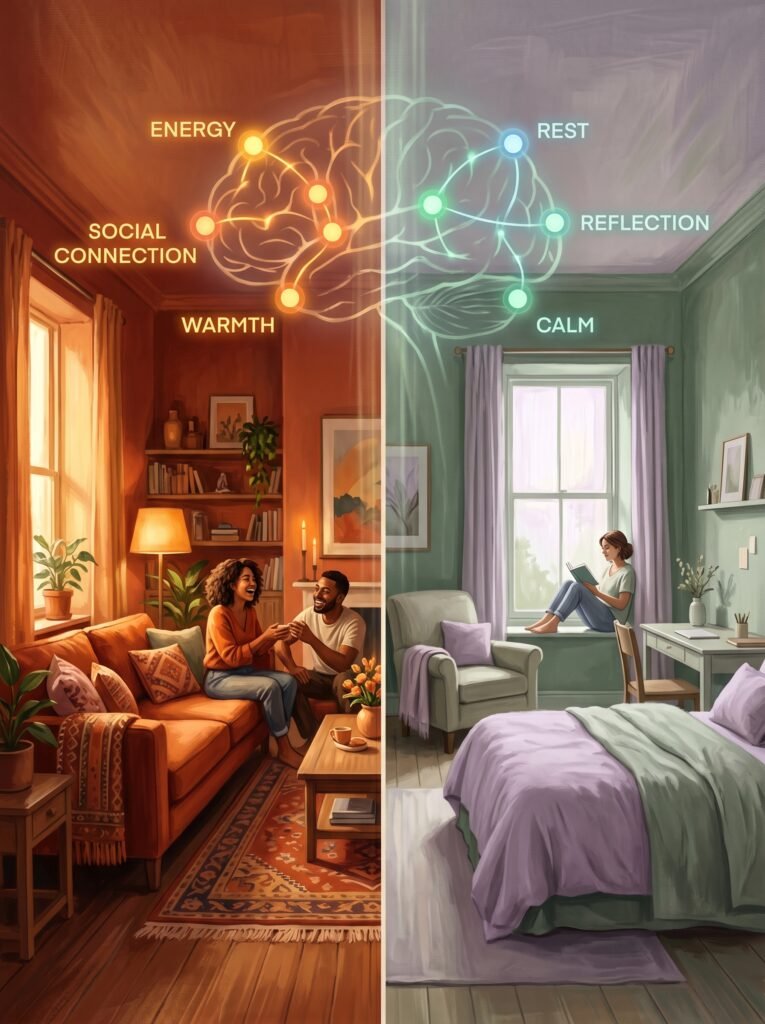
Color is one of the first things your brain processes when you enter a room. Before you notice the furniture layout or the art on the walls, your nervous system has already registered the dominant hues and begun adjusting your mood accordingly. Warm colors — deep terracottas, golden yellows, burnt oranges — activate the part of your brain associated with energy, appetite, and social connection. Cool colors — soft blues, sage greens, dusty lavenders — slow your heart rate slightly and invite rest and reflection.
This is not coincidence. It’s biology. And when you start decorating with this awareness, your home stops being a collection of furniture and starts becoming an environment that actively supports how you want to feel each day.
“Color isn’t decoration. It’s the emotional architecture of your home.”
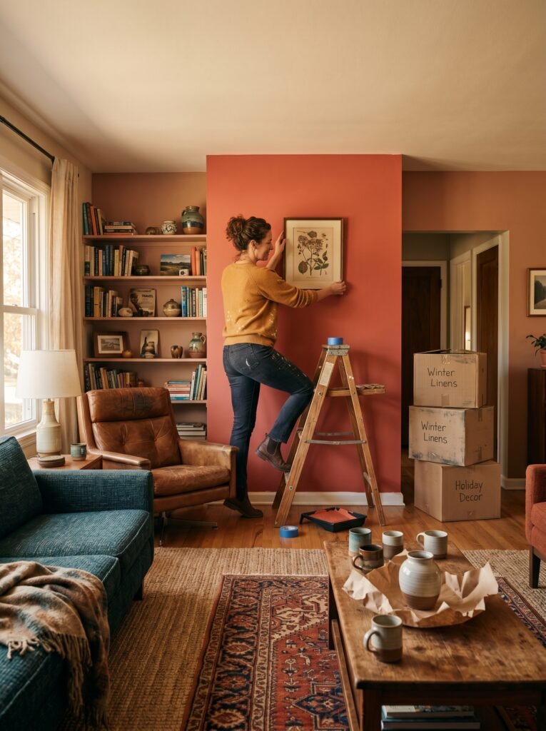
The most joyful, memorable homes are the ones where someone made intentional color decisions — not necessarily bold ones, but purposeful ones. Even a single accent wall in a rich, unexpected hue can completely shift a room’s emotional register. That’s the kind of design power that no neutral beige can replicate.
—
2. Starting With What Scares You: Finding Your Color Comfort Zone
Most people who say they’re afraid of color are actually afraid of making a mistake they can’t undo. That fear is completely valid — and completely solvable. The secret is to start where the risk feels manageable, and build from there.
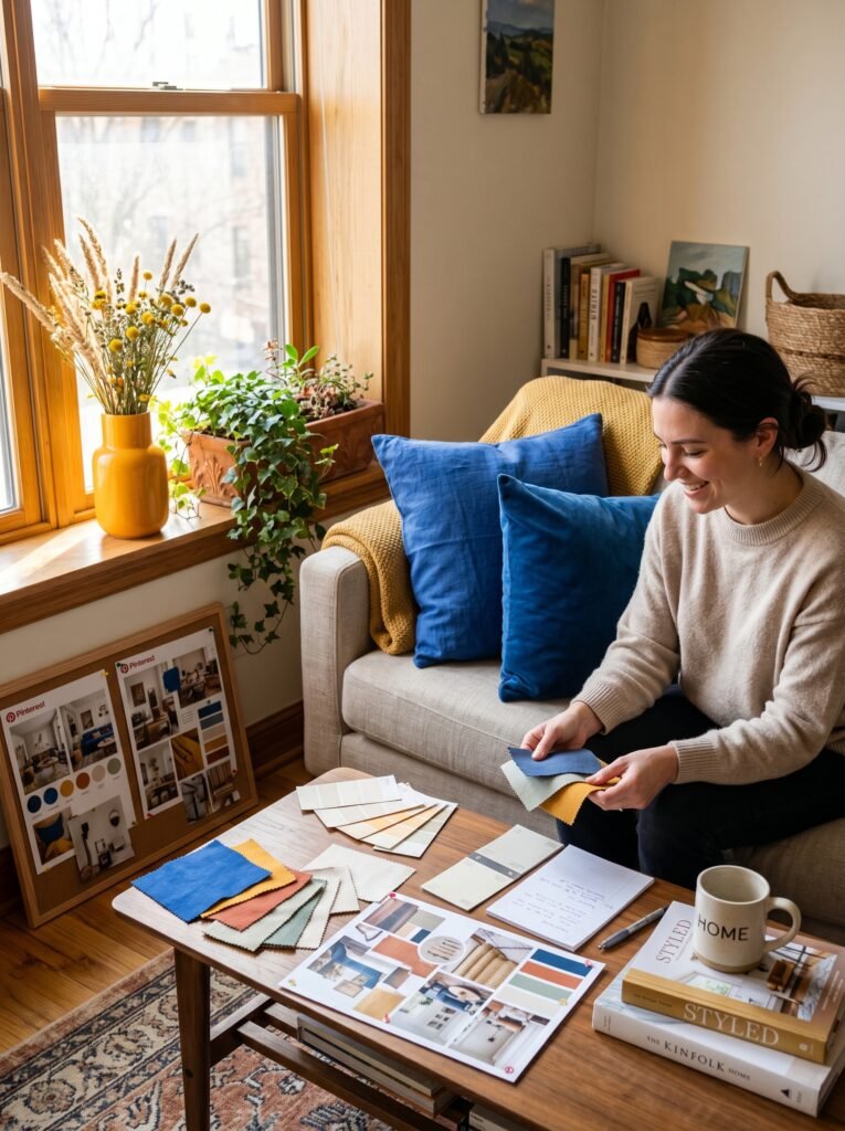
Begin with accessories. A set of cobalt blue throw pillows. A marigold ceramic vase. A terracotta planter filled with trailing ivy. These small bursts of color cost very little and can be swapped out in an afternoon. They let you live with a color before committing to it on walls or furniture.
Once you’ve developed a feel for the hues that genuinely light you up — not the ones you think you should like, but the ones that make you pause when you scroll past them on Pinterest — you’ll have the confidence to go bigger. Your comfort zone expands naturally when you let yourself experiment without pressure.
—
3. The Rule of Three Colors That Every Designer Quietly Uses
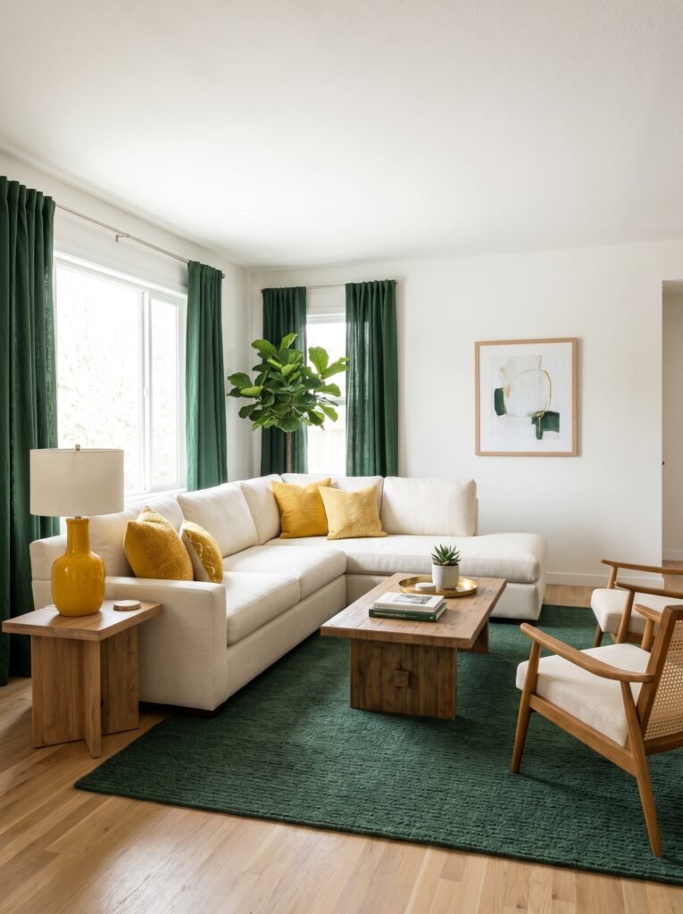
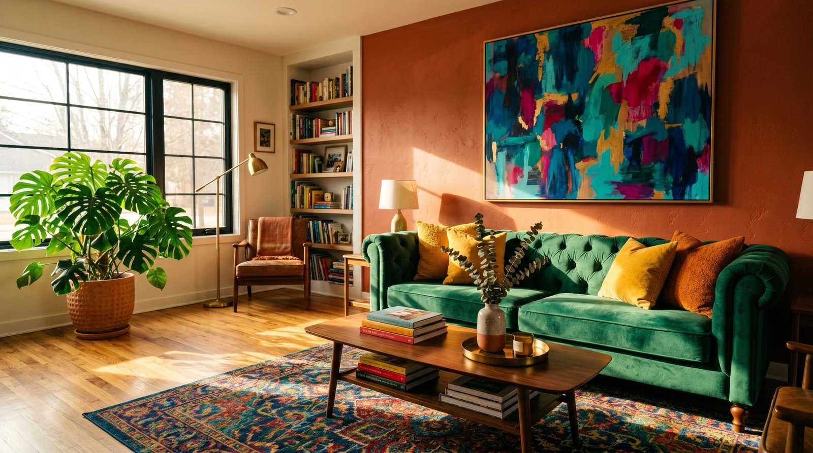
Walk into any professionally designed colorful interior and you’ll notice something beneath the visual richness — a hidden structure that keeps the room from feeling chaotic. That structure is usually the rule of three: one dominant color, one secondary color, and one accent color.
The dominant color takes up about 60% of the room’s visual space — typically the walls and large pieces of furniture. The secondary color covers roughly 30%, showing up in sofas, rugs, or curtains. The accent color is used sparingly at about 10%, punctuating the space with energy through throw pillows, artwork, lamps, or decorative objects.
This 60-30-10 principle is why some colorful rooms feel effortlessly pulled together while others feel overwhelming. It’s not about using fewer colors — it’s about giving each color a clear role to play. Once you understand this rhythm, you can be incredibly bold with your palette and still land in a space that feels balanced and livable.
—
4. Warm Vs. Cool Palettes: Choosing the Right Emotional Story for Each Room
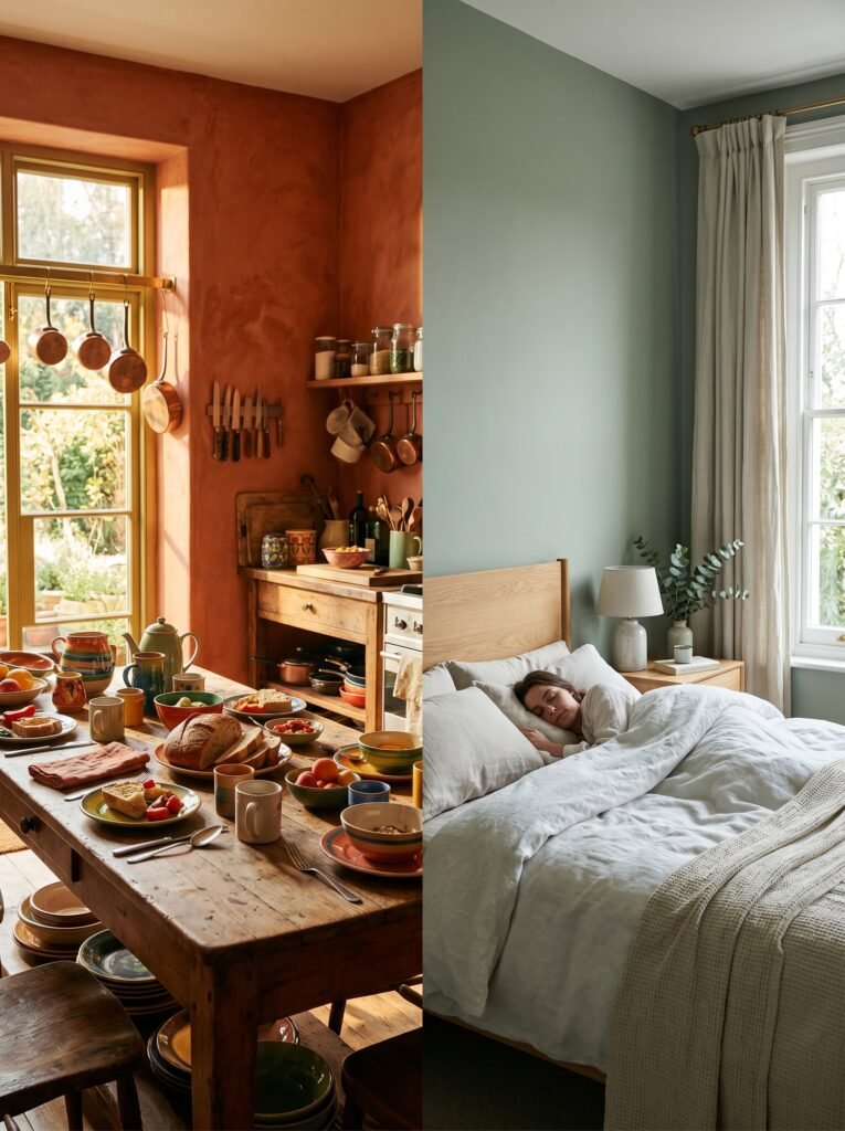
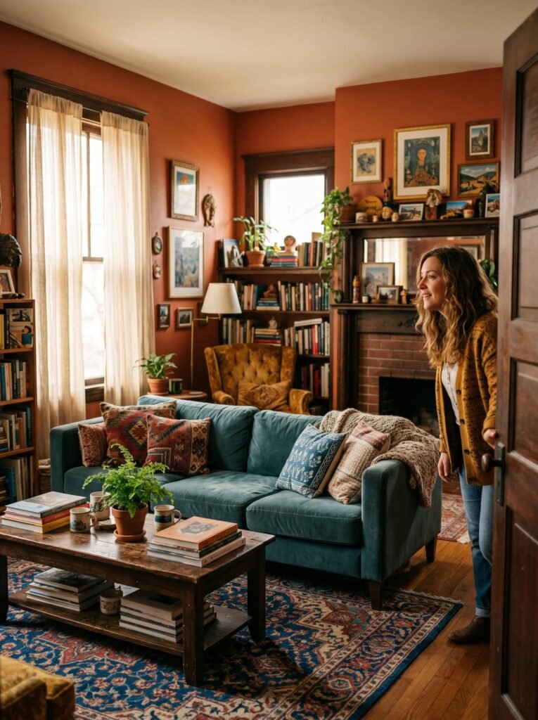
Every room in your home serves a different emotional purpose, and your color palette should reflect that. The kitchen calls for a different mood than the bedroom. The living room speaks differently than a home office.
Warm palettes — think deep reds, rich yellows, warm whites, burnt siennas — are beautifully suited to kitchens, dining rooms, and living spaces where you want energy, conversation, and a sense of abundance. Imagine a kitchen with terracotta walls and brass fixtures, morning light pouring across a wooden table laid with colorful mismatched ceramics. That warmth invites people to linger.
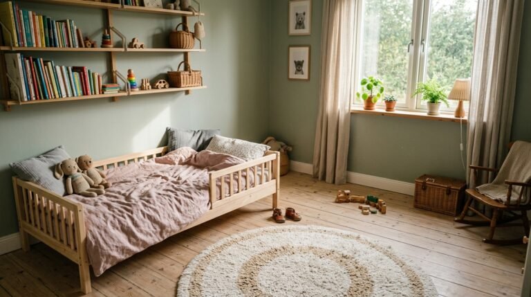
Cool palettes — dusty blues, sage greens, soft purples, cool grays — work magnificently in bedrooms and bathrooms, where your nervous system needs permission to unwind. A bedroom draped in muted sage green with white linen and natural wood accents doesn’t just look beautiful — it feels like a sigh of relief at the end of a long day.
Neither palette is superior. What matters is alignment: matching the emotional function of the room with the psychological language of color.
—
5. The Unexpected Magic of Colorful Ceilings

For years, the ceiling was the forgotten surface — painted white by default and never questioned. But something shifted in the design world, and colorful ceilings are now one of the most transformative — and surprisingly accessible — ways to bring personality into a room.
A painted ceiling creates what designers call a “color canopy.” When you paint the fifth wall in a deep, warm hue — a navy blue, a forest green, even a dusty rose — the entire room feels more intimate, more intentional, and more finished. It’s the design equivalent of putting a lid on a box: everything inside suddenly coheres.
“The ceiling is the room’s sky. Why would you leave it plain when you could make it extraordinary?”
The best part? Because ceilings are horizontal rather than vertical, even a very saturated color tends to feel less overwhelming than it would on a wall. Deep midnight blue on a ceiling reads as moody and sophisticated, not heavy. It’s one of the highest-impact, lowest-risk color moves in interior design.
—
6. How to Make Colorful Furniture Work Without Overwhelming a Room

A colorful sofa is one of the most searched Pinterest interior trends — and one of the most misunderstood. Many people fall in love with a mustard yellow loveseat or a forest green sectional and then have no idea how to build a room around it.
The key is to let the furniture be the star and ensure everything else plays a supporting role. When your sofa is the statement, your walls should be quieter — a warm white, a soft linen, or even a complementary deeper tone. Your rug should contain at least one color from the sofa to create visual continuity. And your accent pieces should echo — not match — the sofa’s hue.
Color matching in interior design isn’t about perfect uniformity; it’s about conversation. Your emerald sofa doesn’t need emerald curtains. It needs a painting with a stroke of emerald in it, a throw blanket with a whisper of green, and a vase that carries the botanical spirit forward. That’s what makes a room feel curated rather than decorated.
—
7. The Role of Natural Light in Bringing Your Color Palette to Life

Here’s something design articles don’t talk about enough: the same color can look completely different depending on which direction your room faces and what time of day it is. Ignoring light when choosing colors is one of the most common decorating mistakes people make.
North-facing rooms receive cool, indirect light throughout the day. In these spaces, warm colors come alive — terracotta deepens beautifully, golden yellow feels radiant, and warm coral glows. Cool colors in north-facing rooms can feel flat or even slightly gray.
South-facing rooms are bathed in bright, warm light for most of the day, which means cool colors — soft blues, lavenders, pale greens — look their absolute best. That powdery blue that looks almost gray in a paint chip? In a south-facing room, it becomes luminous.
Always test paint colors at different times of day before committing. Tape large swatches directly onto the wall and observe them at 8am, noon, 4pm, and evening under artificial light. The color that looks perfect at noon might feel entirely different at dusk, and you deserve to love the result all day long.
—
8. Color Blocking: The Bold Design Move That Transforms Empty Walls
Color blocking — the practice of painting sections of a wall in contrasting or complementary hues — has moved from fashion runways directly into some of the most celebrated interior spaces on Pinterest. And for good reason. It is graphic, bold, and deeply personal.
The simplest version is a horizontal split: painting the lower third of a wall in a darker color and the upper two-thirds in a lighter tone. This grounds the room visually and creates an architectural effect even in flat, featureless spaces. More adventurous interpretations involve geometric shapes, arches, or asymmetrical blocks that turn an entire wall into a piece of art.
Color blocking is particularly powerful in small spaces like hallways, powder rooms, and reading nooks — areas where you want maximum impact in minimum square footage. A tiny bathroom with color-blocked walls in sage and terracotta doesn’t feel small. It feels designed, intentional, and completely unforgettable.
—
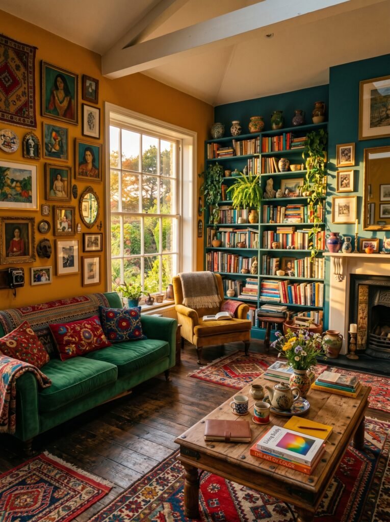
9. Plants, Textiles, and Art: The Trinity of Layered Color
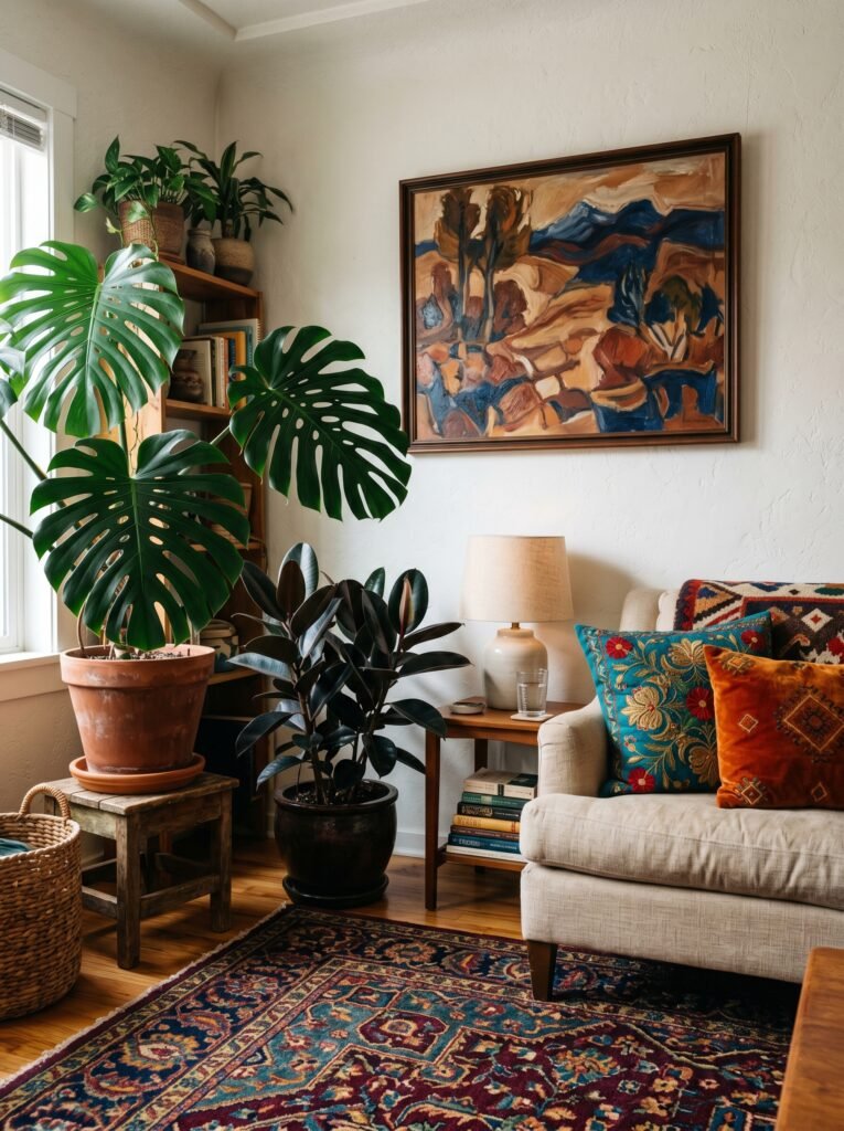
Color doesn’t only live on walls and furniture. In the most beautiful, Pinterest-worthy colorful interiors, it cascades through three additional layers — plants, textiles, and art — creating depth, texture, and the sense that the room has been lived in and loved over time.
Plants bring organic color that no paint can replicate. The particular green of a monstera leaf, the burgundy-black of a rubber plant, the silver-blue of an echeveria succulent — these natural hues add a layer of aliveness that makes an interior feel like an ecosystem rather than a stage set.
“A home with plants has a pulse. And a home with colorful plants has a personality.”
Textiles — cushions, throws, curtains, rugs — are where you can safely play with your most adventurous color instincts. A heavily patterned rug in deep jewel tones can anchor an entire room’s palette. A set of embroidered cushions in contrasting colors can pull together elements that might otherwise seem unrelated.
Art is the room’s voice. Original paintings, printed photographs, hand-lettered quotes, woven wall hangings — art introduces color in its most emotional, storytelling form. Hanging a piece of art before choosing your wall color — rather than after — is a trick used by professional interior stylists that results in rooms that feel far more intentional and cohesive.
—
10. Budget-Friendly Ways to Add Color That Feel High-End

The most beautiful colorful interiors on Pinterest are not always the most expensive ones. Color is one of the great democratizers of interior design — a can of paint costs a fraction of new furniture and delivers impact that no amount of money spent on neutrals can buy.
Paint is the most obvious investment, but beyond that, consider thrift stores and secondhand markets as treasure troves of colorful vintage ceramics, bold printed textiles, and one-of-a-kind art. A secondhand sideboard painted in deep navy blue and fitted with new brass handles costs very little but looks like a designer statement piece.
Removable wallpaper — another Pinterest favorite — allows renters and commitment-phobes to introduce dramatic color and pattern without a permanent decision. A single accent wall of removable botanical wallpaper in rich greens and warm rust can transform a plain bedroom into something magazine-worthy over a single weekend.
—
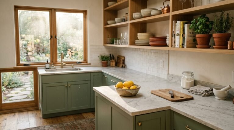
11. The Colorful Kitchen: Where Cooking Becomes a Full Sensory Experience

There is something profoundly right about a colorful kitchen. Food is color — the deep red of a slow-simmered tomato sauce, the bright green of freshly chopped herbs, the golden crust of a loaf of bread just out of the oven. A kitchen that honors color creates a sensory harmony between the space and what happens inside it.
Colorful kitchens don’t require a full renovation. Open shelving styled with mismatched but coordinated colored ceramics creates instant visual warmth. A collection of colorful enamel cookware displayed on a pot rack becomes both storage and art. Painted cabinet fronts in a deep, sophisticated hue — forest green, midnight navy, warm terracotta — can completely reframe even the most dated kitchen without touching a single structural element.
The kitchen is where your family gathers every single day. It deserves to be a room that feels like you.
—
12. How to Evolve Your Colorful Interior as Your Taste Grows
One of the most freeing realizations in interior design is this: your home is allowed to change. Your color choices today don’t have to last forever. And in fact, the most beautifully designed homes are the ones that evolve slowly with their owners, accumulating meaning and personality over time rather than being styled all at once.
Think of your colorful interior as a living document — something you add to, edit, and occasionally reimagine. Swap out accessories seasonally. Experiment with a new accent color each year. Repaint a room when you’ve grown beyond its current palette. Give yourself permission to change your mind, because the homes that feel most alive are the ones that are in constant, gentle conversation with the people who live in them.
The goal isn’t a perfect room. The goal is a room that feels unmistakably, joyfully, deeply yours.
—
🌿 How to Take Care of Your Colorful Interior
Maintaining a colorful home is really about keeping each element at its best so the overall effect stays intentional and fresh. Here’s how to do it without stress.
Touch up painted walls once or twice a year — always keep a small amount of your wall paint stored in a labeled jar so you can address scuffs and chips before they dull the room’s overall vibrancy. For colorful textiles, wash cushion covers regularly and follow fabric care instructions closely, since bright dyes can fade with incorrect laundering. Rotate your decorative accessories with the seasons — putting certain pieces away and bringing others out keeps the space feeling curated rather than cluttered. For colorful ceramics and art, avoid placing them in direct prolonged sunlight, which can fade pigments over time. And finally, trust your instincts — if something isn’t bringing you joy anymore, edit it out. A colorful interior only sings when every element is genuinely loved.
—
❓ FAQ
Q: Is it possible to have a colorful interior without it looking chaotic or overwhelming? A: Absolutely. The key is using the 60-30-10 rule — one dominant color, one secondary color, and one accent color — which gives even the boldest palettes a sense of structure and calm. Choosing colors from the same tonal family (all warm or all cool) also helps the room feel cohesive rather than busy.
Q: What’s the easiest single change that will make my home look more colorful? A: Paint is your most powerful and affordable tool. Even painting one wall, one piece of furniture, or your front door in a rich, deliberate color can completely transform how your home feels. Start with one surface and see how it changes the energy of the entire space.
Q: How do I choose colors for an open-plan home where rooms flow into each other? A: Focus on building a master palette of three to five colors that recur throughout the connected spaces in different proportions. This creates visual flow without uniformity — each area feels distinct but related, like chapters in the same beautifully written book.
—
💭 Final Thought
Color is one of the most personal, powerful choices you can make in your home — and yet so many of us live surrounded by safe, apologetic neutrals, waiting for permission to be bolder. Your home is your story. It is the only place on earth that exists entirely for you, and it deserves to be told in full, saturated, joyful color. So here’s the question only you can answer: what color have you always loved but never quite been brave enough to let inside?