
Why Greige Is the Interior Color That Finally Makes Your Home Feel Like You
There’s a moment — maybe you’ve had it — where you stand in the middle of a room you’ve decorated and feel nothing. Not bad, exactly. Just… nothing. Greige is the color that quietly fixes that, and once you understand why, you’ll never look at a beige wall the same way again.
—
1. The Color That Couldn’t Decide — and Won Because of It
Greige is exactly what it sounds like: a sophisticated marriage between gray and beige. But calling it simply a blend would be like calling a great meal “food.” It undersells the magic entirely.
What makes greige so quietly extraordinary is that it carries the warmth of beige — that buttery, skin-like softness that makes a room feel inhabited — while borrowing the cool composure of gray, which brings depth, modernity, and a sense of visual calm. Neither color dominates. They exist in a kind of perfect tension that, somehow, resolves into something altogether more beautiful than either parent shade.
Interior designers have been leaning into greige for years, but in the last decade it’s moved from a professional trade secret to a genuine cultural phenomenon. And for good reason. Most of us don’t live in showrooms. We live in real homes with furniture we bought at different times, rugs we inherited, and art we’ve collected gradually. Greige has an almost supernatural ability to tie all of that together without demanding that anything match perfectly.
“Greige doesn’t ask your furniture to coordinate. It asks your home to simply breathe.”
The color works because it doesn’t fight for attention. It creates a canvas — and every great painting starts there.
—
2. The Psychology of Greige: Why Your Brain Loves It
Color psychology is a real science, and greige is one of its most fascinating case studies. When researchers study emotional responses to color, neutral tones — especially warm neutrals — consistently rank high for inducing feelings of safety, comfort, and groundedness. Greige occupies a sweet spot that pure beige and cool gray can’t quite reach on their own.
Beige, in its pure form, can read as dated or slightly anxious — trying too hard to be inoffensive. Gray, on its own, risks tipping into coldness, especially in rooms with limited natural light. Greige threads that needle with extraordinary precision. The brain registers the warmth and relaxes. It also registers the sophistication and feels elevated.
Think of it this way: greige is the interior design equivalent of a well-tailored linen shirt. Relaxed but considered. Effortless but intentional.
This is why therapists, architects, and hospitality designers often gravitate toward greige for spaces meant to support rest, conversation, and restoration. It’s not accidental — it’s evidence-based design made accessible.
—
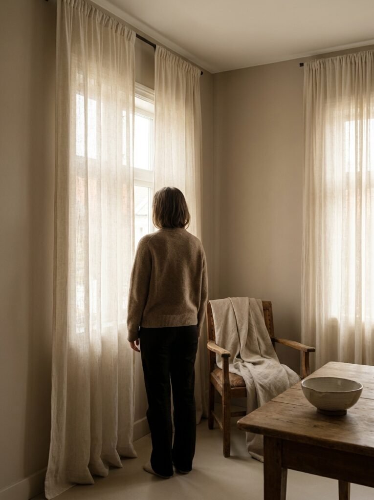
3. The Secret Life of Natural Light in a Greige Room
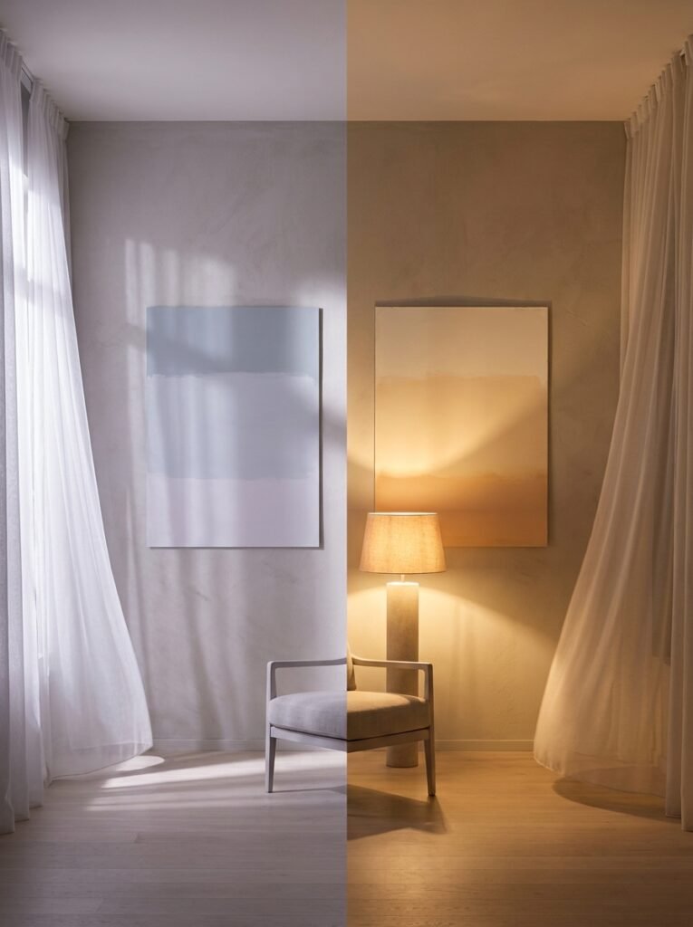
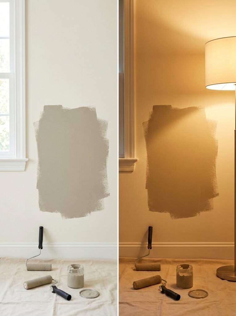
Here’s where greige gets genuinely interesting — and where many people get tripped up. Greige is one of the most light-sensitive colors you can put on a wall, and the same shade can behave like two completely different hues depending on the light in your room.
In a north-facing room with cool, indirect light, a greige that looked warm and golden in the paint store can suddenly look lavender or even slightly blue-green. That’s the gray pulling forward in low, cool light. Conversely, a south-facing room drenched in afternoon sun will bring out the beige, flooding the space with honeyed warmth.
This isn’t a flaw — it’s actually one of greige’s most compelling features. A greige room changes personality throughout the day in the most subtle, beautiful way. Morning light makes it feel fresh. Midday sun makes it feel alive. Evening lamplight turns it into something that feels almost amber-warm, like the room is glowing from within.
The practical advice? Always, always test your greige with large paint swatches and observe them across a full day before committing. What you see at noon is not what you’ll live with at 7 p.m. with the lamps on — and that evening version may well be the one you love most.
—
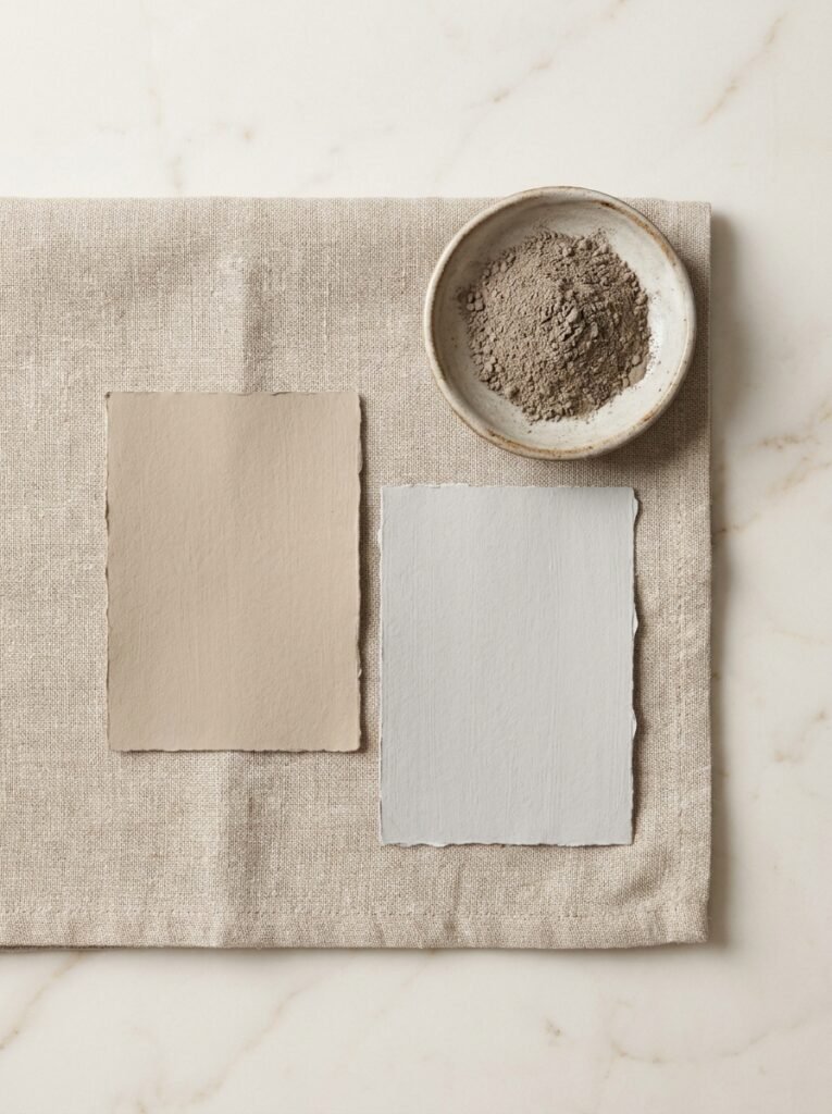
4. Greige Paint Shades Worth Knowing By Name
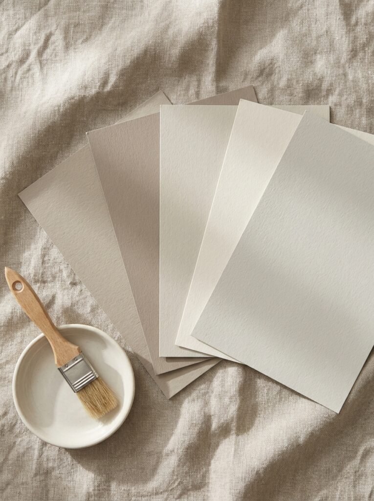
Not all greige is created equal, and the difference between a beautiful greige room and a disappointing one often comes down to choosing the right formula. The ratio of gray to beige, the undertones lurking beneath the surface, and even the finish you choose can transform the entire character of a space.
Some of the most beloved greige shades in interior design circles include Benjamin Moore’s Revere Pewter, a classic with slightly warm brown undertones that’s become so popular it’s practically its own genre. Sherwin-Williams’ Accessible Beige leans warmer and works beautifully in rooms with leather furniture or warm wood tones. Agreeable Gray, also from Sherwin-Williams, is considered by many designers to be the perfect modern greige — balanced, versatile, and almost impossibly adaptable.
For those who want something with a little more personality — a greige that skews cooler and more contemporary — Edgecomb Gray by Benjamin Moore has an almost ethereal quality that works magnificently in minimalist and Scandinavian-influenced spaces.
The finish matters too. Matte and eggshell finishes deepen the complexity of greige and hide imperfections beautifully, making them ideal for living rooms and bedrooms. Satin works well in kitchens. Avoid high-gloss on large wall surfaces — it tends to flatten the nuance that makes greige so special.
—
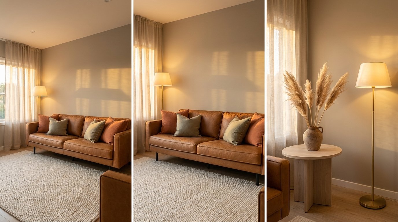
5. The Furniture Pairings That Make Greige Sing
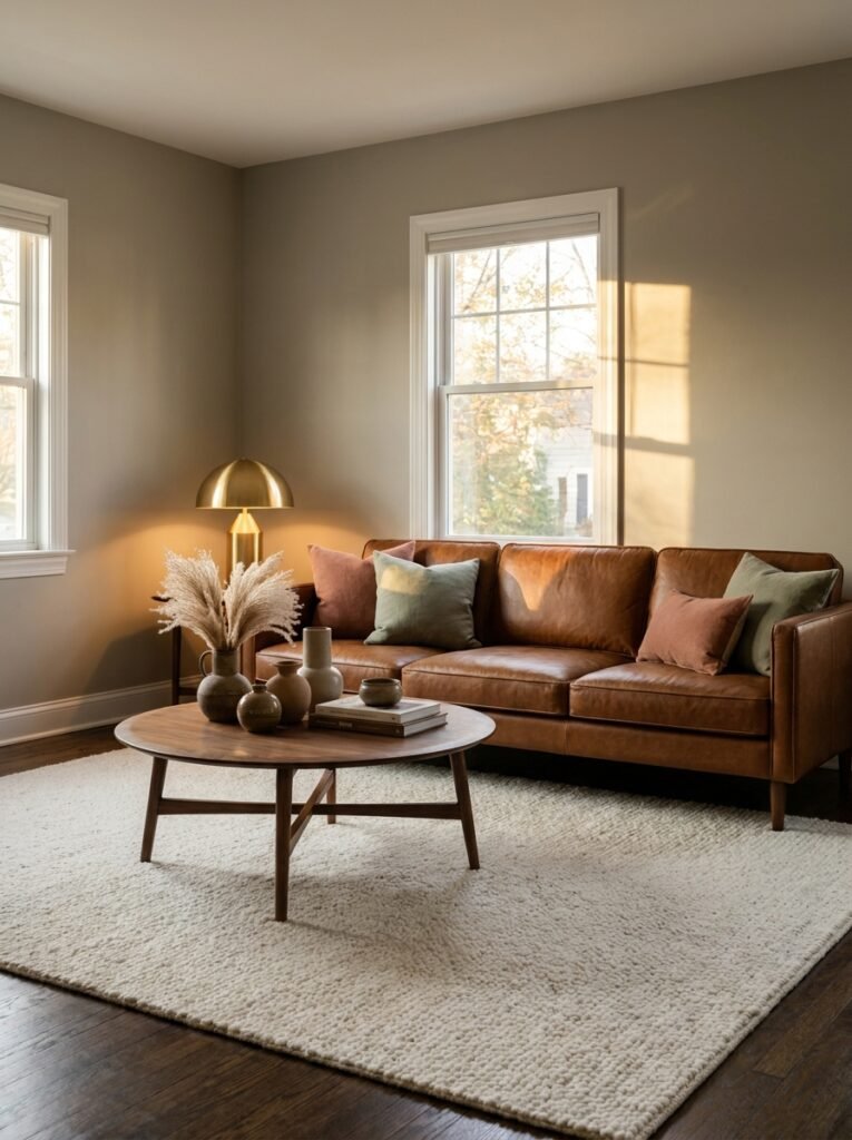
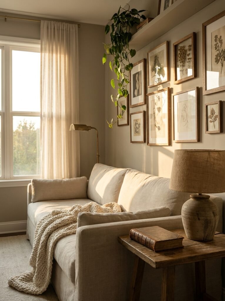
Imagine walking into a greige living room where a deep cognac leather sofa sits anchored by a soft ivory wool rug. Or picture a bedroom where greige walls meet linen bedding in dusty mauve and a bed frame in bleached oak. These combinations aren’t accidental — they’re the result of understanding how greige interacts with other tones.
The beauty of greige as a base is that it supports an extraordinarily wide range of furniture and textile palettes. But there are a few pairings that consistently elevate a greige room from pleasant to breathtaking.
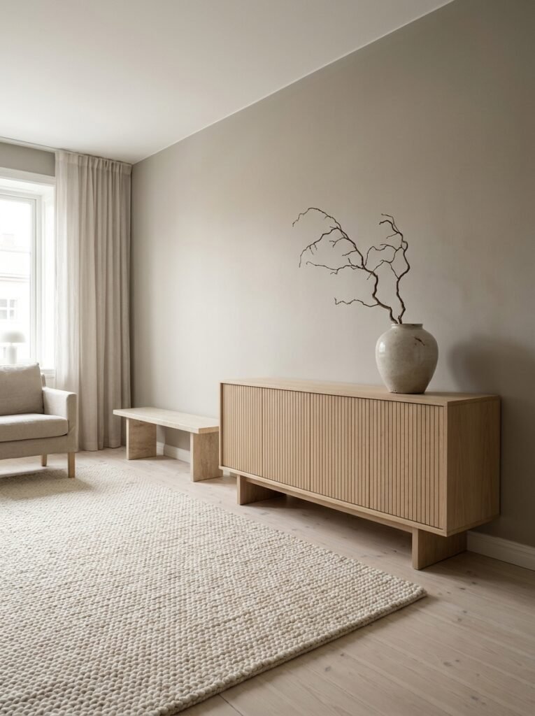
Warm woods — walnut, oak, and teak — pair with greige in the most organic, natural way imaginable. The warmth in the greige reflects back and the room feels like it grew from the earth. Brass and gold hardware amplifies this further, adding just enough glimmer without screaming for attention.
For upholstery, dusty and muted tones work far better than bright or saturated colors in a greige room. Think terracotta, sage green, dusty blue, and warm rust. These earthy tones feel like they belong in the same story as the greige walls, while bright colors — electric blue, hot pink — tend to jar against the greige’s quiet temperament.
“In a greige room, every color gets to shine because none of them fight the walls for attention.”
White trim is a classic companion to greige walls — it sharpens the edges of the room and prevents the neutrality from feeling muddy. Cream trim, however, creates a softer, more enveloping effect. The choice between the two is a matter of how much structure versus softness you want the room to hold.
—
6. How to Use Greige in a Small Space Without Losing Light
One of the great fears people have about using greige in smaller rooms is that it will make them feel dark or closed-in. This is an understandable concern — and entirely avoidable with the right approach.
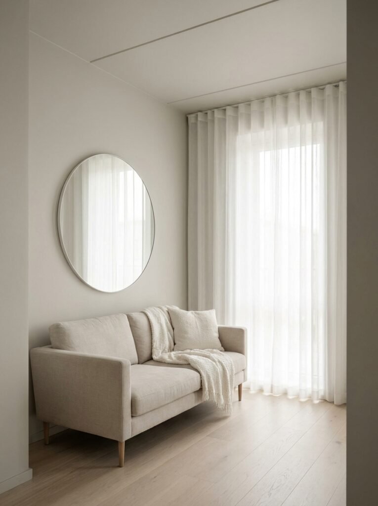
The key is to lean into the reflective quality of lighter greige shades. A greige that’s closer to warm white on the value scale — light but complex — can make a small room feel spacious while still offering the depth and warmth that greige does so well. Pair it with mirrors, light-colored flooring, and sheer window treatments to maximize the sense of openness.
Another trick that designers use consistently: paint the ceiling the same greige as the walls, or go one shade lighter. This blurs the visual boundaries of the room and creates a sense of continuous, enveloping space. It feels cocooning in the best possible way — like the room is holding you.
Avoid heavy, dark furniture in a small greige room. Keep legs visible on sofas and chairs so the floor reads clearly, and choose pieces that feel lightweight even if they’re substantial in size.
—
7. Greige in the Kitchen: Where Warmth Meets Function
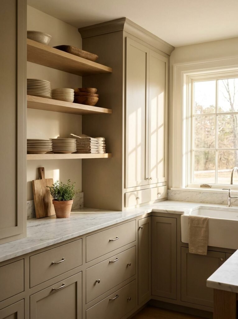
The kitchen is, for many of us, the most emotionally charged room in the house. It’s where we start our mornings in a fog, where we cook through our feelings, where the best conversations happen leaning against the counter. Greige in the kitchen honors all of that.
Greige cabinetry — particularly in matte or soft satin finishes — has become one of the defining interior design trends of recent years. It offers everything that white kitchen cabinetry does in terms of openness and light, while adding a warmth and complexity that white simply cannot deliver. Fingerprints and wear are also far less visible on a greige cabinet than a stark white one, which is a practical blessing in a hardworking kitchen.
Greige walls behind open shelving stacked with wooden bowls, ceramic plates, and linen napkins creates a backdrop that feels like something from a French farmhouse or a Nordic kitchen — deeply considered but entirely livable. Pair greige cabinets with countertops in white marble, warm quartz, or honed limestone, and you have a kitchen that photographs beautifully and feels even better in person.
—
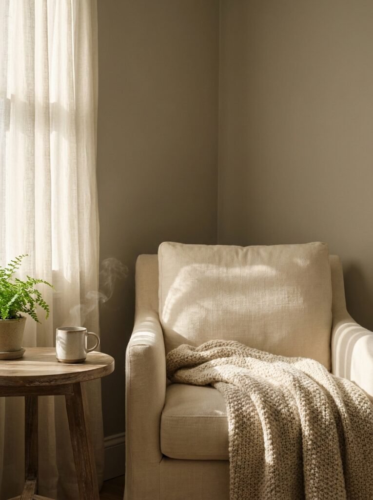
8. The Bedroom in Greige: Designing for Deep Rest
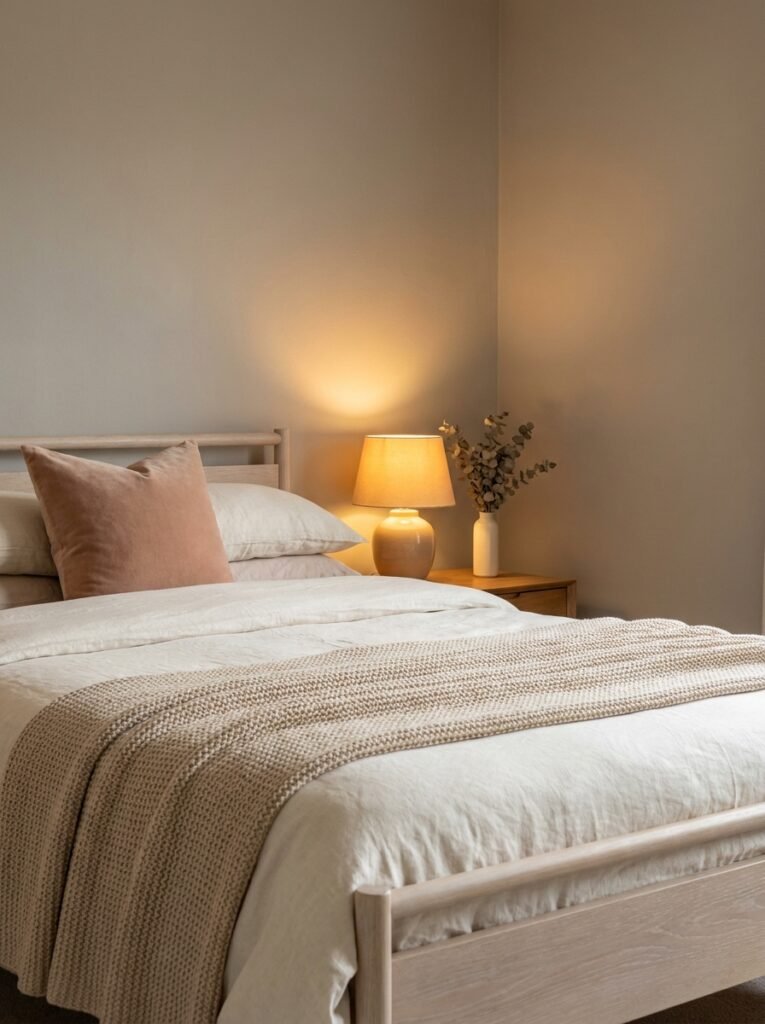
Sleep researchers consistently point to neutral, warm environments as more conducive to rest than bright or highly saturated ones. Greige, with its inherent calm and warmth, is perhaps the ideal bedroom color — and yet it’s often overlooked in favor of more dramatic choices.
A greige bedroom doesn’t have to be boring. Layer it with textures: a linen duvet in soft ivory, a chunky knit throw in warm sand, a velvet cushion in blush or deep taupe. The walls recede and the textures come forward. The room becomes about sensation — softness, warmth, depth — rather than visual noise.
Bedside lighting in greige rooms is particularly important. Warm-toned bulbs (around 2700K) enhance the golden undertones in the greige and create the kind of amber, candlelit glow that makes a bedroom feel genuinely restorative. Cooler bulbs will pull out the gray and make the room feel clinical, which is the last thing a bedroom should feel.
—
9. Greige and the Art of Layered Neutrals
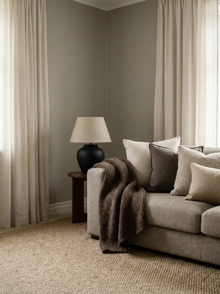
One of the most sophisticated things you can do with a greige room is to layer it with other neutrals — and this is where the real artistry lies. The mistake many people make is stopping at greige walls and neutral furniture, resulting in a room that feels flat. The answer is layering neutrals of different temperatures, textures, and values.
A room built around greige walls might include a rug in warm cream, curtains in a slightly cooler stone linen, and a throw in deep warm brown. On paper, these are all “neutrals.” On a room, they create a rich, dimensional landscape that feels curated without being obvious.
“The most beautiful neutral rooms aren’t monochromatic — they’re a conversation between shades that all speak the same quiet language.”
Adding black as an accent — in a lamp base, a picture frame, or a piece of hardware — grounds the layered neutrals and gives the eye something to land on. Without that anchor, a room full of soft neutrals can feel unresolved, as if it’s waiting for something to happen.
—
10. Trending Greige Styles: From Japandi to Modern Farmhouse
Greige is one of those rare colors that doesn’t belong to a single aesthetic — it moves fluidly through multiple design languages, adapting and enriching each one.
In Japandi design — the hybrid of Japanese minimalism and Scandinavian coziness that has taken Pinterest by storm — greige serves as the connective tissue between natural wood, wabi-sabi ceramics, and clean architectural lines. It brings the warmth of hygge while honoring the restraint of Japanese aesthetics.
In Modern Farmhouse spaces, greige on shiplap walls creates a softer, more evolved version of the style — one that feels less like a theme and more like a genuine home. The gray in the greige modernizes the look while the beige prevents it from feeling industrial.
In transitional interiors — homes that blend traditional and contemporary elements — greige is practically essential. It bridges the gap between an antique chest and a contemporary sofa, between Victorian crown molding and a clean-lined pendant light. It is, in the truest sense, a universal translator.
—
11. Common Greige Mistakes (and How to Avoid Them)
Even the most beautiful color can go wrong with the wrong approach, and greige is no exception. The most common mistake is choosing a greige that has muddy or dirty undertones — often the result of a ratio that’s slightly off, with too much brown sneaking into the mix. If a greige makes you think of concrete or clay, it’s veering into a different territory entirely.
Testing is non-negotiable. Never choose greige from a small paint chip under store lighting. Buy sample pots and paint large swatches — at least 12×12 inches — directly on your wall. Look at them at different times of day and under your actual artificial lighting.
The second common mistake is failing to account for the undertones of existing elements in the room. A greige with strong purple undertones will clash with warm wood floors. A very cool greige will fight with warm brass hardware. Know your undertones — and your room’s existing undertones — before you commit.
Finally, don’t under-invest in accessories. A greige room without sufficient texture and warmth through cushions, rugs, art, and plants can feel like an empty waiting room. It’s the accessories that transform a greige room from “neutral” to “sanctuary.”
—
12. Why Greige Is More Than a Trend — It’s a Way of Living
Some colors are fashionable. Greige is something more enduring than that. It’s a reflection of a particular kind of life — one that values calm over spectacle, quality over quantity, substance over show. In an era of visual noise and constant stimulation, a greige home is an act of quiet resistance. A declaration that this space, at least, will not compete for your attention. It will simply hold you.
The best greige rooms feel like a long exhale. They feel like arriving. They have an almost therapeutic quality — not because they’re perfect, but because they create the kind of neutral backdrop against which real life — cooking, laughing, resting, crying, and everything in between — can unfold without friction.
That’s not a small thing. That’s, arguably, what a home is for.
—
🌿 How to Take Care of Your Greige Walls and Spaces
Maintaining a greige room so it continues to feel fresh and beautiful is simpler than you might think, but a few consistent habits make a real difference.
First, clean your greige walls gently. Matte and eggshell finishes, while beautiful, can be delicate. Use a barely damp sponge with a tiny amount of mild dish soap for scuffs and marks. Harsh scrubbing will remove the finish and leave a shiny patch that catches the light differently from the surrounding wall.
Second, refresh your accessories seasonally. Swap out cushion covers, throws, and small decorative objects with the seasons. In autumn and winter, lean into deep taupes, warm rusts, and heavy textures like velvet and wool. In spring and summer, lighten the room with linen, soft sage, and pale clay tones. Greige walls make this seasonal rotation effortless — they’re the constant your changing accessories can always return to.
Third, pay attention to your lighting as the seasons change. In winter, with less natural light, you may want to add warmer bulbs or additional lamps to keep the greige feeling warm rather than flat and gray. A single cold overhead light in a greige room in January is a quiet tragedy.
Fourth, protect greige cabinetry and furniture from prolonged direct sunlight, which can cause fading over time — particularly in softer, more pigment-light formulations of the color.
And finally, repaint every five to seven years, or when you notice the depth of the color has shifted. A fresh coat of your greige returns the room to exactly what it felt like on day one — and there are few simpler home renovation joys than that.
—
❓ FAQ
Q: Is greige the same as taupe? A: They’re closely related but not identical. Taupe tends to have more brown and sometimes purple undertones, sitting closer to the brown end of the spectrum. Greige is more explicitly a gray-beige blend, typically cooler than taupe and with greater visual flexibility in contemporary spaces. The overlap between them is real, but a trained eye — or a side-by-side comparison — will reveal the difference.
Q: Does greige work in rooms with very little natural light? A: Yes, but the choice of shade matters enormously. In low-light rooms, choose a greige that leans warmer and lighter — something closer to warm off-white with gray complexity, rather than a mid-value greige that can read as murky without sufficient light. Complement it with warm artificial lighting and reflective surfaces to keep the room feeling alive.
Q: Can you use greige in a rental apartment without painting? A: Absolutely. If painting isn’t an option, bring greige in through large-scale rugs, curtains, and furniture. A greige linen sofa against a white wall will carry much of the same energy as greige walls, and when you move, it all comes with you. Removable wallpaper in greige tones is also widely available and has become remarkably convincing in recent years.
—
💭 Final Thought
Greige is quietly one of the most human colors in interior design — because it asks nothing of you except that you live in it fully. It doesn’t demand a matching aesthetic, a particular furniture style, or a certain kind of life. It simply makes a room feel like home, in whatever shape that takes for you.
The homes we love most aren’t usually the loudest or the most dramatic — they’re the ones that somehow always feel exactly right when we walk through the door.
Is your home speaking in a color that sounds like you?