Why Pink Belongs in Every Living Room (Yes, Even Yours)
You walked past a pink room once — maybe in a magazine, maybe a friend’s apartment — and something in you went quiet for a second. Not the bubblegum pink of a child’s bedroom, not the neon blast of a candy shop. Something softer. Something that made the space feel like a deep exhale.
That’s what we’re chasing today.
—
1. The Pink That Designers Are Actually Using Right Now (It’s Not What You Think)
Let’s get one thing straight before we talk about a single throw pillow or paint swatch: the pink having a serious moment in interiors right now is not Barbie pink. It’s not millennial pink, though that opened the door. It’s something warmer, murkier, more considered.
Think blush that leans toward terracotta. Think dusty rose that’s been sitting in a French linen closet for forty years. Think the inside of a shell — not the glossy outside, but that quiet, peachy-pink interior that barely looks pink at all until the light hits it.
These are the shades showing up in apartments from Brooklyn to Bristol, and they work because they don’t announce themselves. They settle in. They make a room feel lived-in and thoughtful rather than decorated. Interior designers have been reaching for Benjamin Moore’s “Pale Blush,” Farrow & Ball’s “Setting Plaster,” and Dulux’s “Dusted Fondant” for good reason. These aren’t trendy colors — they’re almost-neutral colors that happen to be warm. That distinction matters enormously when you’re working with a small apartment living room where every choice has to pull weight.
The question isn’t whether pink is too bold. The question is whether you’ve been looking at the right pink.
“The right pink doesn’t demand attention. It just makes everything else in the room look better.”
2. The Color That Keeps Showing Up in Every Beautiful Pink Living Room Right Now
Terracotta. Every single time.
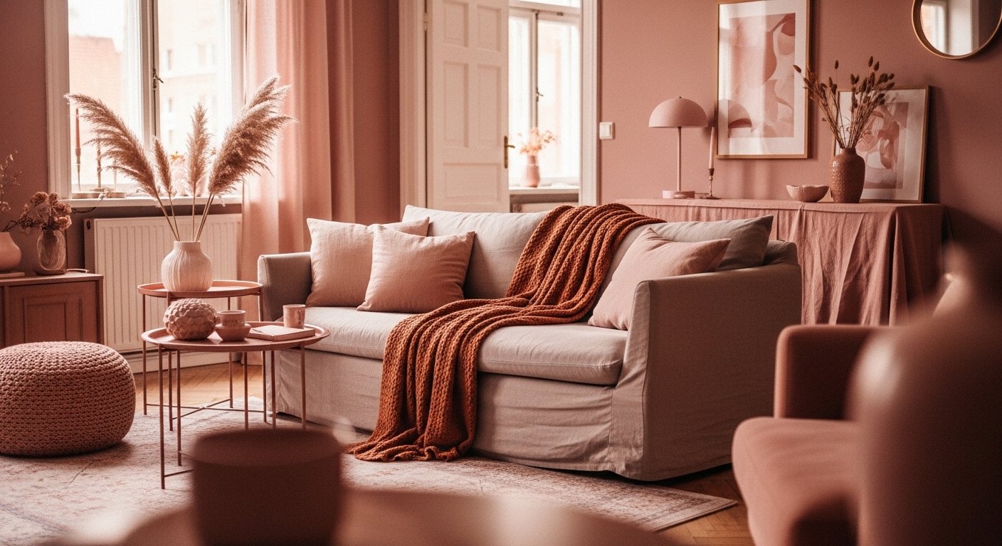
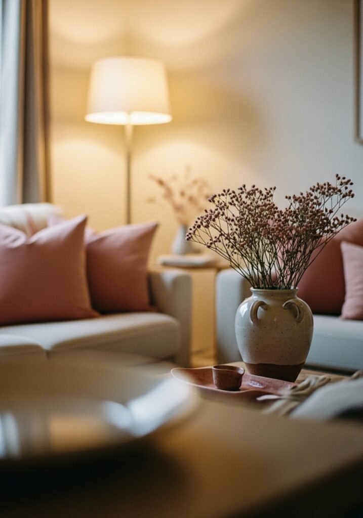
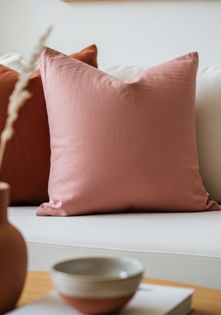
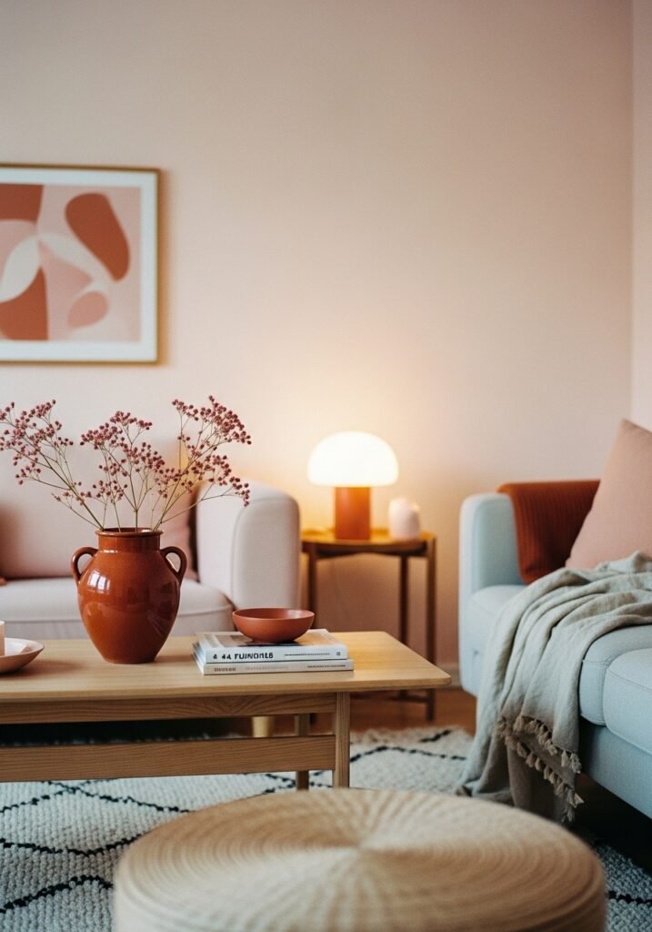
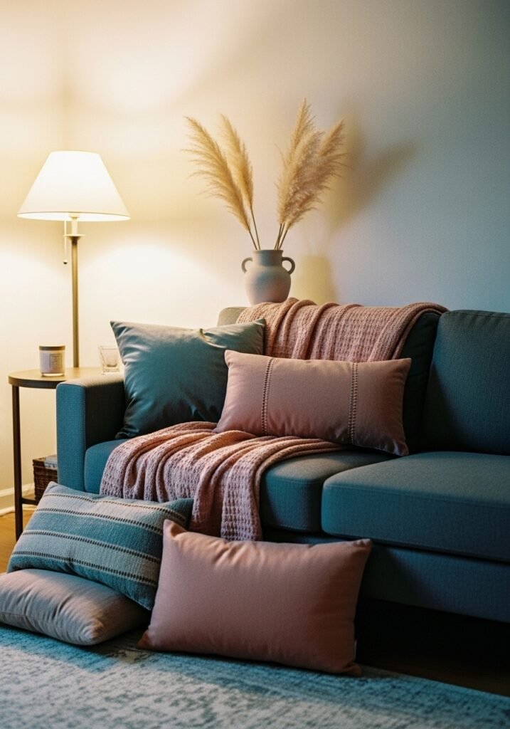
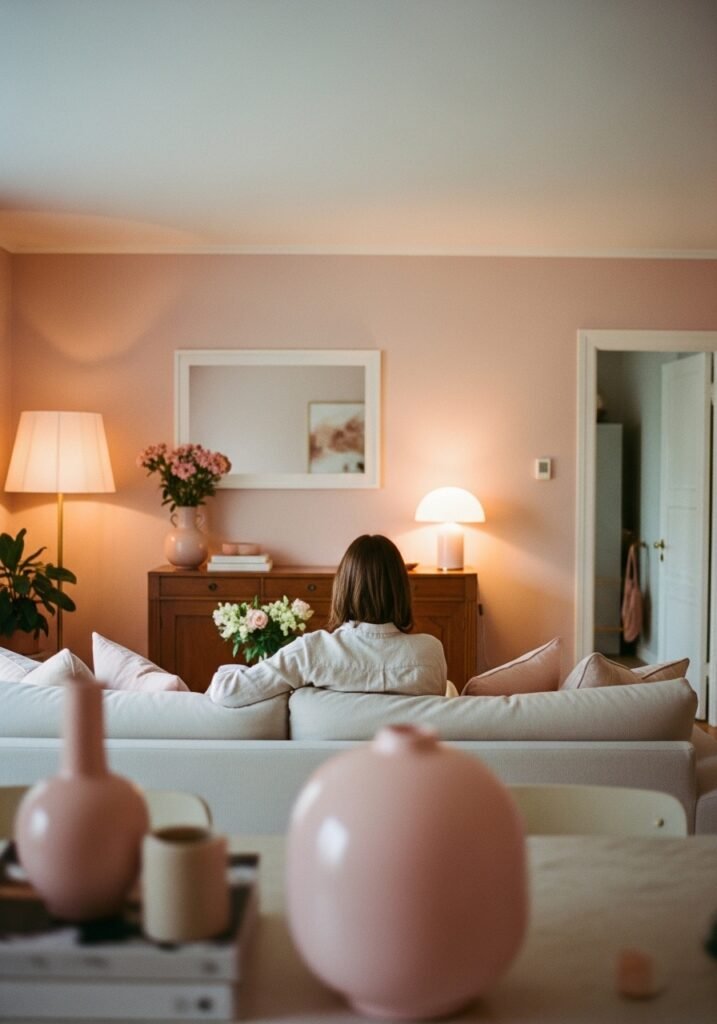
If you’ve been pinning pink living rooms and wondering why some look effortlessly chic while others look like a birthday party, look at the secondary palette. The rooms that sing almost always have terracotta somewhere — in a clay pot, a woven throw, a painted accent wall, a ceramic lamp base. It acts as a grounding note, a reminder that pink is a natural color, not a synthetic one.
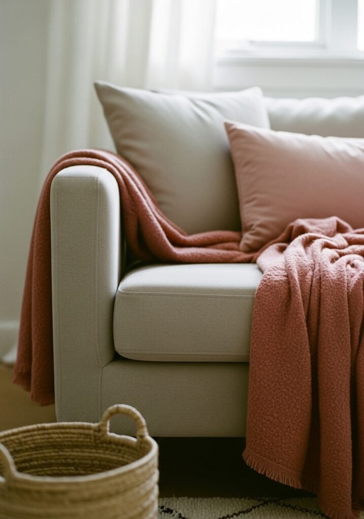
Dusty rose walls with terracotta cushions and warm wooden floors create something that feels genuinely ancient and genuinely modern at the same time. It’s the color of old Italian villas, of Moroccan plaster, of sun-warmed brick. Against a soft pink sofa or a blush linen armchair, terracotta doesn’t fight — it holds. It gives the pink room a spine.
The other surprising partner? Sage green. Not the bright, herby kind, but the grey-green of old olive trees or faded eucalyptus. Against a dusty rose wall, sage brings the outside in without trying. A trailing pothos, a cluster of dried pampas grass, a single sprig of eucalyptus in a bud vase — these touches turn a pink room from pretty into something that feels genuinely alive.
Don’t be afraid of this combination. It’s not twee. It’s grown-up in exactly the way Pinterest keeps searching for.
3. The One Rule That Makes a Pink Apartment Living Room Feel Intentional, Not Accidental
Here it is: commit to warm tones everywhere.
Pink — especially the soft, dusty varieties that work in adult living rooms — belongs to the warm side of the color wheel. The moment you introduce cool greys, stark whites, or icy blues, the pink starts to look awkward. Lost. Like it wandered in from a different room.
Warm cream instead of white. Aged brass instead of chrome or silver. Natural wood instead of lacquered MDF. Beeswax candles that smell of honey and vanilla. Stone-colored linen instead of crisp cotton. Every material decision should feel like it was sun-warmed at some point in its existence.
This rule is especially important in rented apartments where you can’t paint. If your walls are off-white or landlord magnolia — which is almost always a cool, flat white — layering in warm textiles, warm-toned lighting, and warm wood furniture is how you stop the room from looking like pink was an afterthought. A chunky wool throw in camel. A jute rug that smells faintly of sea and grass when it first arrives. A wooden coffee table with visible grain and a bit of knot. These aren’t just style choices — they’re the infrastructure that makes pink work.
Get the warmth right and the pink almost glows.
4. What to Do With Your Sofa (This Is Where Most People Get Stuck)
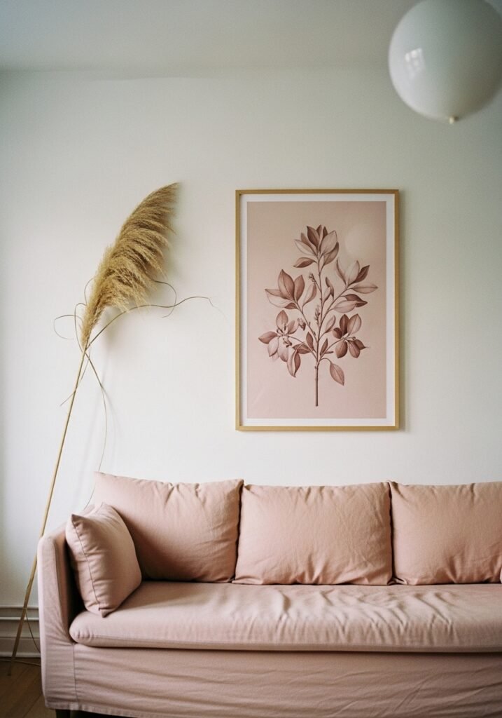
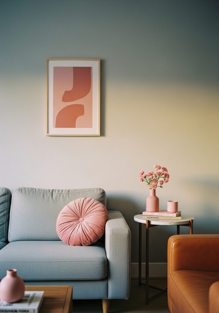
If you already have a grey sofa, congratulations — you’re actually in great shape. A medium grey sofa with warm pink accessories is one of the most sophisticated combinations in apartment decorating right now, and it requires almost no money to achieve. A pair of dusty rose cushions, a terracotta knit throw, a blush pink candle on the side table, and suddenly your grey sofa looks like an intentional choice rather than a rental compromise.
If you’re starting fresh and considering a pink sofa — do it. Truly. A blush linen sofa is one of those purchases that people agonize over and then wonder why they waited. The key is fabric. Velvet blush can tip into glam territory quickly, which is fine if that’s your energy, but linen or cotton blend in a dusty rose will serve you for years without ever feeling like a trend. It softens with washing. It gets better with use. It looks different at 10am in sharp winter light than it does at 9pm under a warm lamp, and both versions are beautiful.
For smaller apartments, consider a blush loveseat rather than a full sofa. Two people, a coffee table, a bookshelf that leans against the wall — that’s a living room. It doesn’t need to seat six.
“A blush linen sofa is the piece people always say they love in your apartment and wish they’d bought in theirs.”
5. The Wall Situation: When You Can’t Paint and When You Can
Most apartment renters in the US and UK can’t paint, and this is where pink living room dreams go to die. But they don’t have to.
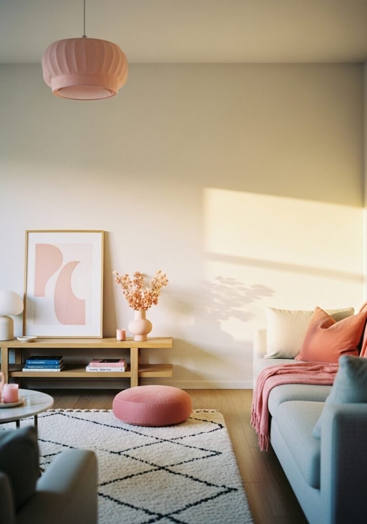
If you can’t paint, your walls become a backdrop — treat them that way. Warm, oversized art prints in dusty rose, terracotta, and cream act as color without commitment. A gallery wall of prints from Etsy (search “maximalist botanical print” or “abstract blush art”) can shift the entire feeling of a room. Frame them in natural oak or aged brass — never black in a pink room, it’s too harsh — and hang them close together for impact.
Removable wallpaper has also genuinely improved in the last few years. Brands like Tempaper, Graham & Brown, and Chasing Paper all offer peel-and-stick options in warm, dusty tones that don’t look like removable wallpaper. A single feature wall in a soft rose linen-look texture can make a rental apartment feel like a design decision you made deliberately, not a wall you’re making do with.
If you can paint: Farrow & Ball’s “Dead Salmon” is not what it sounds like. It’s a complex, faded pink with grey undertones that makes every room look like a room in a 19th-century country house. It photographs beautifully. It’s warm without being saccharine. In the US, look for comparable shades from Clare Paint or Backdrop — both ship samples and both have done the dusty rose palette justice.
6. Lighting Is Doing 40% of the Work in Your Pink Room
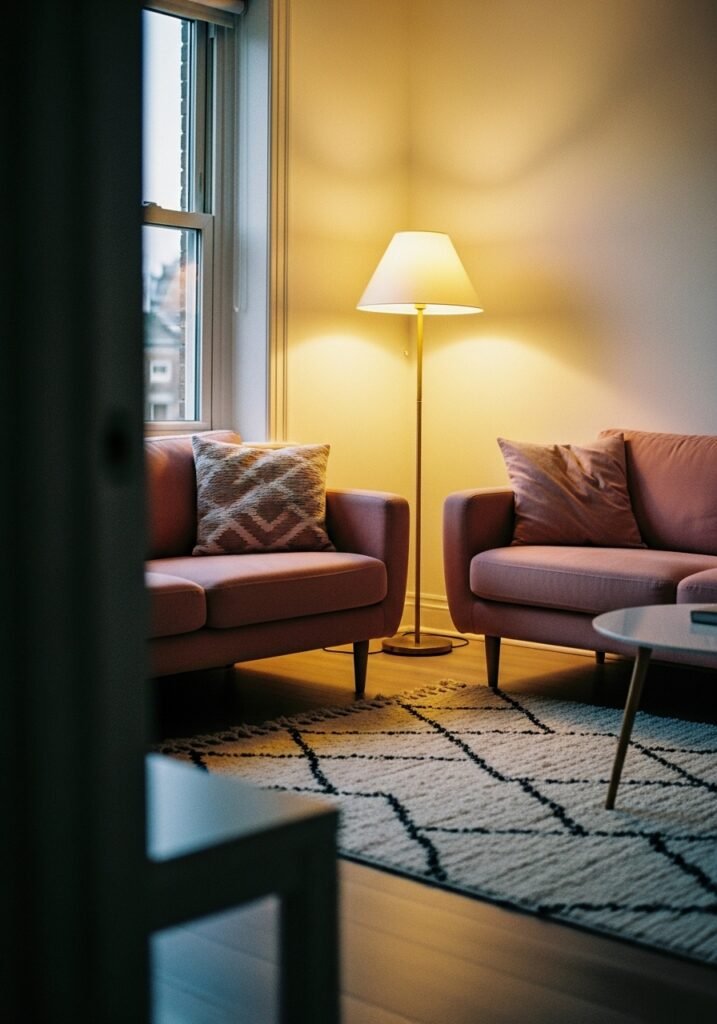
Say it again: lighting is doing forty percent of the work.
Pink is uniquely sensitive to light temperature. Under cool, blue-toned overhead lighting, a dusty rose room can look washed out and a little sad. Under warm light — the amber glow of an Edison bulb at 7pm, the soft flicker of a beeswax candle, the low hum of a table lamp with a linen shade — that same pink room looks like somewhere worth staying.
Ditch the overhead light entirely if you can. Or at least supplement it heavily. A floor lamp in the corner with a warm-white bulb. A table lamp on a side table with a drum shade in cream or natural linen. Candles on every flat surface — not as a fire hazard, but as the cheapest atmospheric upgrade available to you.
The lamp itself can be part of the pink story. A ceramic table lamp base in dusty rose or terracotta is a design object in its own right. Pair it with a cream linen shade and it becomes a focal point you didn’t have to work hard for.
Warm lighting in a pink room creates something close to magic. It’s not an exaggeration. The room breathes differently after 6pm.
7. The Textile Rule Nobody Tells You (But Explains Everything)
Layer textures, not just colors.
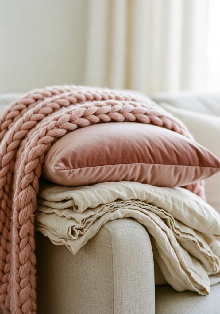
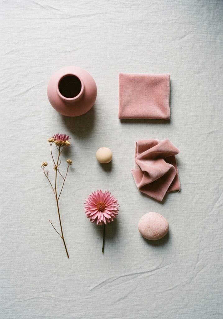
A pink room that uses only smooth surfaces — a velvet cushion, a satin throw, a lacquered lamp — will feel flat, even if the individual pieces are beautiful. What makes a pink living room feel genuinely cozy and layered is contrast in texture. Rough against smooth. Nubby against sleek. Organic against structured.
A chunky knit throw draped over a linen sofa. A jute rug under a smooth marble coffee table. A ceramic vase with an imperfect, handmade glaze sitting next to a perfectly pressed linen cushion. Dried pampas grass or dried cotton stems in a terracotta pot next to a glass of water and a stack of hardback books.
This is the difference between a room that looks like a showroom and a room that looks like a life.
Texture also solves the “too much pink” problem. If you’re nervous about the room tipping into saccharine territory, more texture is the answer. A rough-weave throw in camel or oatmeal introduces a material reality that grounds the pink without neutralizing it. The room stays warm. It just gets heavier, more interesting, more real.
“More texture is always the answer. A knubby weave does more for a pink room than any new cushion cover ever will.”
8. The Small Details That Make People Stop and Look Twice
Books. Specifically, the color of your book spines.
This sounds obsessive, and it is a little, but hear it out: a shelf of books with warm-toned spines — cream, red, orange, dusty pink, muted yellow — against a blush wall is one of the most Instagram-worthy and genuinely beautiful things in a living room. Books are not decor, but their color is. Take the dark navy spines and hide them on a lower shelf. Let the warm tones live at eye level.
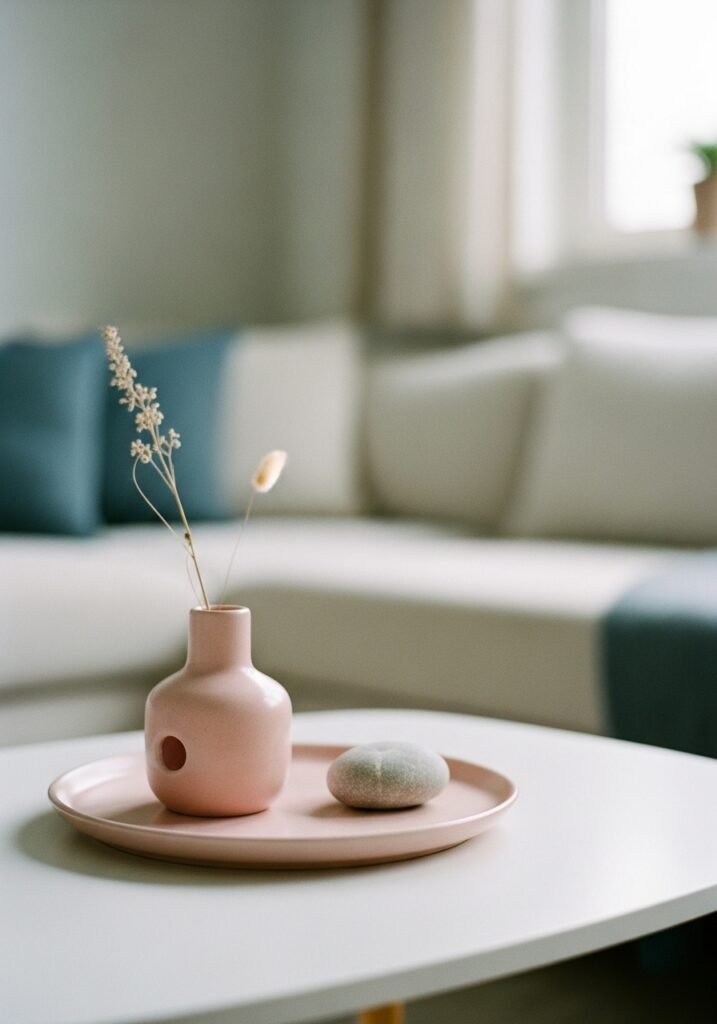
Ceramics on a coffee table. Not a matching set — a loose collection of handmade mugs, small bowls, a single taper candle in a clay holder. There’s something about imperfect, handmade ceramics in warm tones that makes a pink room feel like someone who has taste and doesn’t need to prove it.
A single piece of art that is not pink. This sounds counterintuitive, but one piece that breaks the palette — a dark botanical print, a moody landscape in green and charcoal, a vintage poster in faded yellow and black — makes the pink read as intentional rather than obsessive. It says you know what you’re doing.
Brass hardware. On your side table. On your bookshelf if it has adjustable legs. On your lamps, your frames, your curtain rod. Aged brass is the metal of a pink living room, full stop.
9. The Budget Version That Looks Like You Spent More Than You Did
Start with the rug.
A good rug in dusty rose, blush, or warm terracotta is the fastest way to anchor a pink living room scheme without touching a wall. And “good” doesn’t mean expensive — it means the right texture and the right color. A Moroccan-style rug with muted rose and cream tones, a simple jute with a pink border, a flat-weave kilim in warm earthy tones — these are all available at Wayfair, Amazon, IKEA, Dunelm, and John Lewis at prices that don’t require a financial decision.
Layer a smaller sheepskin or faux sheepskin over the top for texture. Now you have a rug situation that looks curated and costs less than a restaurant dinner.
Add a blush pillow cover — not a new cushion, just a cover for something you already own — and two pillar candles in a warm off-white. A small plant in a terracotta pot. One piece of pink-toned art printed at home and stuck in a frame you already have.
That’s a pink living room. You didn’t need to buy a sofa.
10. How to Use Pink in a Living Room You Share With Someone Who Hates Pink
This is a real situation and it deserves a real answer.
Don’t make pink the main event. Make it the warmth underneath everything else. A dusty rose rug, blush linen cushions on a grey or cream sofa, a single terracotta lamp, dried flowers in a pink-toned vase — none of these register as “a pink room” to someone who doesn’t like pink. They register as warm, cozy, well-styled. The pink is doing the emotional work without announcing itself.
The colors that neutral-pink-skeptics respond well to are the ones that sit on the edge of pink without committing. Terracotta. Warm peach. Old rose that leans brown in certain lights. These are colors that have permission in rooms where “pink” feels like a fight. They’re pink in the way that dawn is pink — undeniably, gently, without asking for a conversation about it.
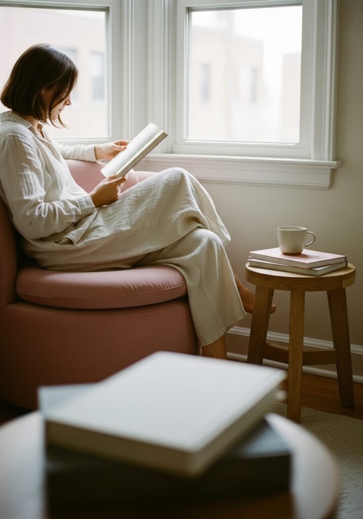
11. The Corner That Changes Everything — Your Pink Reading Nook
Every apartment has a corner that isn’t quite anything. The weird angle next to a window. The space beside the bookshelf that never has furniture because nothing fits. The empty stretch of wall opposite the sofa that feels like it needs something but you’ve never figured out what.
Put a chair there.
Not any chair — a chair in blush, terracotta, dusty rose, or even a warm cream that works with your pink palette. Add a small side table. A lamp that pools warm light into the corner. A throw that you actually use. A small stack of books or a tray with a candle and a plant.
That corner becomes a destination. It becomes the place in your apartment that photographs beautifully and, more importantly, feels like the place you actually want to be at 4pm on a Sunday afternoon with rain hitting the window and something warm to drink.
Pink is not a color that belongs on every surface. It belongs in the places where you slow down.
12. The Finish Line: How to Know When Your Pink Room Is Done
Stop before you think you’re finished.
This is the hardest and most important piece of advice for anyone decorating a pink apartment living room. The instinct is always to add — another cushion, another print, another plant, another candle. And sometimes that’s right. But more often, the room hits its peak before you think it does.
The test: stand in the doorway and see if your eye knows where to go first. If it does, the room has a focal point and it’s working. If your eye bounces around without landing anywhere, there’s too much competing for attention — not too little. Take something away before you add anything new.
A pink room is not a collection of pink things. It’s a feeling. Warmth, ease, intention, softness that doesn’t apologize for itself. When you walk in and your shoulders drop half an inch because the room is just that comfortable to be in — that’s done. That’s it.
—
🌿 Quick Tips
The warmth of your lightbulb matters more than almost any furniture choice. Switch to warm white (2700K) bulbs in every lamp in a pink room and then reassess.
If your landlord’s magnolia walls are killing your pink scheme, lean into warm cream and camel tones in your soft furnishings — they bridge the gap better than any art or accessory.
Dried flowers age beautifully in a pink room. Dried pampas, dried bunny tail grass, dried cotton — they add organic warmth that fake plants simply don’t.
Don’t match your pinks. A dusty rose cushion, a terracotta pot, a blush throw — all slightly different, all warm. That variation is what makes it look like a considered palette rather than a kit.
Buy the pink thing second-hand first if you’re not sure. A vintage blush chair from a Facebook Marketplace find lets you test the color in your space without the commitment of buying new.
—
❓ FAQ
Q: Will a pink living room feel dated in five years? A: The dusty, warm, terracotta-leaning pinks in interiors right now aren’t trend pinks — they’re more like neutrals with personality. Shades like Setting Plaster, Dead Salmon, and warm blush have been used in European interiors for centuries. They don’t date the way neon or candy pink would. Buy quality pieces in classic silhouettes and the color becomes a backdrop, not a statement.
Q: What if my apartment gets very little natural light — will pink just look washed out? A: Actually, soft pink can be a smart choice in a dark apartment because it bounces warm light around more generously than grey or white. The key is warm artificial lighting and choosing a pink with yellow or terracotta undertones rather than blue or purple undertones. Test paint swatches or textile samples in your actual light before committing.
Q: How do I stop a pink living room from feeling too feminine if I want it to feel more gender-neutral? A: Ground it with materials that have weight and texture — dark wood, aged leather, linen, stone, brass. A deep leather chair in cognac or chocolate next to a blush sofa immediately neutralizes any perception of the room as exclusively feminine. Pink paired with charcoal, dark wood, and natural stone reads as sophisticated and contemporary rather than sweet.
—
💭 Final Thought
Somewhere along the way, pink got assigned a story it didn’t write. Too soft. Too much. Too much for you, maybe. But the rooms that stop us mid-scroll — the ones that make us save without thinking — so many of them have pink somewhere. In the cushions. In the plaster. In a single lamp glowing against a cream wall at dusk.
You don’t have to commit to all of it at once. You just have to let something warm into the room.
What’s the one pink thing you’ve been looking at for months, telling yourself it’s too much?