Black and Gold Living Room Decor That Actually Works in a Real Apartment (Not Just a Pinterest Fantasy)
You’ve pinned it a hundred times. That impossibly chic living room — matte black walls, brass candleholders catching the light, velvet in a shade of ink. Then you look at your actual apartment with its off-white walls and mixed-up furniture and think: there’s no way that works here. But here’s what those pins don’t tell you. Black and gold isn’t a renovation. It’s a decision.
—
1. Why This Color Combination Hits Different Than Every Other Trend Right Now
There’s a reason black and gold keeps showing up everywhere — on Pinterest boards, in London townhouses, in Chicago studio apartments styled to within an inch of their lives. It’s not a trend in the way millennial pink was a trend. It doesn’t have an expiration date stamped on the bottom.
Black grounds a room. Fully, completely, without apology. It stops a space from feeling like it’s floating — that fuzzy beige limbo so many apartments exist in when nobody’s made a real decision yet. Gold adds warmth to what could otherwise feel cold or severe. Not yellow-gold. Not brassy and cheap. The right gold has depth — antique brass, aged metal, the particular warmth of something that looks like it’s been somewhere.
Together, they create contrast that reads as intentional. And in a rented apartment where you can’t repaint the walls or rip up the flooring, intentional is the most powerful design word there is. You’re not working with a blank canvas. You’re working with a found canvas. Black and gold are assertive enough to speak over whatever’s already there.
The other reason this palette endures? It works across styles. Minimalist lofts. Maximalist Victorian-era flats. Mid-century apartments. Modern builds. It’s not married to one aesthetic, which means it’s not going to date the way a single-style room will.
“Black and gold don’t follow a trend. They set the tone.”
2. The Apartment Reality Check: What You Can and Can’t Do With Paint
Let’s be honest about renting. Most landlords in the US and UK will not let you paint the walls matte black — and even the ones who technically allow it know that “return to original condition” is sitting in that lease like a quiet threat.
So you pivot. And pivoting, it turns out, is where the most interesting design decisions get made.
Instead of painting walls, you paint furniture. A dated side table gets two coats of flat black and suddenly looks like it belongs in a boutique hotel. A charity shop find — a chunky wooden console, an old bookshelf — in black becomes an anchor piece. The wall stays off-white or magnolia or whatever color of beige your landlord chose. The furniture does the heavy lifting.
If you do have permission to paint, even one dark wall — a single accent wall behind the sofa — changes the entire feeling of the room. Black works especially well behind a sofa because it frames the seating area like a stage set. Everything in front of it looks deliberately placed.
For UK renters specifically: feature walls are often more negotiable than full repaints. Worth asking. The worst they can say is no.
And if painting is completely off the table? Black comes in other forms. Wallpaper. Removable peel-and-stick panels. Large-format art with dark backgrounds. You build the darkness in layers rather than all at once, and the effect is surprisingly similar.
3. The Gold That Actually Looks Expensive (And the Kind That Doesn’t)

This is the section that saves you from a mistake. Because there are two kinds of gold and they could not be more different.
Shiny, yellow-toned, polished gold reads as cheap in almost every living room context. It’s the gold of plastic frames and fast fashion accessories. It’s gold trying too hard.
Antique brass, brushed gold, matte gold, aged bronze — these are the tones that photograph beautifully and read as expensive in person. They have texture. They have depth. They look like they’ve been worn in, like someone chose them deliberately over something shinier. That slight warmth, that hint of imperfection, is exactly what makes them feel luxurious rather than gaudy.
When you’re shopping — whether that’s at West Elm or TK Maxx or a Sunday car boot sale — hold the piece up to the light. Polished gold will flash at you. Brushed or aged gold will absorb the light a little, give it back softly. That’s the one you want.
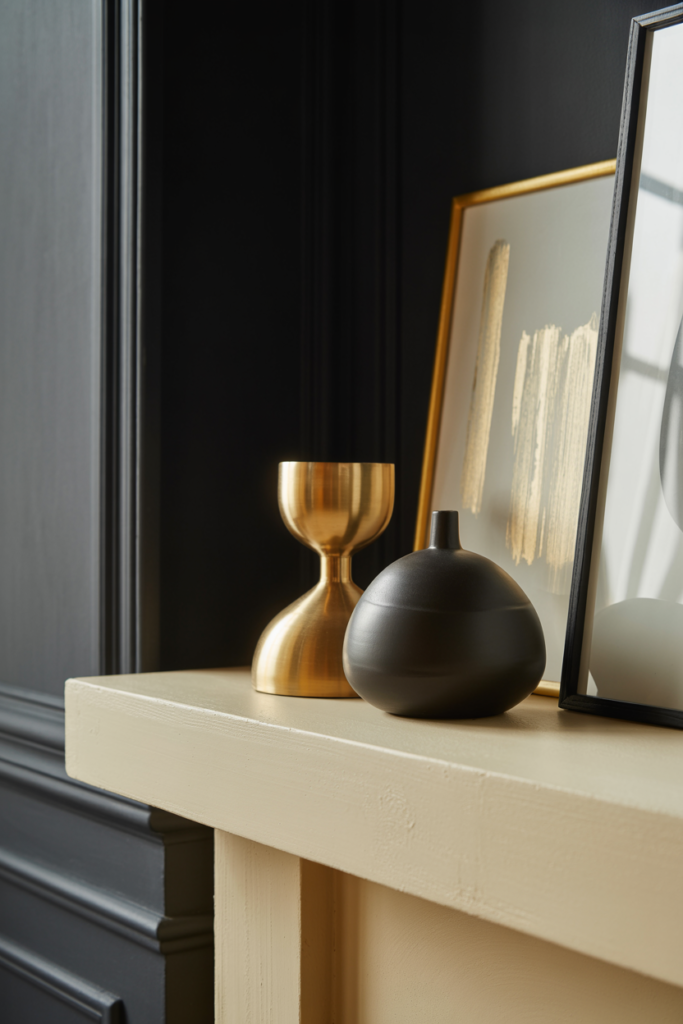
One gold finish across all your metal accents is not a requirement. Slightly varying tones of warm metal actually look more collected and less like a matching set from a catalog. A brass lamp next to an antique gold picture frame next to a bronze vase — that’s a room that was assembled with taste, not purchased as a bundle.
4. The Sofa Question: What Color Actually Works Here
The sofa is the biggest piece of furniture in your living room and the decision most people agonize over. In a black and gold scheme, you have more options than you think.
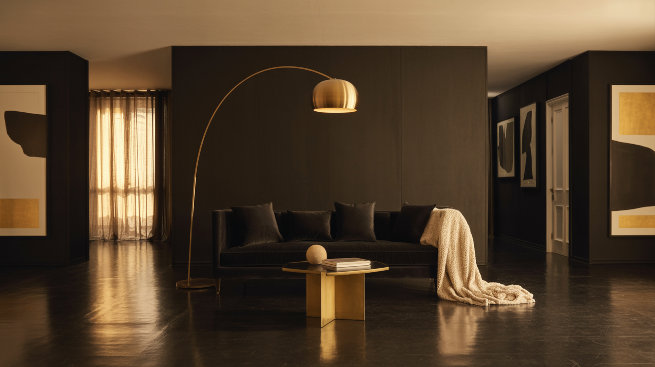
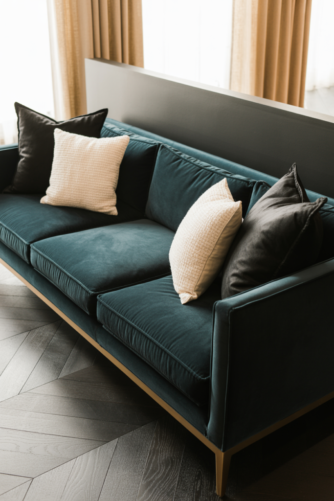
Black velvet sofa is the obvious dream choice — and it genuinely is stunning. Deep, rich, and it anchors the whole room. In a smaller apartment it can feel heavy, so you balance it with lighter elements: a pale rug, white or cream cushions, reflective gold accessories that bounce light around.
But not everyone wants a black sofa, and not everyone should have one (pet owners, small children, anyone who eats cereal on the couch — you know who you are). The alternatives that work beautifully in this palette: deep charcoal, which reads almost black but photographs softer. Forest green, which sits alongside black like a natural pair and lets gold accessories sing. Cream or oatmeal linen, which gives the room breathing room and makes the black and gold elements pop harder by contrast.
The one color to avoid? Mid-tone grey. It doesn’t anchor, it doesn’t brighten, it just sits there looking uncertain. You need either commitment to darkness or commitment to light. The in-between muddies everything.
“The sofa doesn’t have to be black. It just has to make a decision.”
5. Textiles Are Where the Room Gets Its Softness
A living room that’s all black and gold with no soft layering looks like a showroom — beautiful in photographs, uncomfortable to actually sit in. Textiles are what make a room feel like someone lives there.
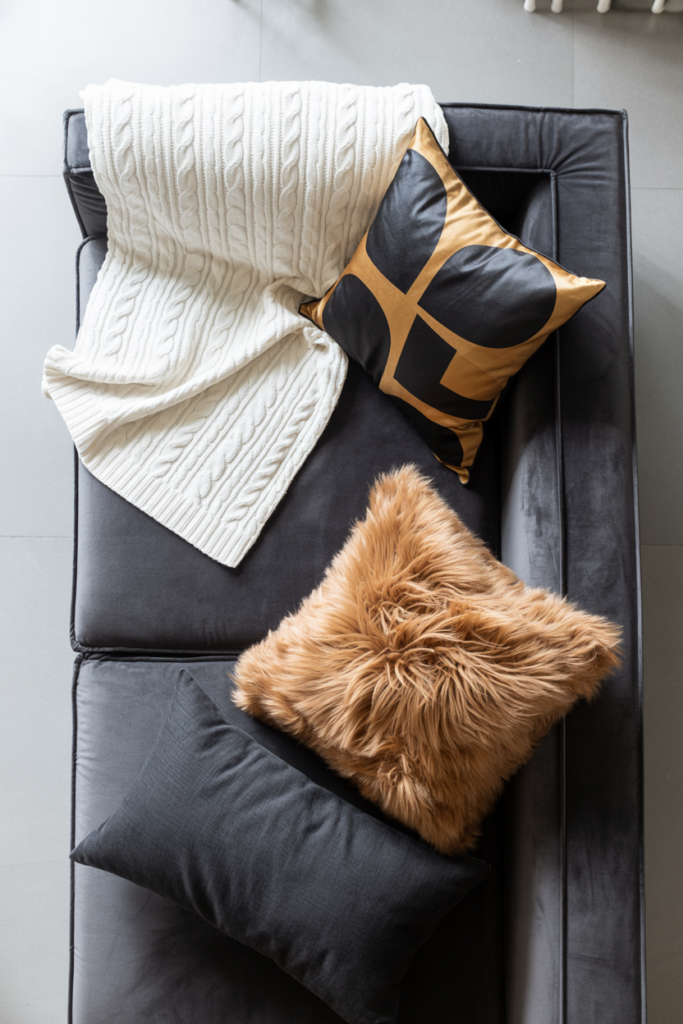
Start with cushions. Mix textures deliberately: a velvet cushion in deep charcoal, a woven cotton cushion in cream with black geometric detail, a gold or mustard throw pillow that ties the metal tones back into the fabric story. You don’t need them all to match. You need them to belong to the same conversation.
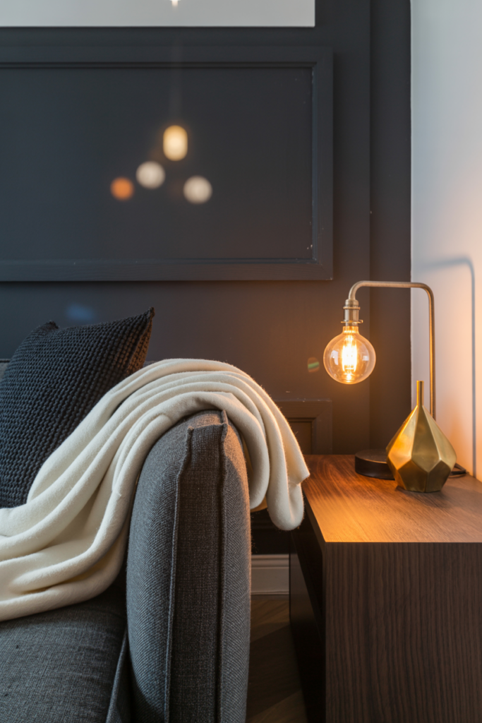
Throws are essential. A chunky knit in cream or oatmeal draped over the arm of a dark sofa does something remarkable — it softens the darkness and adds that lived-in quality that no amount of styling can fake. In the UK especially, where living rooms tend to be used hard and coziness is practically a cultural value, a throw isn’t optional.
Curtains deserve more attention than they usually get. In a black and gold room, floor-to-ceiling curtains in deep navy, forest green, or even black velvet add drama and make ceilings feel higher. If you want to keep it lighter, cream linen with a subtle gold rod and rings threads the gold tone through vertically, pulling the eye upward.
A rug in this palette is grounding. A cream or ivory base rug with a black geometric or abstract pattern is probably the most versatile choice — it anchors the seating area, adds visual interest at floor level, and doesn’t compete with everything happening above it.
6. Lighting Is Doing More Work Than You’ve Given It Credit For
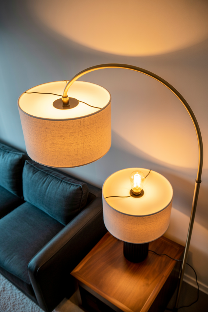
The amber glow of an Edison bulb at 7pm changes a room. That sentence is not an exaggeration.
Overhead lighting in most apartments is terrible. The single ceiling fixture casting flat light downward from directly above — it flattens everything, kills shadows, and makes even beautiful rooms look like dentist waiting rooms. Black and gold schemes depend on layered, warm lighting to come alive.
Floor lamps with black bases and white or gold shades. Table lamps in matte black ceramic with a warm bulb. Wall sconces in antique brass if your lease allows fixture swaps. A cluster of gold pendant lights over a console table if you have a plug-in pendant option. Every layer of light you add creates depth, casts shadows, and makes the gold in your room actually glow.
Candles are not decorative backup. Pillar candles in black or white on a gold tray, a cluster of brass candleholders at varying heights — they add flickering warm light that no electric fixture can replicate. Light them in the evenings. The room transforms.
The bulb temperature matters enormously. You want 2700K — warm white, sometimes labeled “soft white.” Not daylight, not cool white. Those bulbs strip the warmth out of gold tones and make your carefully assembled room look clinical.
7. The Wall Art Formula That Makes This Palette Feel Complete
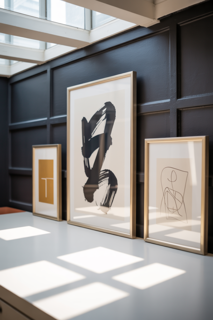
Blank walls in a black and gold room feel like an unfinished sentence. But gallery walls in this palette, done right, are some of the most impactful things you can do without touching the actual wall color.
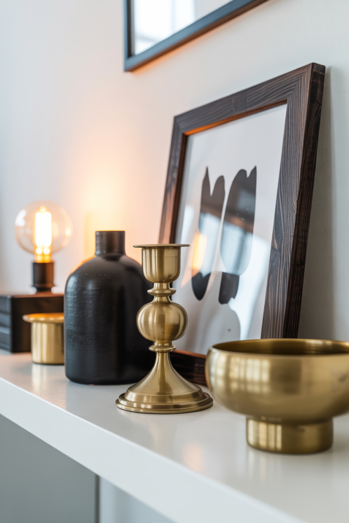
Black frames are your foundation. A mix of sizes — some large, some small, not all the same — creates a collected feel rather than a matchy-matchy one. Gold frames mixed in with the black add warmth and tie back to your metal accessories. The ratio that tends to work: roughly two-thirds black frames to one-third gold.
What goes inside the frames matters as much as the frames themselves. For this palette: botanical prints with dark backgrounds, abstract art with black ink and gold leaf detail, architectural photography in black and white, vintage maps with aged yellow tones. The content should feel as intentional as the frames.
One large statement piece — a single oversized print or painting in a chunky black or gold frame — can do more for a room than a full gallery wall. If your apartment is on the smaller side, one big, confident piece beats a cluster of small ones.
“One oversized print with total conviction beats twelve small ones with none.”
8. Small Apartment Survival: Making Black Work Without Shrinking the Room
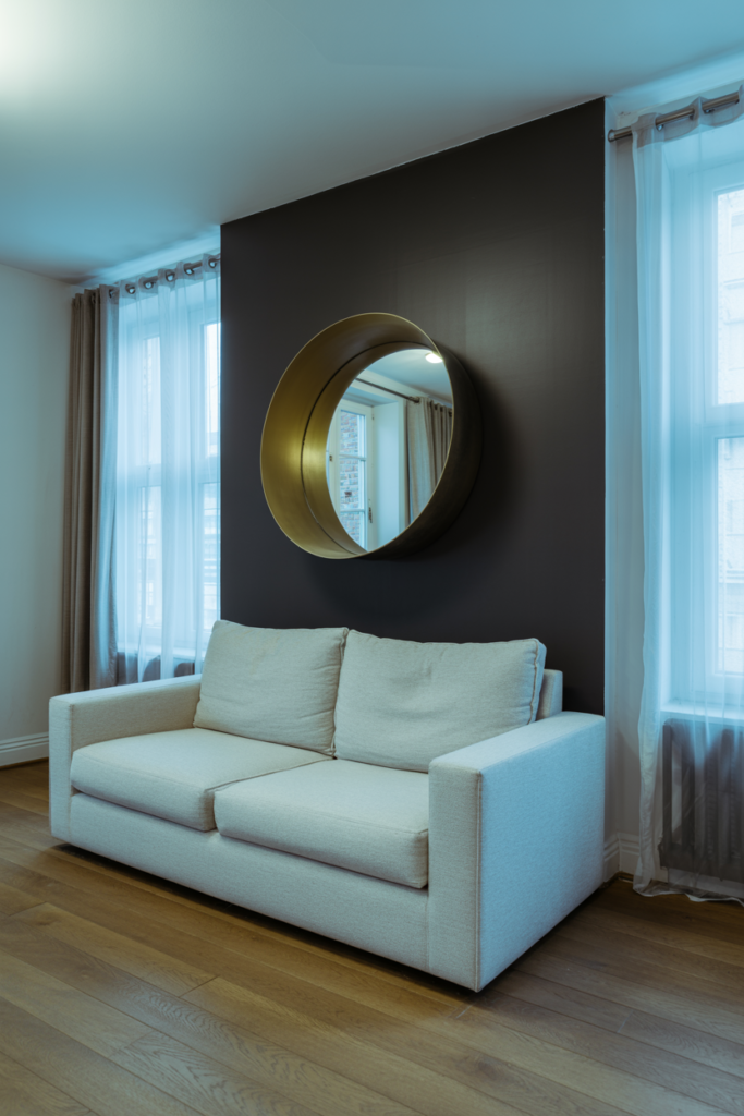
The fear is real and understandable. You have a 600-square-foot apartment in London or a compact one-bedroom in a city that charges accordingly for every inch. Will black make it feel like a cave?
Only if you do it wrong.
The key is contrast and reflection. Every dark element needs a counterpart that bounces light. A black console table needs a large mirror above it — and not just any mirror, a mirror with a slim gold or black frame that doesn’t chop the reflection. A dark velvet sofa needs cream cushions and a pale rug. Black accessories on a shelf need a white or cream background behind them to read as intentional rather than just dark.
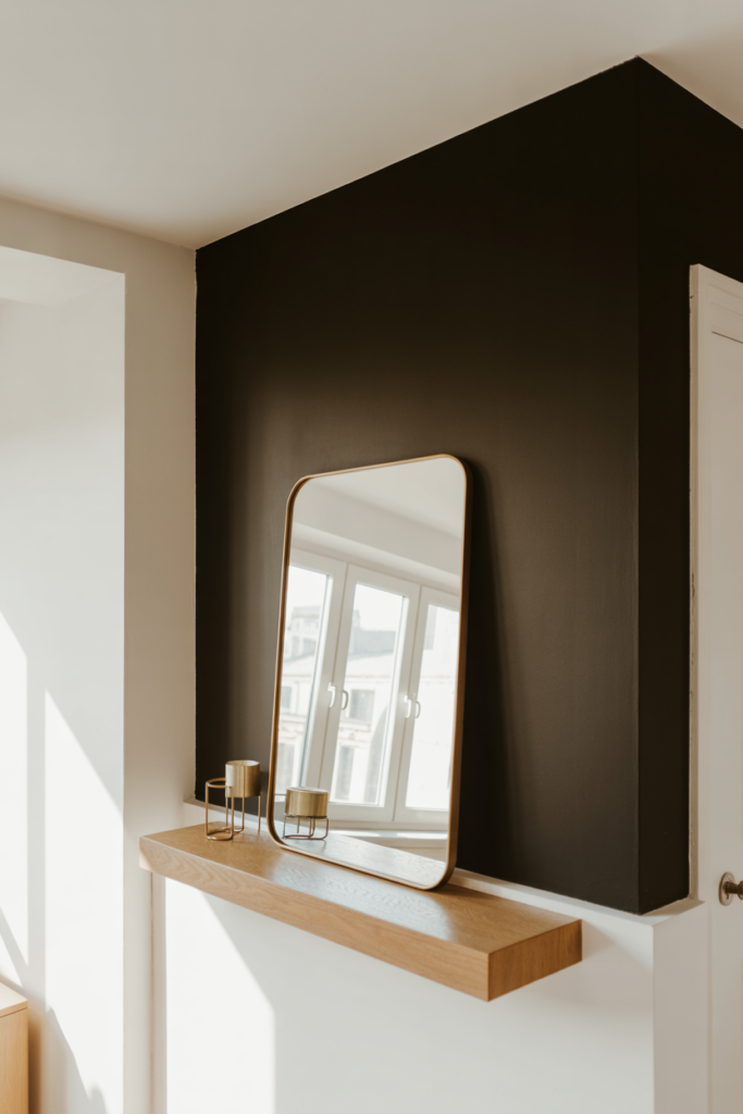
Mirrors deserve a whole conversation. In a small apartment, a large mirror — and we mean genuinely large, not that little one from your bathroom — on the wall opposite your main light source doubles the perceived size of the room and bounces light into dark corners. A gold-framed floor mirror leaning against the wall in a corner is one of the most hardworking pieces of furniture you can own.
Keep the ceiling light. Whatever you do with walls and furniture, a dark ceiling in a small apartment is a commitment most people regret. The eye naturally rises; a light ceiling makes the room feel taller even when everything below it is dark and dramatic.
9. The Accessories That Pull the Whole Thing Together
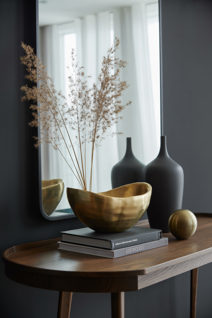
Accessories are where people overspend and under-think. Here’s the truth: you need fewer things of better quality, placed with intention, than a lot of things scattered around hoping for the best.
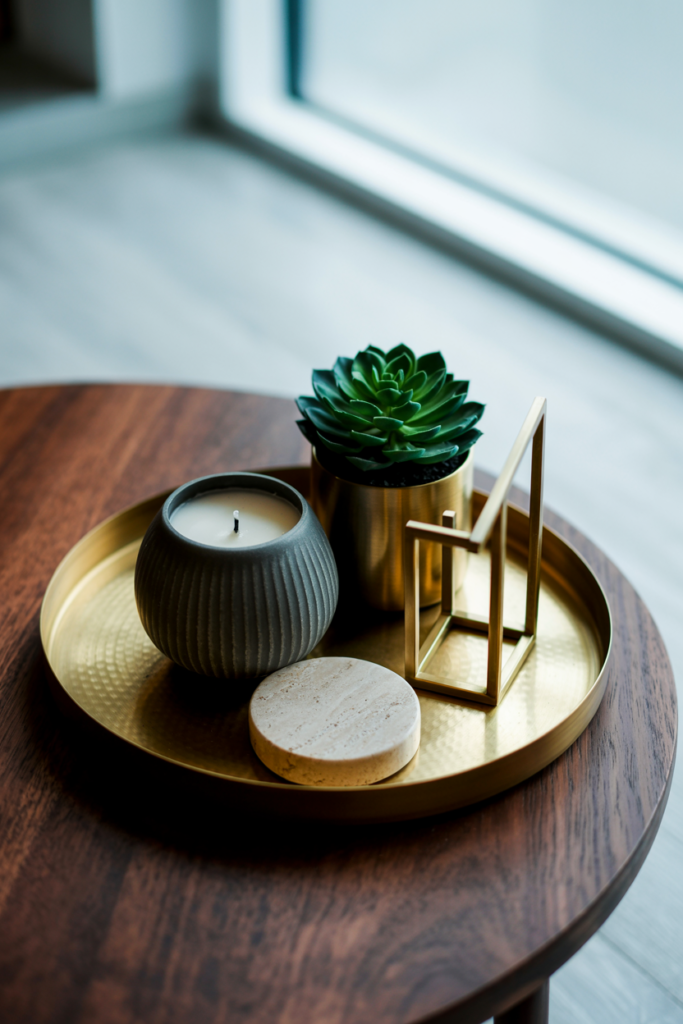
In a black and gold living room, the accessories that do the most work are the ones that combine both tones. A black vase with a gold rim. A marble-effect pot — white and grey — with a brass planter inside it. A tray in matte black holding a collection of gold and black objects (a small sculpture, a candle, a paperweight, a single stem in a slim vase).
Trays are underrated as a styling tool. They contain and organize accessories into a single visual unit, which stops shelves and coffee tables from looking cluttered. A round brass tray on a coffee table with three or four deliberately chosen objects on it looks styled. The same objects scattered across the table look like you haven’t tidied.
Books with black or gold spines arranged on a shelf. A globe in antique bronze. A geometric bowl in black concrete. These are the objects that feel personal without being precious. You’re not decorating a museum. You’re making a place that feels like yours.
10. The Coffee Table That Does Everything Right
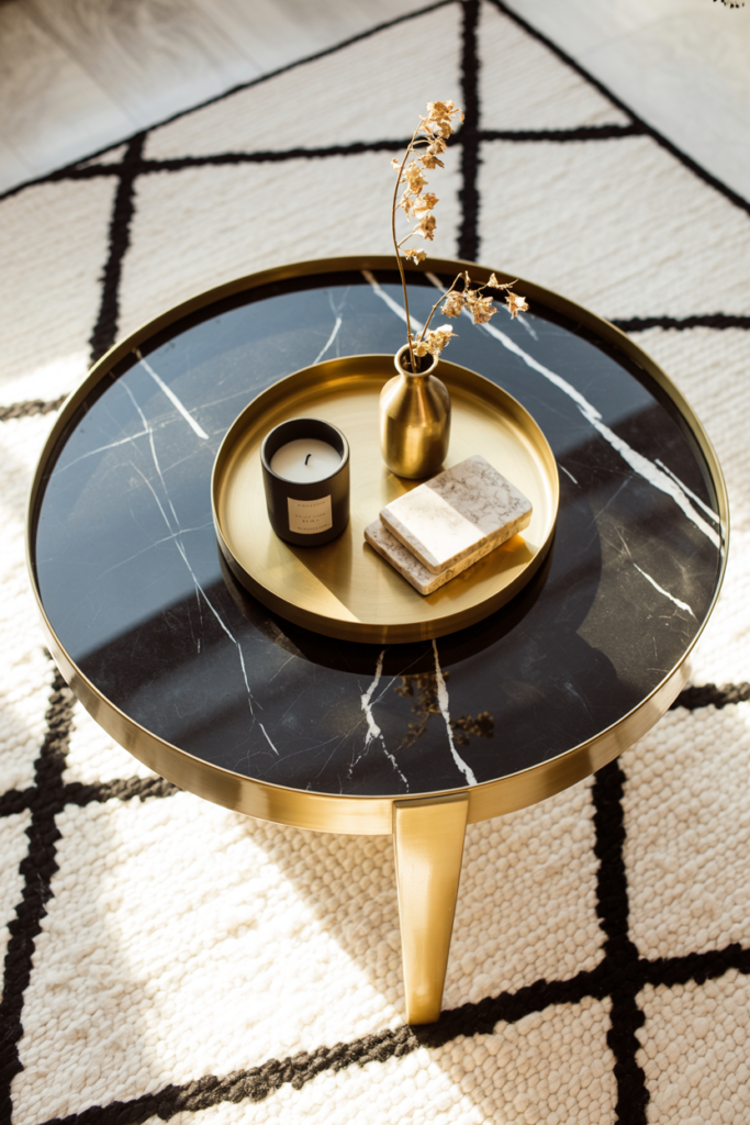
The coffee table is the center of the living room — literally. It’s the first thing guests notice, it appears in every photograph of the space, and it’s the hardest-working surface in the room.
For a black and gold apartment, a coffee table in one of three finishes tends to work best: black lacquer or matte black for drama and contrast; aged brass or gold metal for warmth and visual lightness; or smoked glass with black or gold legs, which adds sophistication without adding visual weight.
Style the surface in odd numbers. Three objects. Or five. A stack of two or three coffee table books (spine color matters — black, cream, or gold spines only), a small sculptural object, a candle or vase. That’s the whole formula.
The scale has to be right for the sofa. Too small and it looks lost. Too large and it blocks the room. A general rule: the coffee table should be roughly two-thirds the length of your sofa and low enough that you’re not craning your neck when you sit.
11. The One Thing Renters Always Miss: Vertical Space
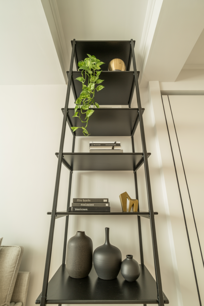
In a rented apartment, the floor is often already taken — by furniture, by rugs, by the square footage reality of city living. Vertical space is frequently ignored and that’s where this palette has room to do something unexpected.
Tall bookshelves in black, floor to ceiling if possible, make a room feel architectural even when it has no architectural detail. They draw the eye upward. They create a sense of scale that furniture on the floor alone can’t achieve. A Billy bookcase from IKEA painted matte black and styled with gold and black objects and carefully chosen books is a genuinely transformative piece — and costs almost nothing compared to what a designer piece would.
A tall floor lamp in the corner of the room, reaching above sofa height, creates a vertical line that makes ceilings feel higher. Pair it with a plant — a fiddle leaf fig, a tall snake plant, a dramatic monstera — and you’ve added life, movement, and another vertical element that costs far less than furniture.
Hanging artwork higher than you think you should, with the center of the piece at approximately eye level when standing (around 57 to 60 inches from the floor), keeps the eye moving upward and makes the room feel bigger. The too-low artwork habit is one of the most common apartment decorating mistakes, and it’s an easy fix.
12. Budget-Friendly Ways to Build This Look Without Buying Everything at Once
The full black and gold living room doesn’t have to appear overnight. In fact, rooms that look the most considered usually came together slowly — one piece at a time, over months.
Start with paint if you can. A single can of matte black paint and an afternoon can transform a tired piece of furniture into something that looks like it cost three times what it did. That’s the highest return on investment you’ll find in home decor, full stop.
Car boot sales and charity shops in the UK, thrift stores and estate sales in the US — they are full of potential black and gold pieces that just need to be seen differently. A dated brass lamp base looks extraordinary once you’ve stripped the shade and replaced it with a black cone shade. A wooden side table painted black with new gold hardware is unrecognizable from what it was.
Amazon, TK Maxx, H&M Home, and IKEA all carry black and gold accessories at price points that make the look accessible. You don’t need the designer version of every piece. You need the designer version of the key pieces — the sofa, the rug, maybe one large light fixture — and then you fill in with budget finds that look elevated because they’re placed well.
The room builds itself if you stay patient and stay deliberate.
—
🌿 Quick Tips
Black hardware on kitchen cabinets or door handles visible from the living room ties the palette through the whole flat — a tiny detail that makes the whole place feel considered.
A single gold-framed mirror above a fireplace or console is the fastest one-piece upgrade to this aesthetic, full stop.
If black furniture feels too heavy for your space, use black in small doses — picture frames, candle holders, a single tray — and let the gold do more of the lifting.
Buy your gold accessories in person when possible. The difference between warm antique brass and cold polished gold is obvious in natural light and nearly invisible in product photos.
Avoid mixing too many patterns. One geometric, one organic (like a botanical or abstract), and one plain is roughly the limit before a small room starts to feel chaotic.
—
❓ FAQ
Q: Will black furniture make my small apartment look smaller? A: Not if you balance it correctly. Pair dark furniture with light rugs, cream textiles, and plenty of mirrors to reflect light. The contrast between dark pieces and light surfaces actually creates visual depth, which can make a room feel more interesting — and even larger — than a room done entirely in pale, safe neutrals.
Q: What shade of gold works best with black in a living room? A: Brushed gold, antique brass, and matte gold are the finishes that consistently photograph well and look expensive in person. Avoid highly polished, bright yellow-toned gold — it tends to read as cheap against matte black surfaces. Warm, slightly aged metal tones are almost always the right answer.
Q: Can I do this look in a rented apartment without painting the walls? A: Absolutely. The palette lives in your furniture, textiles, lighting, and accessories — not the walls. A dark sofa, gold light fixtures, black picture frames, and warm layered lighting will create the same atmosphere even against a standard off-white rental wall. You can also use removable wallpaper or large-format dark art to add depth without touching the actual walls.
—
💭 Final Thought
The best-looking apartments aren’t the ones where someone spent the most money. They’re the ones where someone made a decision and committed to it. Black and gold is a commitment — to drama, to warmth, to a room that knows what it is. You don’t need to do it all at once, and you don’t need to do it perfectly. Start with one piece that makes you feel something.
What’s the one thing in your living room right now that you’d repaint black tomorrow if you had the chance?