Why a Blue Living Room Might Be the Most Emotionally Powerful Design Decision You’ll Ever Make
There’s a moment — and if you’ve ever stood in a beautifully blue room, you’ll know exactly the one — where everything just exhales. The walls seem to breathe. The light shifts into something softer. And you feel, without quite being able to explain it, that you’ve arrived somewhere safe. That’s the quiet magic of blue in a living room, and once you understand it, you’ll never look at a beige wall the same way again.
—
1. The Surprising Psychology Behind Why Blue Feels Like Home
Before you pick a paint sample or order that navy velvet sofa, it helps to understand why blue affects us the way it does — because the answer goes far deeper than aesthetics.
Blue is the color most consistently associated with calm, trust, and emotional safety across cultures. Psychologists call it a “receding color,” meaning it visually pushes walls back, making spaces feel more expansive and less pressured. For a living room — a space that’s meant to hold your most tired evenings, your most important conversations, your quietest Sunday mornings — that psychological softening is almost invaluable.
Research from the University of British Columbia found that blue environments reliably boost creativity and calm simultaneously. Interior designers on both sides of the Atlantic have known this intuitively for decades. It’s why you’ll find soft blues in English country houses and bold navy in Brooklyn brownstones alike. Blue, in all its complexity, just works in living rooms in a way that few other colors can match.
“Blue doesn’t just decorate a room — it changes how you feel inside it.”
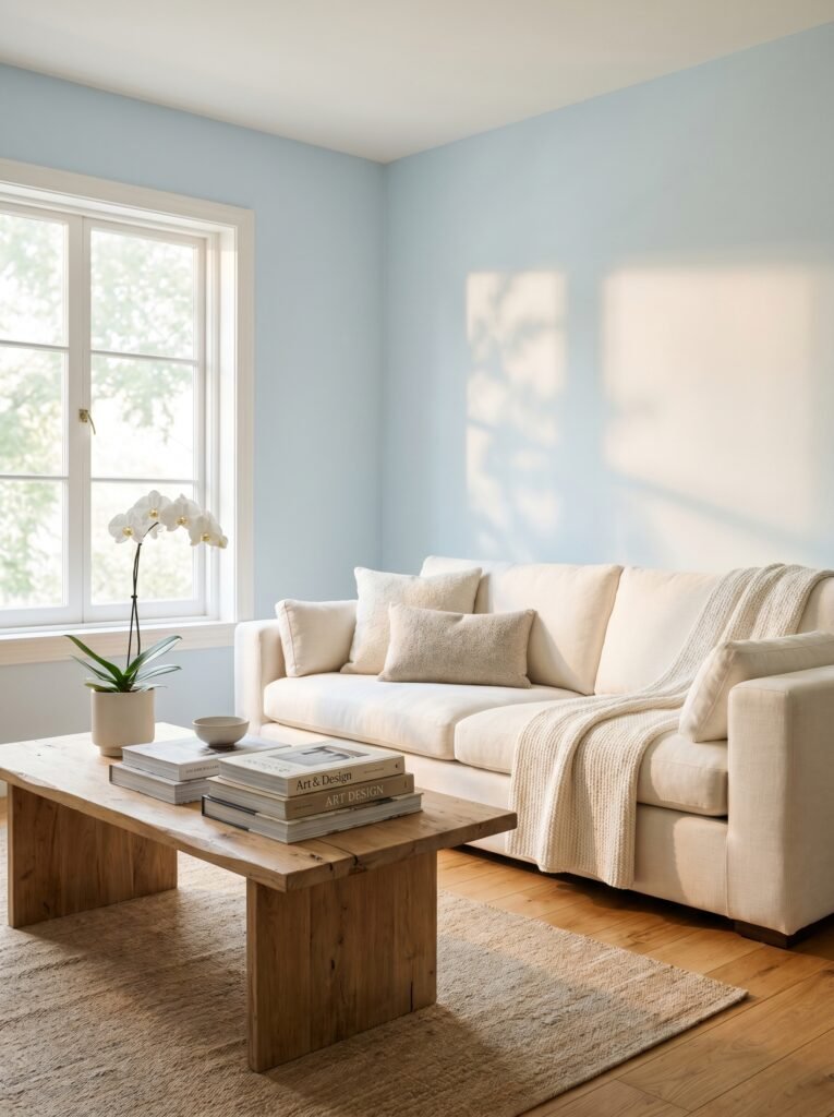
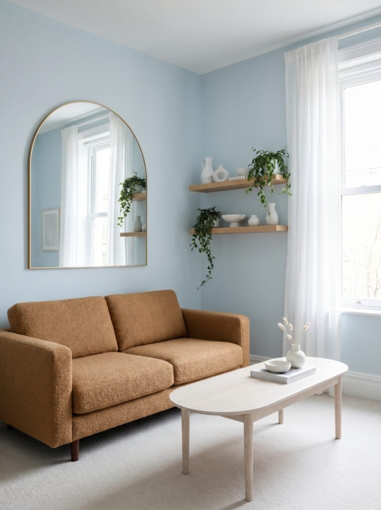
The shade matters enormously, of course. A pale powder blue creates an airy, almost coastal feeling. A deep navy commands attention and warmth in equal measure. And a complex slate or denim blue sits somewhere in the middle — grounded, honest, endlessly liveable. Knowing what you want to feel in your living room is the first step to choosing the right version of blue.
—
2. The Blue Living Room Shades That Are Actually Trending Right Now
Interior design forecasters in the US and UK have been watching blue evolve over the past few years, and the direction is fascinating. We’ve moved past the era of safe, watery baby blue. The blues dominating Pinterest boards and design magazines right now are richer, more considered, and — honestly — more beautiful.
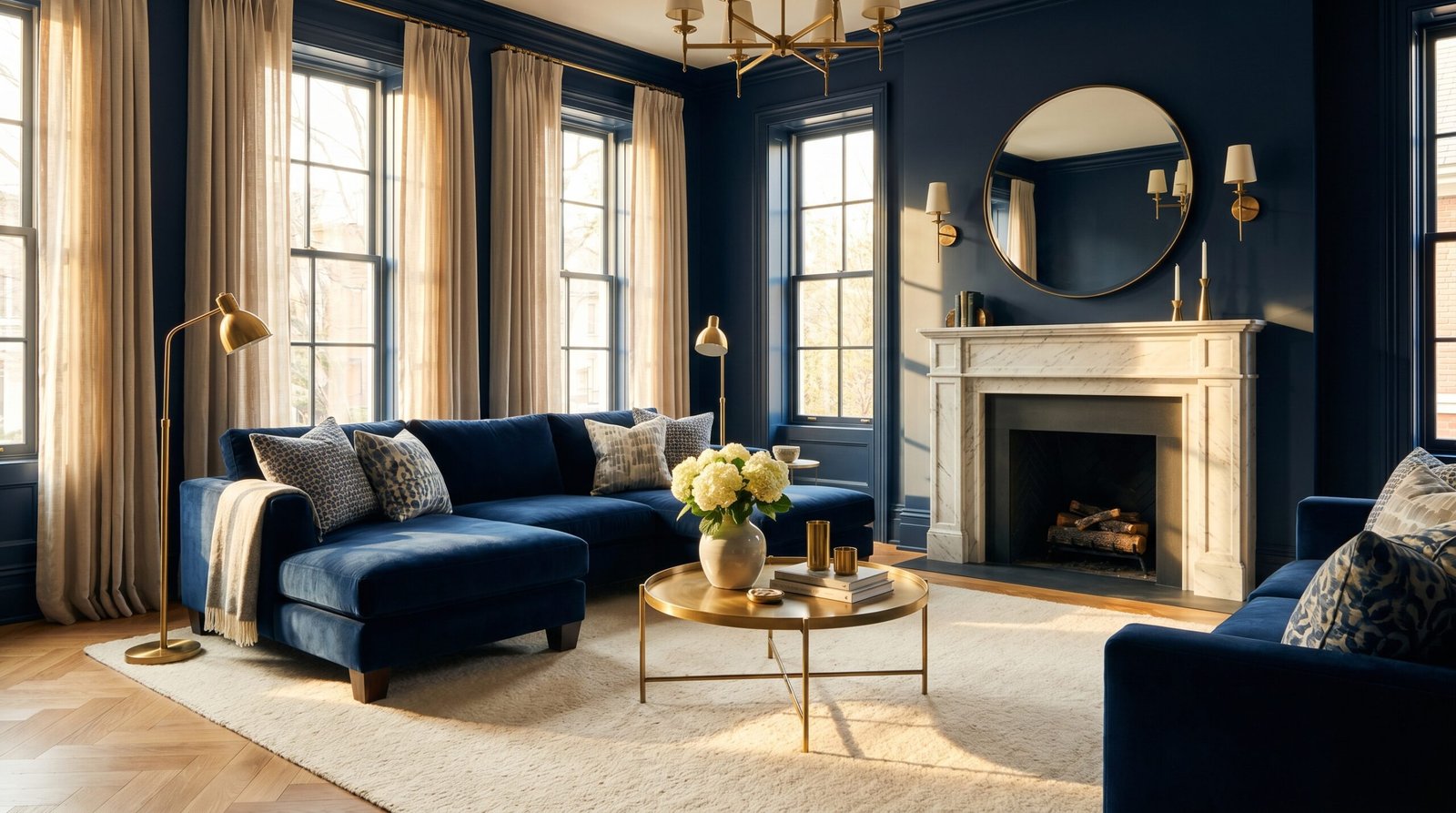
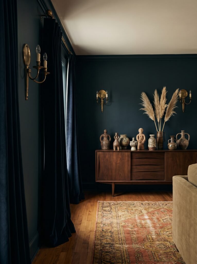
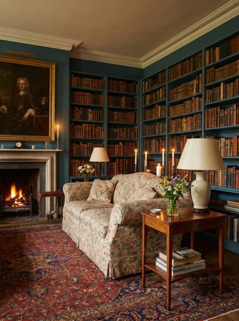
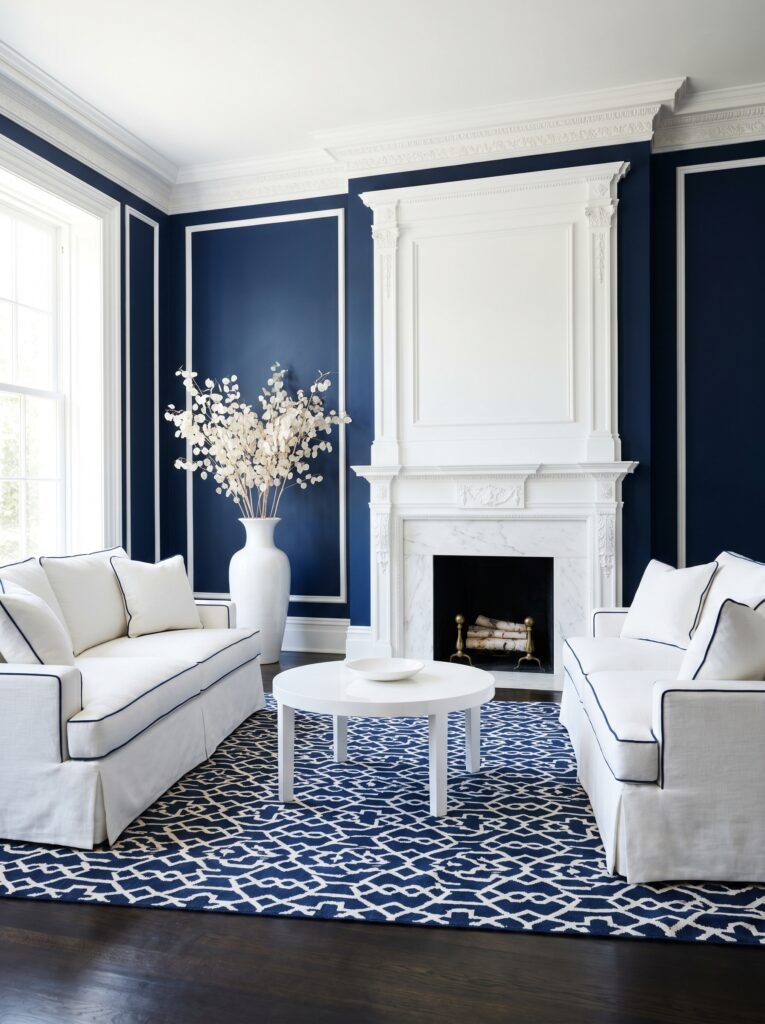
In the UK, Farrow & Ball’s Hague Blue remains a perennial hero: a deep, almost inky blue-green that transforms any living room into something that feels centuries of thoughtfulness poured into four walls. Their Pitch Blue is having a significant moment too — a true, saturated navy that pairs extraordinarily well with warm wood tones and brass hardware.
Across the Atlantic, Benjamin Moore’s Van Deusen Blue and Hale Navy are dominating American interiors, especially in traditional New England homes and contemporary West Coast spaces alike. Sherwin-Williams’ Naval — their 2020 Color of the Year — never really left the conversation, and for good reason. It’s the kind of blue that makes a room feel like it was designed by someone with genuine taste.
For those who want something with a little more personality, dusty blue and muted teal are carving out a beautiful middle ground — sophisticated enough for adults, calming enough for family spaces, and photographically stunning on Pinterest.
—
3. Small Living Room? Here’s Why Blue Is Actually Your Secret Weapon
If you’ve been avoiding dark colors in your small living room because you’re afraid of making it feel like a cave, this section is for you — and it might genuinely change your perspective.
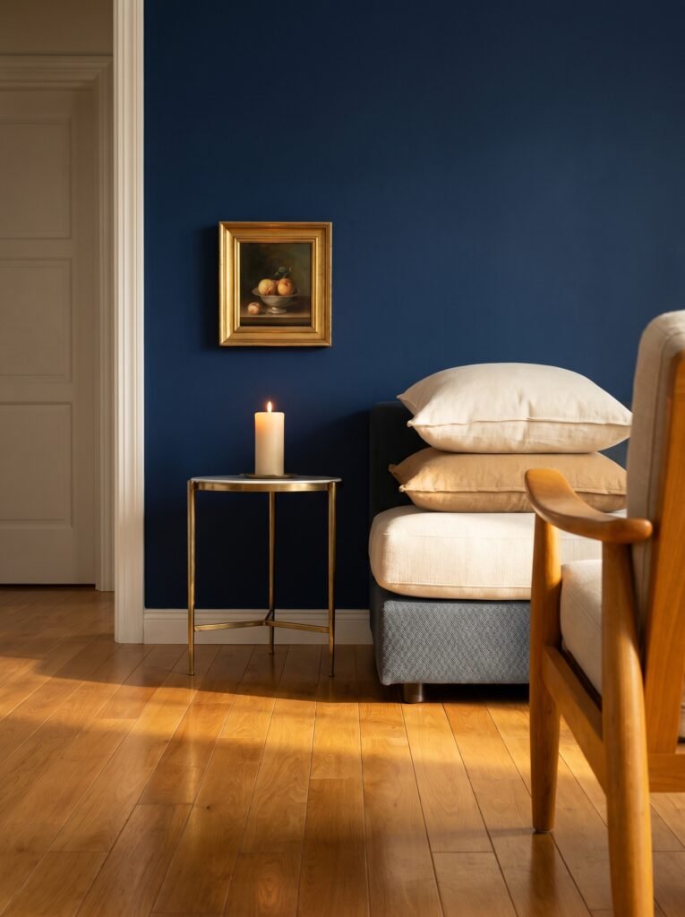
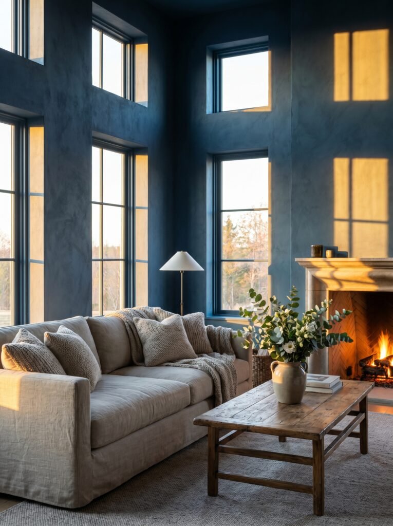
The cave fear is understandable, but it’s largely a myth in well-lit rooms. Dark blues, used with intention, can make a small space feel like a considered jewel box rather than a cramped afterthought. The trick is contrast and light management.
Paint your small living room in a deep blue — something like Farrow & Ball’s Stiffkey Blue or Benjamin Moore’s Old Navy — and then bring in generous light sources: a warm-toned arc floor lamp, candlelight in clusters, sheer curtains rather than heavy drapes. The blue walls absorb the warmth and reflect it back in a way that feels genuinely luxurious.
In a small flat in London or a studio apartment in Chicago, a blue living room signals intentionality. It says this space was designed, not just furnished. And that distinction — between a room that was styled and one that simply happened — is everything in interior design.
—
4. The Furniture Colors That Make Blue Walls Absolutely Sing
Here’s where so many people get stuck: they choose a beautiful blue for their walls and then second-guess every furniture choice after. Let’s simplify it.
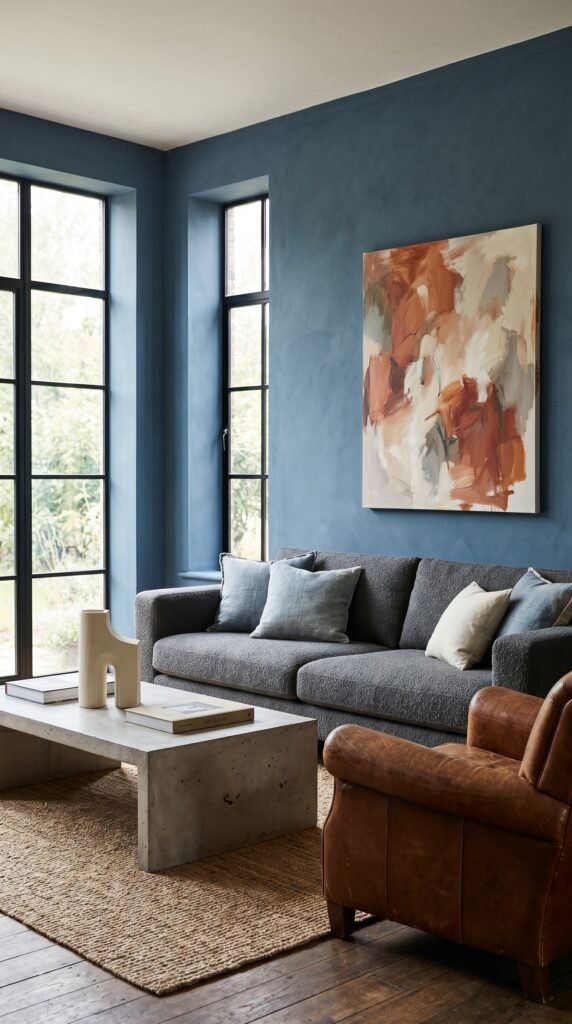
Blue is one of the most generous colors when it comes to furniture pairings. Warm woods — think walnut, oak, and teak — create a grounded, Scandinavian-inspired look that’s enormously popular in both the UK and US right now. The warmth of the wood counterbalances the cool of the blue in a way that feels completely natural, like the color palette was borrowed from a Nordic forest.
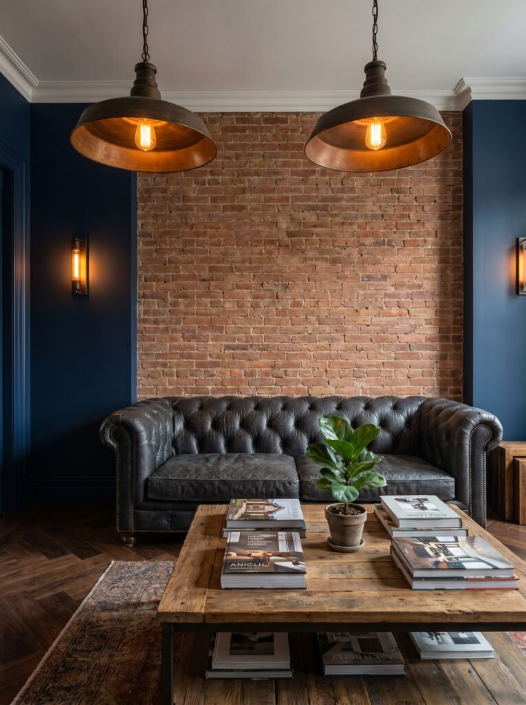
Cream and off-white upholstery against a navy or cobalt blue wall is a classic British country house move — and it’s classic for a reason. The contrast is clean without being stark, sophisticated without being cold. If you want to go bolder, a burnt orange or terracotta accent chair against a blue wall creates one of the most visually arresting combinations in contemporary interior design. Blue and orange sit opposite each other on the color wheel, which means they intensify each other without competing.
Metallics are equally important here. Brass and gold hardware on furniture legs, picture frames, and light fixtures elevate blue rooms from casual to curated. If your style leans more contemporary, brushed silver and chrome work just as beautifully — cleaner, more architectural, equally stunning.
—
5. Blue Living Room Styling: The Textiles That Pull Everything Together
You can paint the most beautiful blue walls in the world and still end up with a room that feels flat. The difference between a blue living room that looks like a Pinterest board and one that looks like a Pinterest board you actually want to live in comes down almost entirely to textiles.
Layering is the secret. Think about your living room in terms of touch-points — every surface a hand might brush, every cushion that might be hugged. A chunky cream knit throw over a navy sofa. A worn Persian rug in deep reds and gold over pale wooden floors. Velvet cushions in sage and terracotta. Linen curtains in unbleached ivory, falling in generous puddles on the floor.
“A blue room without texture is just a blue box — but a blue room with layers is a home.”
In the UK, the layered textile look has deep roots in English country house style — that beautiful, slightly imperfect abundance of fabrics and patterns that feels lived-in and beloved. In the US, it aligns beautifully with the coastal grandmother aesthetic and the now-iconic “grandmillennial” style that continues to resonate with younger homeowners who want warmth over minimalism.
Don’t be afraid of pattern, either. A blue-and-white toile cushion, a geometric indigo throw pillow, or a floral curtain in navy and cream can add the kind of visual interest that keeps a room from feeling like a hotel lobby.
—
6. Lighting a Blue Living Room: The Rule Every Designer Lives By
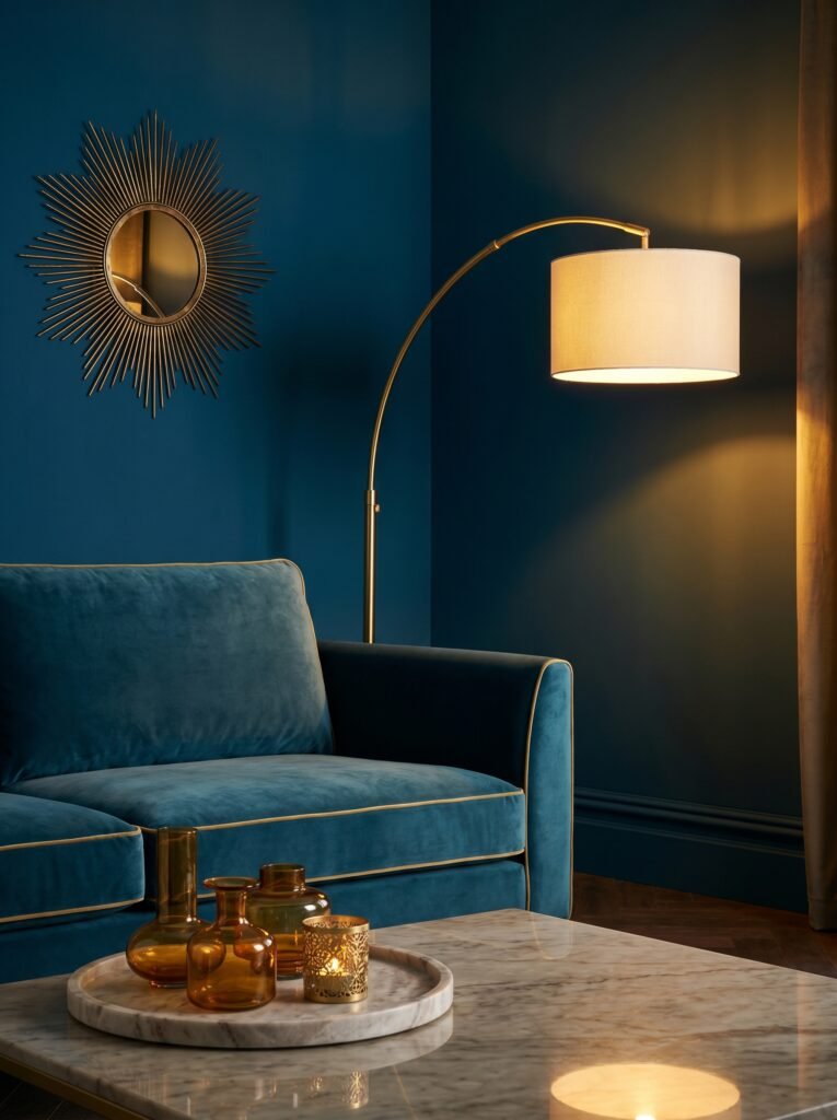
Lighting and color are inseparable. A blue that looks serene in daylight can turn cold and uninviting under the wrong artificial light — and understanding this saves you from expensive mistakes.
The golden rule for blue living rooms: always use warm-toned bulbs. Aim for LED bulbs rated between 2700K and 3000K (the Kelvin scale measures color temperature). These cast a warm, amber-tinged light that wraps around blue walls beautifully, preventing that cold, institutional feeling that cooler daylight bulbs can create.
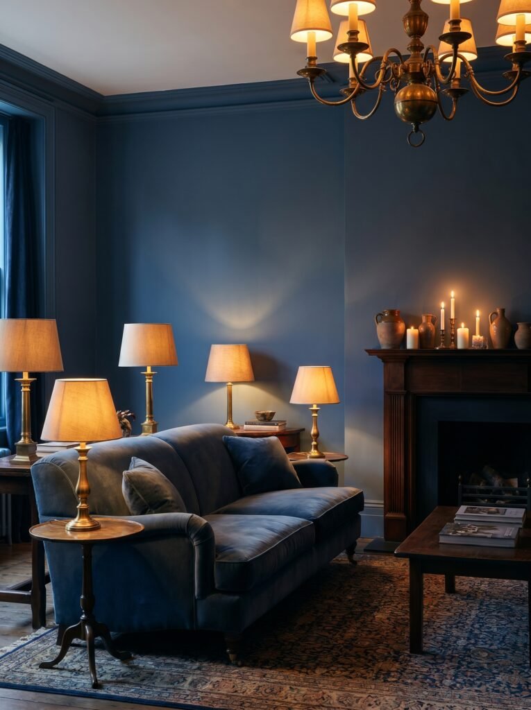
Layer your lighting the same way you layer textiles. A central ceiling fixture gives you ambient light. Table lamps on either side of the sofa add warmth at eye level. A floor lamp in the corner creates depth and drama. Candlelight — actual candles, or high-quality LED alternatives — adds the kind of flicker that makes any room feel like somewhere special.
In rooms with limited natural light, mirrors become essential. A large, ornate mirror on the wall opposite your window amplifies daylight and doubles the visual depth of your blue room. In the UK particularly, where natural light can be in short supply between October and March, this trick is practically non-negotiable.
—
7. Art and Accessories: How to Make Your Blue Living Room Feel Personal
A blue living room without personal touches is just a beautiful stage set. The art, the objects, the small details — these are what transform a designed space into a lived space, and in a blue room, they matter even more because the backdrop is so strong.
Go bold with art in a blue room. The richness of the wall color can handle large-scale paintings, graphic prints, and colorful photography in a way that white walls simply cannot. In the US, maximalist art collectors are pairing deep navy walls with large abstract oil paintings — and the results are extraordinary. In the UK, the tradition of gallery walls with eclectic framed prints, botanical illustrations, and antique maps looks magnificent against a blue backdrop.
When it comes to accessories — vases, books, candles, ceramics — think about creating small moments of color that echo the room’s palette. A terracotta pot. A stack of cream and gold books. A single stem of dried pampas grass in a white ceramic vase. These aren’t decorative accidents; they’re the punctuation marks that make the room’s story legible.
—
8. Blue Living Rooms in Open-Plan Spaces: The Do’s and Don’ts
Open-plan living is the norm in most modern American homes and increasingly popular in UK new-builds and renovated properties. And blue, used thoughtfully, is one of the best colors for defining zones within a larger space — but it requires more intention than painting a single enclosed room.
The most effective approach in an open-plan space is to use blue on a feature wall or within a defined seating area, rather than washing the entire open space in a single color. This creates visual cohesion without overwhelming the space, and it allows the kitchen or dining area to maintain its own identity.
If you do want to go all-in on blue throughout a large open-plan space, keep the ceiling and floors neutral — warm white above, natural wood or stone below. This grounds the blue without competing with it, and stops the space from feeling like the inside of a blue envelope.
—
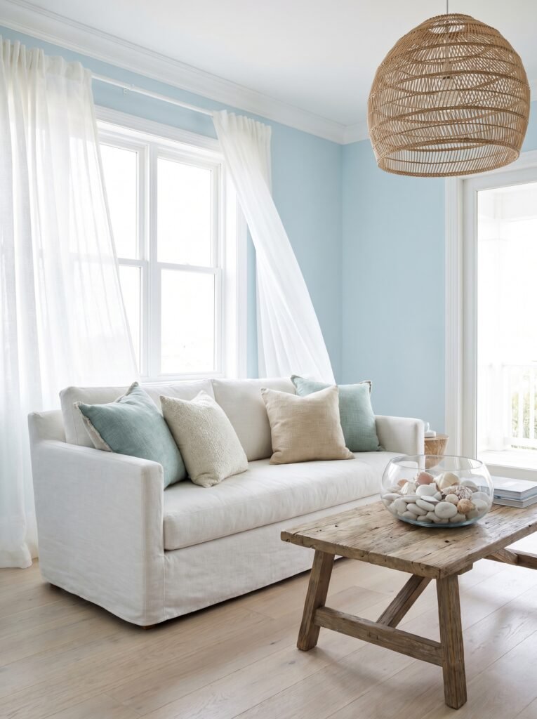
9. The Coastal Blue Living Room: Bringing the Ocean Indoors
If there’s one blue living room style that consistently dominates Pinterest boards in both the US and the UK, it’s coastal. And while the coastal aesthetic has been interpreted many times over, the current version is far more sophisticated than the seashell-and-driftwood clichés of the early 2000s.
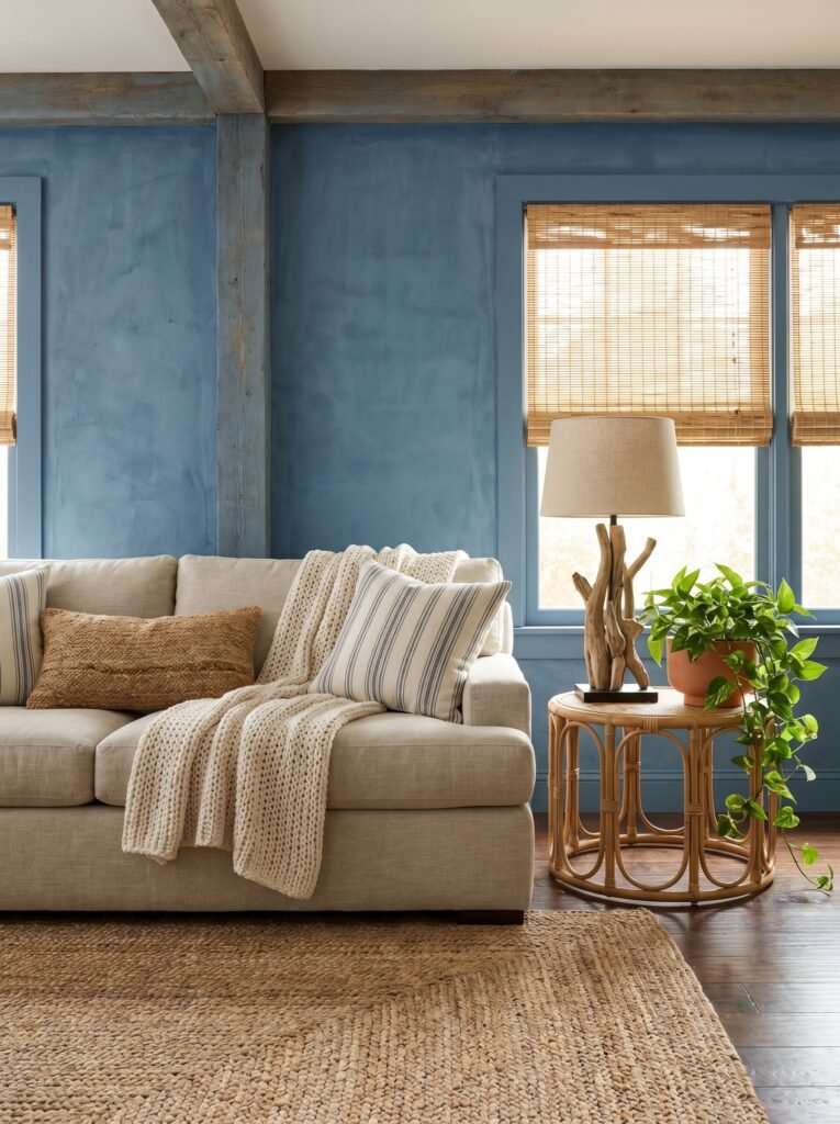
Modern coastal blue interiors take their cues from the actual ocean — the complexity of it, the varying depths of color, the way it shifts between teal and midnight and pale grey depending on the light. Think Aegean Teal (Benjamin Moore), Blue Lagoon (Farrow & Ball), or a layered palette that moves from sandy cream at floor level up to deep cerulean on the upper walls.
“The best coastal living rooms don’t look like a beach souvenir shop — they look like the sea itself.”
Natural materials are essential in a coastal blue room: rattan and wicker furniture, linen upholstery, weathered driftwood accessories, woven seagrass rugs. In coastal New England homes and in seaside British properties from Cornwall to the Norfolk Broads, this aesthetic feels genuinely rooted in place. Even if you’re landlocked in the Midwest or the Midlands, a well-executed coastal blue living room can make you feel the salt air through the open window.
—
10. Blue Paired With Green: The Nature-Inspired Combo Nobody Warned You About
If you’ve been strictly thinking about blue in isolation, here’s a combination that might stop you mid-scroll: blue and green together, used with intention, create some of the most quietly beautiful living rooms in contemporary interior design.
The fear around mixing blue and green — that it’ll look garish, or unfinished — is entirely unfounded when you choose tones from the same depth of color. A deep teal paired with forest green, or a soft powder blue alongside sage, creates a nature-inspired palette that’s genuinely serene. It mirrors what happens naturally outdoors: sky meeting forest, sea meeting shore.
This combination is appearing consistently in interiors published by Elle Decor, House Beautiful, and Livingetc — publications with influence on both US and UK readers. It’s particularly stunning in living rooms with good natural light and wood furniture, where the overall effect is somewhere between a Scandinavian cabin and a cottage garden.
—
11. Budget-Friendly Ways to Bring Blue Into Your Living Room
Not every blue living room transformation requires a complete repaint or a designer sofa. Sometimes the most impactful changes are the most affordable — and this is genuinely good news for renters in London and Chicago alike.
Start with cushions. A set of deep blue velvet cushions on a neutral sofa can shift the entire mood of a living room for well under $50 or £40. Add a blue-toned area rug — IKEA, Wayfair, and Made.com all carry beautiful options at accessible price points — and the room begins to take shape. A single piece of blue-toned art from Etsy or Society6 can anchor a gallery wall and set the color story.
For renters who can’t paint, blue removable wallpaper has become genuinely sophisticated in recent years. Brands like Chasing Paper (US) and Milton & King (UK) offer peel-and-stick options that look like the real thing and leave no damage when removed. A single feature wall in a bold blue pattern can transform a rented flat without touching the lease.
—
12. The Blue Living Room Combinations That Interior Designers Swear By
After all of this, it helps to have a few tried-and-true combinations that you can carry straight into your own home — practical starting points rather than just inspiration.
Navy + brass + warm white: The most timeless combination in blue living room design. Deep navy walls, brass light fixtures and picture frames, cream or warm white upholstery. Works in Georgian townhouses and modern apartments with equal elegance.
Powder blue + natural oak + terracotta: Light, airy, and grounded simultaneously. This combination feels Scandinavian and Southern European at once — effortlessly chic for contemporary homes on both sides of the Atlantic.
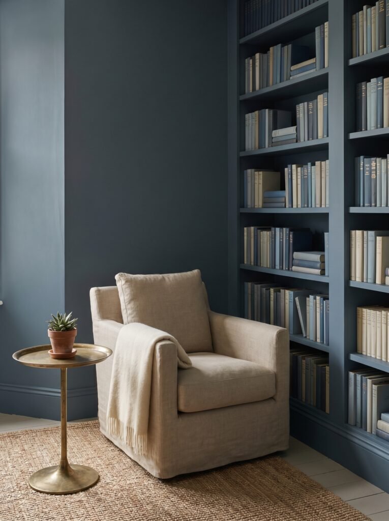
Slate blue + deep green + linen: Perfect for the nature-lover who wants their living room to feel like a clearing in a forest. Rich, complex, deeply calm.
Denim blue + off-white + warm wood: Casual and lived-in, this works beautifully in family homes where the living room needs to be both beautiful and functional. The denim-toned blue is forgiving of everyday use and ages gracefully.
—
🌿 How to Create a Blue Living Room That Truly Works
Creating a blue living room that feels intentional rather than accidental comes down to a few key principles that designers return to again and again.
Start with the light. Visit your living room at different times of day and notice how natural light changes with the hours. A blue that looks perfect at noon might feel entirely different at six in the evening — and your artificial lighting needs to compensate for this with warm-toned bulbs and layered light sources.
Sample before you commit. Paint three or four generous swatches directly onto your walls and observe them over several days before making a final decision. Paint companies like Farrow & Ball, Benjamin Moore, and Sherwin-Williams all offer sample pots for just this purpose, and it’s the single best investment you can make before committing to four walls.
Layer from the floor up. Choose your rug before your curtains, your curtains before your cushions, and let each decision inform the next. The room should feel layered and cohesive — not like a collection of individual purchases. Build warmth into every layer through texture: wool, linen, velvet, wood, ceramic.
Don’t rush the art. Live in your blue room for at least a few weeks before hanging art. Once you see how the light moves across the walls and how the furniture settles in, you’ll have a much clearer instinct for what the room needs on its walls — and you’ll be far less likely to regret your choices.
—
❓ FAQ
Q: Will a dark blue living room make my space feel smaller? A: Not necessarily — in fact, dark blue used with warm lighting and thoughtful contrast can make a room feel more intimate and cocooning rather than cramped. The key is to balance deep walls with lighter furniture upholstery, warm-toned lighting, and strategic mirrors to keep natural light circulating.
Q: What’s the most popular shade of blue for living rooms in the UK right now? A: Farrow & Ball’s Hague Blue and Pitch Blue are consistently among the most requested shades by interior designers working in the UK. In the mainstream market, shades similar to Dulux’s Midnight Teal and Crown’s Inky Blue are seeing significant sales growth, reflecting a broader shift toward deeper, more saturated blues in British interiors.
Q: Can I mix blue with other bold colors in my living room? A: Absolutely — and the results can be stunning when done with intention. Blue pairs beautifully with warm terracotta, burnt orange, soft sage green, and deep plum. The key is to choose one bold accent color and introduce it in measured doses through cushions, throws, and accessories rather than overwhelming the room with competing strong colors.
—
💭 Final Thought
There’s something quietly revolutionary about choosing blue for your living room — about deciding that the space where you rest, gather, and simply exist deserves a color with this much depth and feeling. Blue doesn’t pretend to be neutral. It makes a choice, and in doing so, it invites you to make one too: to build a room that isn’t just beautiful, but that genuinely holds you.
Whether you go all-in with an inky Hague Blue on every wall or simply introduce a pair of deep navy velvet cushions onto a neutral sofa, you’re participating in a design tradition that stretches from English country houses to New York brownstones — a tradition rooted in the simple, powerful truth that color shapes how we feel at home.
So here’s the question worth sitting with: if your living room could make you feel one specific emotion every time you walked into it, what would you want that emotion to be — and is the color on your walls currently doing that work?