Why Red and Green Belong Together: The Surprisingly Timeless Interior Design Combination You May Have Been Afraid to Try
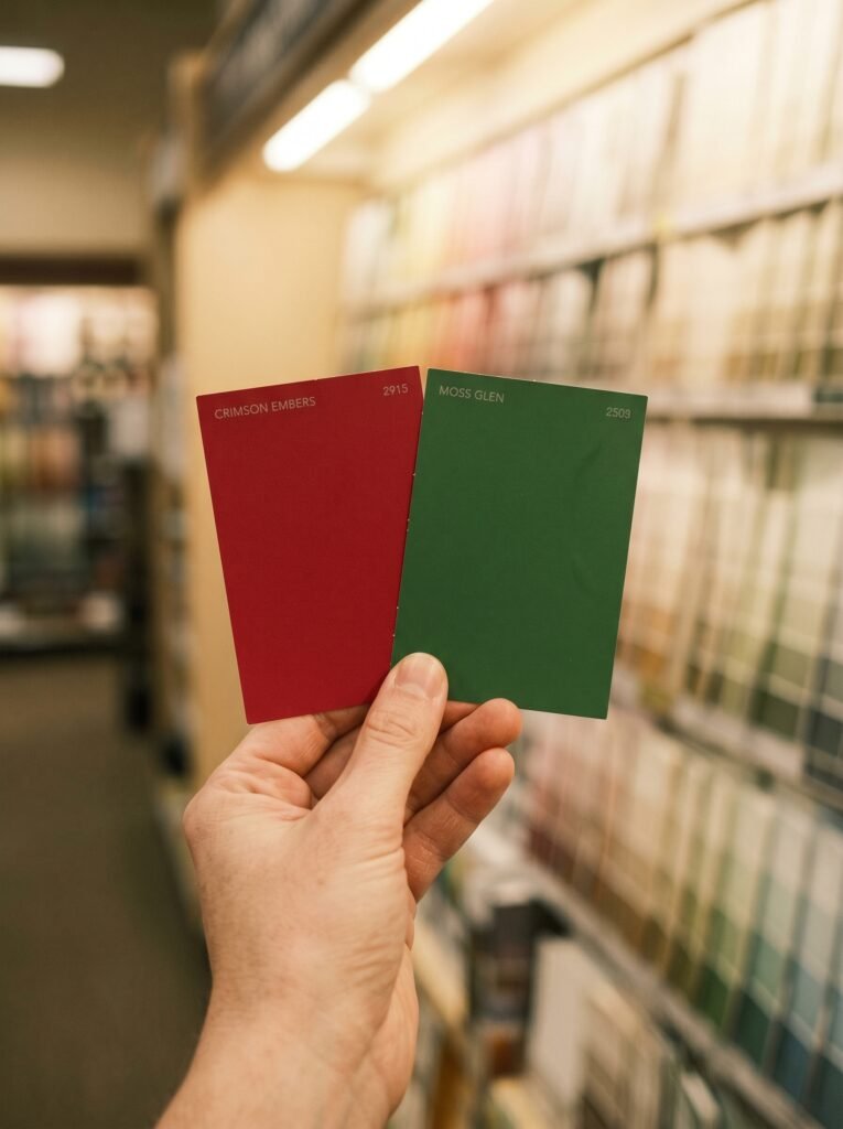
There’s a moment most of us have had — standing in a paint aisle, holding two color swatches side by side, heart half-hopeful and half-terrified. Red felt bold. Green felt alive. Together? That felt like a risk. But what if that fear has been keeping you from one of the most beautiful, psychologically rich color pairings in all of interior design?
—
Table Of Content
1. The Color Pair That History Refused to Forget

Long before Pinterest boards and design influencers, red and green were already living together in the most celebrated interiors in the world. Victorian parlors draped in deep crimson with forest green accents. Italian Renaissance frescoes that used terracotta reds alongside sage and olive. Traditional Chinese interiors where lacquered red walls met jade green textiles. This pairing didn’t survive centuries by accident — it survived because something in the human eye, and perhaps even deeper in the human soul, responds to it.
“Some color combinations don’t trend — they endure. Red and green is one of them.”
What makes this pair so persistent is rooted in color theory. On the traditional color wheel, red and green sit directly opposite each other — they are complementary colors. Complementary colors, when placed together, don’t clash; they amplify. They make each other more vivid, more alive, more present. A green cushion looks greener next to a red sofa. A red rug looks richer against a green wall. That contrast is not a problem — it’s the point.
2. Why Our Eyes Are Wired to Love This Combination

Here’s something fascinating that most design guides skip over: the human eye has specialized photoreceptors called cones, and two of the three types are specifically tuned to detect red and green wavelengths. This isn’t a coincidence of evolution — our ancestors needed to distinguish ripe red fruit from green foliage to survive. Somewhere in our biology, red against green reads as important. As alive.
When you walk into a room decorated with both colors, your visual system doesn’t feel confused — it feels engaged. There’s a reason nature uses this combination so freely. Think of holly berries, ripe tomatoes on the vine, or a red-breasted robin perched in an evergreen tree. Red and green in nature is almost always a signal of vitality.
3. The Shades That Make or Break the Room
Here’s where most people go wrong — not in choosing red and green, but in choosing which red and which green. The Christmas-ornament version of this pairing (bright candy red and electric pine green) can feel festive in December and garish in July. But shift those tones slightly, and everything changes.
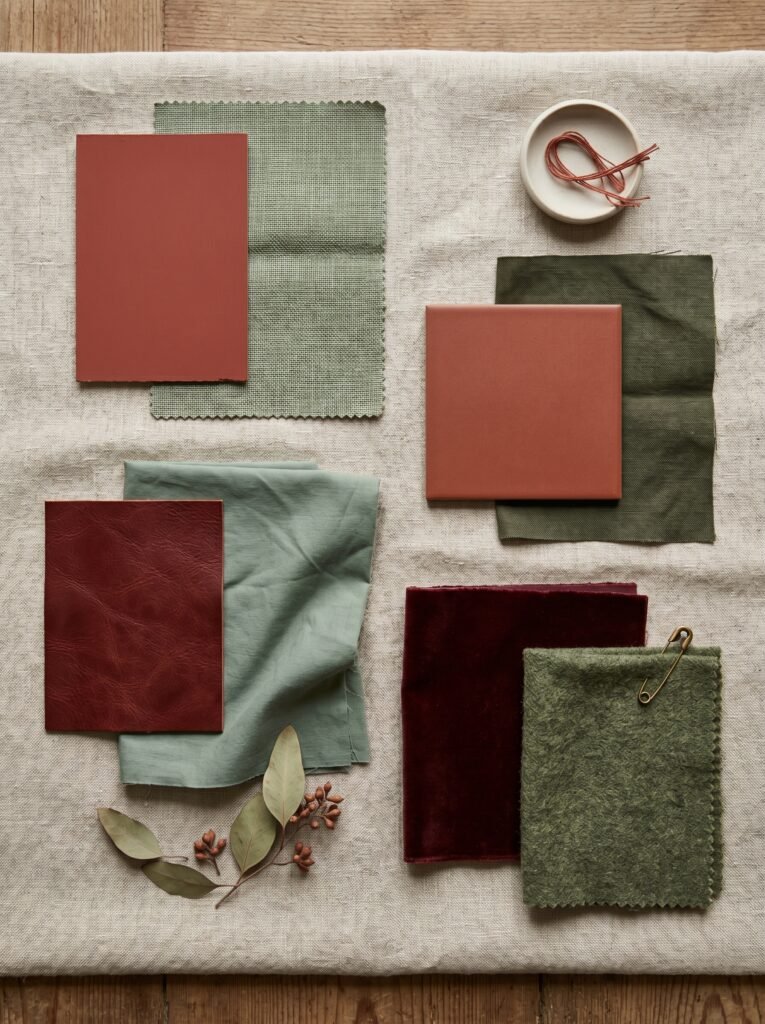
Think terracotta red paired with sage green. Oxblood paired with eucalyptus. Rust paired with olive. Burgundy paired with moss. These combinations feel sophisticated, grounded, and deeply livable. They bring warmth without shouting. They create depth without overwhelming. The key is to work within the same temperature and saturation range — muted with muted, warm with warm, deep with deep.
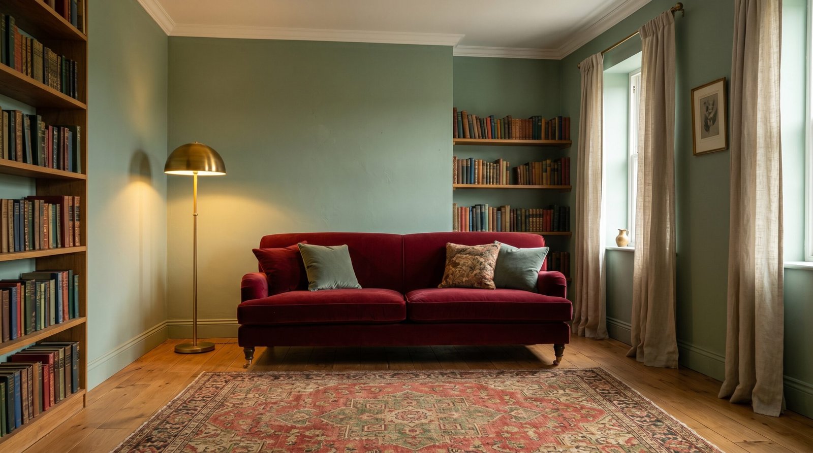
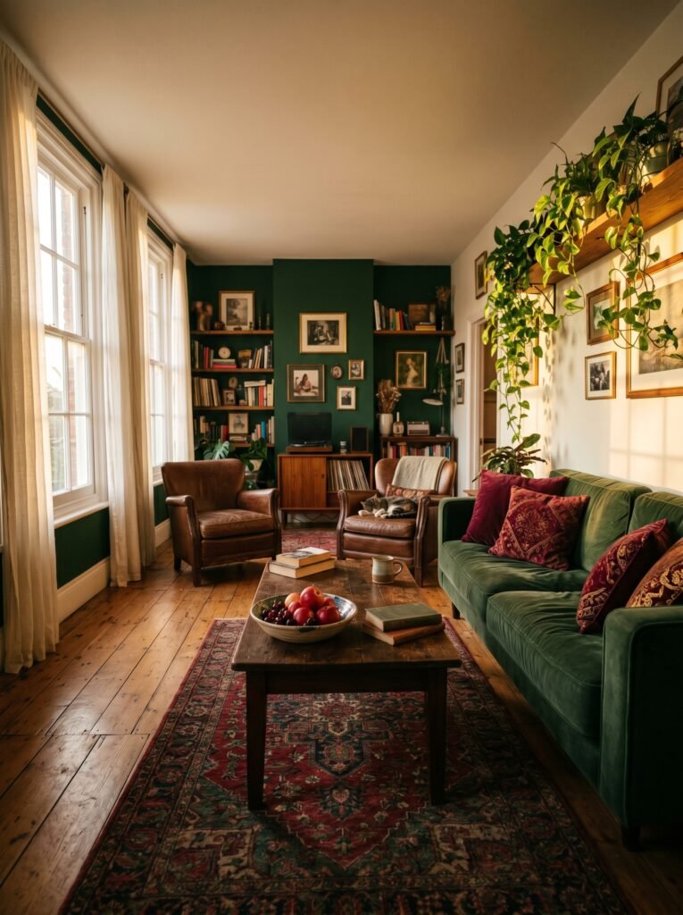
4. The Living Room That Feels Like a Deep Exhale
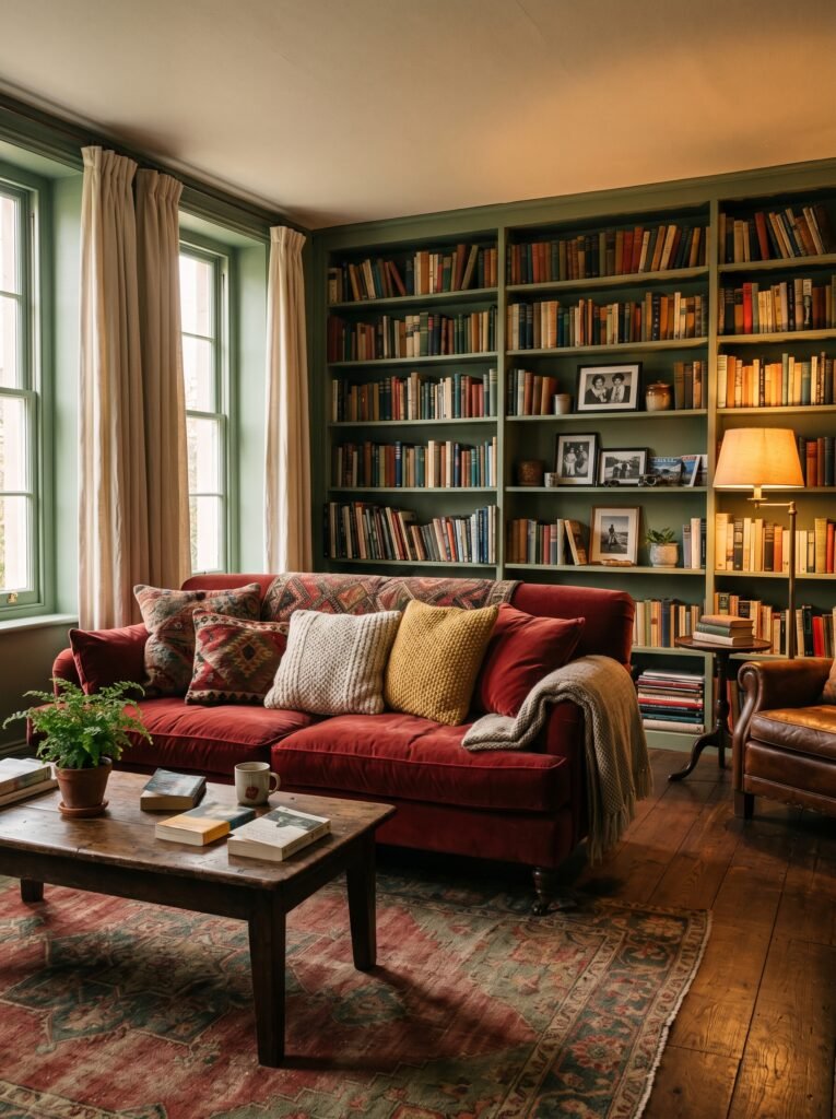
Imagine walking into a living room with walls painted in a soft, chalky sage green. A deep red velvet sofa anchors the space. Wooden bookshelves full of worn spines line one wall. A brass floor lamp glows in the corner. There’s a Turkish rug underfoot in faded reds, greens, and golds. This room doesn’t feel designed — it feels accumulated, like a space that has been loved for a long time.
That feeling is not accidental. Red and green together create warmth and enclosure — what designers call a “cozy” quality. The contrast provides visual interest so your eye keeps traveling around the room, while the complementary nature of the pair makes everything feel cohesive rather than chaotic.
5. Using Green as Your Foundation, Red as Your Accent
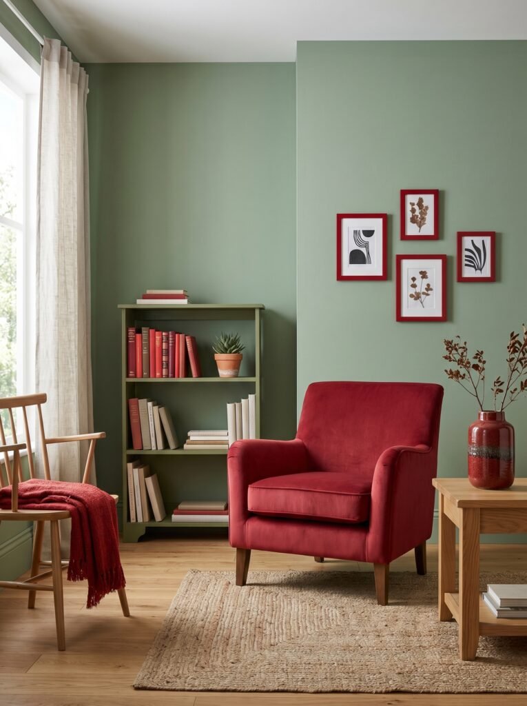
One of the most reliable approaches to decorating with red and green is to treat green as your dominant color and red as your accent. Green is easier to live with as a backdrop — it reads as natural, restful, and flexible. Sage, olive, hunter, or celadon painted on walls creates a room that breathes.
Then you bring in red through layers. A red throw blanket folded over the arm of a chair. A stack of red-spined books on a shelf. A ceramic vase in a deep brick red on a side table. Red picture frames. A single red armchair in an otherwise green-toned room. Each touch of red acts like punctuation — it draws the eye, creates emphasis, and gives the room its energy without overwhelming the senses.
“Decoration isn’t about filling a room — it’s about knowing exactly where to let color speak.”
6. The Reverse Approach: When Red Leads and Green Supports
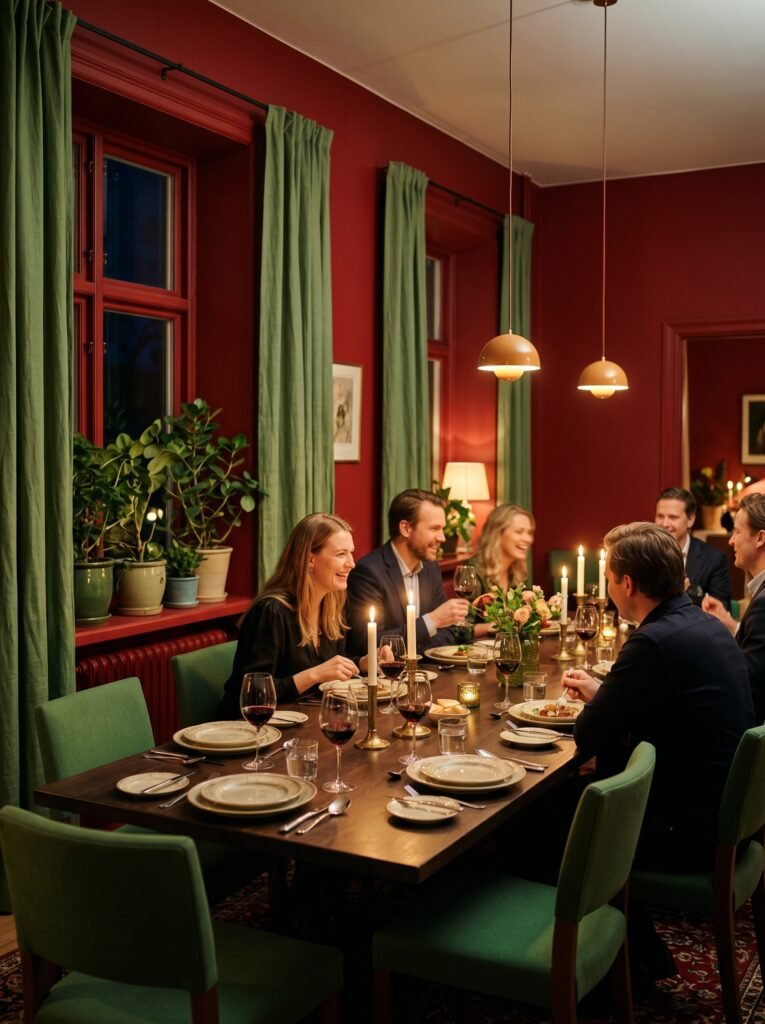
Some rooms call for boldness. If you want red to lead, let it. Red-painted walls are dramatic and intimate — they make a room feel smaller in the best possible way, like being wrapped in warmth. In a dining room, this can be transformative. Red walls have long been favored in dining spaces because they stimulate conversation and appetite.
In this scenario, green plays the role of the calming counterpoint. Green upholstered dining chairs. Green linen curtains. A few potted plants — living green — clustered on a windowsill. The plants, in particular, are one of the most effortless ways to introduce green into any red-leaning room, because their organic form prevents the pairing from ever feeling too rigid or formal.
7. The Bedroom: A Bolder Choice Than You’d Expect
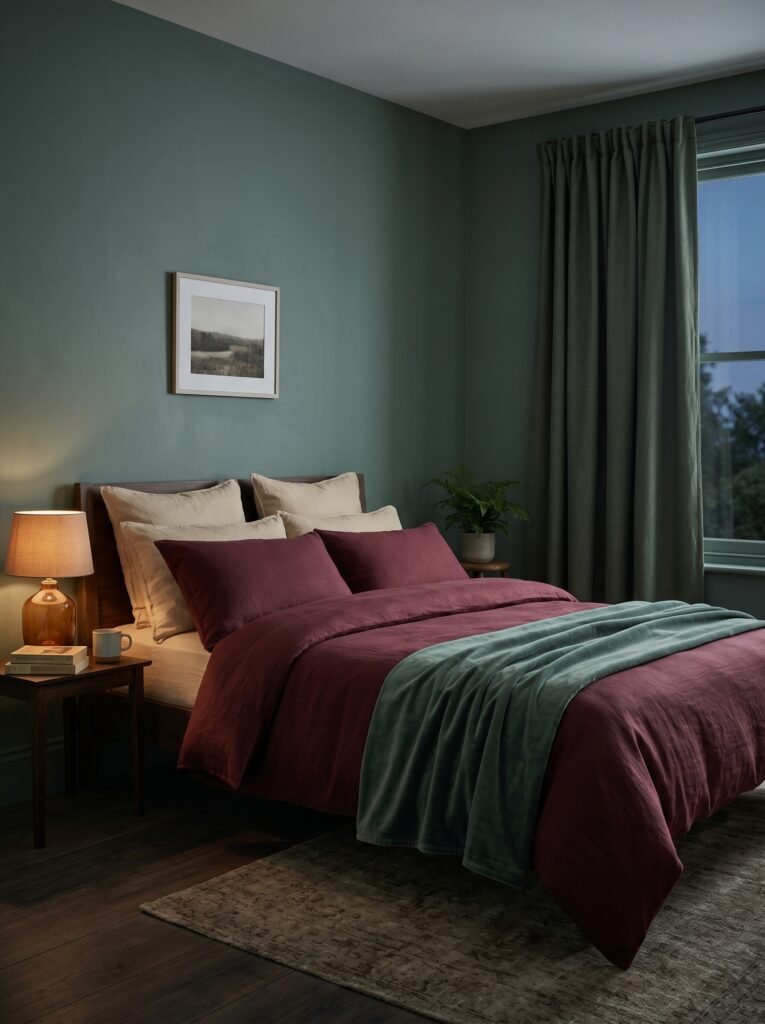
Most people default to neutral tones in the bedroom, afraid that anything stronger will disrupt sleep. But dark, enveloping colors in the bedroom can actually feel profoundly restful when handled well. A deep sage green on the walls, paired with burgundy or wine-red bedding, creates a room that feels like a retreat — cool, lush, and still.
The trick in the bedroom is to keep the red tones soft and desaturated. Wine, rose, terracotta, and blush all carry the warmth of red without the alerting quality of brighter hues. Combine these with a green that has some blue or grey in it — like eucalyptus, sage, or sea glass — and the bedroom becomes genuinely restful rather than stimulating.
8. What Textures Do for This Color Pairing
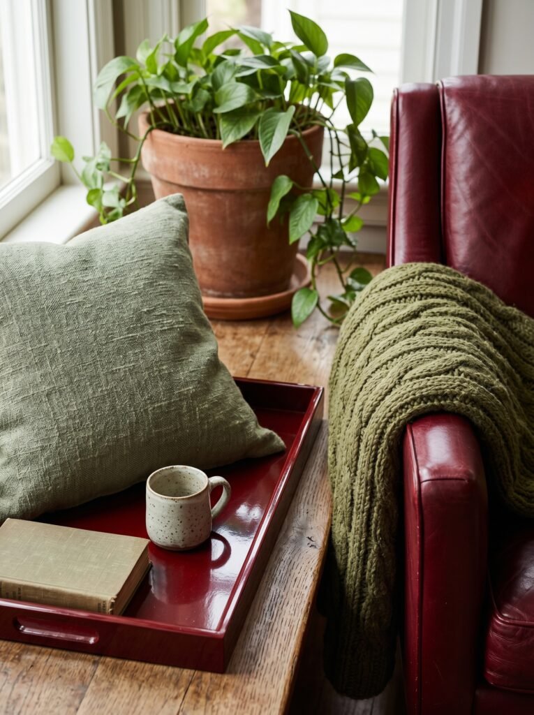
Color alone doesn’t make a room — texture is what makes color feel real. Red velvet and green linen feel entirely different from red gloss and green matte, even if the exact same hues are used. In a red and green interior, layering textures is what prevents the space from feeling flat or costume-like.
Consider rough linen in sage against the smoothness of a red lacquered tray. A chunky-knit olive green throw against a sleek crimson leather chair. A terracotta pot (which reads in the red family) next to a trailing pothos plant. Texture gives each color a physical quality — something the eye can almost feel — and that tactile richness is what makes a room feel genuinely beautiful rather than just visually correct.
9. The Role of Neutrals: What Holds It All Together

No red and green interior works without a strong neutral foundation. Neutrals are the grammar of a room — they make the other elements legible. Warm whites, creams, natural wood tones, aged brass, and warm grey all work beautifully as the connective tissue between red and green.
“The most beautiful rooms aren’t the most colorful — they’re the most carefully balanced.”
Think of a cream-colored ceiling that keeps a bold green and red room from feeling heavy. Or natural oak floorboards that warm the whole space. Or linen curtains in an oatmeal tone that soften the contrast between the two strong colors. Neutrals don’t dilute the red and green — they give them room to breathe.
10. Seasonal Flexibility: How to Refresh the Palette Year-Round
One practical concern people raise about red and green interiors is the worry that they’ll feel too Christmas-adjacent in winter and out of place the rest of the year. This is worth addressing directly, because it’s a real consideration — and a solvable one.
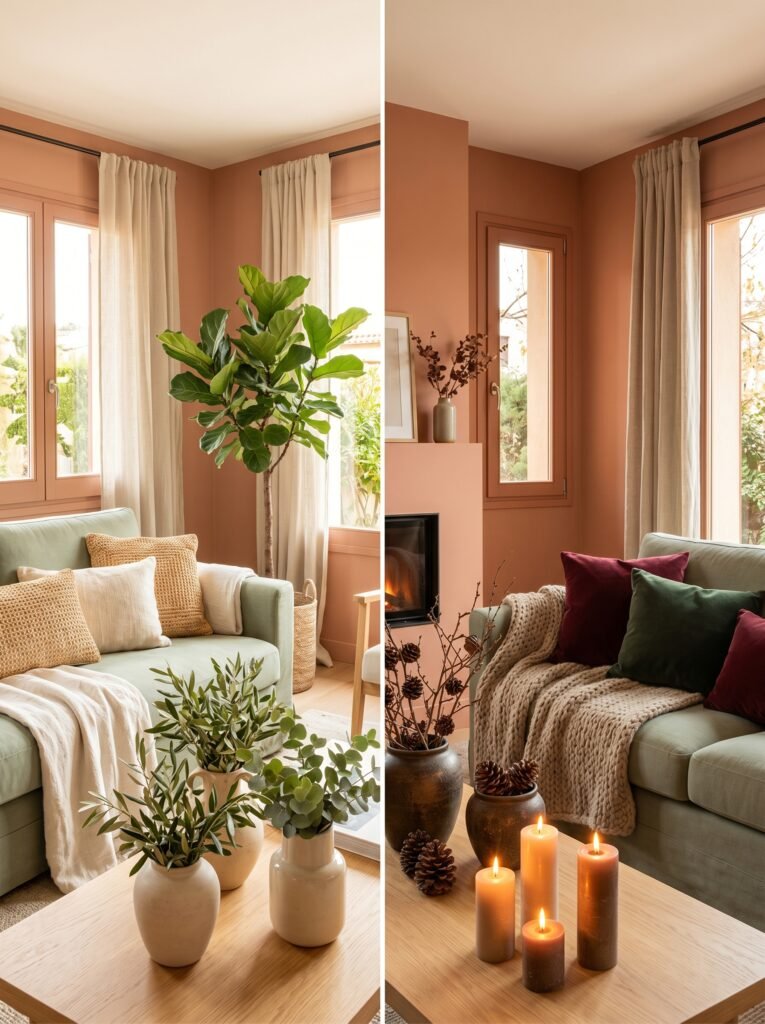
The answer lies in the specific tones you choose and the way you layer them. A terracotta and sage palette reads as warm and Mediterranean in summer, autumnal in fall, and cozy in winter. A deep forest green with oxblood reads rich and sophisticated regardless of the month. Avoid candy-bright versions of both colors, and the seasonal association fades naturally.
You can also rotate accessories seasonally while keeping the bones of the room constant. In spring and summer, add natural rattan, lighter linens, and fresh botanicals to lighten the palette. In fall and winter, layer in heavier textiles, candlelight, and darker accents to deepen it.
11. How Lighting Transforms the Pairing
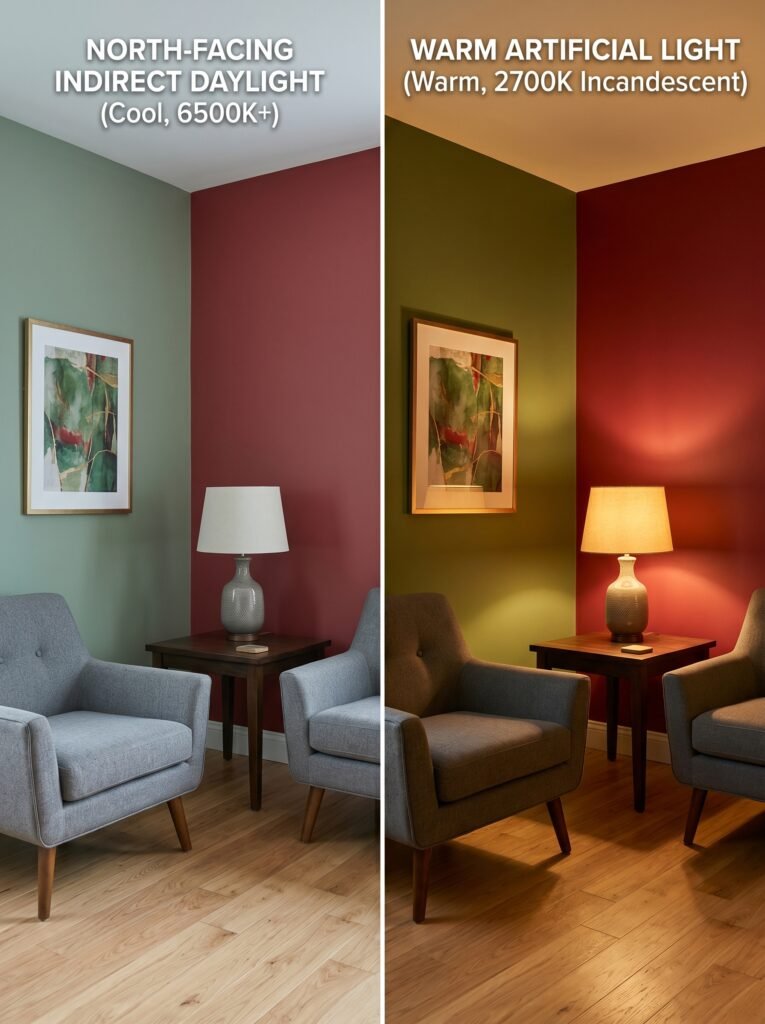
Natural light and artificial light change red and green dramatically throughout the day. North-facing rooms (which receive cool, indirect light) can make green feel blue-tinged and red feel slightly muddy. South-facing rooms flood with warm light that makes both colors sing. This matters when choosing your specific shades.
In lower-light rooms, opt for warmer versions of both colors — ochre-tinged greens, tomato or brick reds — to compensate for the cool light. In brighter rooms, you have more flexibility. For artificial lighting, warm-toned bulbs (around 2700K) are almost always the right choice with this palette — they bring out the richness in both colors without the clinical cast of cooler light temperatures.
12. Small Spaces, Big Confidence: Red and Green in Compact Rooms
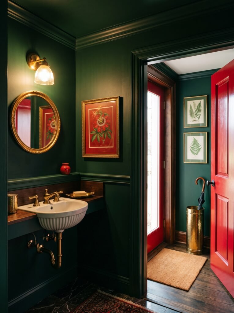
There’s a persistent myth that bold colors shrink small rooms. In reality, small rooms often benefit from commitment — a half-hearted attempt at color in a small space frequently looks timid rather than tasteful. A powder room painted entirely in deep hunter green with red accents can feel jewel-box luxurious. A small entryway with a red-painted door, green botanical prints, and a brass umbrella stand tells a design story the moment you walk in.
In small spaces, the key is coherence. Choose two or three elements and commit to them. Don’t try to do everything. A single red pendant light above a green-painted console table in a small hallway is more impactful than ten competing red-and-green elements fighting for attention.
—
🌿 How to Take Care of Your Red and Green Interior
Living with bold colors means thinking about how to keep them looking intentional and fresh over time. Here’s how to do that without it becoming a chore.
Start by protecting your investment. Deep-toned paints — especially dark greens and rich reds — show dust and marks more readily than neutral walls. A satin or eggshell finish is far more practical than flat matte for colored walls, as it allows gentle cleaning without damaging the surface.
Layer your lighting thoughtfully. As the seasons change and natural light shifts, your colors will change with it. Keep a few warm-toned bulbs on hand so you can adjust the artificial light when needed and keep the palette looking its best.
Tend to your textiles. Velvet cushions in red or green can flatten with use — give them a regular light brush or a pass with a garment steamer to revive their sheen. Rotate cushions and throws seasonally to prevent uneven fading.
Let living plants do the work. If you’ve introduced green through paint or fabric, living plants are the single easiest way to keep the palette feeling fresh and alive. Even one or two well-placed plants soften a room and reinforce the natural logic of the red-green pairing.
Finally, resist the urge to constantly add. Red and green interiors are powerful, and they can quickly tip into overwhelming if you keep accumulating. Edit regularly — remove what isn’t earning its place, and let what remains breathe.
—
❓ FAQ
Q: Will red and green always look like Christmas decorations? A: Only if you choose the brightest, most saturated versions of both colors. When you work with muted, earthy, or deeply saturated tones — think sage and terracotta, or olive and burgundy — the combination reads as sophisticated and timeless, with no seasonal association whatsoever.
Q: Which rooms work best for a red and green color scheme? A: Living rooms, dining rooms, and studies tend to be the most natural fits because these spaces invite richness and visual interest. That said, this palette can work beautifully in bedrooms and even bathrooms when handled with care — the key is adjusting the intensity to suit the function of the room.
Q: How much red should I use compared to green? A: A rough guide that works well in practice is the 60-30-10 rule. Use one color for roughly 60% of the room (often the walls or largest furniture), the second color for about 30% (upholstery, rugs, curtains), and leave 10% for accent touches in both colors plus neutrals. You don’t need to follow this mathematically, but the principle of having a dominant color with a supporting partner prevents the room from feeling like a standoff.
—
💭 Final Thought
There is something quietly courageous about decorating with color — about deciding that your home deserves more than beige, that you deserve to walk into a space that makes you feel something. Red and green, handled with care and intention, don’t just fill a room with color. They fill it with warmth, history, vitality, and life. They remind you, in a small but real way, of ripe fruit and deep forests and the particular pleasure of a room that feels genuinely, unmistakably alive.
So the question worth sitting with is this: if you stopped letting fear make your design decisions, what would your home actually look like?