Colour Blocking Interior: The Bold Design Move That Will Make Every Room Feel Like a Work of Art
There’s a moment — and you’ve probably had it — when you walk into a room and feel something shift inside you. Not because of the furniture or the view, but because of the colour. Something about the way the walls spoke to the cushions, the way one bold panel of paint made the whole space feel intentional and alive. That feeling has a name, and it’s called colour blocking — and once you understand it, you’ll never look at your walls the same way again.
—
Table Of Content
1. What Colour Blocking Actually Means — And Why Designers Are Obsessed With It
Colour blocking in interior design is the deliberate practice of placing two or more contrasting or complementary solid colours side by side to create bold, graphic, visually defined spaces. It borrows directly from the world of fashion — think Yves Saint Laurent’s iconic geometric colour block dresses from the 1960s — and translates that same confident, structured energy into rooms, walls, furniture arrangements, and even architectural details.
But here’s what makes it more than just a trend: colour blocking is rooted in colour theory, one of the oldest and most respected principles of visual art. When you place a deep terracotta against a warm cream, or a forest green panel beside a dusty blush wall, you’re not just decorating — you’re composing. You’re creating visual tension that the eye finds endlessly satisfying, the same way a perfect piece of music uses contrast and harmony to move you.
“A room without colour contrast is a sentence without punctuation — technically present, but flat, and forgettable.”
Designers love colour blocking because it gives a room a backbone. It creates architectural interest where there might be none. It draws the eye, defines zones, and communicates personality without a single piece of furniture needing to do all the heavy lifting. If you’ve ever felt like your home looks “fine” but not yours, colour blocking might be exactly the design language you’ve been missing.
2. The History Behind the Boldness — Where This Trend Came From
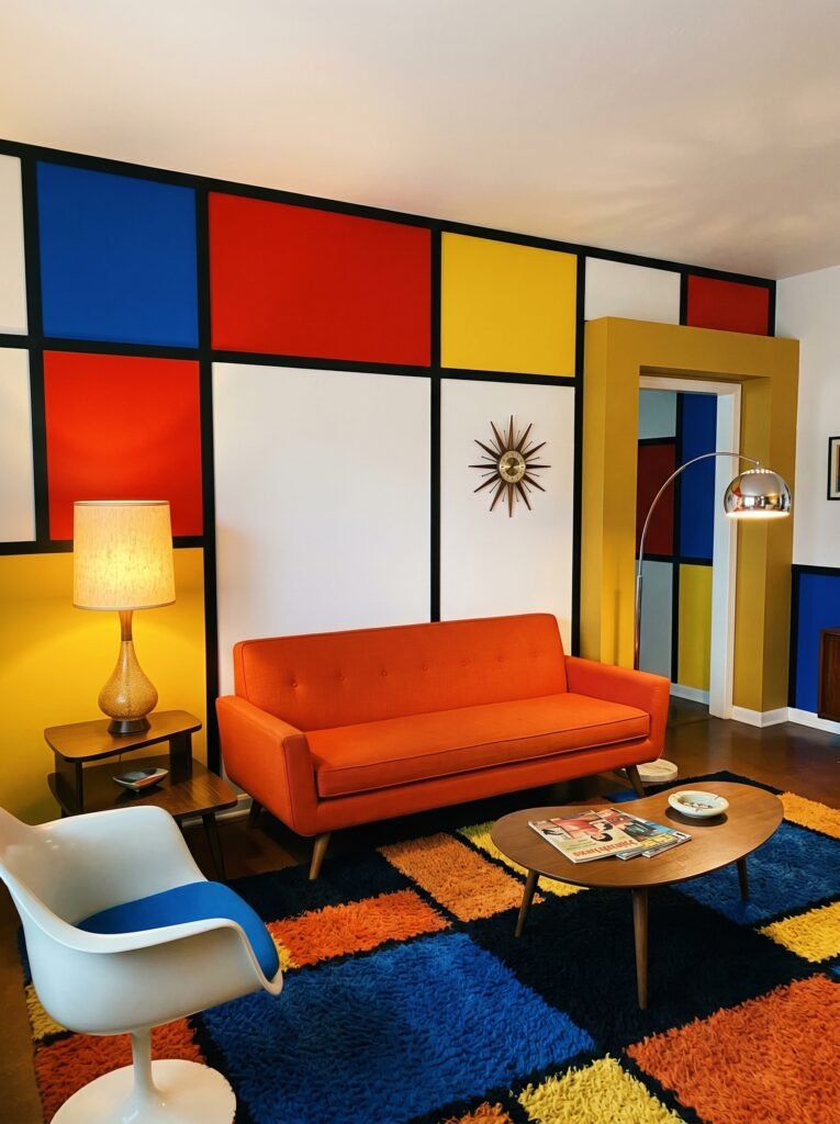
Colour blocking didn’t arrive in living rooms out of nowhere. Its roots stretch back to the De Stijl art movement of the early twentieth century, championed by artists like Piet Mondrian, whose grid-based compositions of primary colours became some of the most recognisable images in modern art. Mondrian believed that pure abstraction — simple geometric shapes and a limited colour palette — could express universal harmony.
Interior designers of the 1960s and 70s took that philosophy and ran with it. Bright orange sofas against white walls, mustard yellow panels framing doorways, bold geometric rugs in contrasting hues — these spaces felt electric, futuristic, and deeply human all at once. The modernist movement understood something essential: that colour is an emotional experience, not just an aesthetic one.
What’s remarkable is that colour blocking never really left. It cycles through design history in waves, each generation reinterpreting it through a new lens. Today’s version is more nuanced, more considered — it blends earthy natural tones with strategic contrast, celebrates imperfection, and finds its place just as naturally in a cosy Scandinavian apartment as in a maximalist New York loft.
3. The Colour Theory Rules That Make or Break a Colour Block Room
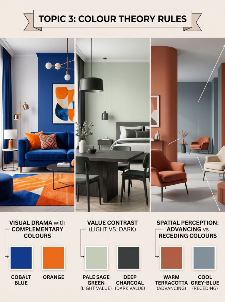
You don’t need a design degree to colour block well, but you do need to understand a few fundamental principles — because this is where most people either create magic or make expensive mistakes.
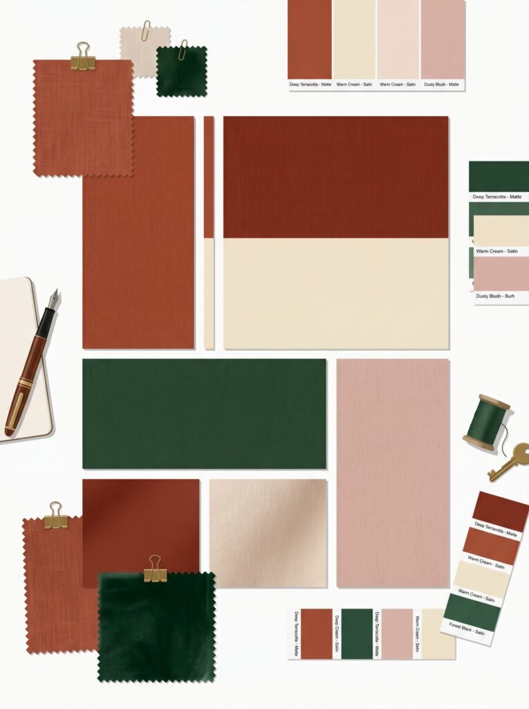
The first principle is contrast versus harmony. Contrasting colours sit opposite each other on the colour wheel — blue and orange, purple and yellow, red and green. They create drama, energy, and visual excitement. Harmonious colours sit adjacent on the wheel — teal and blue, burnt orange and terracotta — and create cohesion, flow, and a sense of calm. Neither approach is wrong; it depends entirely on the mood you want to create.
The second principle is value — that is, the lightness or darkness of a colour. A successful colour block pairing almost always involves a meaningful difference in value. Pale sage paired with deep charcoal. Soft powder blue against rich navy. That value contrast is what gives colour blocking its graphic punch without becoming chaotic.
The third principle is temperature. Warm colours (reds, oranges, yellows, warm creams) advance visually — they make spaces feel smaller and more intimate. Cool colours (blues, greens, purples, cool greys) recede — they make spaces feel larger and more airy. Understanding this helps you decide which colour to give more real estate in your room.
4. The Five Most Beautiful Colour Block Combinations for 2024 and Beyond
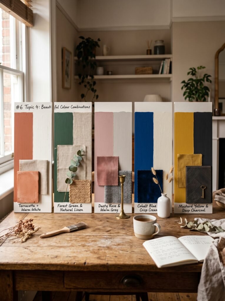
Trends come and go, but some colour pairings feel genuinely timeless while still feeling fresh. These five combinations are earning their place in the most thoughtfully designed homes right now.
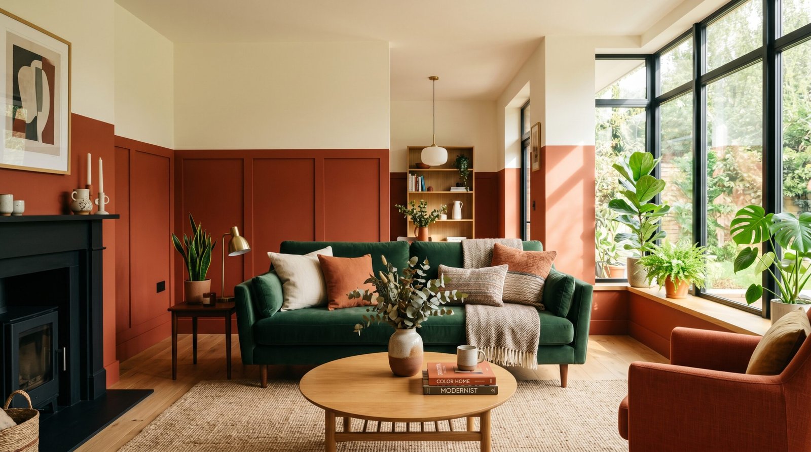
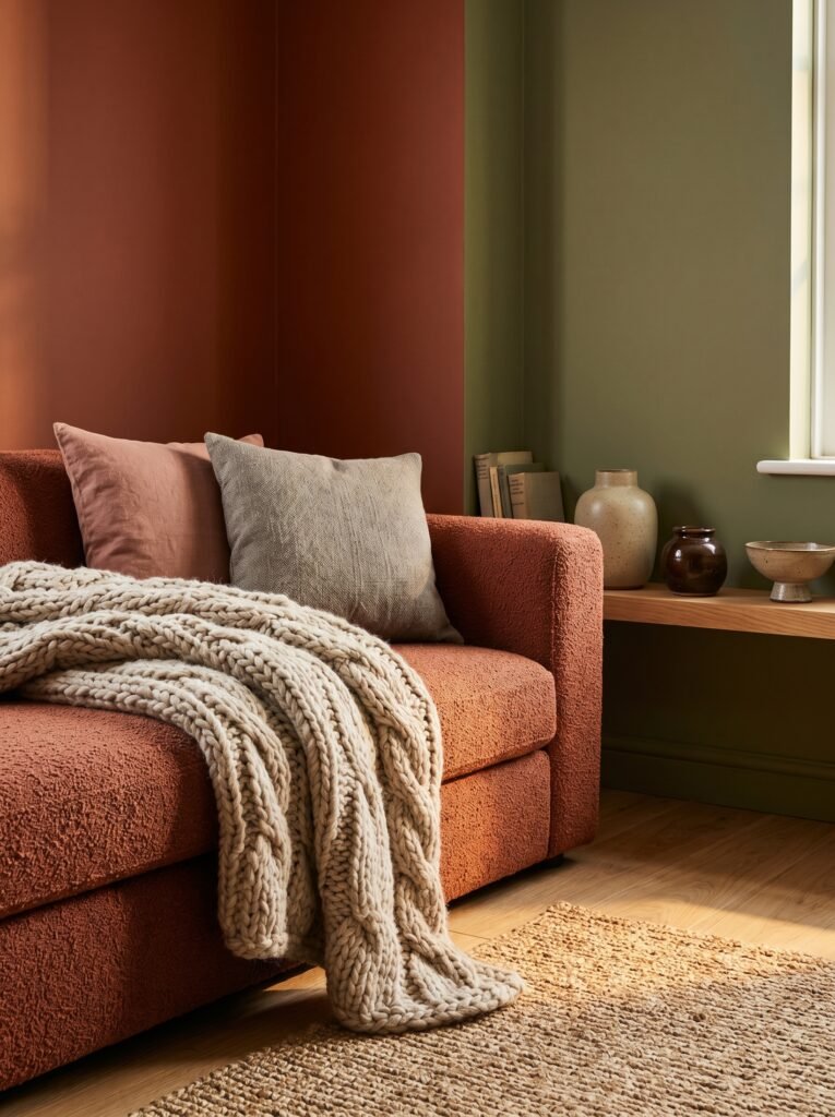
The first is terracotta and warm white. This pairing feels ancient and modern at the same time — earthy, Mediterranean, deeply grounding. Use terracotta as a lower wall panel or a single feature wall, and let warm white carry the rest of the room.
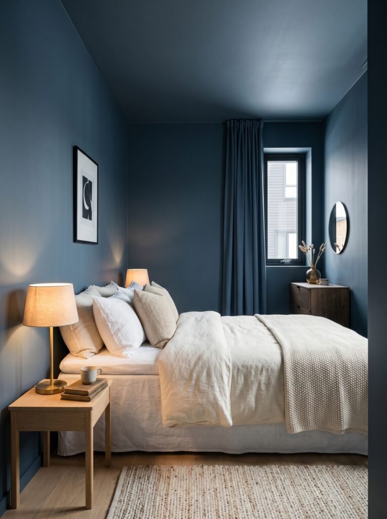
The second is forest green and natural linen. This combination breathes. It brings the outside in and creates a space that feels both curated and completely relaxed. It works brilliantly in bedrooms and reading nooks.
The third is dusty rose and warm grey. This is sophistication without pretension — feminine without being saccharine. It works in living rooms and bedrooms alike, especially when layered with natural wood tones.
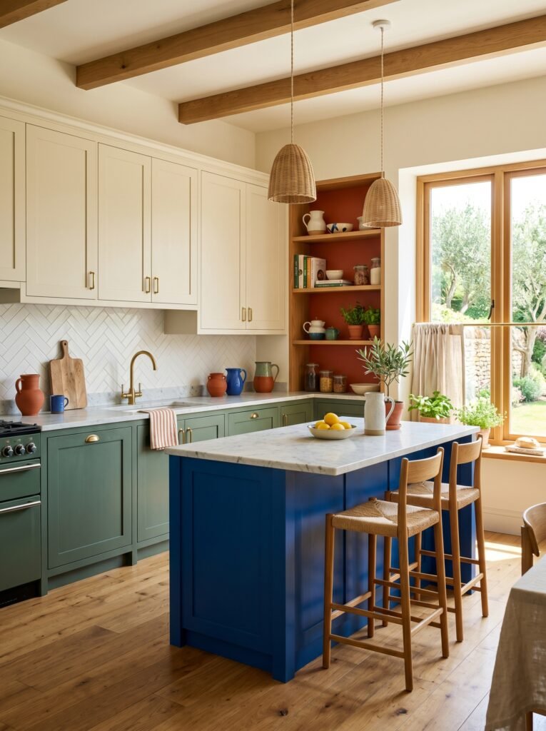
The fourth is cobalt blue and crisp cream. Bold, graphic, joyful — this pairing borrows from traditional Mediterranean architecture and feels endlessly invigorating. It’s particularly stunning in kitchens and dining rooms.
The fifth is mustard yellow and deep charcoal. This is the combination that made mid-century modern interiors famous, and it still holds up entirely. It’s warm, confident, and undeniably stylish.
“Colour is the fastest way to communicate feeling in a room — choose yours like you mean it.”
5. How to Use Colour Blocking on Walls — Beyond the Basic Accent Wall
The accent wall had a long run, and it served its purpose — but colour blocking takes that concept and elevates it into something far more architectural and considered.
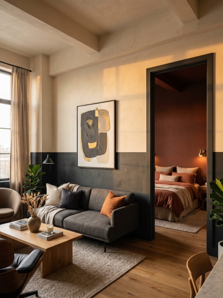
The most impactful wall colour blocking technique is the two-tone horizontal split. Paint the lower third or lower half of a room’s walls in a deeper, richer colour, and leave the upper portion in a lighter tone. This technique visually lowers the ceiling in tall rooms (creating cosiness) or grounds the space by anchoring the lower half. It references the classic use of dado rails and picture rails in Victorian architecture, but feels entirely contemporary when done in bold, modern tones.
Vertical colour splits — painting one wall or half a wall in a contrasting colour, from floor to ceiling — create drama and define zones in open-plan spaces. Imagine a dining area carved out from a living space simply by painting the section of wall behind the dining table in a deep, saturated hue. No partition walls, no furniture arrangement gymnastics — just colour doing the work.
Another technique worth exploring is colour blocking the ceiling into the walls. Take your wall colour and extend it over the ceiling plane — the “fifth wall” — to create a cocooning, envelope-like effect. This is particularly beautiful in bedrooms, where it makes the room feel like a private sanctuary rather than just a place to sleep.
6. Colour Blocking With Furniture — When the Sofa Does the Talking
Not every colour block story needs to be told on the walls. Sometimes the most powerful statements come from the furniture itself.
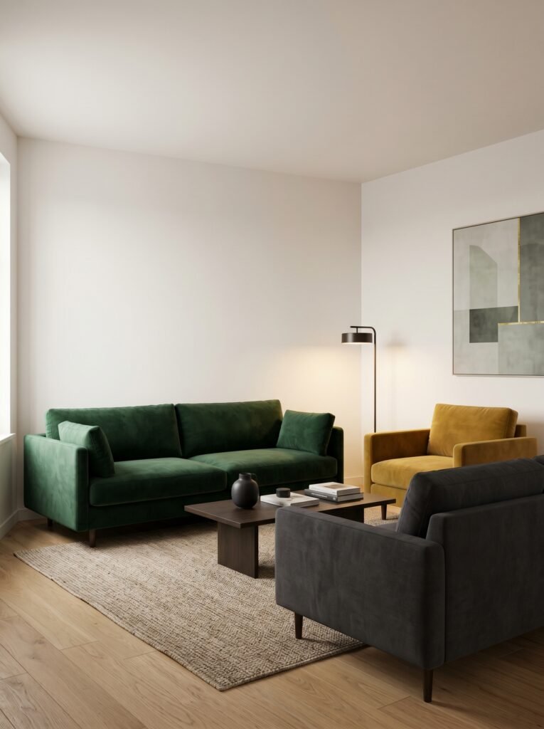
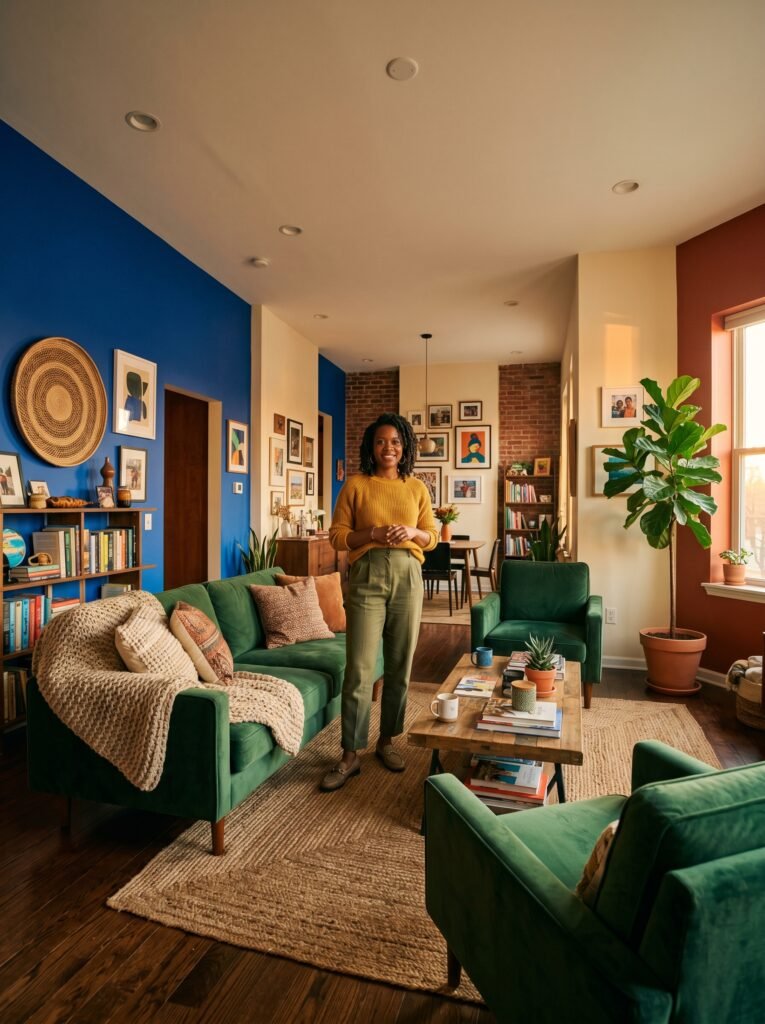
A deeply coloured sofa — forest green velvet, cobalt blue linen, terracotta bouclé — against a neutral wall is arguably the purest form of colour blocking in a living room. The sofa becomes the architectural gesture, and everything else becomes its frame. What makes this approach work is restraint: let the sofa be the hero, and resist the urge to compete with it from every other direction.
Colour blocking with furniture also extends to the deliberate pairing of pieces. A mustard yellow armchair placed beside a deep charcoal sofa isn’t an accident — it’s a composition. When you start thinking about your furniture arrangement in terms of colour relationships rather than just spatial relationships, your room stops looking like a showroom and starts looking like a home with a distinct point of view.
7. The Role of Texture in Making Colour Blocks Feel Warm, Not Cold
Here is the design truth that separates a successful colour block room from one that feels clinical or flat: texture is what gives colour its warmth.
Solid blocks of colour on their own can read as harsh, particularly in larger spaces or under certain lighting conditions. But drape a chunky knit throw over that coloured sofa, add a jute rug under the colour blocked accent wall, layer linen cushions in harmonious tones — and suddenly the colours breathe. They soften. They start to feel like home.
The rule of thumb is simple: the bolder and more saturated your colour palette, the more important it becomes to introduce varied textures to balance the energy. Think wool, linen, wood, ceramics, woven baskets, matte plaster finishes — anything that catches light in a different way and prevents the room from feeling too graphic or graphic-heavy.
8. Small Spaces and Colour Blocking — Defying the “Keep It Light” Myth
If you’ve ever been told that small rooms need to be painted white or pale to feel larger, you’ve been given half the story.
Colour blocking in small spaces, done correctly, can actually make a room feel more intentional, more designed, and — paradoxically — more spacious. The reason is psychological: a strongly colour blocked room reads as purposeful. It doesn’t apologise for its size. Instead, it leans into it.
In a small bedroom, try painting all four walls and the ceiling in the same deep, enveloping tone — slate blue, warm terracotta, or soft charcoal — while keeping the bedding and soft furnishings in lighter, contrasting hues. The monochromatic envelope removes all visual edges and boundaries, making the room feel both cosy and surprisingly expansive.
In a small living room or studio apartment, a single deeply colour blocked wall — particularly behind the sofa or the main seating area — gives the room an anchor point that makes the rest of the space feel organised and generous by comparison.
“Small rooms don’t need less colour — they need more intention.”
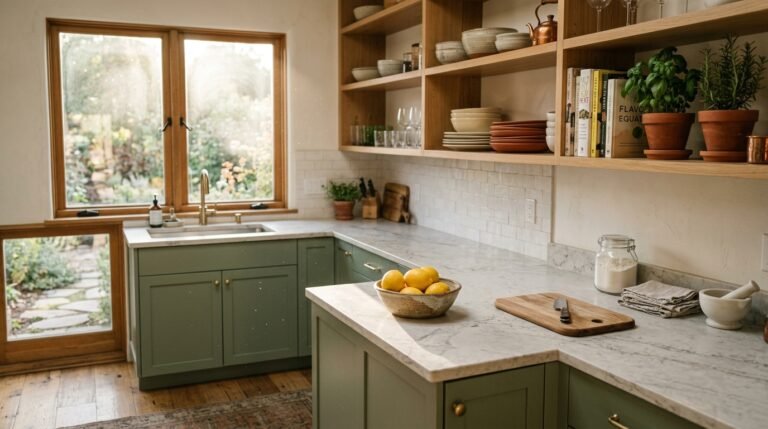
9. Colour Blocking in the Kitchen — The Unexpected Frontier
The kitchen is arguably the most underused canvas in the home, and colour blocking here has the power to transform a purely functional space into one of the most characterful rooms in the house.
Two-tone cabinetry is the most popular form of kitchen colour blocking — upper cabinets in one colour, lower cabinets in another. Think sage green lowers with warm cream uppers, or deep navy lowers with pale grey uppers. The visual weight of the darker lower cabinets grounds the space while the lighter upper cabinets keep it feeling open and airy.
But colour blocking in the kitchen extends beyond cabinetry. Consider colour blocking the island in a contrasting tone to the perimeter cabinets. Or painting the inside of open shelving units in a bold accent colour. Even painting a section of wall between the countertop and the upper cabinets — the backsplash area — in a bold, saturated colour rather than tiling it can create a graphic, modern effect that feels entirely fresh.
10. How Lighting Transforms Your Colour Block Palette Throughout the Day
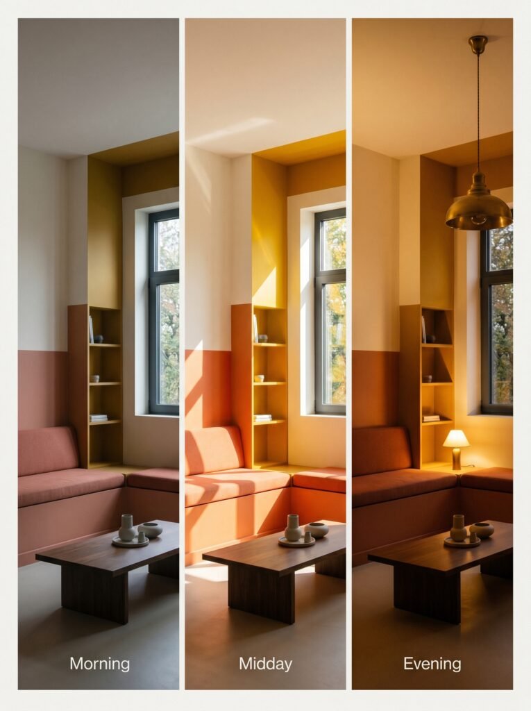
Every colour block decision you make will look different at seven in the morning than it does at seven in the evening, and understanding that shift is crucial to getting the result you want.
Natural light from a north-facing room is cooler and more diffuse — it will soften warm tones and intensify cool ones. South-facing rooms receive warm, direct sunlight that enriches earth tones and can make very bold or saturated colours feel even more vivid at peak brightness. Before committing to a colour block palette, observe your room at different times of day and under different artificial lighting conditions.
Warm incandescent or warm LED bulbs (2700K-3000K colour temperature) will bring out the golden richness in terracottas, mustards, and warm creams. Cooler LED bulbs (4000K and above) will sharpen blues and greens, making colour blocked rooms feel more graphic and architectural. Neither is universally right — it depends entirely on the mood and palette you’ve chosen.
11. Common Colour Blocking Mistakes — And How to Avoid Every One of Them
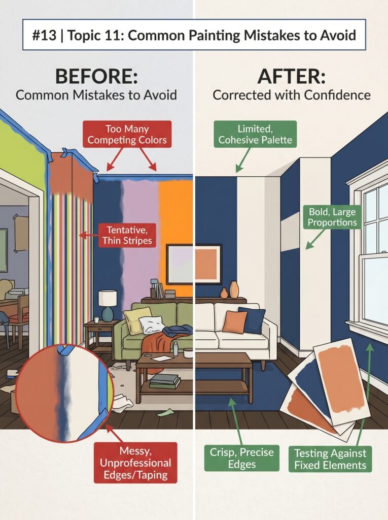
The first and most common mistake is using too many colours. Colour blocking is fundamentally about clarity and confidence — two or three carefully chosen colours will almost always outperform five competing ones. Restraint is the foundation of elegance here.
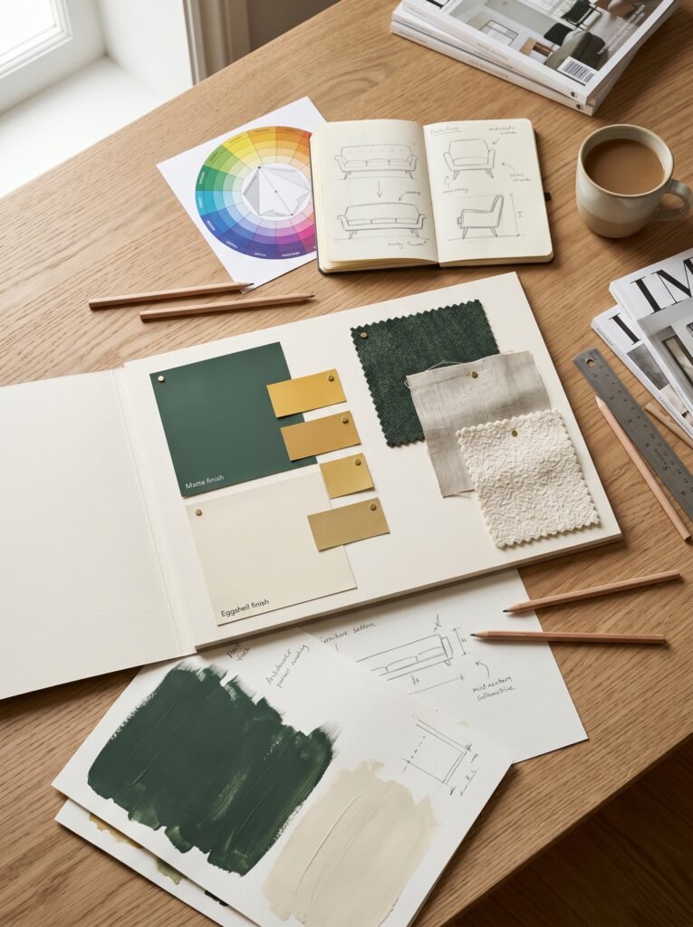
The second mistake is ignoring the undertones in your chosen colours. A seemingly neutral cream and a seemingly neutral white can look dissonant against each other because one has a pink undertone and the other a green one. Always test paint colours on large swatches — at least A3 paper size — on your actual walls before committing.
The third mistake is colour blocking in isolation, without considering the fixed elements in the room — flooring, woodwork, window frames, existing furniture. Your colour block palette must work with what’s already there, not in spite of it. Take samples home and hold them against every fixed element in the room before making any final decisions.
The fourth mistake is going too small. Colour blocking is designed to be bold. A colour block stripe that’s only six inches wide on a wall looks tentative and indecisive. Commit to the gesture — make it architectural, make it confident, make it felt.
12. Bringing It All Together — Designing Your Colour Block Room Start to Finish
Begin with a single feeling. Before you open a paint deck or browse furniture, ask yourself: how do I want to feel when I walk into this room? Energised? Calm? Creative? Cosy? Let that feeling guide every colour decision that follows.
From there, choose your dominant colour — the one that will take up the most visual real estate. Then choose your secondary colour, which will contrast or harmonise with it. Finally, if the space warrants it, add a single accent colour for cushions, artwork, or a smaller piece of furniture.
Work from the architecture outward. Decide how the walls will be treated first, then bring in furniture that responds to them, and finally layer in soft furnishings and accessories that tie the palette together. Avoid shopping for everything at once — live with the wall colours for at least a week before committing to furniture colours, because your eye needs time to understand how the space feels in real life, not just on a mood board.
—
🌿 How to Take Care of Your Colour Blocked Interior
A beautifully colour blocked room deserves to be maintained with the same thoughtfulness that went into creating it. Here are five practical ways to keep it looking its best.
First, invest in quality paint. Colour blocking makes paint quality highly visible — cheaper paints often have a flat, chalky finish that doesn’t reflect light beautifully. Choose a paint with a slight sheen (eggshell or satin) for walls that will be touched frequently, particularly on lower wall panels.
Second, touch up regularly. Because colour blocking is graphic and precise, scuffs and marks are more noticeable than they would be on a plain neutral wall. Keep a small amount of each paint colour stored and labelled in a cool, dry place for quick touch-ups.
Third, protect transitions. If you’ve used painter’s tape to create clean lines between colour blocks, consider finishing the edge with a very fine brush for the crispest possible line. Blurry colour block edges undermine the whole effect — the precision is part of the design.
Fourth, let the palette evolve slowly. Colour blocking doesn’t need to be a permanent commitment. If you’ve started with a more cautious palette and feel ready to go bolder, repaint one wall or section at a time rather than overhauling everything at once.
Fifth, trust your instincts over trends. The best colour blocked rooms are the ones that feel like the person who lives there — not like a magazine photograph. Use trends as a starting point, but let your own emotional response to colour be the ultimate guide.
—
❓ FAQ
Q: Do I need to hire a professional designer to successfully colour block my home? A: Not at all. Colour blocking is one of the most accessible interior design techniques available because it relies on bold, simple gestures rather than complex construction or furniture selection. A solid understanding of basic colour theory, careful paint testing, and a willingness to commit to bold decisions is genuinely all you need to achieve a professional-looking result at home.
Q: Can colour blocking work in a rented home where I can’t paint the walls? A: Absolutely. Colour blocking doesn’t require paint to be effective. You can achieve the same principles through large area rugs in contrasting tones, bold furniture choices, oversized artwork, removable peel-and-stick wallpaper panels, or even groupings of colour-consistent accessories and soft furnishings. The principles translate beautifully into non-permanent solutions.
Q: How do I know if two colours will work together before I buy the paint? A: The most reliable method is to paint large test swatches — at least 30cm by 30cm — directly onto your wall and observe them across different times of day and under both natural and artificial light. Many paint companies also offer sample pots specifically for this purpose. Digital tools like the Farrow & Ball colour visualiser or the Dulux visualiser app can also give you a helpful preview, though nothing replaces seeing the actual paint in your specific space.
—
💭 Final Thought
Colour blocking is, at its heart, an act of conviction — a decision to stop apologising for your preferences and start designing with confidence. Every room that has ever made you stop and catch your breath had someone behind it who dared to commit to a vision, to choose boldness over safety, and to trust that the way colour makes you feel is every bit as important as how it looks in a photograph.
Your home is the single space in the world that should feel most like you. So here’s the question worth sitting with tonight: what feeling have you been holding back from your walls?