The Fall Living Room Refresh That Doesn’t Look Like a Pumpkin Exploded In It
There’s a version of fall decor that looks incredible and a version that looks like someone panic-bought everything in the Target seasonal aisle on October 1st. You want the first one. So let’s talk about how to actually get there — without spending a fortune or starting from scratch.
—
1. The Exact Moment Your Living Room Stops Feeling Like Summer
You know when it happens. You’re sitting on the sofa one evening, maybe mid-September, and the light has shifted. It’s coming in at a lower angle, it’s a little more golden, and suddenly your bright linen throws and that glass vase full of dried pampas just… don’t fit anymore. The room feels wrong and you can’t explain why.
That’s your cue. Not the calendar. Not the shops pulling out their cinnamon-scented candles. Your own eyes telling you the room needs to change.
Fall decorating works best when you respond to that feeling rather than chasing a trend. Because here’s the thing — the trend changes every year. Terracotta was everywhere two years ago, then it was moody plum, then it was “quiet luxury beige” (which, honestly, is just regular beige with better PR). But the feeling of a good fall living room? That stays the same. Warm. Grounded. Like you don’t really want to leave.
So before you buy a single thing, sit in your room at dusk and look at what it’s already doing. What’s catching the light? What looks dull and flat? That’s where you start.
—
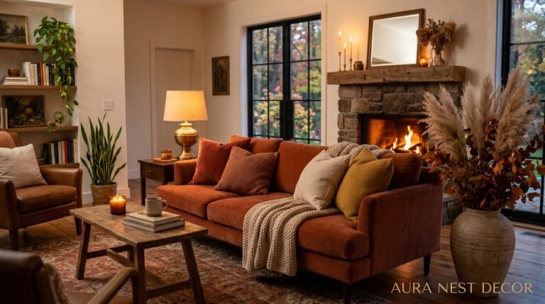
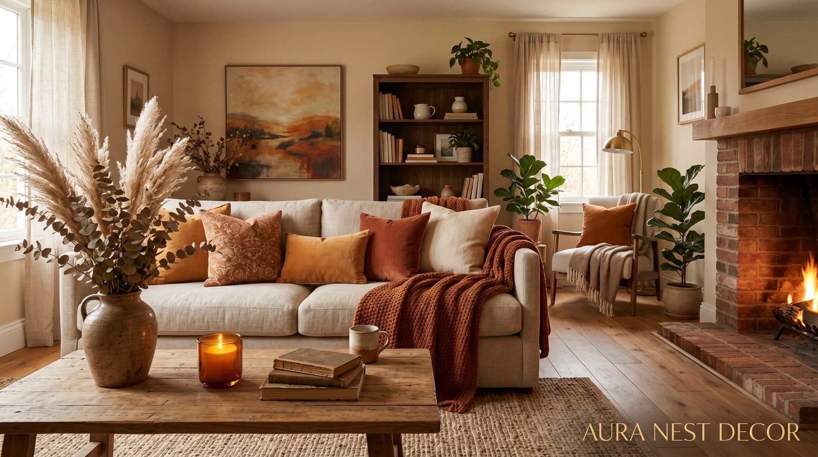
2. Why Your Throw Pillows Are Doing All the Wrong Things
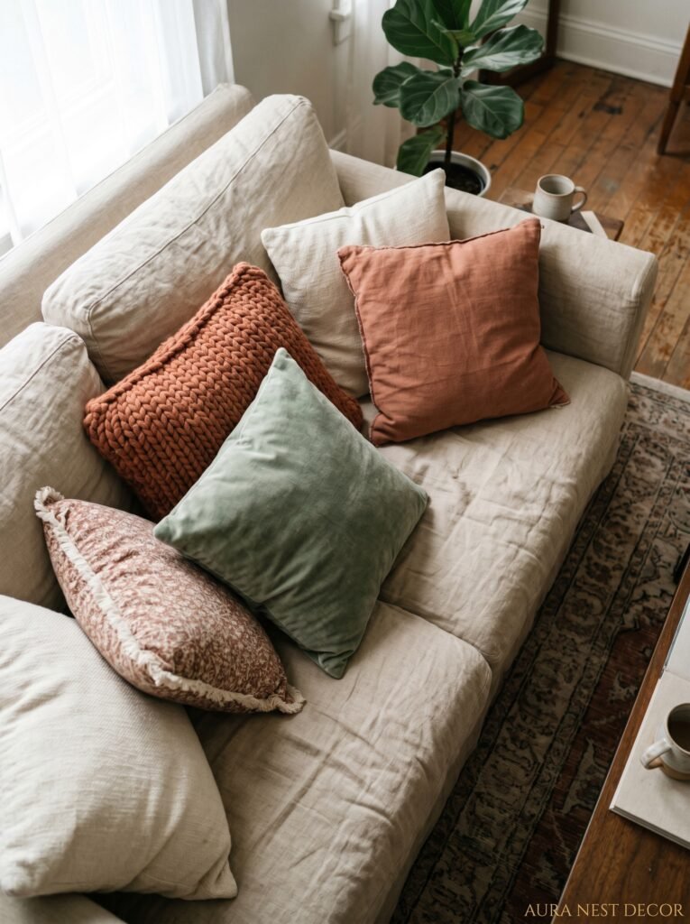
Most people’s fall pillow situation is either too chaotic or too coordinated. Both are problems.
Too chaotic: every pillow is a different shade of orange or rust, there are at least two with leaves on them, and the whole sofa looks like it’s wearing a Halloween costume. Too coordinated: you bought a matching set in “fall colors” and it looks exactly like what it is — a matching set in fall colors.
What actually works is a little harder to explain but really easy to execute once you see it. You want CONTRAST within warmth. So maybe two pillows in a deep, almost-chocolate brown linen. One in a faded terracotta that looks like it’s been sitting in a Tuscan farmhouse for twenty years. And then — this is the bit people skip — one slightly unexpected one. A dirty olive green. A moody navy. Even a worn cream with a small geometric pattern.
That last pillow is what makes the rest look intentional instead of themed. It’s the one that says “someone lives here who has taste” rather than “someone went to HomeGoods in September.”
Don’t over-stuff the sofa either. Four to five pillows, depending on sofa size. Any more and you’re just creating a situation where your guests awkwardly hold pillows in their laps because there’s nowhere to sit.
“The pillow that doesn’t quite match is usually the one that makes the whole sofa look designed.”
—
3. The Candle Mistake Almost Everyone Makes in October
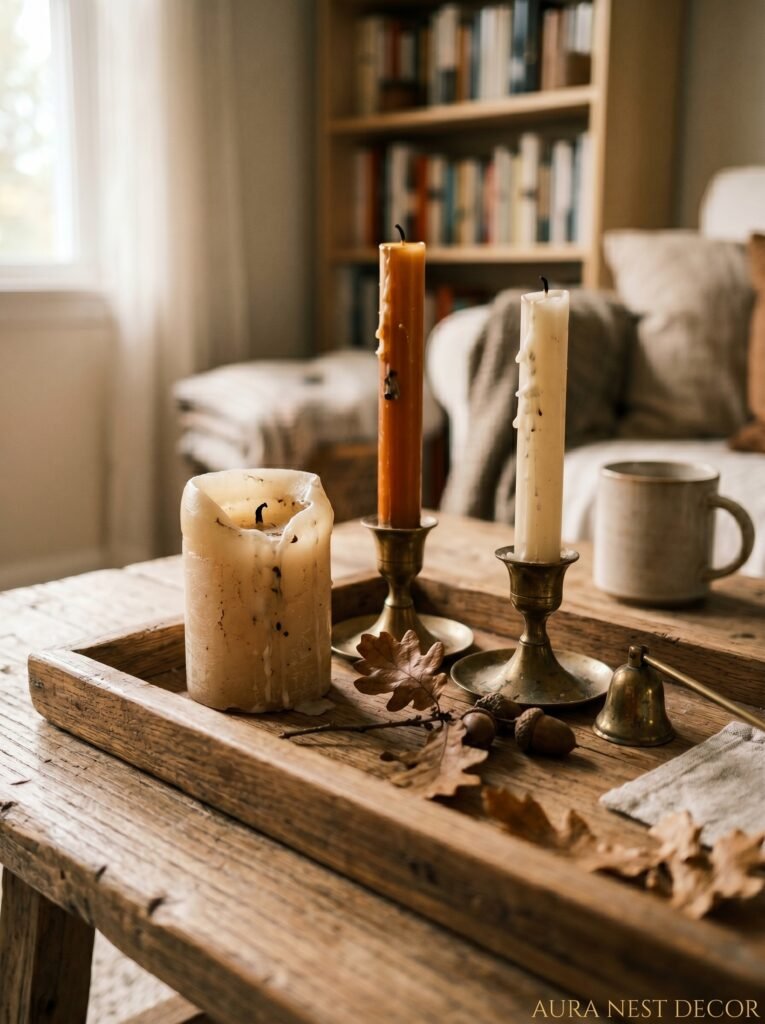
Not gonna lie, I did this for years. You pull out all your fall candles — the pumpkin spice, the apple cider, the one that smells aggressively like nutmeg — and you light them all at once or in such quick rotation that your living room smells like a Yankee Candle had a party and nobody cleaned up.
Scent layering in fall decor is a real thing, and it matters more than the visual stuff in some ways, because it hits you before you even see the room.
The trick is to pick ONE dominant scent and let it anchor the space. Something woodsy, smoky, or slightly sweet but not aggressively so. Cedarwood. Amber and sandalwood. A good fig. Then add texture to the visual candle situation rather than the scent — different heights, different vessels, maybe one fat pillar candle on the coffee table next to two taper candles in simple brass holders.
Brass is everywhere right now, but honestly? It deserves to be. The warm metal picks up candlelight in a way that chrome and silver never will. A set of simple brass taper holders from a charity shop or a kitchen store will genuinely change how your living room looks after dark in autumn. I know that sounds dramatic but I stand by it.
And please — burn the candles. Don’t display them unlit as “decor.” A candle that’s never been burned looks sad and a little desperate.
—
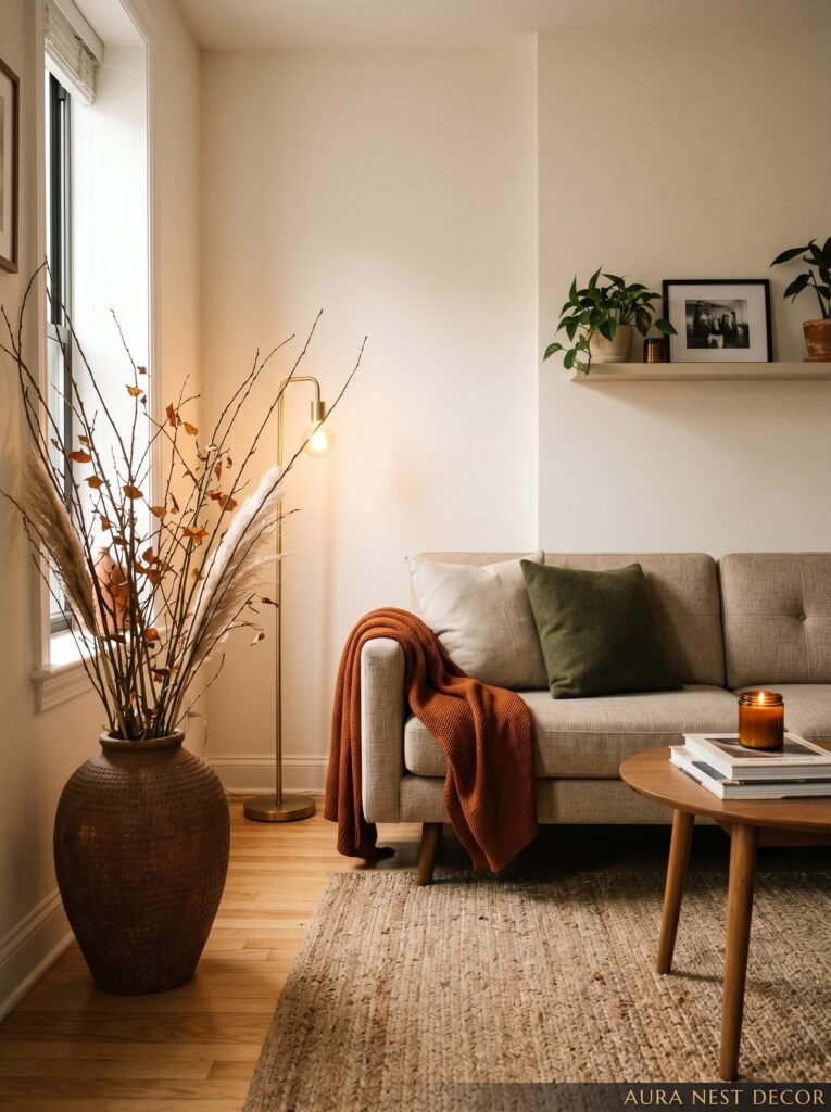
4. What “Cozy” Actually Means (And What It Doesn’t)

Here’s what cozy is NOT: filling every surface with stuff. A chunky knit blanket draped over every chair. So many cushions you can’t find the actual sofa. Little pumpkins on every ledge, shelf, and windowsill until the room looks like a harvest festival gift shop.
Cozy is a feeling, and it comes from warmth, softness, and a sense that the room is contained — like it’s wrapping around you rather than expanding outward. You can achieve that with three things done right rather than thirty things done desperately.
Warm light is probably the biggest one. Turn off the overhead lights. Seriously, just turn them off. Or at least switch the bulbs to something with a much warmer color temperature — we’re talking 2700K or below, which is that amber-gold tone rather than the clinical white that makes everything look like a dentist’s office. Add lamps. Floor lamps especially. A lamp in the corner of a room creates a pocket of warmth that a ceiling light never can.
The second thing is a rug. If you don’t have one in your living room, fall is the time to fix that. A large rug that the furniture actually sits ON (not just the front legs, the whole thing) grounds the space completely. Something with a little texture — wool, jute, a flatweave with some warmth in the palette — makes the room feel like a place you want to sink into.
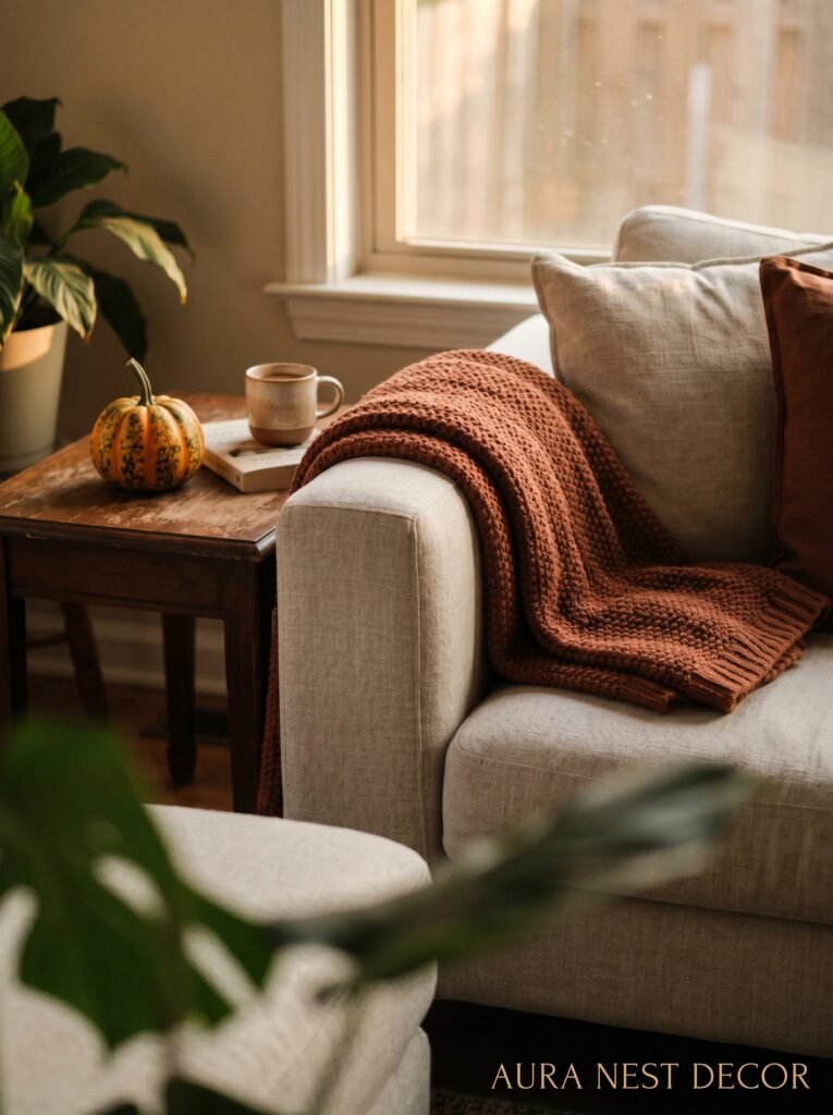
Third thing? One really good blanket. Not seventeen. One. Folded or loosely draped over the arm of the sofa, looking genuinely touchable. That’s the one that makes visitors want to curl up.
“Cozy isn’t about adding more. It’s about making what’s there feel like it was always meant to be together.”
—
5. The Color That Keeps Showing Up in Every Beautiful Fall Living Room Right Now
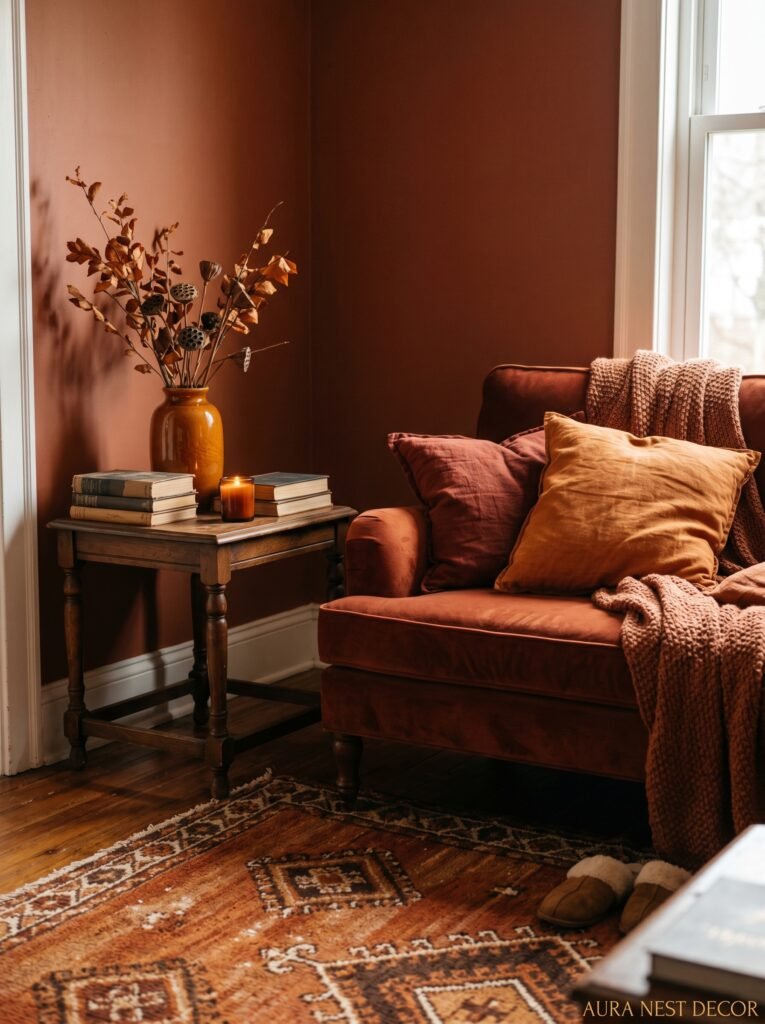
It’s not orange. It’s not even the burnt sienna that was everywhere a couple of years back. It’s a deep, almost-muted green — somewhere between forest and sage, leaning darker. And it works in fall in a way that surprised even me when I started noticing it.
Think about why: dark green reads as natural, it suggests depth, it echoes the last of the trees before they go bare. Paired with warm neutrals and wood tones, it feels grounded and rich without being heavy. You can bring it in through cushions, a single piece of velvet, even a painted accent piece.
And the thing about this particular shade is it carries through winter too, so you’re not buying something you’ll want to hide by December. It bridges the seasons in a way that orange simply can’t — orange is firmly October, and then it starts to feel wrong.
—
6. Your Bookshelf Is Doing More Work Than You Think

I know this is about the living room broadly, but if you have bookshelves, they need a fall update too. And I don’t mean sticking a little decorative pumpkin between your books (though, honestly, a single matte ceramic pumpkin in a nice neutral isn’t the worst thing in the world, I’ll admit that).
What I mean is adjusting the color story of the books themselves. Yes, you can re-arrange books by color — it sounds like the most precious, design-blog-y thing imaginable, but it genuinely works and it takes about fifteen minutes. Pull the books with warm spines — browns, burnt reds, mustards — forward or to the center. Push the whites and bright greens back or to the edges. It shifts the whole wall.
Then add one or two objects with actual texture: a small ceramic bowl, a stack of old wooden boxes, a brass bookend you found at a market. Not a gallery’s worth of objects. A couple. Shelves that are TOO styled look fake, and everyone who walks into your house will know you spent an afternoon arranging them — and not in a good way.
—
7. The One Rule That Makes Any Tiny Living Room Feel Like Fall Without Feeling Cramped
Small spaces have it rough in autumn. Fall decor in a compact room can tip from “cozy” to “suffocating” embarrassingly fast.
Here’s the rule: go vertical, not horizontal. Add height. Don’t pile things on coffee tables and low surfaces — look UP. A tall vase with some dried grasses or branches. Artwork hung slightly higher than usual to draw the eye up. A floor lamp with a good arc. These choices make the room feel taller, which makes it feel bigger, which means you can still layer in warm textiles and candles without the space closing in on you.
The other thing that saves small fall living rooms is restraint with pattern. In a large room you can mix a patterned rug with patterned cushions. In a small room, pick one patterned thing and let everything else be solid. It sounds limiting but it actually gives you MORE creative freedom with color, because you’re not trying to make patterns work together on top of each other.
“Height is the secret ingredient in a tiny room. Everything else is a distraction.”
—
8. The Coffee Table Styling Approach That Doesn’t Look Staged
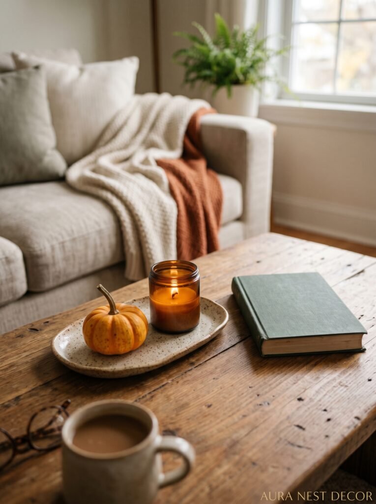
Coffee tables are where fall living room styling goes wrong most often. You’ve seen it — the perfectly arranged tray with a candle, a book, a tiny gourd, and a bowl of acorns, and it looks like someone copied a Pinterest flat lay and placed it on their table. It looks like a photo, not a life.
Real coffee table styling looks lived in. A book that’s actually open or slightly crumpled at the spine because someone’s been reading it. A candle that’s been burned. A coaster that’s not perfectly aligned with the tray. And yes, one seasonal object — maybe a cluster of small pumpkins in varying heights, or a low bowl of those dark, almost-black berries you can find in autumn — but paired with the everyday mess of a house that’s actually used.
The goal is “someone has good taste AND they live here,” not “someone is desperately trying to have good taste.” The difference is in the imperfection.
—
9. Curtains Nobody Talks About But Every Pinterest-Worthy Room Has
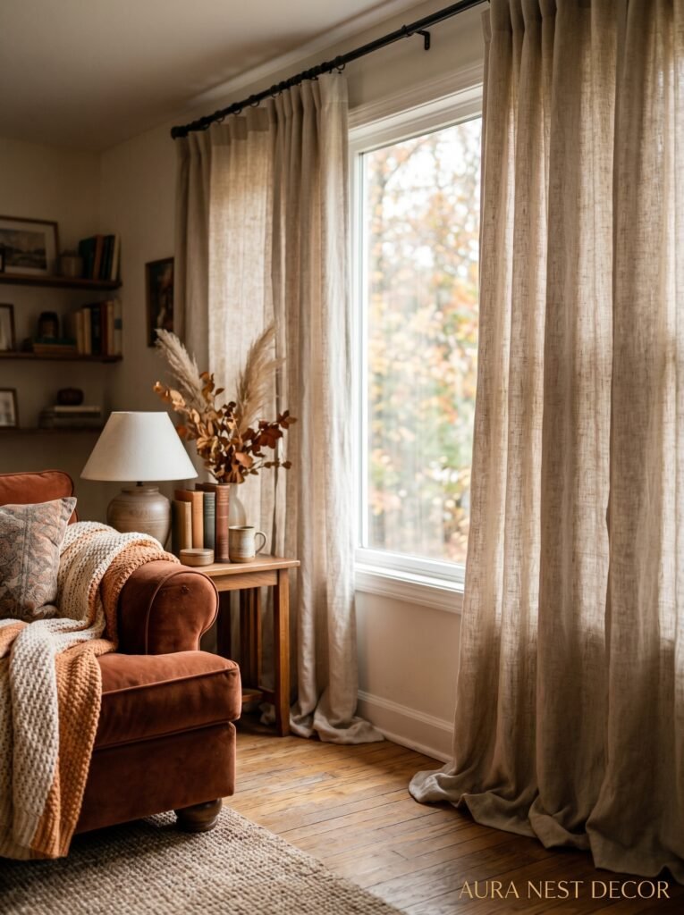
Linen curtains in fall. I know they’re associated with spring and summer and that breezy, bright aesthetic that doesn’t scream autumn. But here’s the thing — in a DARK linen, like a warm grey-brown or an oatmeal so deep it’s almost camel, they’re extraordinary in fall. They hold the light differently when it’s low. They don’t block it out, they filter it, and filtered October light through dark linen is genuinely one of the more beautiful things a room can do.
The other option that’s massively underused is velvet. A deep velvet curtain — bottle green, dusty plum, even a very dark rust — makes a room feel like it’s been designed by someone who actually knows what they’re doing. And velvet curtains don’t have to be expensive. IKEA has done them. H&M Home has them. You don’t need to spend designer money to get the effect.
Hang them HIGH. As close to the ceiling as possible, regardless of where your actual window frame starts. It’s the oldest trick in interior design and it never stops working.
—
10. Nature Doesn’t Cost Anything and It’s the Best Fall Decor There Is

Go outside. That’s the advice. Go outside and come back with things.
Branches from a tree that’s just starting to turn. A handful of those pine cones that are dropping everywhere right now. Dried seed heads from the garden if you have one — the kind that look like brown lace when the light hits them. A bunch of whatever’s growing wild at the edge of a field or a path.
A tall glass vase, or an old ceramic jug, stuffed with bare twiggy branches instantly looks like something from an editorial shoot. A wooden bowl of pine cones on the coffee table — not the ones from a craft shop sprayed with fake glitter, just regular ones you found on a walk — looks better than most things you could buy.
This also stops the “fall decor” from feeling purchased and curated. Nature is imperfect, irregular, and beautifully random, and it brings that quality into a room that needs it desperately.
—
11. The Forgotten Surface That Changes Everything

The mantelpiece — or if you’re American, the fireplace mantel — is the one surface people style for seasons and then completely ignore for the rest of the year. In fall, it should be doing the most work in the room.
Not in a cluttered way. A fall mantel doesn’t need to have a garland AND candles AND framed art AND a little display of gourds AND your gran’s candlesticks. Pick a direction and commit. Either go natural and spare — a few large branches, one single fat candle, maybe a small piece of ceramic — or go slightly dramatic with layered mirrors and candlelight and a deep-colored object that anchors it.
But whatever you do, don’t center everything. Off-center, asymmetric arrangements feel curated rather than placed. Symmetry is formal. Autumn doesn’t really do formal.
—
12. The Finishing Detail That Makes It Feel Like YOUR Home, Not a Mood Board
Here’s what I want to leave you with. All of this — the candles, the cushions, the curtains, the natural bits you picked up on a walk — it only works if some of it is yours. Not styled. Not curated. Yours.
The old blanket that’s a bit of an odd color but you’ve had it for ten years and it’s the one you actually reach for. The mug on the side table that doesn’t match anything but makes you happy. The paperback with the broken spine. The small ugly vase that belonged to someone you loved.
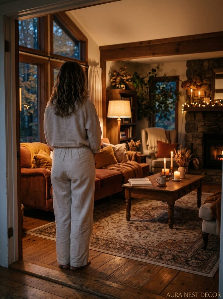
Fall, more than any other season, is when your home should feel inhabited. Lived in. Evidence of a life happening inside it. And no amount of perfectly chosen fall decor will create that feeling. That part has to come from you.
So do the styling, yes. Add the warmth, the candles, the beautiful deep-green velvet cushion that you’ve been eyeing for weeks. But then — actually live in it. Move things around. Let the pine cones roll slightly. Burn the candle down. That’s when it looks right.
—
❓ FAQ
Q: How do I make a living room feel like fall without buying a ton of new stuff? A: Swap out throw pillows and blankets for warmer tones, rearrange your books and shelves to bring forward earthy colors, and collect natural materials from outside — branches, pine cones, seed heads — to use as free decor. Lighting change makes the single biggest difference; warmer bulbs and more lamps cost very little.
Q: What fall colors actually work in a living room that isn’t neutral? A: If your room already has a strong color, lean into contrast rather than matching. A grey or blue room looks incredible in fall with deep rust and warm wood tones. A white room can handle much deeper autumn shades — almost-black green, chocolate brown, moody plum — without feeling too heavy.
Q: Is it too early to do fall decor in September? A: If the light has shifted and the evenings are getting cooler, it’s not too early. Fall decor isn’t really about dates — it’s about responding to how the light and mood of the season is already changing your home. Trust that over the calendar.
—
💭 Final Thoughts
A fall living room at its best doesn’t look decorated. It looks like a place where someone lives warmly, notices beauty, and doesn’t try too hard. Start with one thing — the light, a single beautiful candle, that one cushion — and let the rest follow slowly.
Your home doesn’t need to be a showroom. It needs to feel like October when you walk through the door.
What’s the one small change that makes your living room finally feel like autumn?