
The Secret Language of Trim and Door Colors: How the Right White (and Beyond) Can Change Everything About Your Home
There’s a moment — you’ve probably had it — when you walk into a room and something just feels right, but you can’t name it. The furniture is nothing special. The art is modest. But there’s this quiet elegance that hums in the background, and it’s coming from the trim. From the doors. From those architectural bones that most of us paint last and think about least.
—
1. Why Trim and Door Colors Are the Most Underestimated Design Decision You’ll Ever Make
Walk into any room designed by a professional decorator and take a closer look at the baseboards, the crown molding, the door frames. There’s a very high chance that what you assumed was “just white” is actually a very specific, carefully chosen shade — maybe warm, maybe cool, maybe barely-there cream, maybe a bold, moody hue that makes the door feel like a piece of furniture in itself.
Trim and door colors are the quiet grammar of interior design. They hold the room together. They define where one thing ends and another begins. They whisper to your eye whether a space is formal or relaxed, modern or vintage, airy or intimate. And yet, most homeowners spend weeks agonizing over wall paint, then grab a random bright white for the trim and call it done.
That small, rushed decision can be the reason a room never quite comes together — even after new furniture, new rugs, and new throw pillows.
“The right trim color doesn’t just finish a room — it reveals it.”
The good news? Once you understand how trim and door colors actually work, you’ll never look at a room the same way again. And the changes you make will be some of the most cost-effective transformations your home has ever seen.
2. The Myth of “Just Use White” — Why Not All Whites Are Created Equal
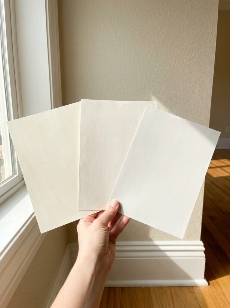
Let’s start here, because this is where so many people go wrong. White trim seems like the safest, most universal choice. And in many ways, it is the right choice — but the word “white” covers an enormous spectrum, and choosing the wrong one can make your walls look dingy, your trim look clinical, or your entire room feel slightly off in a way you can’t quite diagnose.
There are warm whites — those with yellow, beige, or pink undertones — and there are cool whites, with blue, gray, or green undertones. Benjamin Moore’s Chantilly Lace is a crisp, almost blue-white that reads as pure and clean. Sherwin-Williams’ Alabaster has a creamy, warm softness that feels lived-in and inviting. Swiss Coffee sits somewhere gently in between. Each of these will look entirely different depending on your wall color, your light source, and your flooring.
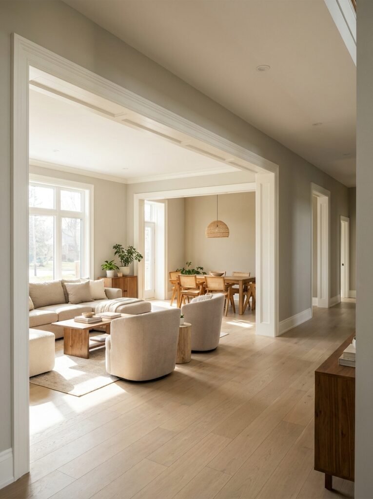
The rule of thumb? If your walls lean warm (think beige, terracotta, warm gray, sage green), your trim will almost always look best in a warm white. If your walls are cool-toned (charcoal, navy, icy blue, cool gray), a crisp, bright white will sing.
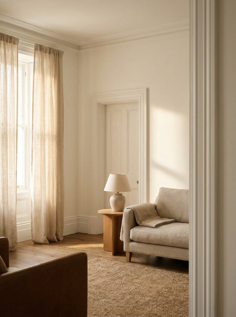
3. What Happens to a Room When Your Trim and Wall Colors Are Too Similar
Imagine a room painted in soft greige with bright white trim. The contrast is clean, intentional, and architectural. The room has edges. It has definition. Now imagine that same room with cream trim instead — suddenly the whole thing blurs together, the bones of the room disappear, and you’re left wondering why it feels a little flat.
Contrast is one of the most powerful tools in interior design, and trim color is one of the easiest places to deploy it. When your trim is slightly — or dramatically — different from your walls, it frames the space. It draws attention to the architectural features you want to celebrate: the tall ceilings, the wide baseboards, the elegantly proportioned doorways.
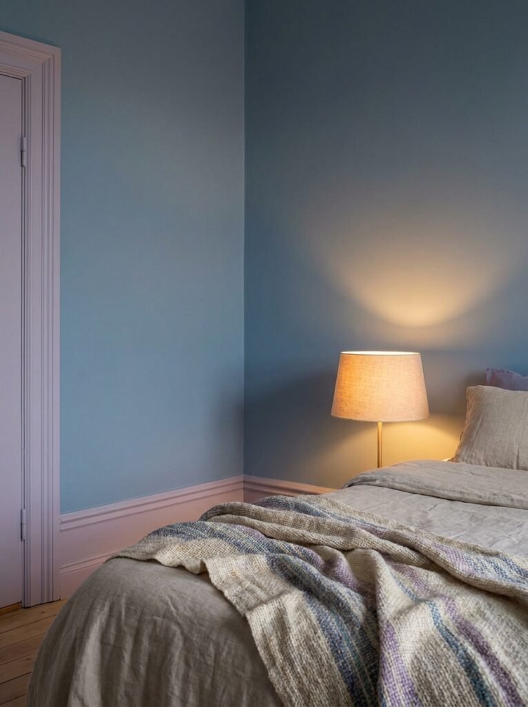
This doesn’t mean you need high contrast in every room. A tone-on-tone approach, where the trim is just a shade or two different from the wall color, creates a soft, enveloping, cocoon-like feel that’s beautiful in bedrooms and reading nooks. The key is making the choice intentionally, not accidentally.
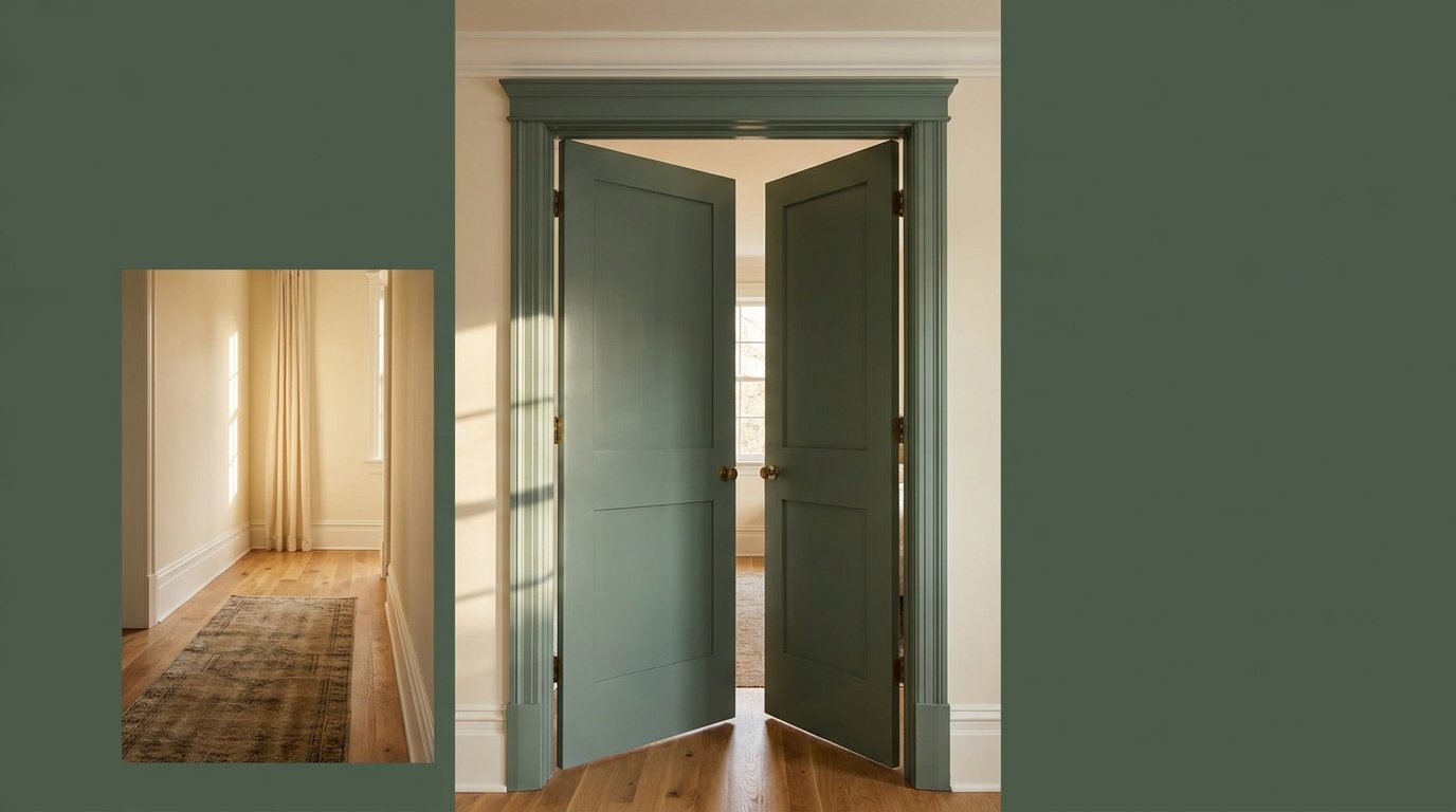
4. Painting Doors a Bold Color: The Single Change That Transforms an Entire Room
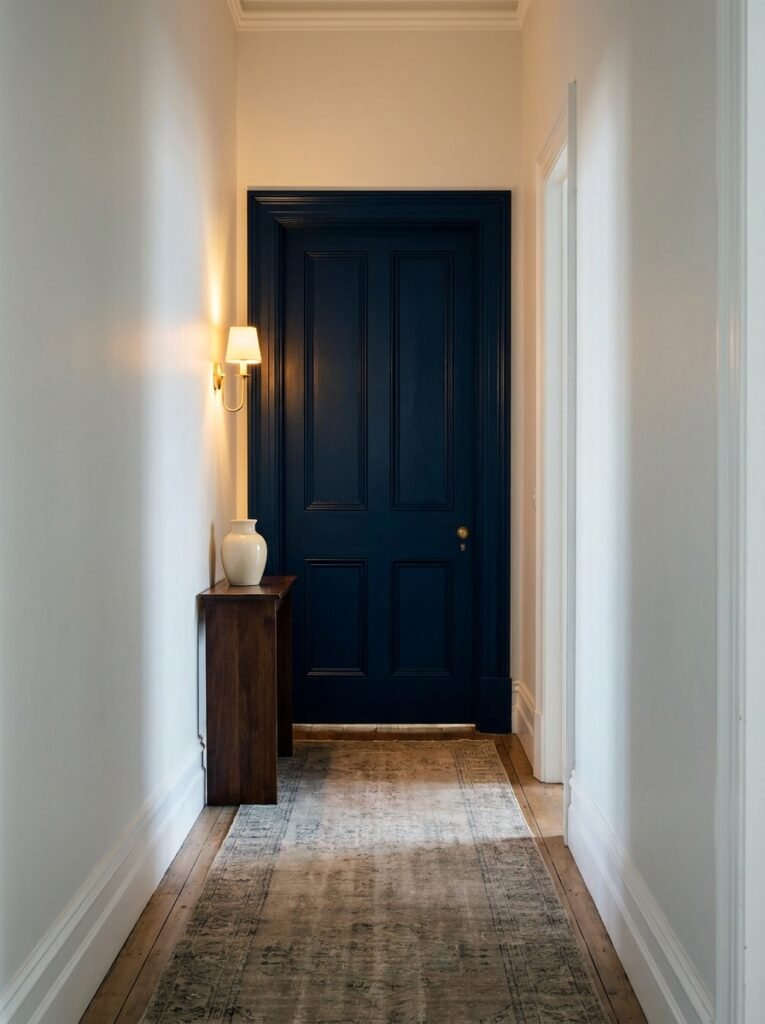
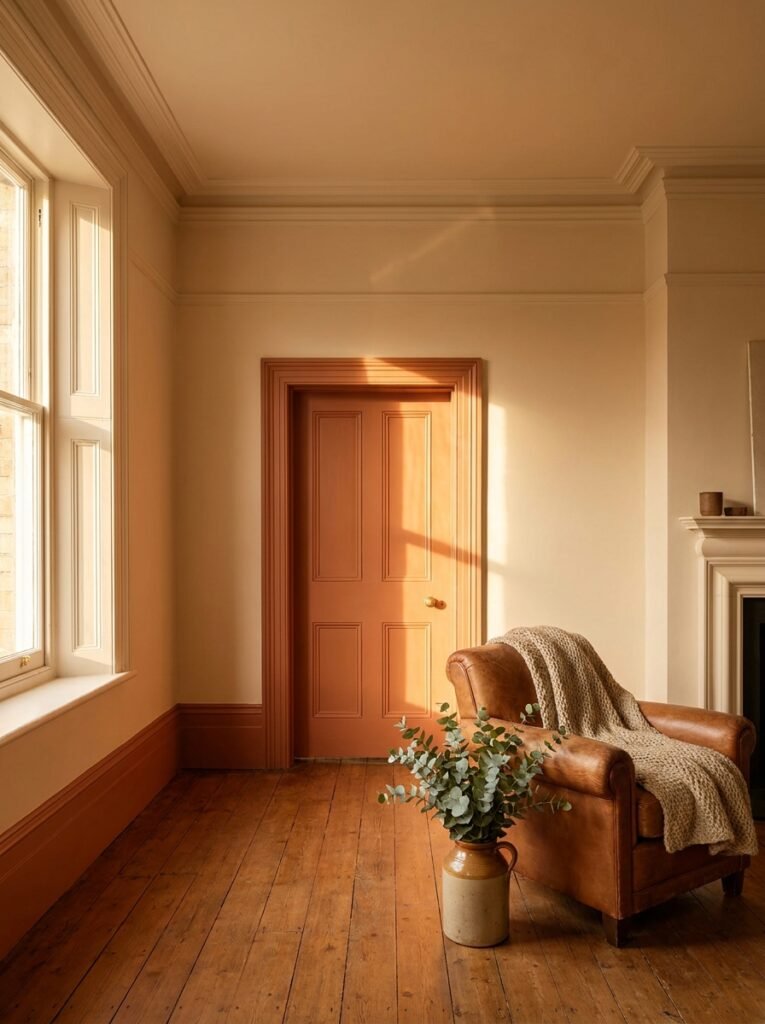
If you’ve never painted an interior door a color — a real color, not just white or off-white — you are missing one of the most joyful, surprisingly powerful design moves available to you. A painted door is like hanging a piece of art that you walk through.
Think of a dusty sage green door in a white hallway. Or a deep navy door at the end of a pale, neutral corridor. Or a warm terracotta door in a kitchen with butcher block counters and cream cabinets. These aren’t bold statements shouting for attention — they’re quiet, considered choices that add personality, depth, and soul.
The inside of your front door, especially, is prime real estate for color. It’s the first thing you see when you come home and the last thing guests notice as they leave. A beautiful color there sets a tone for the entire home — it says something about who lives here and how they want to feel within these walls.
“A painted door doesn’t just add color — it adds a point of view.”
5. The Classic Combinations That Design Professionals Keep Coming Back To
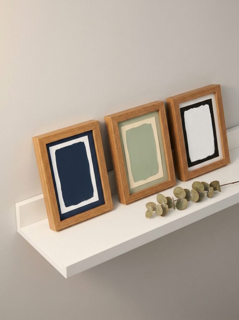
There’s a reason certain pairings have endured for decades: they simply work. Here are some of the most beloved trim and door color combinations, and why they earn their reputation.
Crisp white trim against deep charcoal or navy walls creates drama without feeling cold — the white keeps it from becoming oppressive. Warm cream trim with sage green walls feels like something out of a farmhouse dream, organic and restful. Black trim — yes, actual black — against white walls is a bold architectural move that feels both modern and timeless, the way it defines every edge with graphic clarity.
Greige walls (that perfect beige-gray hybrid) paired with soft warm white trim is possibly the most forgiving combination in existence, working in almost any light condition and with almost any furniture style. And for those feeling adventurous: a deeply colored door — forest green, burgundy, inky blue — against white walls and white trim creates a focal point that costs almost nothing but delivers an enormous visual return.
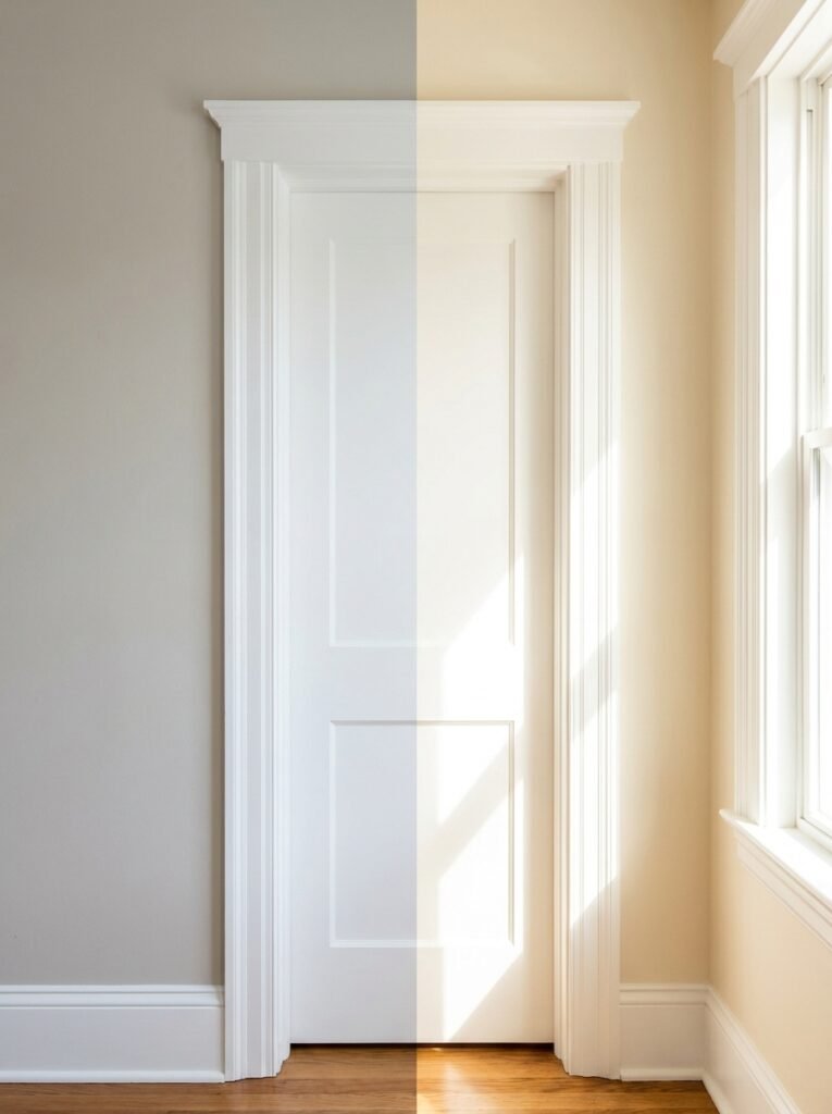
6. Light, Direction, and the Color That Changes Every Hour
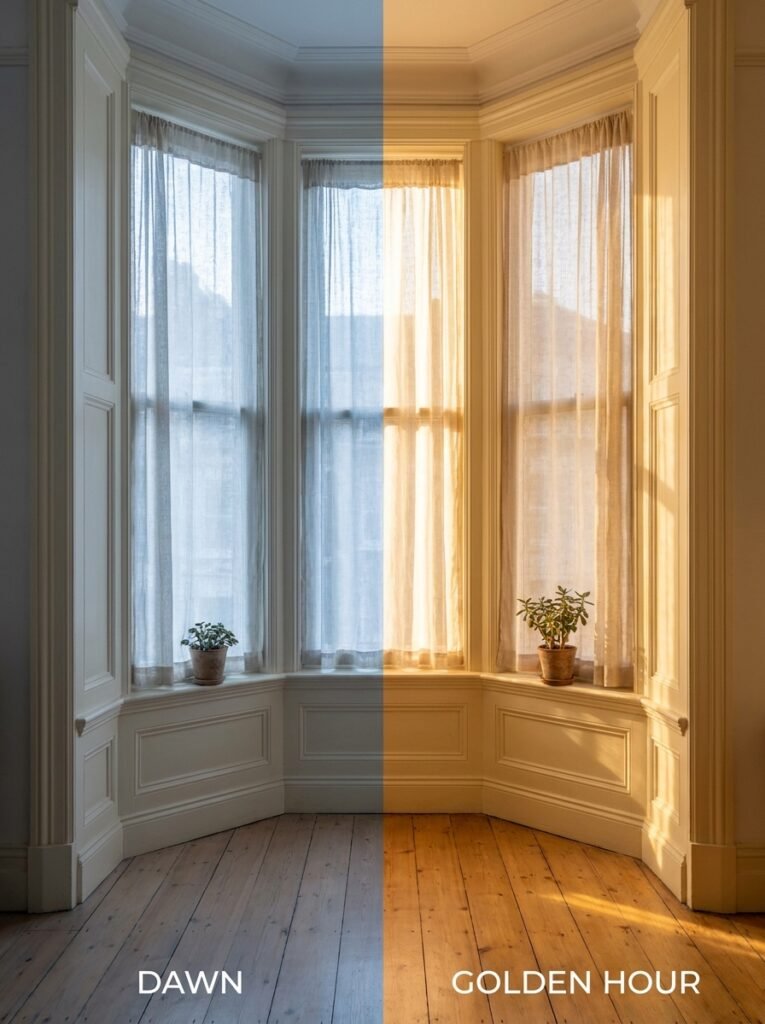
Here’s something that doesn’t get talked about enough: trim and door colors look different at 7am than they do at 7pm. They look different on a sunny day than on an overcast afternoon. North-facing rooms receive cool, indirect light that can make warm whites look dingy and cool whites look gray. South-facing rooms flood with warm light that can make bright whites appear almost yellow by noon.
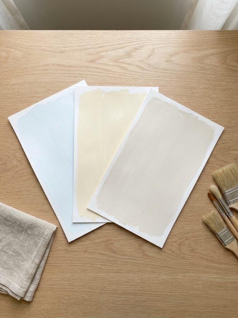
This is why designers always — always — test paint samples before committing. And not just a tiny chip against the wall. A large swatch, at least 12 by 12 inches, tested on the actual trim and left to be observed across multiple days and lighting conditions. What looks perfect in the paint store can look completely different once it’s on your baseboards.
The lesson here isn’t that color is unpredictable and terrifying — it’s that your room has a specific personality shaped by its orientation, its windows, its ceiling height, and its existing surfaces. Understanding that personality before you choose your trim color means the difference between a room that looks curated and one that looks slightly confused.
7. Ceiling Color and Its Relationship With Your Trim — The Connection Nobody Talks About
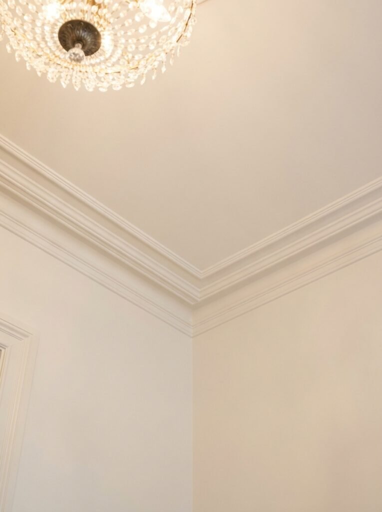
The ceiling is often called the fifth wall, and the relationship between your ceiling color and your trim color is more intimate than you might think. When your ceiling and trim are painted the same color — a classic approach in older homes and formal spaces — the room gains a sense of completeness, a wrapped feeling that’s simultaneously elegant and cozy.
When the ceiling is white and the trim is a different shade of white, the transition between the two needs to be handled carefully. A cool white trim paired with a warm white ceiling can create an unintentional clash that reads as a mistake rather than a design choice. Bringing the ceiling and trim into the same color family — even if they’re not identical — creates cohesion.
Some designers, particularly those working with lower ceilings, paint the trim slightly lighter than the ceiling to draw the eye upward, creating the illusion of height. Others paint the trim in a deeper shade to anchor the room and make ceilings feel more dramatic. These are small decisions with outsize impact.
8. When to Use the Same Trim Color Throughout Your Home — And When Not To
There’s a school of thought that says: one trim color, entire house, full stop. This approach creates a sense of flow and continuity that makes a home feel cohesive as you move from room to room. It simplifies the decision-making process and ensures that nothing ever clashes.
For most homes, especially those with an open floor plan where multiple rooms are visible from a single vantage point, this is wise advice. The eye travels through space, and it appreciates rhythm and repetition. A single trim color threading through every room creates that rhythm effortlessly.
But there are exceptions. A powder room, a home office, or a primary bedroom that’s fully enclosed can handle a different trim treatment. Maybe the walls and trim are both painted in the same moody, enveloping color. Maybe it’s the one room where you experiment with a bolder choice. Closed rooms offer creative freedom that open-plan spaces don’t.
“Consistency in trim creates the visual thread that ties every room of your home together.”
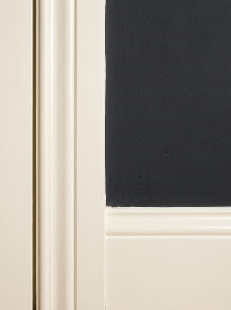
9. Matte, Satin, or Semi-Gloss? The Finish Is Half the Story
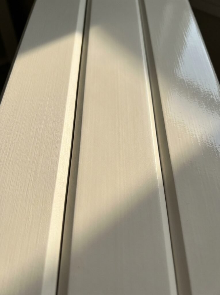
The color you choose matters enormously, but the sheen you apply it in changes the entire character of that color. Trim is traditionally painted in semi-gloss or satin for practical reasons — these finishes are more durable, easier to wipe clean, and hold up against the inevitable bumps, scuffs, and cleaning sessions that trim and doors endure.
But finish also affects how color reads. Semi-gloss trim in bright white reflects light and creates crisp, clean lines — beautiful in a modern or coastal home, but potentially harsh in a more relaxed, rustic space. Satin finish offers a softer sheen that’s elegant and a little more forgiving on imperfect surfaces. Flat or matte trim — less common but increasingly popular in high-end spaces — has a velvety, quiet depth that photographs beautifully and feels luxurious underfoot.
For interior doors, the finish you choose also affects how the color appears throughout the day. A high-gloss door in a bold color is dramatically reflective and very intentional — it says: look at me. A flat or eggshell door in the same color is quieter, more meditative. Same color. Completely different personality.
10. How Trim Color Affects the Perceived Size and Shape of a Room
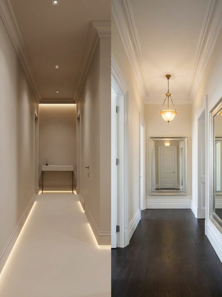
This is where trim color gets genuinely fascinating — and genuinely useful for anyone working with challenging spaces. In a narrow hallway, painting the trim in the same color as the walls (or only slightly lighter) makes the boundaries of the space softer and less confining. The room breathes more easily when it isn’t surrounded by contrasting lines drawing attention to its narrowness.
In a small room with low ceilings, white trim and white ceiling against colored walls can feel overwhelming — all that framing around a confined space. But painting the ceiling and trim in the same soft tone as the walls envelops you in color instead and, paradoxically, the room can feel larger.
Conversely, a tall room with high ceilings and beautiful crown molding benefits enormously from contrasting trim that draws the eye upward and emphasizes those proportions. The trim becomes a kind of architectural theater, and you — the person living in the room — are the audience.
11. The Rising Trend of Tinted Trim — And Why It Might Be Perfect for Your Home
For years, white trim was the default. Period. But somewhere in the last decade, designers started questioning that assumption, and the results have been quietly revolutionary. Tinted trim — where the trim is painted in a very light version of the wall color, or in a soft complementary hue — creates a room that feels warmer, softer, and more intentionally designed.
Light gray walls with barely-there gray trim. Soft blue walls with a pale lavender trim. Warm terracotta walls with a peachy cream trim. These combinations feel like the room was designed by someone who truly understood color, and yet they’re achievable by anyone willing to step away from the default white.
Tinted trim works especially well in rooms where you want a sense of softness and enclosure — reading rooms, bedrooms, dining rooms where candlelight plays across surfaces. It’s intimate and considered without being dramatic. If you’ve always wanted your home to feel like it was designed rather than decorated, tinted trim might be the move you’ve been missing.
12. Where to Start When You’re Feeling Overwhelmed by the Options
The world of trim and door colors can feel paralyzing when you’re standing in front of a paint deck trying to make a decision. Here’s how to simplify it. Start with your walls. Identify whether your wall color is warm or cool, light or dark, neutral or saturated. That gives you your first constraint.
Then ask yourself: do I want contrast or cohesion? High contrast — a bright trim against a deeper wall — is graphic and architectural. Low contrast — a near-tonal combination — is soft and enveloping. Neither is wrong. They just serve different purposes and create different moods.
Once you’ve answered those two questions, test three to five samples on the actual trim in actual light. Live with them for a week. Look at them in the morning, at noon, in the evening lamplight. And then — trust your instincts. The option you keep going back to, the one that makes the room feel most like home, is almost certainly the right one.
—
🌿 How to Get Your Trim and Door Colors Right the First Time
Getting this decision right doesn’t require a design degree — it requires a little patience and a willingness to test before committing. Here’s how to approach it like a pro.
First, always paint large test swatches directly on your trim — not a tiny chip, and not just on the wall. The actual surface matters. Second, observe those swatches at different times of day, particularly in the morning light and under your evening artificial lighting. Third, hold your trim swatch next to your wall color and your flooring simultaneously — the relationship between all three is what determines success. Fourth, consider the finish carefully: satin for most applications, semi-gloss if you want crispness and durability, flat if you want that luxurious, modern depth. And fifth, if you’re painting a door a bold color, paint the entire door — both sides and the edges — for a cohesive, professional result that looks intentional rather than accidental.
—
❓ FAQ
Q: Should interior trim always be white? A: Not at all — white is simply the most versatile starting point, but tinted, colorful, and even black trim are all legitimate, beautiful choices depending on your style and the mood you want to create. The most important thing is that your trim color feels intentional and relates thoughtfully to your wall color and overall palette.
Q: Can I paint interior doors a different color than the trim? A: Absolutely, and this can be a stunning design choice. A colored door with white trim creates a beautiful focal point. The most successful pairings keep the door color related to the broader room palette — so a sage green door works beautifully in a room with green or neutral undertones, for example.
Q: What’s the most timeless trim color combination for resale value? A: Warm white or bright white trim against neutral walls — particularly in satin or semi-gloss finish — remains the most universally appealing combination for buyers. It reads as clean, well-maintained, and move-in ready. If you’re decorating for resale, this is your safest and most reliable choice.
—
💭 Final Thought
Trim and door colors are the quiet heroes of interior design — the details that hold everything together without announcing themselves, the choices that make a room feel finished, thoughtful, and genuinely alive. They’re also among the most accessible changes you can make: a gallon of paint, a weekend afternoon, and a willingness to see your home with fresh eyes.
So here’s the question worth sitting with: if the trim and doors in your home were designed with the same intention and care as everything else, what story would they tell about the way you want to live?