
Why Burnt Orange Is the Interior Color Everyone Is Falling in Love With — And Never Looking Back
There’s a moment — maybe you’ve felt it — when you walk into a room and something just feels right. Not because it’s perfectly curated or straight out of a magazine, but because it wraps around you like a warm blanket on a rainy afternoon. That feeling? More often than not, there’s burnt orange on the walls, in the textiles, or anchoring the space from a single, perfect piece of furniture. This color has a quiet power, and once you understand it, you’ll never look at your home the same way again.
—
1. The Color That Holds Its Own History
Before we talk about how to use burnt orange in your home, let’s talk about why it resonates so deeply — because this isn’t a color that arrived on a mood board without a story.
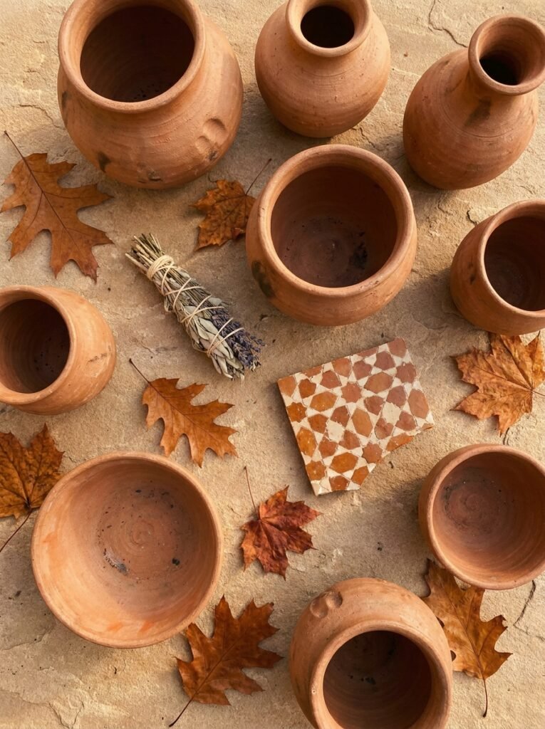
Burnt orange sits at the intersection of red’s passion, yellow’s warmth, and brown’s groundedness. It’s the color of terracotta clay baked in the sun, of autumn leaves reaching their final, most glorious moment, of a wood fire burning low on a winter evening. Indigenous and Mediterranean cultures have used versions of this hue for centuries in ceramics, textiles, and architectural details — not because it was trendy, but because it felt human. It felt like the earth.
In interior design, burnt orange had a significant moment in the 1970s, appeared in the bohemian interiors of the early 2000s, and has now returned — but this time with more sophistication. It’s no longer paired with harvest gold and avocado green (though, honestly, some people are doing that again beautifully). Today, it’s being layered with deep forest greens, warm creams, aged brass, and rich charcoal to create interiors that feel both rooted and elevated.
“Burnt orange doesn’t decorate a room — it transforms the emotional atmosphere of an entire space.”
Understanding this color’s lineage helps you use it with intention rather than impulse. When you bring it into your home, you’re connecting to something ancient, tactile, and deeply human.
—
2. What Burnt Orange Actually Does to a Room’s Energy
Color psychology is a real science, and burnt orange is one of its most fascinating subjects. Unlike straight orange — which can feel aggressive or overly stimulating in large doses — burnt orange carries a built-in muting effect. The “burnt” quality softens it, adds depth, and gives it an almost meditative quality that pure orange simply doesn’t have.
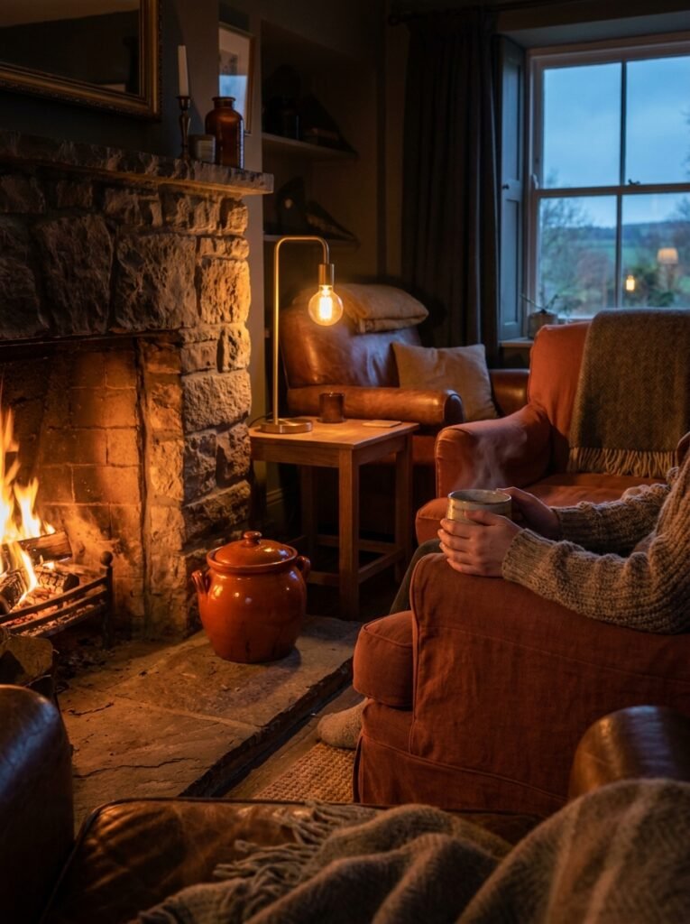
In a living room, burnt orange encourages conversation. It raises the energy just enough to make people lean forward, engage, and feel present — without making them feel overstimulated. In a bedroom, used sparingly, it creates a cocooning effect, making the space feel intimate and sensory rather than cold or clinical. In a kitchen or dining room, it stimulates appetite and conviviality — which is, not coincidentally, why so many warm-toned restaurants feel so inviting.
Psychologists often refer to warm, earthy tones like burnt orange as “grounding colors.” They help people feel connected to the physical world — to texture, to season, to the body. In a culture that spends increasing amounts of time in digital, screen-lit environments, a room with burnt orange in it offers something rare: a visual exhale.
—
3. The Paint Colors Interior Designers Actually Recommend
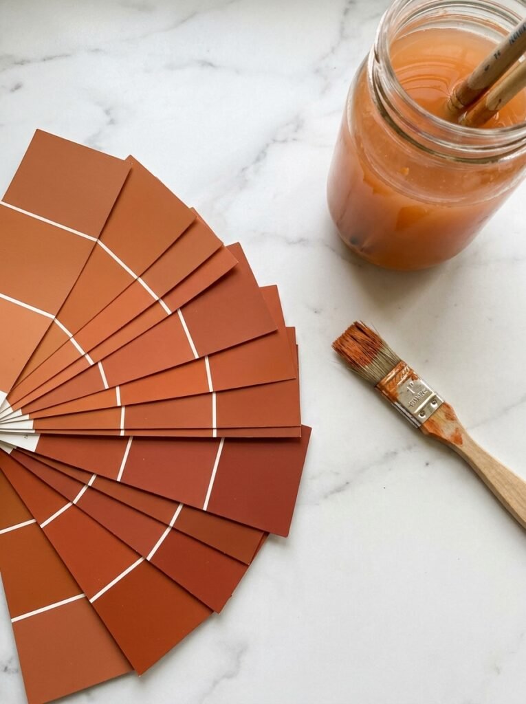
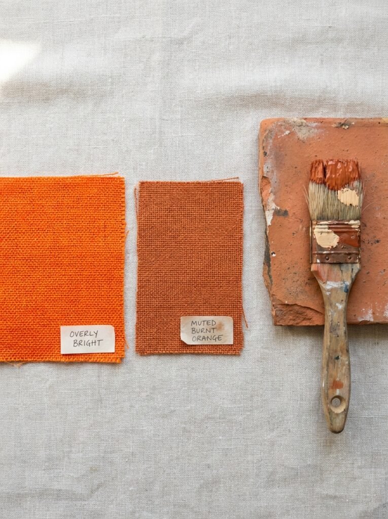
If you’ve decided you want burnt orange on your walls — and once you understand it, you very likely will — the next challenge is choosing the right shade. Because “burnt orange” as a category spans a surprisingly wide range, from amber-toned terracottas to deeply saturated russet hues that almost edge into brick red.
Some of the most beloved paint options among interior designers and home stylists include Farrow & Ball’s “Red Earth,” which leans more toward a deep, sun-baked terracotta — perfect for dining rooms and spaces where you want drama without aggression. Benjamin Moore’s “Pumpkin Spice” sounds seasonal but reads as a sophisticated, warm burnt orange in natural light. Behr’s “Rustic Barn” is a slightly darker, more grounded option ideal for rooms with plenty of natural light to counterbalance its depth. And Clare Paint’s “Cayenne” has become a darling of the interior design world for its perfectly balanced saturation — bold enough to make a statement, warm enough to feel welcoming.
The key thing to remember: always sample. Burnt orange is a color that shifts dramatically depending on the light in a room. A north-facing room will push it toward rust and brown; a south-facing room will amplify its warmth and bring out its amber tones. What looks perfect in the store can look entirely different on your walls at 7pm with the lamps on.
—
4. How to Bring It In Without Painting a Single Wall
Not ready to commit to full walls? That’s completely fine — and honestly, some of the most beautifully executed burnt orange rooms I’ve ever seen achieved maximum impact without a drop of paint. The secret is layering.
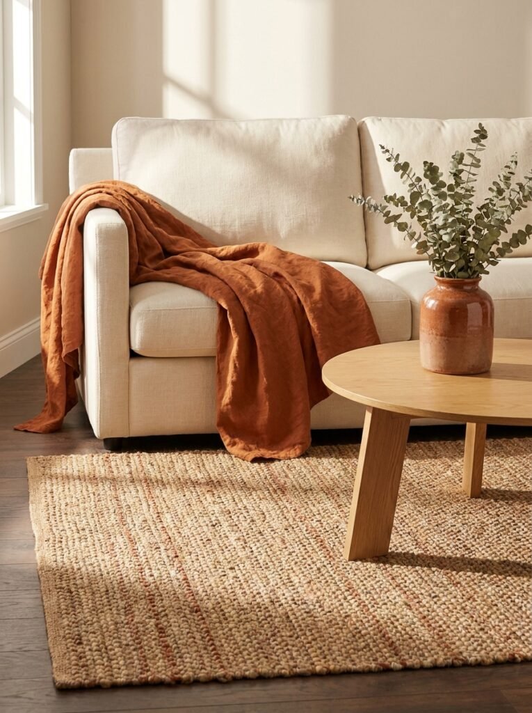
Start with textiles. A burnt orange linen throw draped over a cream sofa can be transformative — it costs relatively little, requires no commitment, and instantly changes how the room feels at a seasonal level. From there, consider a terracotta-glazed ceramic vase on a coffee table or open shelf. Add a woven jute rug with burnt orange threading, and suddenly your room has warmth, depth, and intentionality — all without a brush stroke.
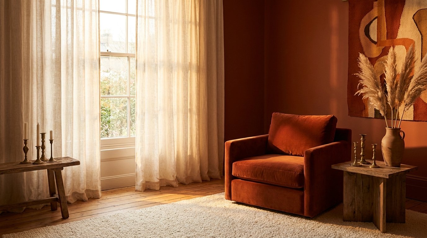
Furniture is another powerful vehicle. A single burnt orange velvet armchair in a room full of neutrals acts as an anchor — the piece every other element organizes itself around. This is the “one brave piece” approach to interior design, and it works extraordinarily well with this particular color because burnt orange has enough presence to hold the room together without shouting.
Art is perhaps the most overlooked vehicle for color. A large-format print or painting that carries burnt orange tones can introduce the hue in a way that feels artistic rather than decorative, and it gives you flexibility to change the room’s direction later without repainting.
“Sometimes the bravest design choice is a single chair in exactly the right color.”
—
5. The Colors That Make Burnt Orange Sing
Burnt orange doesn’t exist in isolation — it’s always in conversation with the other colors in a room. Getting those pairings right is the difference between an interior that feels cohesive and intentional versus one that feels chaotic or muddy.
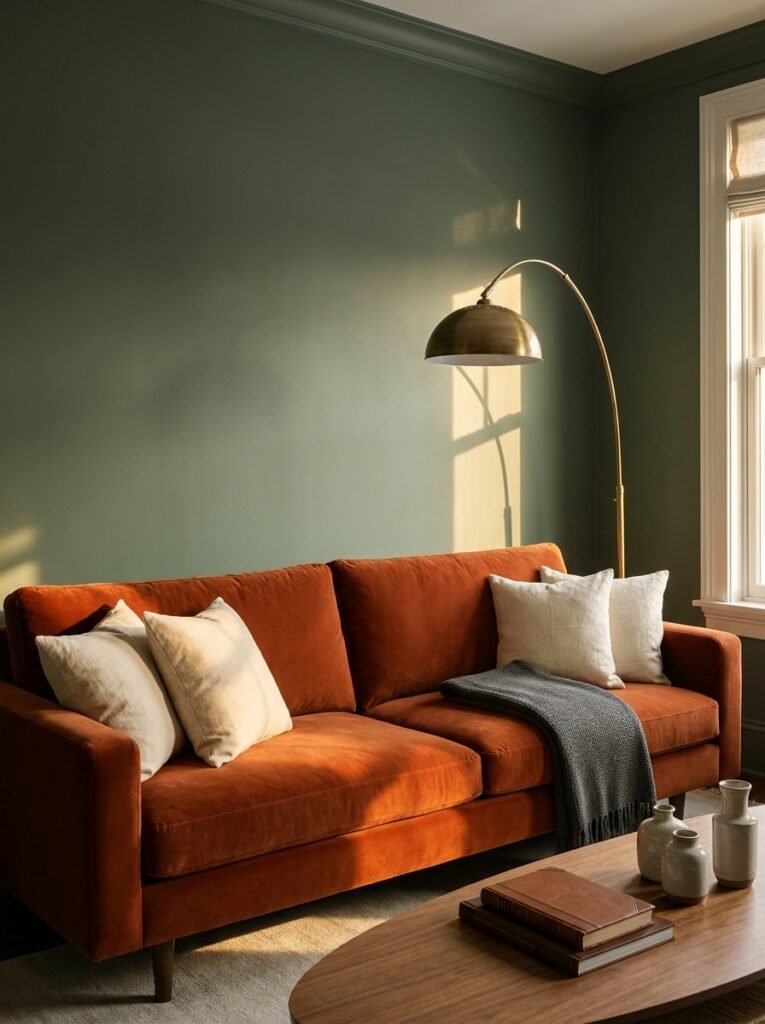
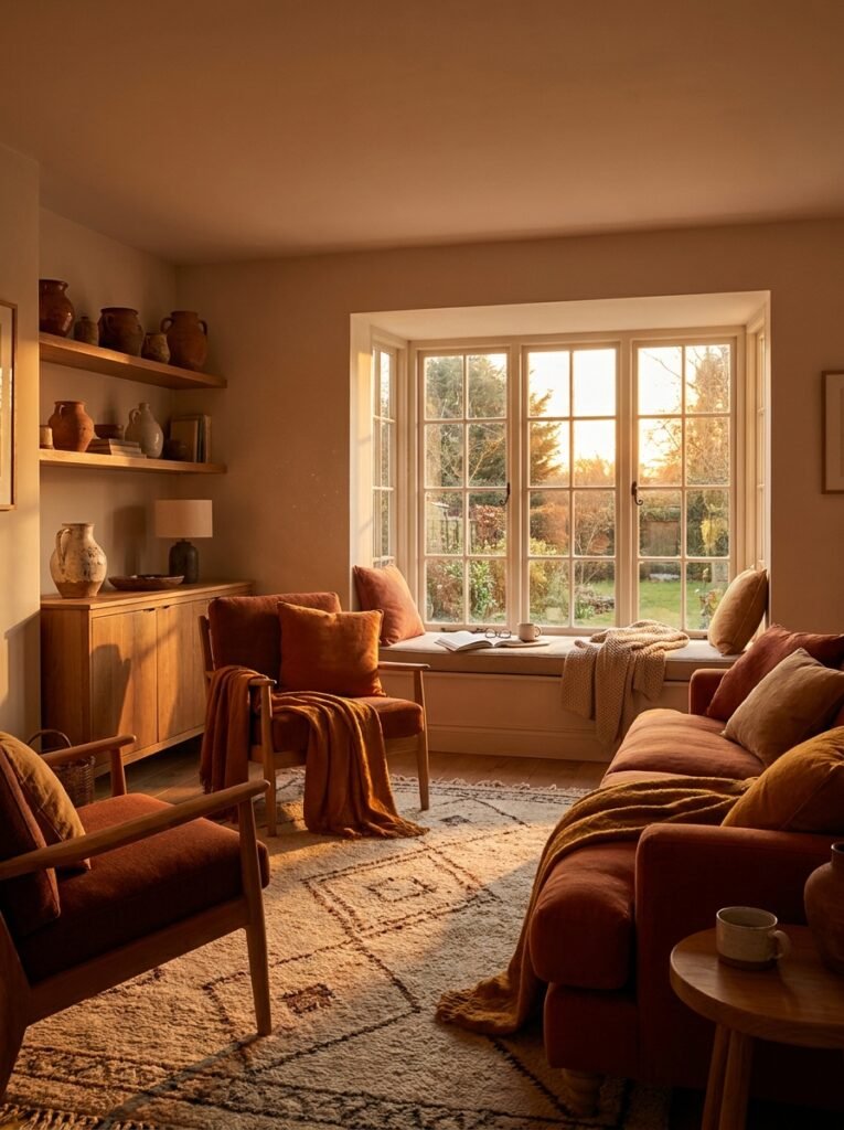
The partnership that has captured the design world’s imagination more than any other right now is burnt orange with deep forest or sage green. These are complementary colors in nature — think autumn leaves against evergreens — and that natural logic translates beautifully into interior spaces. A burnt orange sofa against sage green walls is the kind of room that makes people stop scrolling.
Warm cream and ivory are natural companions that allow burnt orange to remain the star without visual competition. Pairing it with cream-painted woodwork, linen curtains, or a creamy bouclé rug softens the combination and prevents the space from feeling heavy.
For a more dramatic, sophisticated approach, burnt orange pairs magnificently with charcoal, near-black, and deep navy. These combinations feel grown-up and editorial — the kind of palette you’d see in an architect’s personal home or a boutique hotel. The contrast creates visual tension in the best possible way.
Warm metallics — aged brass, unlacquered bronze, antique gold — are the finishing touches that make a burnt orange room feel genuinely elevated. They mirror the warmth of the color itself and add a layer of richness that chrome or silver simply can’t provide.
—
6. Burnt Orange in Small Spaces — Why Less Isn’t Always More
There’s a common misconception that warm, saturated colors make small spaces feel smaller. While it’s true that very dark colors can visually compress a space, burnt orange — especially in its lighter, more terracotta-adjacent forms — actually does something more interesting. It makes a small room feel cozy rather than cramped. There’s a meaningful difference.
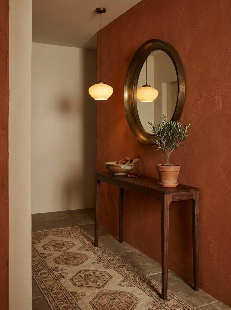
In a small entryway, a burnt orange accent wall with a simple wooden console and a brass mirror creates an arrival experience that feels considered and inviting. In a small bathroom, terracotta-toned tiles on the floor or in a feature alcove add warmth and texture to what might otherwise feel like a cold, clinical space. In a home office nook, a hint of burnt orange through cushions, a desk accessory, or even a framed print can make hours of work feel more humane and less sterile.
The principle at work is that warmth = welcome, and welcome = spacious. A room that makes you want to stay feels larger than a room that makes you want to leave — regardless of its actual dimensions.
—
7. The Furniture Styles That Work Best With This Palette
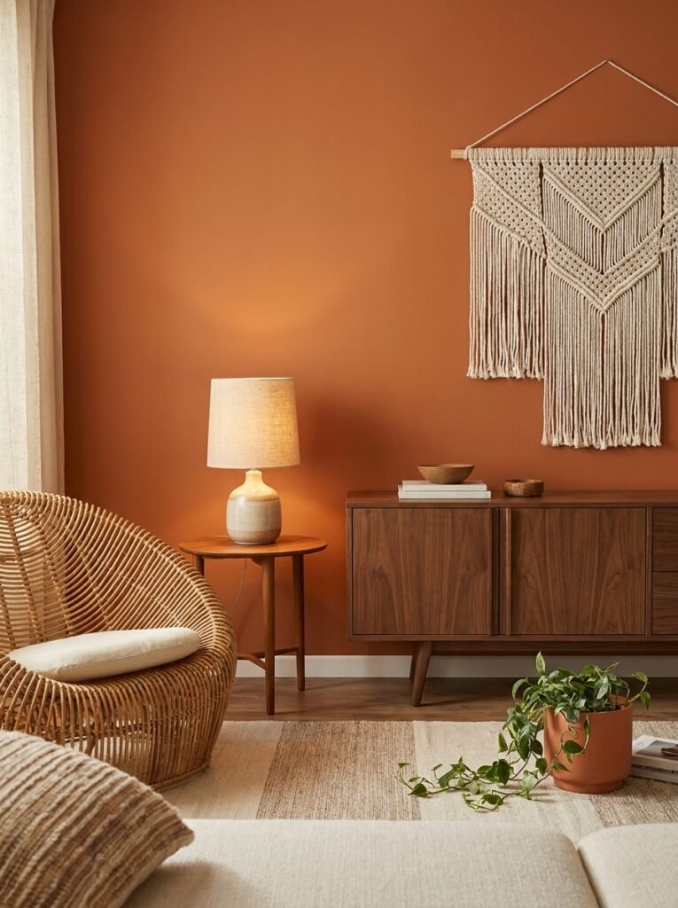
Burnt orange has an affinity with certain furniture aesthetics that’s worth understanding before you start shopping. Mid-century modern pieces — low-profile sofas, tapered-leg chairs, walnut sideboards — feel completely at home with this palette because the era itself leaned heavily on warm, earthy tones. A teak credenza beneath a burnt orange painted wall is practically a time capsule of the good parts of 1960s design.
Bohemian and global-influenced furniture also pairs naturally with burnt orange — rattan chairs, hand-carved wooden coffee tables, Moroccan-inspired lanterns, macramé wall hangings. These pieces carry a similar earthy, artisanal quality to the color itself.
Interestingly, some contemporary and even minimalist furniture can work beautifully with burnt orange if the shapes are clean and the palette around them is controlled. A sleek, burnt orange velvet sofa in a white-walled loft with concrete floors and black steel windows is startlingly chic — it bridges the warmth-versus-minimalism divide in a way that feels current and surprising.
What doesn’t pair well? Very ornate, gilded, or rococo furniture tends to fight with burnt orange rather than complement it. And very cold, chrome-heavy modern pieces can make the color look harsh. The through-line is warmth — if the furniture carries any warmth in its material, tone, or silhouette, burnt orange will meet it gracefully.
“The furniture you choose doesn’t just fill space — it either amplifies or diminishes the emotional intention of your color choices.”
—
8. Seasonal Styling With Burnt Orange Year-Round
One of the greatest misunderstandings about burnt orange in interior design is that it’s a fall-only color — something to bring out with the pumpkins and put away with the holiday decorations. This could not be further from the truth, and keeping it seasonal is genuinely a missed opportunity.
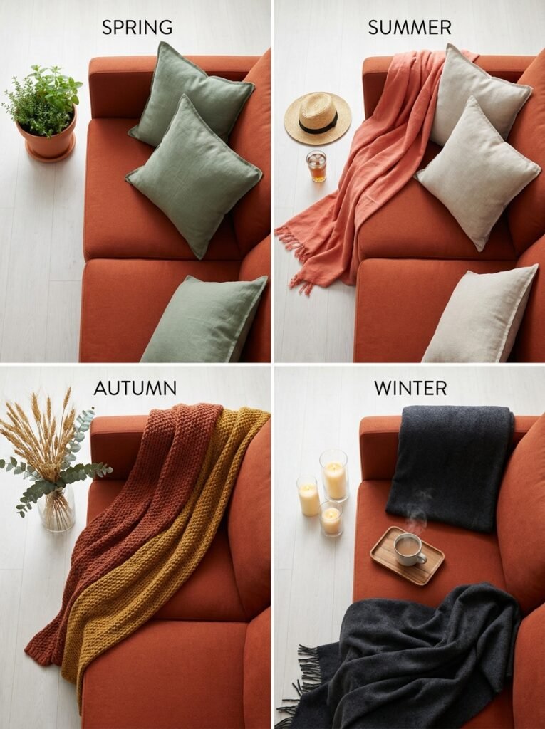
In spring, pair burnt orange with fresh sage green and creamy white, and the combination feels like a terracotta pot filled with new growth — earthy and alive. In summer, pair it with warm whites, natural linen, and the occasional burst of dusty coral or marigold, and it reads as Mediterranean and sun-soaked. In winter, surround it with deep charcoal, candlelight, and the texture of chunky wool throws, and it becomes the warmest, most inviting anchor in a room you never want to leave.
The secret to keeping burnt orange fresh across seasons is adjusting the accessories, not the foundational color. Your burnt orange sofa or accent wall stays constant; what changes are the cushions, the throws, the floral arrangements, and the smaller decorative objects. This approach makes seasonal refreshing effortless and cost-effective.
—
9. The Kitchen — Where Burnt Orange Becomes Completely Transformative
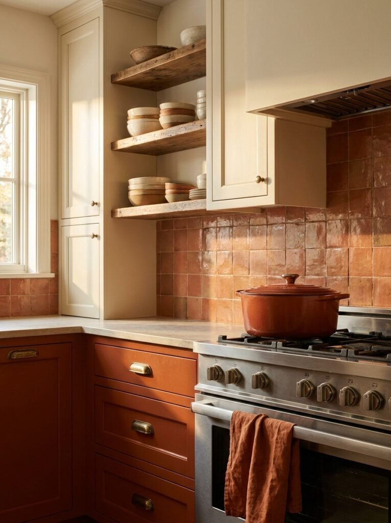
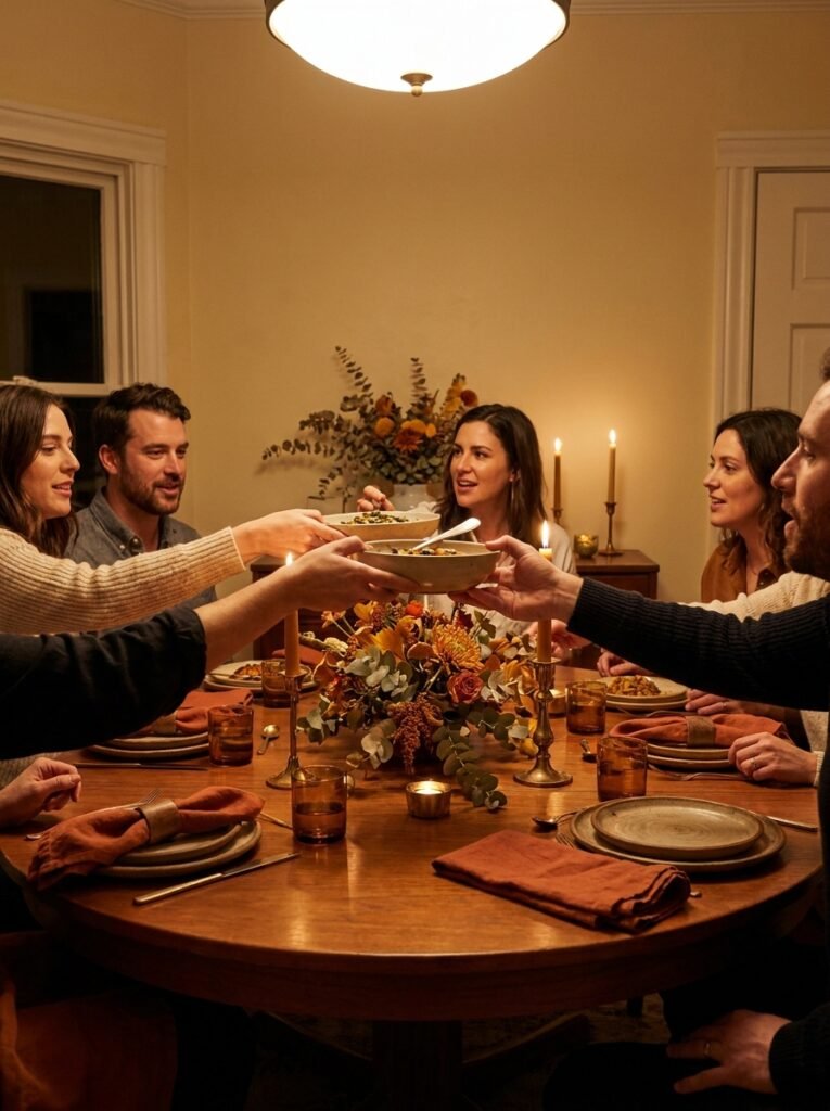
If there’s one room where burnt orange earns its most devoted following, it’s the kitchen. And it makes complete sensory sense — this is a space defined by warmth, fire, nourishment, and gathering. Burnt orange in a kitchen isn’t decorating; it’s alignment between color and purpose.
The most popular applications right now include terracotta-glazed tile backsplashes that create a handmade, artisanal feel behind open shelving or a cooking range. Burnt orange cabinetry — particularly on lower cabinets paired with cream or sage upper cabinets — creates a grounded, layered look that photographs beautifully and functions even better. And for those who want something more subtle, simply swapping out ceramic bowls, a Dutch oven, or a stand mixer to a burnt orange or terracotta tone can shift the entire feeling of a kitchen without touching the structure.
From a food photography perspective — which matters enormously for anyone building a food or lifestyle presence on Pinterest — burnt orange backgrounds and props make food look incredible. The warmth of the color makes dishes appear more appetizing, more textured, more worthy of a moment’s attention. It’s not an accident that so many of the most-saved food photos on Pinterest involve terracotta boards, burnt orange linen napkins, or earthy ceramic vessels.
—
10. Burnt Orange in the Bedroom — More Calming Than You’d Expect
The instinctive hesitation many people feel about putting burnt orange in a bedroom is understandable. Warm, saturated colors can feel stimulating, and the bedroom is supposed to be a sanctuary of rest. But here’s what changes the calculation: how you use it.
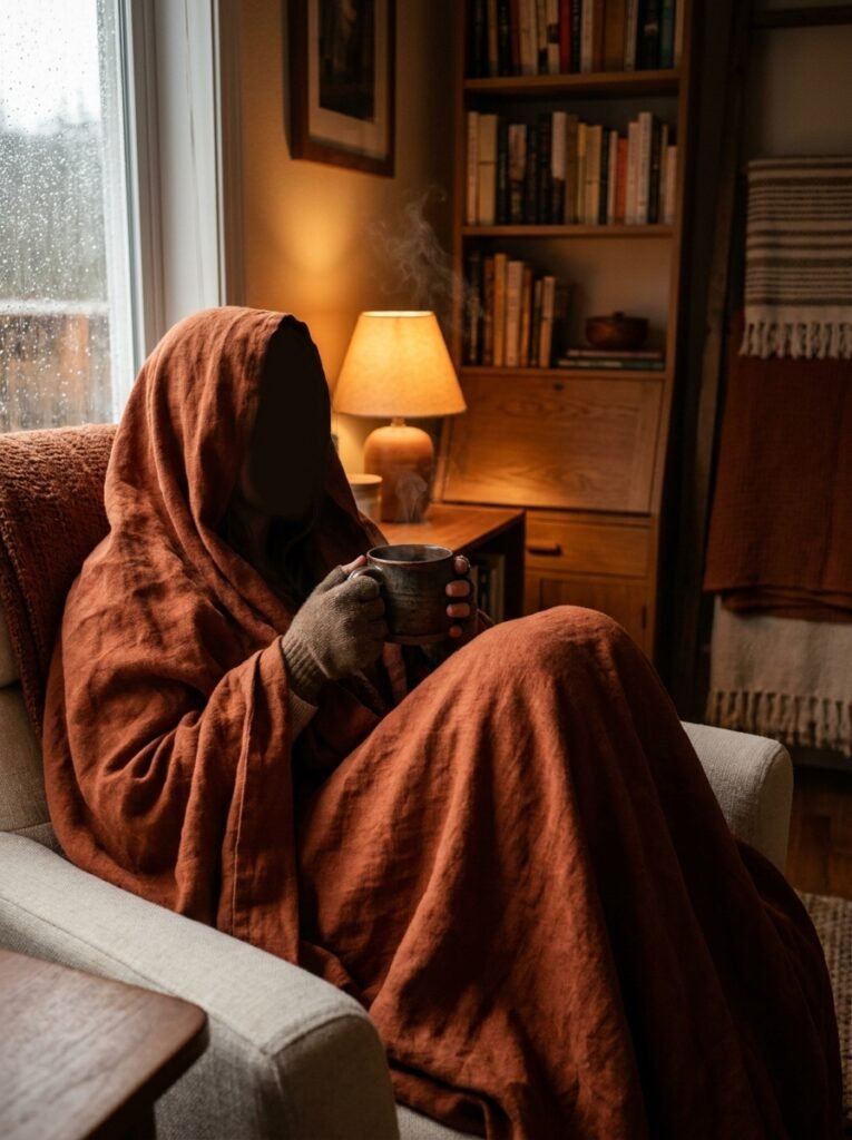
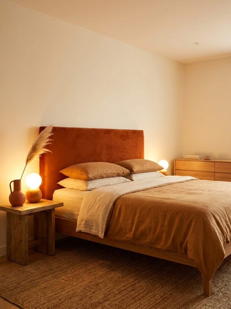
A fully burnt orange bedroom would indeed feel energizing in a way that might work against sleep. But nobody is suggesting that. The approach that works — and works beautifully — is using burnt orange as an accent against deeply calming neutrals. Imagine warm white walls, linen bedding in a soft caramel tone, and then a burnt orange velvet headboard. Or terracotta-painted walls in a matte, low-sheen finish paired with cream cotton bedding and wooden furniture. The orange grounds the room, adds richness, and creates a sense of cocooning without overstimulating.
Candlelight and warm-toned lamps are the final piece of the puzzle in a burnt orange bedroom. Under warm light, the color deepens and softens, becoming genuinely soporific. It’s the visual equivalent of the golden hour — that magical time just before sunset when everything feels bathed in amber warmth and the world slows down.
—
11. Common Mistakes People Make With This Color (And How to Avoid Them)
Even the most beautiful color can go wrong with poor execution. Burnt orange has a few specific pitfalls worth knowing about before you commit.
The most common mistake is choosing a shade that’s too bright or too saturated and then wondering why the room feels more like a fast-food restaurant than a sophisticated home. The “burnt” in burnt orange is crucial — it’s what separates this from pure orange. If your chosen paint or fabric looks bright under the store lighting, it will look even brighter on a large surface at home. Always lean toward the version that seems almost too muted when you’re choosing it.
Another mistake is over-indexing on the color — using it on walls, in the furniture, in the rug, and in the art simultaneously. Burnt orange is powerful, and power requires restraint to remain elegant. Pick two or three applications, then let the color breathe against neutrals.
Finally, neglecting texture is a missed opportunity. Burnt orange in a flat, matte application on walls alone can feel one-dimensional. The color truly comes alive when it’s layered across different textures — a nubby linen cushion, a smooth ceramic pot, a velvet chair, a rough terracotta tile. Texture makes color feel three-dimensional and alive.
—
12. Why This Color Feels Especially Right for Right Now
There’s a reason burnt orange has had such a sustained moment — not just a seasonal trend spike, but a genuine cultural embrace — over the past several years. It’s worth reflecting on what this color is actually offering us.
We are living in a moment of significant disconnection — from nature, from community, from our own physical senses. We spend enormous amounts of time in environments that are digitally mediated, artificially lit, and visually cold. Burnt orange is the antidote to all of that. It is tactile in its visual quality. It is warm the way a real fire is warm. It is rooted in the natural world — in clay, in harvest, in the turning of seasons — in a way that speaks to something very old and very instinctive in us.
When you bring burnt orange into your home, you’re not just making a decorating choice. You’re making a statement about what kind of environment you want to live in. You’re choosing warmth over coolness, depth over flatness, presence over perfection. You’re saying that your home is a place of comfort and life and sensory richness — a place where people arrive and immediately want to stay.
That’s not a trend. That’s a value.
—
🌿 How to Take Care of Your Burnt Orange Interior
Like any carefully considered design choice, a burnt orange interior thrives with a little ongoing attention.
For painted walls, use a washable matte or eggshell finish — flat finishes are beautiful but less durable, and burnt orange tends to show scuffs in high-traffic areas. Touch-up paint is your best friend; keep a small jar labeled and stored from your original purchase.
For burnt orange textiles — cushions, throws, curtains, upholstered furniture — treat them to UV protection where possible. Warm-toned fabrics can fade with prolonged direct sun exposure, so rotate cushions seasonally and consider lining curtains if they receive intense afternoon light.
Terracotta and ceramic pieces benefit from a simple wipe-down with a damp cloth. Avoid harsh chemical cleaners, which can dull the glaze and affect the color over time.
Refresh the surrounding neutrals periodically. Because burnt orange is the anchor, the colors around it need to remain clean and intentional — a cream wall that’s gone dingy or a rug that’s faded will make your burnt orange pieces look tired by association.
Most importantly, trust your instincts. A burnt orange room should make you feel something every time you walk into it. If it stops doing that, it’s probably time to refresh an accessory or two, not the whole room.
—
❓ FAQ
Q: Is burnt orange a good color for a living room? A: Absolutely — it’s one of the most versatile and emotionally rich colors you can choose for a living room. Whether used on a feature wall, as an accent through a sofa or armchair, or layered through textiles and ceramics, burnt orange creates a warm, inviting atmosphere that encourages conversation and makes guests feel genuinely welcome. Pair it with warm neutrals for the most effortlessly elegant result.
Q: What colors go with burnt orange in interior design? A: The most harmonious and designer-approved pairings are sage or forest green, warm cream and ivory, deep charcoal or near-black, and aged brass or bronze metallics. For a bolder approach, dusty pink and burnt orange together create a surprisingly sophisticated, sunset-toned palette that photographs beautifully. The key in every pairing is keeping the surrounding palette warm rather than cool — cold grays and cool blues tend to clash rather than complement.
Q: Can I use burnt orange in a small room without making it feel smaller? A: Yes — and the result might surprise you. In a small space, burnt orange creates a cocooning effect that feels intimate and welcoming rather than cramped. The key is to use it in a matte or low-sheen finish, keep the rest of the palette light and airy, and ensure the room has good lighting — both natural and warm artificial. A small entryway or bathroom with burnt orange is often more successful than people expect.
—
💭 Final Thought
Burnt orange is one of those rare colors that manages to feel both timeless and completely of this moment — ancient in its roots, contemporary in its execution, and deeply, unmistakably human in its warmth. It asks nothing complicated of you. It simply invites you to slow down, look around, and feel at home.
So here’s the question worth sitting with tonight: what would it feel like to live inside a little more warmth?